


The graph and table below give information about water use worldwide and water consumption in two different countries.
Summarise the information by selecting and reporting the main features, and make comparisons where relevant. Write at least 150 words.
The graph and table below give information about water use worldwide and water consumption in two different countries.
Summarise the information by selecting and reporting the main features, and make comparisons where relevant. Write at least 150 words.
Câu hỏi trong đề: 2000 câu trắc nghiệm tổng hợp Tiếng Anh 2025 có đáp án !!
Quảng cáo
Trả lời:
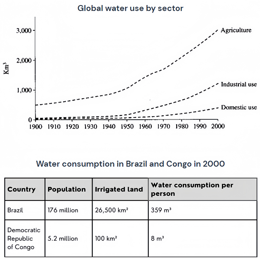
Sample 1:
The line graph shows global water consumption in three different sectors between 1900 and 2000, while the table compares water use in Brazil and the Democratic Republic of Congo in 2000.
Overall, water consumption increased in all three sectors, but agriculture consumed far more water than the other two. Brazil was a much bigger water consumer than Congo.
Agriculture remained the most water-consuming industry. It used about 500 km3 of water in 1900 and this number increased dramatically to around 3,000 km3 in 2000. Less than 100 km3 of water was used for either industrial or residential purposes in 1900. Not until around 1950 did water consumption rise significantly, eventually reaching by 2000 roughly 1000 km3 for the former and 500 km3 for the latter.
Brazil had a population of 176 million, an irrigated land area of 26,500 km2, and a per capita water consumption of 359 m3. In comparison, the corresponding figures for Congo were only 5.2 million, 100 km2, and 8 m3. This made Brazil a much larger water user than Congo.
Sample 2:
The graph and the table portray the utilization of water around the world and consumption of water in two different countries.
The major portion of water consumption in terms of global usage was done by the agriculture sector. Industrial agents were the second largest users of water worldwide, followed by domestic users of the general population. The table shows the contrast in water utilization between a large country like Brazil and a smaller nation like the Democratic Republic of Congo.
The line graph shows that the consumption of water worldwide had gone from below 1000 km3 to over 3000km3 for the agricultural sector from 1990 to 2000. Water consumption for the industrial sector increased to a little over 1000 km3 and almost 500 km3 for domestic use from 1990 to 2000.
From the table, it can be seen that the water consumption in Brazil is quite larger than that in The Democratic Republic of Congo. This is due to the vast difference in the population and land area of the two countries.
Sample 3:
The graph shows how the amount of water used worldwide changed between 1900 and 2000.
Throughout the century, the largest quantity of water was used for agricultural purposes, and this increased dramatically from about 500 km³ to around 3,000 km³ in the year 2000. Water used in the industrial and domestic sectors also increased, but consumption was minimal until mid-century. From 1950 onwards, industrial use grew steadily to just over 1,000 km³, while domestic use rose more slowly to only 300 km³, both far below the levels of consumption by agriculture.
The table illustrates the differences in agriculture consumption in some areas of the world by contrasting the amount of irrigated land in Brazil (26,500 km³) with that in the D.R.C. (100 km²). This means that a huge amount of water is used in agriculture in Brazil, and this is reflected in the figures for water consumption per person: 359 m³ compared with only 8 m³ in Congo. With a population of 176 million, the figures for Brazil indicate how high agriculture water consumption can be in some countries.
Sample 4:
The table compares water consumption between Brazil and the Democratic Republic of the Congo for the year 2000, while the graph presents information about water usage in agriculture, industry, and domestic use between 1990 and 2000.
Overall, all three of these sectors have seen a considerable growth in the worldwide use of water since the middle of the 20th century. During the period in question, Brazil's water usage was noticeably higher than that of the Democratic Republic of the Congo (DRC).
Water consumption for agriculture was 500 km3 per year in 1900, but since 1940, it kept dramatically increasing, which peaked in 2000 at over 3000 km3. However, up until 1950, when considerable growth began, industrial and home water usage had a lacklustre performance. These industries (agricultural and industry) have had a slight rise in water usage since 1950. Even while industrial usage has always outpaced home consumption, it remained significantly lower than the level of use in the agriculture sector.
On the other hand, while having only roughly one third population of DRC, Brazil consumed 26,500 km2 of water in 2000 while DRC used only 100 km2. As a result, in 2000, Brazil's per-person water consumption was more than 40 times higher than that of the DRC.
Sample 5:
The table furnishes a comparative analysis of water consumption patterns in Brazil and the Democratic Republic of the Congo (DRC) for the year 2000, while the graph elucidates the sectorial water usage delineating agriculture, industry, and domestic consumption from 1990 to 2000.
A remarkable global upsurge in water usage across the aforementioned sectors is evident since the mid-20th century. During the scrutinised duration, Brazil's consumption patterns significantly overshadowed the DRC's.
Agricultural water consumption, standing at a mere 500 km3 per annum in 1900, witnessed a dramatic escalation post-1940, culminating in 2000 at an exorbitant 3000 km3. In stark contrast, up until 1950, industrial and domestic water usage reflected an unimpressive trend. These sectors initiated a modest upturn in their water consumption post-1950. Despite industry consistently exceeding domestic use, it trailed significantly behind the agricultural sector.
Contrastingly, Brazil, despite having roughly a third of the DRC's population, manifested a staggering consumption of 26,500 km2 of water in 2000, dwarfing DRC's meagre 100 km2. Consequently, Brazil's per capita water consumption in 2000 was a whopping 40 times that of the DRC.
Sample 6:
The line graph and accompanying table provide insight into the patterns of water use globally over the last century, as well as comparing the specific water consumption metrics in Brazil and the Democratic Republic of Congo as of the year 2000.
The overarching trend depicted by the graph is a significant rise in global water usage across three key sectors: agriculture, industry, and domestic needs. Agriculture has consistently been the dominant consumer, with its water use escalating from approximately 500 cubic kilometers in 1900 to an estimated 3,000 cubic kilometers by the turn of the millennium. Industrial water use, initially modest, began to climb around 1950, reaching just above 1,000 cubic kilometers, while domestic consumption experienced a more gradual increase to about 300 cubic kilometers.
In stark contrast, the table presents a detailed snapshot of water use in Brazil and the Democratic Republic of Congo. Brazil's extensive irrigation for agriculture covers 26,500 square kilometers, which dwarfs the Democratic Republic of Congo's 100 square kilometers. The impact of this agricultural activity is reflected in the per capita water consumption figures: a Brazilian uses 359 cubic meters of water, vastly outstripping the 8 cubic meters used by a Congolese individual. When these figures are contextualized against Brazil's large population of 176 million, the scale of water used for agriculture becomes even more pronounced.
Sample 7:
The provided illustrative data delineates the trajectory of water use worldwide over a century and delineates consumption in two distinct nations.
An examination of the graph reveals a stark upward trajectory in global water use, segmented into agricultural, industrial, and domestic categories. Agriculture claims the lion's share, with its consumption skyrocketing from a meager 500 cubic kilometers in the early 1900s to a staggering 3,000 cubic kilometers by the year 2000. Meanwhile, industrial and domestic sectors also demonstrated an uptick in water use worldwide, with industrial water consumption ascending to just over 1,000 cubic kilometers, and domestic use, though increasing more modestly, reaching 300 cubic kilometers by the century's end.
The accompanying table provides a comparative lens on water use in Brazil versus the Democratic Republic of Congo. The sheer scale of Brazil's irrigation - an expansive 26,500 square kilometers - contrasts sharply with the Democratic Republic of Congo's modest 100 square kilometers. This discrepancy is further evidenced in per capita water consumption figures: an average Brazilian's water footprint is 359 cubic meters, a stark contrast to the 8 cubic meters for a Congolese counterpart. With Brazil's robust population of 176 million, the data illustrates the profound impact of agricultural practices on water use worldwide and individual water consumption.
Sample 8:
The graph and table below give information about water use worldwide and water consumption in two different countries.
The charts compare the amount of water used for agriculture, industry and homes around the world, and water use in Brazil and the Democratic Republic of Congo.
It is clear that global water needs rose significantly between 1900 and 2000, and that agriculture accounted for the largest proportion of water used. We can also see that water consumption was considerably higher in Brazil than in Congo.
In 1900, around 500km³ of water was used by the agriculture sector worldwide. The figures for industrial and domestic water consumption stood at around one fifth of that amount. By 2000, global water use for agriculture had increased to around 3000km³, industrial water use had risen to just under half that amount, and domestic consumption had reached approximately 500km³.
In the year 2000, the populations of Brazil and the Congo were 176 million and 5.2 million respectively. Water consumption per person in Brazil, at 359m³, was much higher than that in Congo, at only 8m³, and this could be explained by the fact that Brazil had 265 times more irrigated land.
Sample 9:
The given graph shows the water consumption in different sectors and how water usage changes rapidly from 1900 to 2000. It also compares the consumption of water in the agriculture sector in two different countries according to their population.
Throughout the century, the highest water consumption could be observed in agricultural sector respectively which was initially 500 km³ and rose steadily approximately to 3000 km³ respectively. Usage of water was recorded at a minimal level in 1900, and it remained the same in half of the century. In 1950 and onwards, water consumption in industrial sector grew significantly to over 1000 km³ while in domestic sector slightly increment in water usages can be seen which was about only 300 km³.
The given table illustrates the water consumption in different areas of the world. Irrigated land in Brazil was 26,500 km2 with the population of 176 million and water consumption per person was 359 m³ whereas D.R.C possesses 100 km2 irrigated land with the lowest number of population (only 5.2 million) and they consumed 8 m³ water per person respectively. Moreover, Brazil consumed more water while Congo consumed less water in irrigated lands.
Sample 10:
The line graph and table demonstrate the trends of the global water use in three different sectors from 1900 to 2000 and compares the water usage in Congo and Brazil in 2001. There was an overall upward trend in water use in these three sectors over this period. Water consumption in Brazil was much higher than that of Congo.
Consuming water in agriculture, industrial and domestic fields all increased dramatically during this time. The figures for agriculture show the most significant changes of all. Between 1900 and 1950 its quantity rose to around 1,000 km3 and then there was a sudden rise of 2,000 km3 in 2000. The patterns of industrial and domestic water consumption were very similar to each other. Starting at almost 100 and 50 km3 respectively in 1900 and had remained nearly constant until 1950. After that, the former jumped noticeably to around 110 km3 in 2000. Likewise, the latter saw a significant peak, rising by nearly 5 times (from approximately 50 to 250 km3) at the same time.
It is clearly seen from the table that the water consumption in Brazil, which had 176 million people, was significantly higher than that of Congo in spite of lower population in Congo (5.2 million), which had 265 times as less space as Brazil had.
Sample 11:
The provided graph and table data reveals information about the usage of water in all around the world and also compares the water consumption, population and irrigated lands in Brazil and Congo.
Firstly, it can be stated that water was mainly used by three major sectors which were agriculture, industrial and domestic sectors. Secondly, Brazilian citizens consumed more water than the people of Congo did.
According to the line graph data, the irrigational need for water was dominant world widely. This consumption was around 500 km3 in 1990; however, it increased sharply to approximately 3000 km3 in 2000. The amount of industrial water consumption and domestic water usage were almost similar in 1990. Both of these water consumptions steadily remained sample until 1950. After that, the industrial sector consumed water more rapidly to over 1000 km3 in 2000. After 1970 the domestic needs for water increased but the highest consumption of water was in the agriculture sector.
The table depicts that, Brazil had far more population (176 million) than that of Congo (5.2 million). Irrigated land in Brazil was 25,500 square km while it was only 100 square km in Congo. Finally, the water consumption by Brazilian was 359 cubic meters per person compared to only 8 cubic meters by each citizen of Congo.
Sample 12:
The volume of water consumed in three sectors - agriculture, industry and domestic, in the twentieth century is demonstrated in the line graph. Meanwhile, the given table illustrates the differences between agricultural and personal water consumptions in Brazil and Congo in 2000.
As the line graph represents, the highest quantity of water was consumed, throughout the given years, for farming and it soared remarkably from 500 km3 to around 3000 km3 in 2000. An inconsiderable amount of water was used for industrial and domestic purposes till the mid of the century. From 1950 onward, industrial water use rose steadily to above 1000 km3 while domestic utilisation of water climbed more slowly to approximately 300 km3.
By looking at the table it is clear that Brazil had 176 million population and 26500 km2 irrigation fields compare to Congo that had 5.2 million population and just 100 km2 arming lands in 2000. Consequently, the volume of water consumed by an average Brazilian was overwhelmingly greater than the water consumption of a person who lived in Congo.
Sample 13:
The charts provided show global water usage across different sectors together with a comparison of water consumption in two countries. Overall, there was a significant increase in water consumption, particularly for agricultural use. The table shows, however, that variation exists at the national level.
From the graph we can see that water consumption was rising from 1900 onwards. This trend accelerated exponentially from around 1950. Agricultural use rose the most, with a sixfold increase from 500 to 3000 km³. The rise in industrial and domestic consumption was less steep. Water usage in these sectors grew to 1100 and 300 km³ respectively by the end of the period.
A comparison of water use in Brazil and the DRC shows that although a global trend is discernable, water utilisation can vary between countries. Even after allowing for differences in population and land use, the difference in per capita consumption is striking. The figure is 359 m³ for Brazil compared to just 8 m³ for the DRC.
Sample 14:
The charts show the global water consumption for homes, businesses, and agriculture as well as the water consumption in Brazil and the Democratic Republic of Congo.
It is evident that the world’s water needs increased dramatically between 1900 and 2000, with agriculture using the majority of that water. Furthermore, evident is the fact that Brazil used a lot more water than Congo.
It is clear that the majority of the water used by agriculture increased dramatically between 1900 and 2000, contributing to the world’s water needs. It is also clear that Brazil used a lot more water than Congo.
Brazil and Congo had respective populations of 176 million and 5.2 million in 2000. Brazil had 265 times more irrigated land than Congo, which may account for the country’s significantly higher water consumption per person (359 m³) than that of the latter country (8 m³).
Sample 15:
The provided charts offer a comprehensive comparison of water utilization globally and, more specifically, in Brazil and the Democratic Republic of Congo. This analysis aims to uncover trends in water consumption across agriculture, industry, and homes.
It is evident from the charts that the global demand for water witnessed a remarkable increase from 1900 to 2000, with agriculture being the predominant sector for water utilization. Furthermore, a substantial contrast in water consumption emerges when comparing Brazil and the Democratic Republic of Congo.
In 1900, global agricultural water usage reached around 500km³, overshadowing industrial and domestic consumption, which stood at approximately one-fifth of that volume. Fast forward to 2000, and the worldwide agricultural water demand surged to around 3000km³, industrial usage rose to nearly half that amount, while domestic consumption reached approximately 500km³.
In the year 2000, Brazil and the Democratic Republic of Congo housed populations of 176 million and 5.2 million, respectively. Strikingly, water consumption per person in Brazil was notably higher at 359m³ compared to a mere 8m³ in Congo. This stark contrast can be attributed to Brazil’s possession of 265 times more irrigated land.
Sample 16:
The graph provides information about global use of water from 1900 to 2000, while the table shows how water was consumed in two specific countries in 2000.
Overall, water use in all sectors increased significantly in all sectors between 1900 and 2000, while Brazil consumed much more water per person than the Democratic Republic of Congo.
Agriculture was the biggest consumer of water throughout the twentieth century. In 1900, about 500 km3 of water was used in this sector, and by 2000 this level had grown dramatically to around 3000 km3. Domestic and industrial water use was quite low in 1900, but both climbed significantly over the next 100 years. In 2000, industrial water use was at 1300km3, while domestic use was at approximately 400 km3.
As for the two countries shown in the table, there are some major differences. Brazil’s population in 2000 was 176 million, which was about 35 times higher than the DRC’s population of 5.2 million. Moreover, while the DRC only had 100 km2 of agricultural land, Brazil’s figure was more than 250 times higher than this (26,500 km2). The difference in water use per person was also great, with a total of 359 m3 per person in Brazil and just 8 m3 in the DRC.
Sample 17:
The graph presents an overview of global water usage in the twentieth century, while the table provides a comparison of water use in 2000 in two specific countries: Brazil and the Democratic Republic of Congo (DRC).
From the graph, it is evident that the total amount of water used around the world increased enormously between 1900 and 2000. Further to this, the graph and the table also show that agriculture is the main factor behind water consumption.
Agriculture was the largest water user throughout the hundred years covered in the graph, and its use grew six-fold over that time from 500km3 to 3000km3. Water use in the industrial and domestic sectors was relatively low in 1900, but then climbed substantially over the next century. By 2000, industrial water use stood at about half that of agriculture, while domestic use had risen to the level agriculture had been at in 1900.
In 2000, the respective populations of Brazil and the DRC were 176 million and 5.2 million. However, water consumption per capita in Brazil was 359m3 compared to only 8m3 in the DRC. This huge difference can be explained by the fact that Brazil (26,500km2) had more than 250 times the amount of irrigated land than the DRC (100km2).
Sample 18:
The line graph illustrates the amount of global water used in agriculture, industrial use and domestic use from 1900 to 2000. In general, there is a diffrence in the consumption between these sectors.
To specify, the amount of global water used in agriculture was highest with almost 3000 km3 in 100 years. Following that, the amount of global water in industrial use was lesser nearly 2 times than the amount of those in agriculture, about 1400 km3. The lowest amount of global water consumption was about 400 km3 belonged to domestic use.
Turning to the table, there is a slightly difference in water consumption in Brazil and Congo in 2000. With 176 million citizens and 26,500 km2 of irrigated land, Brazilian consumed 359 m3 water per person in 2000. Meanwhile, dramatically lesser than Brazil in population and irrigated land (5.2 million and 100 km2, respectively), Democratic Republic of Congo has only 8 m3 water consumption per person in that year.
Sample 19:
The table compares water usage per person, in cubic metres. The comparison is between Brazil and the Democratic Republic of the Congo in the year 2000. While the line graph depicts the global rate of water consumption by three sectors (agricultural, industry, and housing) in km3 between 1900 and 2000. Agriculture accounted for the majority of the water utilised, and overall, all three sectors had increased worldwide water consumption throughout the last century. Brazil also consumed a lot more water than Congo, by a wide margin.
Regarding the use of water on a worldwide scale, agriculture accounted for roughly 500 km3 in 1900. Whilst the comparable estimates for the other two were said to be close to one-fifth of that amount. After about half a century, the figures for industrial and domestic use started to gradually rise. It was until they stood at approximately 1000 km3 and 500 km3 respectively at the end of the period. Over the next 100 years, agricultural water consumption increased steadily to 3000 km3. While industrial and domestic water consumption increased at a more gradual pace.
Brazil had 176 million people, and Congo had 5.2 million people according to the statistics, and the former had 265 times more irrigated land than the latter. These aspects make it simple to comprehend why the water consumption rate per person in Brazil (359 m3). It was about 45 times greater than the same number for Congo.
Sample 20:
The graph displays the change in global water usage between 1900 and 2000 as well as the relative water consumption of two nations to their respective populations.
The biggest amount of water was utilised for agriculture throughout the century, and in the year 2000, this rose significantly from around 500 km3 to nearly 3,000 km3. Though consumption was relatively low until the middle of the twentieth century, water use in the industrial and home sectors both rose. From 1950 forward, industrial usage increased gradually to slightly over 1,000 km3. While home use increased more slowly to only 300 km3, both far less than the levels of consumption by agriculture.
The comparison between the extent of irrigated land in Brazil (26,500 km3) and the Democratic Republic of the Congo (100 km2). It can be seen in the table that highlights the disparities in agricultural consumption in different regions of the world. According to the data on water use per person, Brazil uses a tremendous quantity of water for agriculture - 359 m3 as opposed to just 8 m3 in Congo. The statistics for Brazil, which has a population of 176 million, show how much water may be used for agriculture in certain nations.
Sample 21:
The given line graph delineates how much global water was used in three distinct sectors between 1990 and 2000. The table compared water consumption in Brazil and the democratic republic of Congo in 2000.
Overall, it is clear that water consumption increased in all three sectors, but agriculture took more than others. On the other hand, Brazil contributed the least to Congo in water consumption.
An in-depth analysis shows that agriculture was the largest consuming industry, using about 500 km3 of water in 1990, and the ratio dramatically increased to 3000 km in the year 2000. Less than 1000 km3 was used for both industrial and domestic use in 1990, until 1950, the number rose significantly, whereas eventually, by 2000, reaching roughly about 1000 km3 for the former and 500 km3 for the latter.
Coming to water consumption in 2000, the population was 176 million in Brazil, and the figure was very less, which was 5.2 million in Congo. Brazil had 26,500 km2 of irrigated land and a water consumption per person of 359 m3. In comparison, the corresponding figures for Congo were only 100 km2 and 8 km3. This made Brazil a much larger water user than Corgo.
Sample 22:
The line graph shows the global rate of water consumption by three sectors (agriculture, industry, and homes) in km³ between the years 1900 and 2000, and the table compares water usage per person, in cubic meters, in Brazil and the Democratic Republic of Congo in the year 2000.
Overall, the amount of water consumed globally by all the three sectors rose within the century with agriculture accounting for the largest portion of the water used. In addition, the figures for water consumption, population, and irrigated lands in Brazil were all significantly higher than those of Congo.
Regarding global water consumption, agriculture was responsible for about 500 km³ of water usage in 1900, while the corresponding figures for the other two sectors were reported to be at nearly one-fifth of that amount. Over the following 100 years, the consumption rate of water by agriculture rose steadily to 3000 km³, and the figures for industrial and domestic use increased gradually and stood at approximately 1000 km³ and 500 km³ respectively at the end of the period.
In terms of the figures for Brazil and Congo, the population of the former was at 176 million and that of the latter at 5.2 million. Moreover, Brazil had 265 times more irrigated land, which explains why the water consumption rate per person in it (359 m³) was almost 45 times higher than the figure for Congo.
Hot: 1000+ Đề thi cuối kì 2 file word cấu trúc mới 2026 Toán, Văn, Anh... lớp 1-12 (chỉ từ 60k). Tải ngay
CÂU HỎI HOT CÙNG CHỦ ĐỀ
Lời giải

Sample 1:
The bar graph illustrates the overseas students' spending on accommodation, tuition, and living expenses, while the table depicts information about the average weekly expenses by international students in four countries: A, B, C, and D.
Overall, foreign students need to spend the highest in country A and the lowest in D. In nearly every nation, the international students’ weekly average living expenses are the greatest, while their housing cost registers the lowest.
The costliest country for studying is A, with a weekly average expense of 875 dollars. This is followed by B, C, and D, which have weekly expenses of 735, 540, and 435 dollars, respectively. However, foreign students always pay the least for accommodation, which incurs on average weekly 220, 280, 240, and 200 dollars in the nations A, B, C, and D, respectively.
On the other hand, living expenditures account for the highest portion of average weekly costs for international students in countries A, B, and C, with 430, 350, and 275 dollars, correspondingly. Tuition fees in the same countries (A, B and C) come in second with the weekly averages of 358, 320, and 250 dollars in order. However, D is the only nation where education accounts for the highest average spending area, coming in at USD 235, followed by the cost of living (USD 225) and housing (USD 200).
Sample 2:
The table illustrates information regarding the weekly spendings by overseas students in four countries, A, B, C and D, while the bar graph depicts the students’ expenditure on the sectors, housing, education fees and living expenses.
Overall, the cost of studying abroad is the highest in country A and the lowest in D. Apart from country D, living costs account for the most part of the weekly spendings in all countries, while accommodation registers the least.
Regarding the total cost of studying, A is the most expensive country with weekly average 875 dollars, followed by B, C and D with 735, 540 and 435 dollars, respectively. On the other hand, the overseas students always spend the least on accommodation, which are on average weekly 220, 280, 240 and 200 dollars in the corresponding countries A, B, C and D.
Considering the living cost, it takes the largest share of foreign students’ average weekly expenses in countries A, B, and C with 430, 350 and 275 dollars, respectively, while tuition fees in the same countries hold the second place with weekly average 358, 320 and 250 dollars, sequentially. However, D is the only country where tuition fee occupies the highest expenditure with average weekly 235 dollars, followed by living cost (USD 225) and accommodation (USD 200.)
Sample 3:
The table and bar graph depict information regarding the weekly spendings by overseas students in countries A, B C and D.
Overall, there are three elements, housing, school fees and living costs that contribute to the total weekly spendings. The total expenditure in country A is the highest while it is the lowest in country D. Living costs account for the most part of the weekly spendings in all countries except D.
The total mean weekly cost for pupils to study in country A is US$875, next by country B at US$735, and then by country C at US$540, and finally by country D at US$435. The living costs are always the biggest component of the expenditure except for country D, with about US$10 less than the major spending which is the school fees.
Accommodation accounts for the least among all spendings in all countries. The most expensive housing is found in country B, at US$280, and the cheapest in country D at US$200. The middle range can be seen in country A at US$220 and country C at US$240, respectively. Costs of the tuition fee range between US$ 358 and US$235 in country A and D, in order.
Lời giải

Sample 1:
The bar chart and pie chart give information about why US residents travelled and what travel problems they experienced in the year 2009.
It is clear that the principal reason why Americans travelled in 2009 was to commute to and from work. In the same year, the primary concern of Americans, with regard to the trips they made, was the cost of travelling.
Looking more closely at the bar chart, we can see that 49% of the trips made by Americans in 2009 were for the purpose of commuting. By contrast, only 6% of trips were visits to friends or relatives, and one in ten trips were for social or recreation reasons. Shopping was cited as the reason for 16% of all travel, while unspecific ‘personal reasons’ accounted for the remaining 19%.
According to the pie chart, price was the key consideration for 36% of American travellers. Almost one in five people cited safety as their foremost travel concern, while aggressive driving and highway congestion were the main issues for 17% and 14% of the travelling public. Finally, a total of 14% of those surveyed thought that access to public transport or space for pedestrians were the most important travel issues.
Sample 2:
The bar chart compares the figures for Americans going out for five reasons and the pie chart illustrates the percentage of six problems that concerned them when travelling in 2009. Overall, it is clear that the main reason why people in the US went out in 2009 is to commute to work, and the cost of travelling is the problem concerning them the most.
Looking first at the bar graph, the proportion of Americans going out for commuting to work stood at 49%, while the figure for those leaving their house for personal reasons accounted for 19%. In addition, the rate of people in the US going out for shopping and recreation made up 16% and 10%, respectively, while visiting friends or relatives accounted for the lowest percentage, at only 6%.
Turning to the pie chart, the cost of travelling was the most concerning problem of Americans when going out, with the figure making up 36%, while the proportion of safety concerns is half of that, at 19%. In addition, 17% of US citizens were concerned about aggressive drivers, while highway congestion made 14% of them worried when leaving their house. Access to public transportation and places for people to walk accounted for the lowest percentages, at only 8% and 6%, respectively.
Sample 3:
The provided charts offer insights into the reasons for travel and the primary concerns faced by the traveling public in the United States during the year 2009. The data is presented through a bar chart illustrating travel purposes and a pie chart highlighting key issues.
Notably, the primary motivation for travel among Americans in 2009 was commuting to and from work. Simultaneously, the major concern for the traveling public during their trips revolved around the cost associated with travel.
Examining the bar chart in detail reveals that almost half of the trips made by Americans in 2009, precisely 49%, were attributed to commuting. Conversely, visits to friends or relatives accounted for a mere 6%, while social or recreational trips constituted one in ten journeys. Shopping emerged as the purpose for 16% of all travel, leaving the remaining 19% for unspecific ‘personal reasons.’
Turning attention to the pie chart, it becomes evident that cost was the primary consideration for 36% of American travelers. Safety closely followed, with nearly one in five people, or 19%, expressing it as their foremost travel concern. Aggressive driving and highway congestion were significant issues for 17% and 14% of the traveling public, respectively. Additionally, 14% of respondents identified access to public transport or space for pedestrians as the most crucial travel issues.
Sample 4:
The bar chart shows why American people chose to travel, and the pie chart shows the main issues for the travelling public in the USA, both for 2009. The trend suggests that the reason and price were the main issues for travel in the United States. It is clear that commuting from work was reported as the biggest contribution to travel, at 49%. People who went travelling for personal reasons and shopping accounted for 35% when these two groups are combined. However, interaction with friends and relatives only accounted for 25% less than the above categories. And social and recreational activities took up only 6%, which was the lowest figure by more than 43%. The travelling public’s main issues were related to price and safety, with 55% of respondents reporting these two issues. While other issues accounted for a relatively small part. Only 17% of the respondents reported issues with aggressive drivers, while highway congestion accounted for even less at 14% of the issues reported. The percentage of access to public transport and space for pedestrians was much lower than the other categories at less than 10% for both. To conclude, price and commuting time were the dominant factors relating to travel in the US in 2009.
Lời giải
Bạn cần đăng ký gói VIP ( giá chỉ từ 250K ) để làm bài, xem đáp án và lời giải chi tiết không giới hạn.
Lời giải
Bạn cần đăng ký gói VIP ( giá chỉ từ 250K ) để làm bài, xem đáp án và lời giải chi tiết không giới hạn.
Lời giải
Bạn cần đăng ký gói VIP ( giá chỉ từ 250K ) để làm bài, xem đáp án và lời giải chi tiết không giới hạn.
Lời giải
Bạn cần đăng ký gói VIP ( giá chỉ từ 250K ) để làm bài, xem đáp án và lời giải chi tiết không giới hạn.