


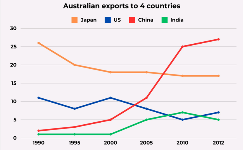
The graph below shows the percentage of Australian exports to four countries from 1990 to 2012.
Summarise the information by selecting and reporting the main features, and make comparisons where relevant. Write at least 150 words.
The graph below shows the percentage of Australian exports to four countries from 1990 to 2012.
Summarise the information by selecting and reporting the main features, and make comparisons where relevant. Write at least 150 words.
Câu hỏi trong đề: 2000 câu trắc nghiệm tổng hợp Tiếng Anh 2025 có đáp án !!
Quảng cáo
Trả lời:
Sample 1:
The given line graph illustrates the proportion of Australian goods exported to four nations between 1990 and 2012.
Overall, there was a gradual decline in the percentage of Australian exports directed to Japan and the US, while the opposite was true for that of China and India. Notably, the figure for China experienced the most dramatic growth, becoming the top destination for Australian exports from 2007 onwards.
The proportion of Australian goods exported to Japan started at just over 25% in 1990, after which it experienced a significant drop to about 17% in 2000, before nearly leveling off towards the end of the period. Similarly, the figure for the US slightly decreased from roughly 11% to 7% between 1990 and 2012, despite some fluctuations.
Only 2% of goods were exported to China from Australia, with a subsequent increase to 5% in 2000 and a final sharp ascent, reaching a peak of 27% in 2012. Meanwhile, the percentage destined for India steadily increased to 6% in 2010 after remaining unchanged at 1% in the first 10 years, but then dropped to 5% in the last year.
Sample 2:
The line chart details exports from Australia to Japan, the United States, China, and India from 1990 to 2012. Looking from an overall perspective, it is readily apparent that total exports to India and particularly China rose, while US and Japanese exports declined. By the end of the period, Chinese exports had become most common, followed by Japanese, American, and finally Indian ones.
The figure for Japan began the period significantly higher than other nations at over 26% before a sharp decline over the next 5 years to around 20% and a more minimal downward trend until 2012 to finish at near 17%. In marked contrast, China in 1990 only received 3% of exports and this figure grew exponentially, especially after the year 2000 and reached a peak of 28% in 2012.
The data for the United States fluctuated around 10% until 2000, then declined and recovered slightly to finish the time surveyed at 6% Similarly, Indian exports stood at around 1% for the first ten years detailed, actually overtook the United States with 7% in 2010 and then ended the period slightly lower than the USA.
Sample 3:
The given line graph represents the proportion of Australian exports to four countries spanning from 1990 to 2012.
Overall, Australian exports to China and India generally witnessed an upward trend, while the opposite was true for Japan and the US. Initially the main importer of Australian products, Japan was subsequently surpassed by China in this regard.
In 1990, Japan was the dominant destination for Australian exports, accounting for around 25% of exports compared to just over 10% for the United States. China and India were significantly smaller markets at the time, receiving less than 5% each.
Afterwards, China’s figure began to surge as the country emerged as the leading importer of Australian goods, peaking at nearly 30% in 2012, having exceeded Japan’s figure since roughly 2007. Japan lost some of its significance as a market for Australian goods, with its export figure dropping to just above 15% in 2012. The US and India, meanwhile, experienced fluctuations throughout the period, both ending in the approximate range of 5%.
Sample 4:
The line graph illustrates how Australia exported its products to four countries, including Japan, the US, China, and India, between 1990 and 2012.
Overall, there was an increase in the proportion of Australian exports to India and China, with the most dramatic rise being seen in the latter, making it the largest export destination for Australia by the end of the period. In contrast, exports to the US and Japan experienced a decrease over the given timeframe.
Looking at the chart in more detail, in 1990, among the four destinations, India and China were the smallest export partners for Australia, with negligible figures of 1% and 2%, respectively. Thereafter, China's importance significantly increased over the period, as the percentage of exports to this country steadily rose to 5% by 2000, before surging more than fivefold to 27% in the final year. Likewise, India maintained a marginal presence in Australia's export market, at just 1% for the first decade, after which its share slightly increased, reaching a peak of 7% in 2010, before falling back to 5% two years later.
With regard to the remaining countries, in the first year, Japan was the leading destination shown for Australian goods, with more than a quarter of total exports going there, twice the figure for the US, at 11%. In the following years, the figures for Japan fell to 17%, and stayed unchanged in the two final years. Similarly, the share of Australian exports to the US underwent a downward fluctuation throughout the period, bottoming out at 5% in 2010 before a modest recovery to 7% by the end of the period.
Sample 5:
The graph shows the proportion of exports from Australia to 4 countries from 1990 to 2012. Overall, the proportion of Australian exports to China and India was on the increase with the export to China experiencing the biggest increase while the exports to Japan and the US went down.
In 1990, over 25% of Australian products were exported to Japan, and this number was much higher than that of other countries. The US imported just over 10% of Australian products, which was ten times higher than the Australian exports to China and India.
From 1990 to 2012, the export to Japan dropped to just above 15%. In contrast, the proportion of exports to China soared, and China had replaced Japan as the leading export market of Australia since 2007, with 30% of Australian products being exported to this country in 2012. During this period, the export to the US flucated and then decreased to above 5% while the figure for India saw a gradual increase to 5% in 2012.
Sample 6:
The given line graph illustrates the proportions of Australian products exported to four countries between 1990 and 2012.
In general, while Australian exports to China and India increased over the period, the US and Japan saw a decline in products imported from Australia. In addition, China experienced the biggest increase in exports over the period, making it the biggest export market of Australia from around 2007 onwards.
In 1990, Japan was the leading export market of Australia, receiving over 25% of all exported goods. China, however, received only a mere 5%. By 2012, the percentage of exports to Japan had dropped to below 20%, while the figures for China saw a dramatic rise to almost 30%.
Meanwhile, Australia exported just over 10% of its goods to the US in 1990, which was around ten times higher than the exports to India. Over the following twenty-two years, the figures for the US fluctuated, and dropped to 5% by 2012. The percentage of exports to India, on the other hand, remained unchanged until 2000, and then increased to about 7% in 2010, before dropping slightly to roughly 5% in 2012.
Sample 7:
The line graph details the figures for Australian exports to four countries between 1990 and 2012.
Overall, what stands out from the graph is that Japan was the country with the highest proportion of exports at the beginning of the period. This top position was challenged by China, whose figure experienced the most dramatic upswing towards the end.
In 1990, Japan topped the list of Australian exports with roughly 26%, far outstripping the figure for the US, at just around 11%. This was followed by China with virtually 3% and India, who imported almost nothing from Australia in this year. Over the time frame, the share of exports to Japan declined steadily to 17% in 2010 and thereafter plateaued until 2012. Meanwhile, there was a boost of 24% in the figure for China, amounting to 27% in 2012.
Regarding the US export figure, it fluctuated over the years in a downward trend, reaching a low of 7% at the end of the period. The rate of exports to India, conversely, remained relatively stable for the first 10 years before rising up to peak at 7% in 2010 and then falling slightly to 5% in 2012.
Sample 8:
The line chart depicts the fluctuations in exports from Australia to Japan, the United States, China, and India between 1990 and 2012. Taking a broader view, it is evident that exports to India and particularly China experienced a significant increase, while exports to the US and Japan declined over time. By the end of the period, Chinese exports became the most dominant, followed by Japanese, American, and finally Indian exports.
Initially, Japan had the highest percentage of exports, standing at over 26% in 1990. However, there was a steep decline over the next five years to around 20%, followed by a minor downward trend until 2012, finishing at nearly 17%. In contrast, China started with only 3% of exports in 1990, but this figure grew rapidly, especially after 2000, reaching a peak of 28% in 2012.
The data for the United States varied around 10% until 2000, after which it declined. It later slightly recovered, ending at 6% by the end of the surveyed period. Similarly, Indian exports remained at approximately 1% during the first decade covered. However, in 2010, Indian exports surpassed those of the United States, reaching 7%. Ultimately, Indian exports finished the period slightly lower than those of the USA.
Sample 9:
The line graph illustrates the exports of Australia to Japan, the United States, China, and India from 1990 to 2012. Overall, it is evident that the total exports to China and India have shown an increasing trend, whereas exports to the United States and Japan have experienced a decline. By the end of the period, China had the highest export values, followed by the remaining countries.
In 1990, Japan’s export figure was considerably higher than the other countries, surpassing $26 billion. However, it witnessed a significant drop to approximately $20 billion in the next five years and continued to decline further to around $17 billion by 2012, exhibiting a continuous downward trend. Conversely, China started with exports worth only $3 billion in 1990 but demonstrated a consistent growth over the years. The numbers changed dramatically after 2000 and reached a peak of $28 billion in 2012.
The export data of the United States fluctuated around $10 billion between 1990 and 2000, subsequently decreased to $5 billion, and experienced a slight recovery, ending the study period at $6 billion. Similarly, India initiated its exports at $1 billion in 1990, remained stagnant for the first decade, and then surpassed the United States with export values of $7 billion in 2010. However, India’s exports concluded slightly lower than that of the United States.
Sample 10:
The graph provides information about the figures for Australian exports to four countries over a period of 22 years. These countries are Japan, the US, China, and India. It can be seen from the graph that the proportion of exports to Japan and the US significantly dropped over the 22-year period, while the proportion of exports to China and India increased significantly. At the end of the period, Japan had the highest percentage of exports among the four countries.
In 1990, the percentage of exports to Japan was 20%, while the percentage of exports to the US was 9%. The proportion of exports to India was 1%, which was lower than the proportion of exports to China, which was 2.5%. However, over the next five years, the proportion of exports to both Japan and the US decreased considerably, to 20% and 9% respectively. Meanwhile, exports to India remained stable at 1%, and the figure for China had a slight increase of 3% in 1995.
In 2012, there was a gradual fluctuation in the percentage of exports to the US, which stood at 7% at the end of the period. At the same time, the figure for Japan steadily decreased to 17%. On the other hand, exports to China rapidly increased by 1% to 6%. However, the most significant change was the percentage of exports to India, which reached a peak of 30% in 2012. Overall, the graph shows that while exports to Japan and the US decreased, exports to China and India increased considerably over the 22-year period.
Sample 11:
The data provided by the line chart depicts the changes in Australia’s exports to Japan, the United States, China, and India from 1990 to 2012. The overall trend reveals an increase in exports to China and India, while exports to the United States and Japan declined. By the end of the 22-year period, China became the primary recipient of Australian exports, followed by Japan, the United States, and India.
In the initial years, exports to Japan began on a high note, exceeding 26%. However, they experienced a significant drop in the subsequent five years, stabilizing at approximately 20%. This declining pattern continued, albeit at a slower pace, until 2012, concluding at nearly 17%.
Conversely, exports to China commenced at a minimal 3% in 1990 but witnessed substantial growth, particularly after 2000, reaching a peak of 28% in 2012. For the United States, approximately 10% of Australian exports were received until 2000, after which there was a decrease, followed by a slight recovery, ultimately reaching 6% by 2012. Similarly, Indian exports began at around 1% and remained relatively stagnant for the first decade. However, in 2010, they surpassed the United States with a percentage of 7% but ended the period slightly lower than the United States.
Sample 12:
The line chart illustrates the proportion of exports from Australia to 4 various countries over a 22-year period.
Overall, while the figures for Australian exports to the US and China followed an upward trend over the period shown, there is an overall decrease in the rate of the other countries. Besides, the share of exports from Australia to China showed the biggest change of all the 4 countries.
In 1990, Australian exports to Japan accounted for around 26%, more than double the figure for the US, at about 12%. Over the next 22 years, the share of Japan imports from Australia experienced a gradual decrease to approximately 18 in 2005, before remaining stable from 2005 to 2012. In the meantime, the percentage of imports into the US from Australia underwent a wild fluctuation, falling to around 6% in 2012.
Turning to the other categories, initiating at about 2% in 1990, the rate of Australian exports to China significantly increased by 26% from 1990 to 2012. The period from 2005 to 2010 marks the point at which China became the major export market. Meanwhile, the period from 1990 to 2012 witnessed an increase in the figure for India imports from Australia to 5% in 2012, after staying constant at 1% between 1990 and 2000.
Sample 13:
The data presented in the form of a line graph illustrates the proportion of Australia’s exports to various countries, including Japan, the U.S, China, and India, between the years 1990 and 2012. The data is expressed as a percentage.
In general, it can be observed from the graph that Japan and the U.S experienced a decline in exports during the later years, while China witnessed a significant increase in exports from 2005 to 2012.
Taking a closer look at the graph, Japan’s proportion of exports started at less than one-third in the initial year and slightly decreased by around 6% in the following five years. Between 2000 and 2012, the proportion fluctuated considerably, ranging from about 80% to less than 20%.
Australia’s exports to the U.S were initially observed at 10% in 1990, gradually decreasing to around 7% between 2000 and 2012, with minor fluctuations throughout the period. The percentage of Australian exports to China had a continuous increase from about 2% to 5% between 1990 and 2000, reaching a peak of 25% in 2010 and 2012. However, the exports to India remained stable at around 1% until 2000, but experienced a dramatic increase from 2005 to 2010, reaching 7%.
Sample 14:
The provided line graph depicts the proportions of Australian products that were exported to four different countries from the year 1990 to 2012. In general, it can be observed that while Australian exports to China and India increased over this period, the United States and Japan experienced a decline in the products imported from Australia. Moreover, China witnessed the most significant rise in exports, becoming Australia’s largest export market from around 2007 onwards.
In 1990, Japan was the primary destination for Australian exports, receiving over 25% of all exported goods. On the other hand, China merely accounted for 5% of the total exports. However, by 2012, the percentage of exports to Japan had dropped to below 20%, while the figures for China experienced a remarkable increase, reaching almost 30%.
In the meantime, around 10% of Australian goods were exported to the United States in 1990, which was roughly ten times higher than the exports to India. Throughout the subsequent twenty-two years, the figures for the United States fluctuated and eventually decreased to 5% by 2012. Conversely, the percentage of exports to India remained constant until 2000, before gradually increasing to approximately 7% in 2010. It then slightly dropped to roughly 5% by 2012.
Sample 15:
The provided graph displays changes in the value of exports from Australia to four distinct nations throughout the years 1990 to 2012. It is evident from the data that, apart from China, Australia experienced relatively poor performance with regards to exports.
In 1990, Japan surpassed the other countries on the list, importing goods valued at over $25 billion from Australia, which was approximately $15 billion more than America’s imports. In contrast, India and China imported goods worth less than $5 billion during the same period. However, after 2000, the value of exports from Australia to both India and China began to grow steadily.
Notably, China exceeded the USA’s imports by 2004 and Japan’s imports by 2007, reaching a peak of approximately $28 billion in 2012. On the other hand, the value of goods imported by India declined from 2010 and settled at $5 billion. Despite some fluctuations, the value of exported goods to Japan and the USA decreased to approximately $16 billion and $6 billion, respectively, in 2012.
Sample 16:
The provided line graph presents data on the proportion of Australian goods exported to four countries (Japan, the US, China, and India) between 1990 and 2012. It is evident that the percentage of Australian products being exported to China and India increased, while the figures for Japan and the US witnessed a contrasting trend. Furthermore, China emerged as the country with the highest imports from Australia throughout the given period.
In 1990, the proportion of Australia’s exports to China stood at approximately 3%, gradually rising to 5% by 2000. Meanwhile, exports to Japan were around nine times higher compared to those going to China. However, the percentage of exports to China experienced a significant growth, peaking at almost 30%. Conversely, Japan witnessed a noticeable decline, reaching around 17% over the remaining 21 years.
For the US, the percentage of Australian exports fluctuated between approximately 12% and 7% within the 22-year period. India, on the other hand, showed no growth at all, with imports from Australia remaining at 0% for the initial ten years since 1990. However, there was a subsequent increase of around 7% in imports, followed by a sharp decline to 5% by 2012.
Sample 17:
The graph below illustrates the percentage changes in Australian exports to four countries: Japan, the US, China and India between 1990 and 2012. Overall, the figure for China and India experienced an upward trend while other countries declined over the period surveyed. Additionally, the percentage of Australian exports to China became the largest by the end.
Looking first at Japan and the US, the proportion of Australian exports to Japan dropped significantly from roughly 26% in the beginning to 20% in the next 5 years. Afterwards, this data declined gradually to end at about 17% in 2012. The figure for the US fluctuated around 10% and reached a peak of around 11% in 2000 before falling considerably to its bottom of 5%. This number then climbed to finish the time span at about 7%.
Turning to China and India, the data of Australian exports to China went up sharply from about 3% in 1990 to 25% in the next 10 years. After that, this figure peaked at approximately 28% in the end of the period shown. The proportion for India remained stable around 2% for 3 years before rising steeply and then soaring to its highest percentage: 7% in 2010. Finally, there was a moderate drop in proportion till it reached exactly 5% at the end of the period surveyed.
Sample 18:
The line graph shows Australia’s exports to Japan, the United States, China and India from 1990 to 2012.
Overall, it is easy to see that total exports to India and China are increasing, while exports from the United States and Japan are declining. At the end of the period, China had the highest exports, followed by other countries.
Japan’s figure was significantly higher than other countries in 1990, exceeding $26 billion, but then plummeted to about $20 billion over the next five years to nearly $17 billion by 2012. It was on a downward trend. In contrast, China’s exports in 1990 were only $3 billion, but that number was steadily increasing. Numbers, which have changed drastically since 2000, was reached $28 billion in 2012.
US data fluctuated around $10 billion between 1990 and 2000, then declined to $5 billion, but recovered slightly and the study period ended at $6 billion. Did. Similarly, India’s exports began at $1 billion in 1990, stagnated for the first decade, and overtook the United States at $7 billion in 2010, then ended slightly lower than the United States.
Sample 19:
The line chart illustrates the exports from Australia to four countries - Japan, the United States, China, and India - over a period of 22 years, from 1990 to 2012. Overall, it is clear that the exports to China and India increased while those to the United States and Japan decreased. By the end of the period, China emerged as the largest recipient of Australian exports, followed by Japan, the United States, and India.
Exports to Japan began at a high of over 26% but experienced a sharp decline over the next five years, settling at around 20%. This trend continued with a more gradual decline until 2012, when it finished at nearly 17%. In contrast, exports to China started at a mere 3% in 1990, but grew exponentially, particularly after the year 2000, reaching a peak of 28% in 2012.
The United States received around 10% of exports until 2000, after which it declined and slightly recovered to finish at 6% by 2012. Similarly, Indian exports stood at around 1% for the first ten years, but overtook the United States in 2010 with 7%, before ending the period slightly lower than the United States.
Sample 20:
The line graph illustrates the distribution of Australian exports to four nations, – Japan, the US, India, and China – between 1990 and 2012.
Overall, while there were declines in the percentage of Australian exports to Japan and the US, the opposite trend was true for China and India. It is also noticeable that China emerged as the leading importer of Australian goods by the end of the period.
Japan started with the highest figure for Australian exports in the whole chart, with roughly 26%, doubling the figure for the US. Thereafter, the share of Australian exports to Japan declined to 20% in 1995, falling steadily to below 20% in the later years. As a result of this fall, Japan fell from the first to the second place in terms of Australian imports. A similar downward trend can be seen in the exports to the US, with the figure fluctuating between 1990 and 2000 before decreasing to just over 5% in the final year.
Moving to China and India, the former initially imported nearly 3% of Australian goods. After that, it witnessed a surge in the percentage of Australian imports, surpassing Japan in three final years and becoming the largest export market of Australia. India began at the lowest point (about 1%), reaching its peak at around 8% in 2010 before going down to slightly above 5% at the end of the period.
Sample 21:
The provided chart demonstrates changes in the number of Australian exports to Japan, the United State, China and India between the year 1990 and 2012.
It is clearly seen that the numbers of Australian exports to Japan and the US experienced a decline while China became Australia’s most significant export market by the end of the period shown.
Looking closer at the graph, it is obvious that at 25%, Japan accounted for the largest proportion of Australian exports in 1990 (over 25%), roughly 13 times higher than the figure of China. However, the percentage of Japan decreased noticeably to around 17% while that of China recorded a sharp rise to reach 28% in the final year of the period, making it the largest importer of Australia that year.
Turning to the remaining markets, the figures of the US and India saw a slight fluctuation around 10% and 1% respectively during the first 10 years of the period. After that, the percentage of Australian exports to the US halved while that of India grew to roughly 7% in 2010. By the end of the period, the former bounced back to the point of 7.5% and the latter went down to become the least significant among the four markets.
Hot: 1000+ Đề thi cuối kì 2 file word cấu trúc mới 2026 Toán, Văn, Anh... lớp 1-12 (chỉ từ 60k). Tải ngay
CÂU HỎI HOT CÙNG CHỦ ĐỀ
Lời giải

Sample 1:
The bar graph illustrates the overseas students' spending on accommodation, tuition, and living expenses, while the table depicts information about the average weekly expenses by international students in four countries: A, B, C, and D.
Overall, foreign students need to spend the highest in country A and the lowest in D. In nearly every nation, the international students’ weekly average living expenses are the greatest, while their housing cost registers the lowest.
The costliest country for studying is A, with a weekly average expense of 875 dollars. This is followed by B, C, and D, which have weekly expenses of 735, 540, and 435 dollars, respectively. However, foreign students always pay the least for accommodation, which incurs on average weekly 220, 280, 240, and 200 dollars in the nations A, B, C, and D, respectively.
On the other hand, living expenditures account for the highest portion of average weekly costs for international students in countries A, B, and C, with 430, 350, and 275 dollars, correspondingly. Tuition fees in the same countries (A, B and C) come in second with the weekly averages of 358, 320, and 250 dollars in order. However, D is the only nation where education accounts for the highest average spending area, coming in at USD 235, followed by the cost of living (USD 225) and housing (USD 200).
Sample 2:
The table illustrates information regarding the weekly spendings by overseas students in four countries, A, B, C and D, while the bar graph depicts the students’ expenditure on the sectors, housing, education fees and living expenses.
Overall, the cost of studying abroad is the highest in country A and the lowest in D. Apart from country D, living costs account for the most part of the weekly spendings in all countries, while accommodation registers the least.
Regarding the total cost of studying, A is the most expensive country with weekly average 875 dollars, followed by B, C and D with 735, 540 and 435 dollars, respectively. On the other hand, the overseas students always spend the least on accommodation, which are on average weekly 220, 280, 240 and 200 dollars in the corresponding countries A, B, C and D.
Considering the living cost, it takes the largest share of foreign students’ average weekly expenses in countries A, B, and C with 430, 350 and 275 dollars, respectively, while tuition fees in the same countries hold the second place with weekly average 358, 320 and 250 dollars, sequentially. However, D is the only country where tuition fee occupies the highest expenditure with average weekly 235 dollars, followed by living cost (USD 225) and accommodation (USD 200.)
Sample 3:
The table and bar graph depict information regarding the weekly spendings by overseas students in countries A, B C and D.
Overall, there are three elements, housing, school fees and living costs that contribute to the total weekly spendings. The total expenditure in country A is the highest while it is the lowest in country D. Living costs account for the most part of the weekly spendings in all countries except D.
The total mean weekly cost for pupils to study in country A is US$875, next by country B at US$735, and then by country C at US$540, and finally by country D at US$435. The living costs are always the biggest component of the expenditure except for country D, with about US$10 less than the major spending which is the school fees.
Accommodation accounts for the least among all spendings in all countries. The most expensive housing is found in country B, at US$280, and the cheapest in country D at US$200. The middle range can be seen in country A at US$220 and country C at US$240, respectively. Costs of the tuition fee range between US$ 358 and US$235 in country A and D, in order.
Lời giải

Sample 1:
The bar chart and pie chart give information about why US residents travelled and what travel problems they experienced in the year 2009.
It is clear that the principal reason why Americans travelled in 2009 was to commute to and from work. In the same year, the primary concern of Americans, with regard to the trips they made, was the cost of travelling.
Looking more closely at the bar chart, we can see that 49% of the trips made by Americans in 2009 were for the purpose of commuting. By contrast, only 6% of trips were visits to friends or relatives, and one in ten trips were for social or recreation reasons. Shopping was cited as the reason for 16% of all travel, while unspecific ‘personal reasons’ accounted for the remaining 19%.
According to the pie chart, price was the key consideration for 36% of American travellers. Almost one in five people cited safety as their foremost travel concern, while aggressive driving and highway congestion were the main issues for 17% and 14% of the travelling public. Finally, a total of 14% of those surveyed thought that access to public transport or space for pedestrians were the most important travel issues.
Sample 2:
The bar chart compares the figures for Americans going out for five reasons and the pie chart illustrates the percentage of six problems that concerned them when travelling in 2009. Overall, it is clear that the main reason why people in the US went out in 2009 is to commute to work, and the cost of travelling is the problem concerning them the most.
Looking first at the bar graph, the proportion of Americans going out for commuting to work stood at 49%, while the figure for those leaving their house for personal reasons accounted for 19%. In addition, the rate of people in the US going out for shopping and recreation made up 16% and 10%, respectively, while visiting friends or relatives accounted for the lowest percentage, at only 6%.
Turning to the pie chart, the cost of travelling was the most concerning problem of Americans when going out, with the figure making up 36%, while the proportion of safety concerns is half of that, at 19%. In addition, 17% of US citizens were concerned about aggressive drivers, while highway congestion made 14% of them worried when leaving their house. Access to public transportation and places for people to walk accounted for the lowest percentages, at only 8% and 6%, respectively.
Sample 3:
The provided charts offer insights into the reasons for travel and the primary concerns faced by the traveling public in the United States during the year 2009. The data is presented through a bar chart illustrating travel purposes and a pie chart highlighting key issues.
Notably, the primary motivation for travel among Americans in 2009 was commuting to and from work. Simultaneously, the major concern for the traveling public during their trips revolved around the cost associated with travel.
Examining the bar chart in detail reveals that almost half of the trips made by Americans in 2009, precisely 49%, were attributed to commuting. Conversely, visits to friends or relatives accounted for a mere 6%, while social or recreational trips constituted one in ten journeys. Shopping emerged as the purpose for 16% of all travel, leaving the remaining 19% for unspecific ‘personal reasons.’
Turning attention to the pie chart, it becomes evident that cost was the primary consideration for 36% of American travelers. Safety closely followed, with nearly one in five people, or 19%, expressing it as their foremost travel concern. Aggressive driving and highway congestion were significant issues for 17% and 14% of the traveling public, respectively. Additionally, 14% of respondents identified access to public transport or space for pedestrians as the most crucial travel issues.
Sample 4:
The bar chart shows why American people chose to travel, and the pie chart shows the main issues for the travelling public in the USA, both for 2009. The trend suggests that the reason and price were the main issues for travel in the United States. It is clear that commuting from work was reported as the biggest contribution to travel, at 49%. People who went travelling for personal reasons and shopping accounted for 35% when these two groups are combined. However, interaction with friends and relatives only accounted for 25% less than the above categories. And social and recreational activities took up only 6%, which was the lowest figure by more than 43%. The travelling public’s main issues were related to price and safety, with 55% of respondents reporting these two issues. While other issues accounted for a relatively small part. Only 17% of the respondents reported issues with aggressive drivers, while highway congestion accounted for even less at 14% of the issues reported. The percentage of access to public transport and space for pedestrians was much lower than the other categories at less than 10% for both. To conclude, price and commuting time were the dominant factors relating to travel in the US in 2009.
Lời giải
Bạn cần đăng ký gói VIP ( giá chỉ từ 250K ) để làm bài, xem đáp án và lời giải chi tiết không giới hạn.
Lời giải
Bạn cần đăng ký gói VIP ( giá chỉ từ 250K ) để làm bài, xem đáp án và lời giải chi tiết không giới hạn.
Lời giải
Bạn cần đăng ký gói VIP ( giá chỉ từ 250K ) để làm bài, xem đáp án và lời giải chi tiết không giới hạn.
Lời giải
Bạn cần đăng ký gói VIP ( giá chỉ từ 250K ) để làm bài, xem đáp án và lời giải chi tiết không giới hạn.