


2000 câu trắc nghiệm tổng hợp Tiếng Anh 2025 có đáp án (Phần 18)
34 người thi tuần này 4.6 17.8 K lượt thi 100 câu hỏi 90 phút
Bạn cần đăng ký gói VIP ( giá chỉ từ 250K ) để làm bài, xem đáp án và lời giải chi tiết không giới hạn.
🔥 Học sinh cũng đã học
2000 câu trắc nghiệm tổng hợp Tiếng Anh 2026 có đáp án (Phần 7)
Trắc nghiệm tổng hợp Tiếng anh có đáp án 2023 (Phần 90)
Trắc nghiệm tổng hợp Tiếng anh có đáp án 2023 (Phần 89)
Trắc nghiệm tổng hợp Tiếng anh có đáp án 2023 (Phần 88)
Trắc nghiệm tổng hợp Tiếng anh có đáp án 2023 (Phần 87)
Trắc nghiệm tổng hợp Tiếng anh có đáp án 2023 (Phần 86)
Trắc nghiệm tổng hợp Tiếng anh có đáp án 2023 (Phần 85)
Trắc nghiệm tổng hợp Tiếng anh có đáp án 2023 (Phần 84)
Danh sách câu hỏi:
Lời giải
Sample 1:
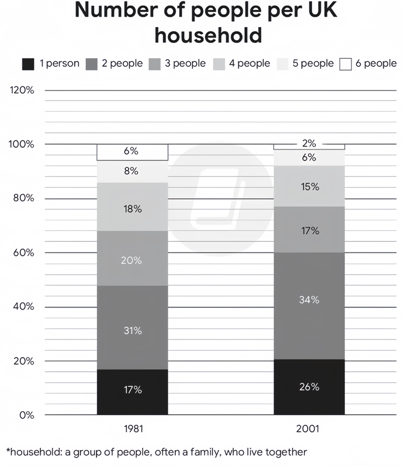
The stacked bar charts give a breakdown of the UK’s household composition in two separate years, namely 1981 and 2001.
Overall, there were decreases in the shares of households having from 3 to 6 people, whereas the converse was true in the case of those having 1 or 2 members, with 2-person and 6-person households being the most and least common in both given years, respectively.
Regarding households with an upward trend, the percentage of 2-member households was consistently the highest, starting at 31% before rising minimally by 3% in the final year. A similar change, but to a greater extent, was observed in the proportion of the smallest-sized households, growing from 17% initially to just over a quarter at the end of the period.
Turning to categories with a downward trend, households with 3 and 4 occupants witnessed the same level of decrease, with their figures dropping from 20% and 18% in 1981 to 17% and 15% two decades later, in that order. 5-person and 6-person households followed similar falling trends, albeit at lower rates. While the figure for the former had declined from 8% to 6% by 2001, that of the latter remained the lowest throughout, dipping from 6% to 2%.
Sample 2:
The two stacked bar charts detail the UK’s household demographics in 1981 and 2001. The initial impression from the chart is that 1-person and 2-person households were the second most and the most common family classifications in both given years, and they also experienced rises in percentages. The remaining groups made up smaller proportions and underwent corresponding drops, with the 6-person household being the least popular one.
In 1981, 2-person household made up 31%, ranking first among the given household type, after which the rate underwent a mild rise to 34% in 2001. A similar picture is evident in 1-person household, with its figure accounting for 17% and thereafter rising to 26% in 2001.
Opposite patterns could be observed with regard to the remaining groups. In 1981 the shares of 3-person, 4-person, 5-person and 6-person were 20%, 18%, 8% and 6% respectively. Over the next 20 years, they all decreased by similar margins (of around 2-3%) to 17%, 15%, 6% and 2%.
Sample 3:
The charts illustrate the percentage of different sized households in the UK, in 1981 and 2001.
Overall, the most common sized household in both measured years was that of 2-person households, while 6-person households were the least common. Additionally, while the percentage of 1-person and 2-person households increased, the percentage of all other sized households decreased.
In 1981, 31% of all households contained 2 people, while 20% of households contained 3 people. 1-person and 4-person households made up similar percentages, at 17% and 18% respectively, whereas 5-person and 6-person households only made up 8% and 6% of the total.
By 2001, the proportion of 1-person and 2-person households had risen to 26% and 34% respectively. Meanwhile, the proportion of all other sized households had decreased, with 3 and 4-person households dropping to similar levels, at 17% and 15% respectively, and 5 and 6-person households dropping to 6% and 2% respectively.
Sample 4:
The stacked bar charts delineate the household compositions with respect to the number of occupants in the UK in 1981 and 2001.
As is shown in the graph, most households in the UK had 2 occupants. Over the surveyed period, single and 2-person households enjoyed upswings whilst other demographics experienced a corresponding downturn.
Regarding the first stacked bar, 31% of households consisted of 2 occupants, heading the list of total demographics. Next came 3-person households with 20%, as opposed to single and 4-member households, accounting for 17% and 18% in turn. Large household sizes ranked in bottom place with 8% for 5-occupant and 6% for 6-occupant units.
20 years later, households with a single person living alone or two persons became dominant, with the figure for the former rising up by 9%, amounting to over one-quarter of total surveyed households. Meanwhile, households with 3 or 4 occupants recorded a fall of 3%, finishing at 17% and 15% respectively. Remaining in the last place were household units of 5 or 6 members, with their figures decreasing to 6% and 2%.
Sample 5:
The stacked bar charts delineate the composition of households in the UK during two distinct years: 1981 and 2001.
Overall, the UK preferred a smaller family size. Throughout both years, households comprising 2 individuals were the most prevalent, while those with 6 members were the least common.
Regarding the escalating trend, 2-person households consistently held the highest percentage, commencing at 31% and experiencing a marginal rise of 3% by the conclusion of the period. A comparable albeit more pronounced upward shift was noticeable in the proportion of the smallest-sized households (1 person), advancing from 17% initially to slightly over 25% by the terminal year.
Conversely, a declining trajectory was evident in households with 3 and 4 inhabitants, both experiencing a reduction from 20% and 18% in 1981 to 17% and 15% respectively by 2001. Similarly, households with 5 and 6 occupants also followed decreasing trends, albeit at slower rates. While the former decreased from 8% to 6% by 2001, the latter consistently demonstrated the lowest representation, plummeting from 6% to a mere 2% over the same period.
Sample 6:
The provided bar graphs compare the number of people per household in the UK in 1981 and 2001, elucidating the dynamic changes of household sizes. Notably, the trend indicates a pivot towards smaller household units over the two decades in question.
Overall, the data presents a clear downsizing trend in UK households, with a notable rise in one and two-person homes and a general decrease in larger family units.
In 1981, two-person households dominated, accounting for 31% of the total, and witnessed a slight increment to 34% by 2001, solidifying their prevalence. Conversely, the smallest household category, one-person units, experienced a significant upsurge from 17% to 26%, marking a move towards more individualised living spaces.
Meanwhile, the more populous household categories all contracted. Four-person homes, which constituted 18% in 1981, retracted to 15% by 2001. Three-person households mirrored this decrease, diminishing from 20% to 17%. Five-person households also saw a reduction, albeit less dramatically, from 8% to 6%. The most pronounced decline was observed in six-person households, which halved from 6% to a mere 2%, marking the most substantial demographic shift.
Sample 7:
The chart elucidates the changes in household composition in the UK, as measured by the number of occupants, between 1981 and 2001.
Overall, there was a noticeable shift towards smaller households in the UK over the 20-year period, with an increase in one and two-person households and a decrease in larger households.
In 1981, two-member households constituted the largest segment, accounting for 31% of the total, and this figure saw a modest rise to 34% in 2001. Single-person households also increased notably, jumping from 17% to 26% over the two decades. Households of three persons experienced a slight decline, from one fifth in 1981 to 17% in 2001.
Contrastingly, larger households displayed a downward trend. In 1981, four-member families accounted for 18% of households, but this fell marginally to 15% in 2001. A similar pattern was observed for five-member households, whose share dropped from 8% to 6% during the same period. Notably, households containing six members were the least common in both years, representing less than 6% of the total.
Sample 8:
The presented chart delineates the evolution of the number of people per household in the UK, by enumerating the number of inhabitants, from 1981 to 2001. It is compelling to note a significant transition towards smaller household units and a concurrent decline in more substantial familial arrangements.
In 1981, the dominant household structure comprised two occupants, accounting for 31% of the total. This segment saw a subtle uptick, reaching 34% by 2001. Singular dwellers also experienced a considerable surge, escalating from 17% to 26% over the two-decade span. The fraction of tri-member households diminished marginally, receding from one fifth in 1981 to 17% by 2001.
In stark contrast, households with larger numbers exhibited a waning trend. Four-member familial units, which represented 18% of total households in 1981, underwent a slight contraction to 15% in 2001. A congruent trajectory was observed amongst five-member households, dwindling from 8% to 6% over the same timeframe. Significantly, households embracing six inhabitants remained the least prevalent category, commanding less than 6% in both surveyed years.
Sample 9:
The given chart depicts the percentages for the number of people living in households over a period of twenty years from 1981 to 2001 in the UK.
Overall, the percentage of families with 1 to two members increased, while the proportion of families with 3 or more people decreased slightly. In addition, two person households account for the largest percentage of households, whereas six person households have the lowest percentage.
In 1981, the number of households with 2-person accounted for 31% and ranked first among the households, after which it witnessed a slight increase to 34% in 2001. Furthermore, the number of single-person households was responsible for 17%, which was followed by a significant increase of 26% in the next two decades.
Turning to households with a downward trend, the number of households with 3-person decreased slightly by 3% from 20% to 17% and households with 4-person witnessed the same level of decrease with their figures dropping from 18% to 15% over the following two decades. Remain in the last place are households of 5 and 6-person who also have a similar decrease with the rate falling to 6% and 2% respectively.
Sample 10:
The bar chart depicts the distribution of households in the UK based on their size in the years 1981 and 2001.
Overall, households consisting of two individuals were the most prevalent category in both years, whereas households with six members were the least common. Furthermore, while the percentage of one-person and two-person households witnessed an upward shift, the proportion of households of other sizes took the opposite trend.
In 1981, approximately 31% of all households comprised two people, while 20% were composed of three individuals. One-person and four-person households accounted for similar proportions, at 17% and 18% respectively, whereas five-person and six-person households constituted only 8% and 6% of the total in that order.
After 20 years, the percentage of one-person households rose considerably to 26%, representing a significant increase of 9%. The proportion of those with two people followed a similar pattern, although the increase was less pronounced, with a 3% rise. Meanwhile, the trend for the remaining categories was downward, as their figures decreased by around 2 to 4%.
Lời giải
Sample 1:
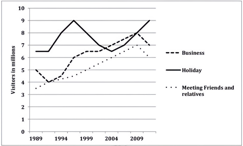
The given line graph illustrates the number of foreign visitors who came to the United Kingdom for business, holiday and for meeting kith and kin, from 1989 to 2009. It can be seen that tourists who came for holiday were more than those for the other given purposes for a major part of the given two decades.
About 6.5 million people travelled to the UK for holidays in 1989. This number rose rapidly and peaked at 9 million by 1997, but after that fell dramatically and reached 6.5 million in 2004. After that the number of visitors picked up again and again reached a high of 9 million in 2009.
Meanwhile, business and socializing trips to the UK showed almost similar trends, starting from 3.5 million and 5 million respectively in 1989 and then rising moderately to reach 6 – 7 million in 2009. After that a fall in the number of visitors can be seen in both these cases. Throughout the given period, more people did business than those who visited their family and friends.
Overall, an upward trend can be seen in all three reasons for visiting abroad.
Sample 2:
The provided line graph illustrates the reasons why international visitors traveled to Britain during a two-decade period starting from 1989.
In general, this nation attracted an increasing number of foreign travelers for all documented motives. Moreover, vacation trips, despite their fluctuation, consistently ranked highest.
6.5 million holidaymakers came to Britain at the start of the period, followed by a surge to 9 million in 1998 but later a six-year plunge to its starting point. After a passing plummet from the initial 5 million, the figure for work-related visits soared to 7 million in 2004 and outdid that for the previously mentioned group. Despite a consistent 3.5-million increase, the number of visitors who arrived in the UK for family and friend reunions still ranked last at 6 million at the same time.
The UK subsequently welcomed a wave of tourists, which climbed to the formerly recorded peak of 9 million, in 2009. The figures for the other categories showed clear similarities in the remaining years. They witnessed proportional rises before declines and ended at 7 million for those going on business trips and 6 million for those visiting friends and relatives.
Sample 3:
The line graph illustrates the trends in activities performed by foreign visitors for three main purposes in the UK from 1989 to 2009. Overall, there was a remarkable increase in the number of foreign travelers visiting the UK for all three purposes. It is also clear that while business remained the most popular reason for visiting, with the exception of the period between 2000 and 2007, meeting friends and relatives was the least common purpose for visitors to visit the UK.
Regarding the leading business category, in 1989, approximately 6.5 million foreigners visited the UK for business purposes, and this number increased to just under 9 million by the mid-1990s. However, the number then dropped sharply to around 6.5 million in 2003 before picking up again in subsequent years. By 2009, the number of visitors for business purposes had surged to around 8.3 million, surpassing holiday to once again become the leading purpose for foreign visitors to the UK.
Regarding the two remaining categories, in 1989 the number of foreigners who came to the UK to enjoy holidays was 5 million. After a sudden drop to 4 million people in 1992, the figure then considerably increased to around 8 million visitors in 2007 before an unexpected decline to around 7 million people after 2009. By contrast, there was a constant growth in the number of visitors who traveled to the UK to meet their friends and relatives from 3.5 million in 1989 to around 7 million travelers in 2007, before declining slightly to around 6.5 million in 2009.
Sample 4:
The given line graph provides information about why international visitors travelled to Britain over a two-decade period starting from 1989.
Overall, this country attracted a growing number of overseas travellers for all reported reasons. In addition, the data on holiday trips, though erratic, nearly always topped the chart.
6.5 million holidaymakers came to Britain at the start of the period, followed by a surge to 9 million in 1998 but later a six-year plunge to its starting point. After a passing plummet from the initial 5 million, the figure for work-related visits soared to 7 million in 2004 and outdid that for the previously mentioned group. Despite a consistent 3.5-million increase, the number of visitors who arrived in the UK for family and friend reunions still ranked last at 6 million at the same time.
The UK subsequently welcomed a wave of tourists, which climbed to the formerly recorded peak of 9 million, in 2009. The figures for the other categories showed clear similarities in the remaining years. They witnessed proportional rises before declines and ended at 7 million for those going on business trips and 6 million for those visiting friends and relatives.
Sample 5:
The line graph illustrates how many foreigners visited the UK for business, holiday and socializing purposes in a period of two decades from 1989 to 2009. Units are measured in millions.
Overall, the number of overseas people who came to the UK for all three reasons soared over the period shown although figures for business travelers were more erratic. Interestingly, this group of tourists generally dominated the chart while those visiting this country for friends and family gathering remained the least.
Business visits to the UK, the largest category of foreign visitors, were impacted by a wild fluctuation in number. In 1989, this figure was far higher than those of the others (around 6.5) despite remaining flat during the first two years. It then fluctuated wildly between this initial level and the highest point of exactly 9 for the next 18 years, running to end at its peak in 2009.
In contrast, the proportion of tourists who paid a visit to the UK for holidays and socialization underwent a surge. As for the former, even after an initial dip, in 2002 and mid 2008 it spiked to overtake business goers before declining to just over 7. Finally, the latter doubled, rising from roughly 3.5 to a peak of 7 in 2008. This figure then experienced a similar trend as the former, downing slightly to finish at well over 6.
Lời giải
Sample 1:
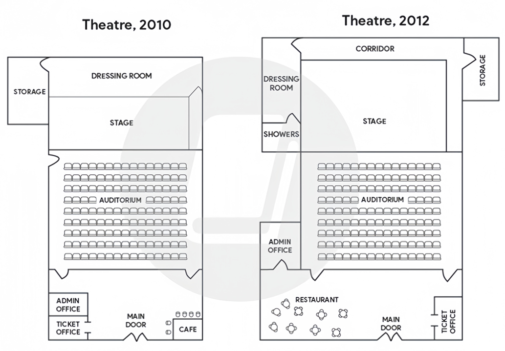
The two maps illustrate the degree to which a small theatre changed from 2010 to 2012.
Overall, after two years, the theater became noticeably larger with the expansion of its upper and lower sections, and all of its facilities were either repurposed or relocated, except for the auditorium and the stage.
Regarding the top of the plan, the stage was enlarged in a northerly direction, overtaking half of the space previously occupied by the dressing room in 2010, which was turned into a corridor two years later. Meanwhile, there used to be a storage space flanking the stage and the corridor on the left in 2010, but it was then repositioned to their right flank in order to make way for two new rooms where performers or actors could get changed and take a shower.
Turning to the remaining areas of the theater, although the auditorium in the middle remained intact, the foyer below it had been extended towards the left by 2012, allowing for the establishment of a restaurant at the expense of the administration and ticket offices on the left-hand side of the main entrance. This in turn led to the relocation of the former to the left side of the auditorium and the latter to the bottom right corner of the plan, replacing the cafe that was present in 2010.
Sample 2:
The maps illustrate the layout of a small theater between 2010 and 2012 show significant changes during that time period.
It can be seen that the theater received renovation efforts in the two-year time frame, with the building itself expanded sideways as existing features were moved and reconfigured. The only part that did not undergo significant changes was the central seating area.
Regarding the southern part of the theater, in 2010, there was a cafe situated in the corner to the right of the theater's main entrance, whereas the left corner was occupied by a ticket office and an administrative office. However, within the next two years, the ticket office was relocated to the bottom right corner where the cafe had been, while the administrative office was moved further back, to the left side of the seating area. This made way for a new restaurant area in the left rear corner.
In the upper section of the maps, one notable change was that the stage in front of the auditorium almost doubled in size with the addition of a side hall behind it, even as the auditorium itself remained unchanged. To the left of the stage was a storage room which, after 2010, was moved to the opposite end of the stage to make way for the construction of a showers area as well as the relocation of the dressing room. The old dressing room was located behind the stage in 2010, but this space, together with the right side of the stage, was redesigned to serve as a corridor which connected the dressing room and the storage room.
Sample 3:
The diagrams show the layouts of a theatre in 2010 and 2012. Overall, by 2012, it had been made significantly larger by adding new facilities and relocating some existing ones, while the main auditorium remained intact.
In 2010, the structure had two adjacent offices for admin and ticket sales and a cafe all located on either side of the main door at the centre of the lower wall. Inside the auditorium, there were two doors for entry, and one door for exit on the left next to the front-row seats. The main stage was about the same size as the dressing room behind it and a storage room was at the left rear of the theatre.
Over the next two years, the main door and auditorium with its entry doors remained untouched, while the exit one was lost. However, the lobby was widened, making room for a new restaurant. This means the admin office was moved a little up to the left in an addition, and the ticket counter replaced the old cafe on the right of the main door. Notably, although the stage was enlarged by almost double, the dressing room and storage were downsized and moved around slightly. The dressing room and new showers were located on the left in an extension, while the storage was on the right, all connected by a new long corridor at the back.
Sample 4:
The maps demonstrate how the layout of the small auditorium has changed over a span of 2 years.
Overall, with the core structure for the main operations remains largely the same, there are horizontal expansion of the theatre and significant alterations in amenities aiming to enhance the experiennce for customers and performers.
In 2010, the storage was occupied by a moderately sized on the left-hand side in the first half, while the rest area was utilized for the dressing room and the stage. Nevertheless, by 2012, the relocation of the storage to the opposite corner of the stage facilitated the establishment of a showers region as well as the refurbishment of a dressing room. Moreover, the old dressing room was combined with the right-hand side of the stage to construct a backstage corridor connecting the storage and dressing room, allowing for smoother movement. Additionally, the stage in front of the auditorium was nearly doubled in its origin, whereas the centered auditorium remained unchanged.
The period from 2010 to 2012 experienced a complete change in the lower section of the theatre. A restaurant was introduced in the left corner, where the admin office and the ticket office had been simultaneously removed. Furthermore, the cafe area was dismantled to accommodate a new ticket office, and the administrative office was shifted to the left-hand side of the seating room.
Lời giải

Sample 1:
The bar chart and pie chart give information about why US residents travelled and what travel problems they experienced in the year 2009.
It is clear that the principal reason why Americans travelled in 2009 was to commute to and from work. In the same year, the primary concern of Americans, with regard to the trips they made, was the cost of travelling.
Looking more closely at the bar chart, we can see that 49% of the trips made by Americans in 2009 were for the purpose of commuting. By contrast, only 6% of trips were visits to friends or relatives, and one in ten trips were for social or recreation reasons. Shopping was cited as the reason for 16% of all travel, while unspecific ‘personal reasons’ accounted for the remaining 19%.
According to the pie chart, price was the key consideration for 36% of American travellers. Almost one in five people cited safety as their foremost travel concern, while aggressive driving and highway congestion were the main issues for 17% and 14% of the travelling public. Finally, a total of 14% of those surveyed thought that access to public transport or space for pedestrians were the most important travel issues.
Sample 2:
The bar chart compares the figures for Americans going out for five reasons and the pie chart illustrates the percentage of six problems that concerned them when travelling in 2009. Overall, it is clear that the main reason why people in the US went out in 2009 is to commute to work, and the cost of travelling is the problem concerning them the most.
Looking first at the bar graph, the proportion of Americans going out for commuting to work stood at 49%, while the figure for those leaving their house for personal reasons accounted for 19%. In addition, the rate of people in the US going out for shopping and recreation made up 16% and 10%, respectively, while visiting friends or relatives accounted for the lowest percentage, at only 6%.
Turning to the pie chart, the cost of travelling was the most concerning problem of Americans when going out, with the figure making up 36%, while the proportion of safety concerns is half of that, at 19%. In addition, 17% of US citizens were concerned about aggressive drivers, while highway congestion made 14% of them worried when leaving their house. Access to public transportation and places for people to walk accounted for the lowest percentages, at only 8% and 6%, respectively.
Sample 3:
The provided charts offer insights into the reasons for travel and the primary concerns faced by the traveling public in the United States during the year 2009. The data is presented through a bar chart illustrating travel purposes and a pie chart highlighting key issues.
Notably, the primary motivation for travel among Americans in 2009 was commuting to and from work. Simultaneously, the major concern for the traveling public during their trips revolved around the cost associated with travel.
Examining the bar chart in detail reveals that almost half of the trips made by Americans in 2009, precisely 49%, were attributed to commuting. Conversely, visits to friends or relatives accounted for a mere 6%, while social or recreational trips constituted one in ten journeys. Shopping emerged as the purpose for 16% of all travel, leaving the remaining 19% for unspecific ‘personal reasons.’
Turning attention to the pie chart, it becomes evident that cost was the primary consideration for 36% of American travelers. Safety closely followed, with nearly one in five people, or 19%, expressing it as their foremost travel concern. Aggressive driving and highway congestion were significant issues for 17% and 14% of the traveling public, respectively. Additionally, 14% of respondents identified access to public transport or space for pedestrians as the most crucial travel issues.
Sample 4:
The bar chart shows why American people chose to travel, and the pie chart shows the main issues for the travelling public in the USA, both for 2009. The trend suggests that the reason and price were the main issues for travel in the United States. It is clear that commuting from work was reported as the biggest contribution to travel, at 49%. People who went travelling for personal reasons and shopping accounted for 35% when these two groups are combined. However, interaction with friends and relatives only accounted for 25% less than the above categories. And social and recreational activities took up only 6%, which was the lowest figure by more than 43%. The travelling public’s main issues were related to price and safety, with 55% of respondents reporting these two issues. While other issues accounted for a relatively small part. Only 17% of the respondents reported issues with aggressive drivers, while highway congestion accounted for even less at 14% of the issues reported. The percentage of access to public transport and space for pedestrians was much lower than the other categories at less than 10% for both. To conclude, price and commuting time were the dominant factors relating to travel in the US in 2009.
Lời giải
Sample 1:
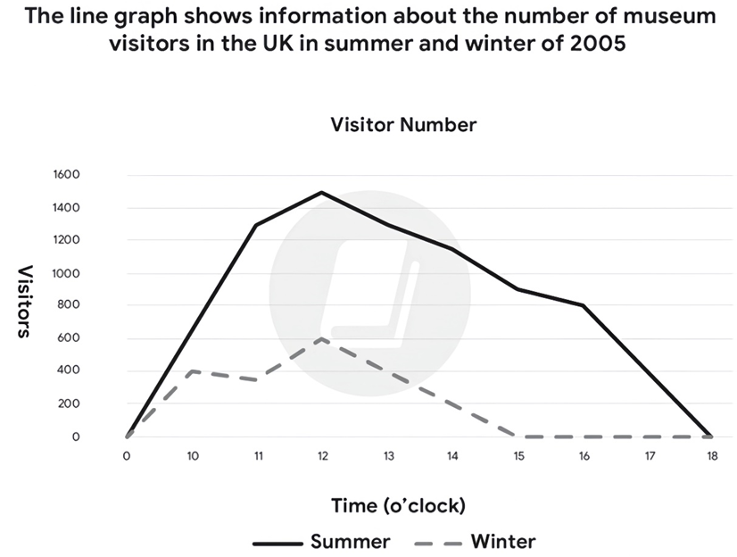
The line graph illustrates how many people, on average, visited a particular UK museum during two seasons in 2005.
Overall, the attendance rate in the summer was generally much higher than that in the winter, with their peak time being at midday. It also appears that the museum had the same opening hours for both seasons, but it closed earlier towards the end of the year.
In the summer, the number of visitors soared/surged from 9 to 12 o’clock in the morning, peaking at approximately 1500 at noon. Subsequently, the museum saw a gradual drop of 700 visitors by 4 p.m., followed by another sharp fall towards 6 p.m. This seemed to be the closing time of the museum, as no visitors were recorded after that time.
The winter season followed a similar pattern, albeit at a lower rate. Despite a slight fall at 11 a.m, there was a considerable rise in visitor numbers between 9 and 12 o’clock, with a high of 600 in the middle of the day. Thereafter, a continual decrease was observed in this attendance figure, and the museum closed its door at 3 o’clock in the afternoon.
Sample 2:
The line chart illustrates how many people went to a British museum in the summer and winter of 2005.
Overall, fewer people went to this museum in the winter than they did in the warmer season. However, during both times of the year, the daily peak time was at midday, although it seems like the building closed earlier in the winter.
In the summer, within the first eleven hours of the day, the head count soared up to around 1300 people and peaked at approximately 1500 people at noon. It then slowly descended by around 700 between 12.00 p.m. and 4.00 p.m., and continued dropping to zero at a more considerable rate towards 6.00 p.m.
On a smaller scale, this pattern was followed by the winter’s figures. The first half of the day witnessed the number of walk-ins climbing gradually to 400, which then fell slightly before making a recovery to its high at 600. Since noon, there were fewer and fewer museum-goers present, setting a consistent drop until the museum was free of any visitors from 3.00 p.m. onwards.
Lời giải
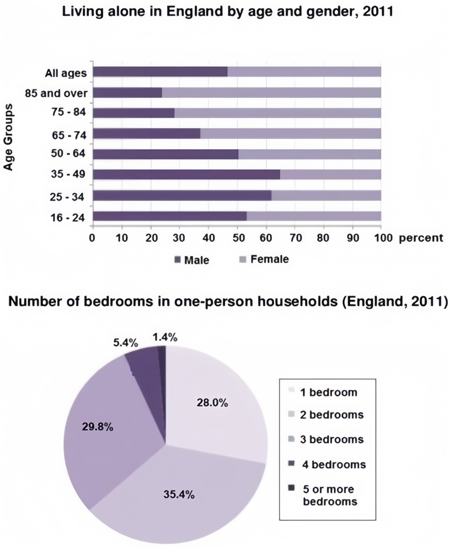
Sample 1:
The first chart compares the percentage of English people living alone in terms of age distribution by gender in the year 2011. The second chart gives information about how many bedrooms these one-person households had in the same year. The trend suggests that women aged 65 and over were more likely to live by themselves than men in England. At the same time, it is also noticeable that the majority of one household lived in a two-bedroom residence.
According to the bar chart, there were more men who lived alone than women in age groups under 65. Close to 65% of men aged 35 to 49 lived by themselves in that year, but this proportion shrank with age. From 65 onward, it is shown that the figure for women who lived alone was increasing, at around 63% in the 65 to 74-year-old bracket and that there was 76% in the 85 and over age group.
In the pie chart, it can clearly be seen that for all age groups, 35.4% of one-person households in England lived in a two-bedroom residence. There were similar percentages of people living alone in one bedroom and a three-bedroom house, at 28% and 29.8%, respectively. Only 1.4% of one-person households lived in houses that had more than five bedrooms.
Overall, a higher number of older women lived alone compared to men, and most English residents lived in a two-bedroom house.
Sample 2:
The bar chart displays the proportions of English men and women of different ages living alone in 2011, while the pie chart illustrates the distribution of the number of bedrooms in these one-person households.
Overall, females constituted a higher proportion of those living alone compared to males, particularly in older age categories. The most common number of bedrooms in single-occupant homes was two.
According to the bar chart, the "All Ages" and 16-24-year-olds categories had balanced proportions between males and females. For the 25-34 and 35-49 age groups, males outnumbered females, with nearly 65% of individuals living alone in the 35-49 category being men. In contrast, females dominated the older age groups, with women constituting around 72% of single occupants aged 75 to 84 and 76% of those aged 85 and over, leaving men at 24% in the latter category.
Regarding the number of bedrooms, 35.4% of one-person households had two bedrooms, making it the most popular choice. Additionally, one-bedroom and three-bedroom homes accounted for 28% and 29.8% of the total, respectively, and less than 7% of single-occupant homes had four or more bedrooms.
Sample 3:
The provided charts offer insights into single-occupant households in England during 2011. The bar chart delineates the distribution of individuals living alone across various age groups and genders, while the accompanying pie chart provides data on the number of bedrooms in these solitary residences.
Notably, a higher percentage of females chose to live alone compared to their male counterparts. This discrepancy was particularly pronounced in the elderly demographic. Additionally, the charts highlight that two-bedroom homes were the most prevalent in single-occupant households.
A significant gender disparity is evident among individuals aged 65 and above living alone in England in 2011, with females constituting the majority. Around 72% of single occupants in the 75-84 age group and 76% in the 85 and above category were women. Conversely, in the 35-49 age bracket, men represented nearly 65% of those residing alone.
In terms of the number of bedrooms, the majority of one-person households in England, 35.4%, featured two bedrooms. One-bedroom and three-bedroom homes accounted for 28% and 29.8%, respectively, of the total. Notably, less than 7% of these solitary residences had four or more bedrooms.
Sample 4:
The two charts give information about single-occupant households in England in the year 2011. The bar chart compares figures for occupants' age and gender, and the pie chart shows data about the number of bedrooms in these homes.
Overall, females made up a higher proportion of people living alone than males, and this difference is particularly noticeable in the older age categories. We can also see that the most common number of bedrooms in a single-occupant home was two.
A significant majority of the people aged 65 or over who were living alone in England in 2011 were female. Women made up around 72% of single occupants aged 75 to 84, and 76% of those aged 85 or over. By contrast, among younger adults the figures for males were higher. For example, in the 35-49 age category, men accounted for nearly 65% of people living alone.
In the same year, 35.4% of one-person households in England had two bedrooms, while one- and three-bedroom homes accounted for 28% and 29.8% of the total. Under 7% of single-occupant homes had four or more bedrooms.
Sample 5:
The bar chart provides a breakdown of English men and women of different ages who were living alone in 2011, while the accompanying pie chart illustrates the distribution of the number of bedrooms within their one-person households.
Overall, older women were more likely to live alone than their male counterparts, while younger men were more prone to solitary living compared to younger women. Additionally, most individuals living alone resided in homes with one to three bedrooms, with two-bedroom properties being the most prevalent.
Focusing on the bar chart, the proportion of women living alone increases with age, especially after the age of 65, where nearly 70% of such individuals are female, far exceeding the percentage of males. In contrast, younger age groups show a reversed trend, with more men opting for single-person households, particularly among those aged 35 to 49, where men represent a significant majority. A similar pattern can be seen in the 16-24 and 25-34 age groups, with men consistently outnumbering women. In the 50-64 age group, however, the percentage of men and women living alone is equal.
The pie chart reveals that the majority of single-person households consist of two or three bedrooms, with two-bedroom homes accounting for 35.4% and three-bedroom residences making up 29.8%. One-bedroom properties are also common, representing 28% of the total. Larger homes, including those with four or more bedrooms, are rare among single occupants, with just 5.4% having four bedrooms and only 1.4% featuring five or more.
Sample 6:
The bar chart illustrates the proportions of English men and women of different ages who were living alone in 2011, while the pie chart provides information about the number of bedrooms available in these one-person households.
In general, older women were more inclined to live independently compared to their male counterparts, whereas younger men showed a greater tendency to live on their own than younger women. Additionally, most one-person households were comprised of homes with one to three bedrooms, with two-bedroom accommodations being the most common.
Delving into the bar chart, it is clear that the trend of living alone shifts notably with age. For individuals over 65 years, women dominate the figures, making up a much larger share compared to men. This gap becomes particularly significant for the 75-84 and 85-and-over categories, where women outnumber men considerably. Conversely, men are more represented among younger age brackets, especially those aged between 35-49, where their share peaks. In the 16-24 and 25-34 groups, men also outstrip women, showing a preference for solitary living during their youth. The only age range with an equal proportion of both genders living alone is 50-64.
The pie chart reveals that two-bedroom residences make up the highest portion of single-occupant homes, followed closely by three-bedroom ones. One-bedroom homes are also frequent among these households, while properties with four or more bedrooms are uncommon. Notably, only a very small fraction of these single-occupant residences features five or more bedrooms.
Sample 7:
The bar chart demonstrates the proportions of English men and women of different ages who were living alone in 2011, while the pie chart displays the distribution of the number of bedrooms in their one-person households.
A significant pattern emerges in both visuals: older women were more likely to live by themselves than their male counterparts, and younger men were more inclined toward independent living compared to younger women. Additionally, the majority of these single-occupant residences consisted of one to three bedrooms, with two-bedroom homes forming the largest segment.
In greater detail, the bar chart reveals that among individuals aged 65 and above, women clearly outnumber men in solitary living, especially in the oldest age categories, where female occupancy rises dramatically. In contrast, the trend is reversed for younger age groups, with a higher proportion of men living alone, most notably between the ages of 35 and 49. A similar male dominance is observed in the 16-24 and 25-34 brackets, indicating that men are more inclined to live independently during their younger years. The age group 50-64 is the only category where the ratio of men and women living alone is perfectly balanced.
The pie chart illustrates that two-bedroom homes are the most frequent choice among these households, followed by those with three bedrooms. One-bedroom accommodations also constitute a substantial share, while larger properties with four or more bedrooms are relatively rare. Only a small minority of single-occupant homes contain five or more bedrooms, emphasizing the preference for compact living spaces.
Sample 8:
The bar graph compares the ratio of English males and females of different ages. In 2011, clusters who resided independently are presented in the pie chart with information on the count of bedrooms they possessed. Generally, a high number of British females chose to live solitary as their age advanced, and the majority of houses belonging to these individually residing people contained one to three sleeping rooms. As per the bar chart, approximately 55% of British females were living alone, a higher rate compared to males. In the year 2011, this statement was especially valid for older ladies because approximately 70% of them. had lived apart as compared to less than 30% of males who were over 65 years old. The proportion between the two. In 2011, the individuals of all genders who were living by themselves and were between the ages of 50 to 64 years old had exact similarities. However, younger English males preferred to live individually more than their female individuals. On average, six out of ten were males who resided alone during their younger age, from 16 to 49 years old. The majority percentage of unmarried men were between the ages of 35 and 49 years old. However, for women, it was different as most single females were above the age of 80 years.
The pie chart shows that a majority of houses occupied by single individuals have one to three bedrooms. Among them, two-bedroom houses are the most common with roughly 35%, which is about 6% more than three-bedroom apartments. Very few singles reside in large homes with many rooms, and around a quarter of these dwellings contain just a single room.
Sample 9:
The bar chart compares the proportion of English guys and females from diverse age bunches who lived independently in 2011, whereas the pie chart shows the number of rooms they had. Generally, more British ladies lived alone when they got more seasoned, and most of these independently living persons' houses comprised one to three rooms.
According to the bar chart, more British females, generally 55%, lived alone than that of guys in 2011. Typically, especially genuine for mature ladies since generally 70% of them lived independently, compared to less than 30% of guys over 65 a long time ancient. The proportion of both sexual orientations living alone who were 50 to 64 a long time ancient in 2011 was precisely the same. In any case, more youthful English guys favoured to live exclusively more than their female partners. Six out of ten, on a normal, were men who lived solo when they were more youthful, 16-49 a long time ancient. The most noteworthy rates of single guys in this category were between 35 and 49 a long time ancient, whereas this proportion was most noteworthy for the ladies over 80 a long time ancient.
The pie chart delineates that most of the single persons' houses had one to three rooms and two-bedroom houses for such individuals were the most elevated, around 35%, surpassing the three-bedroom flats by generally 6 percent. Barely they had bigger houses with numerous rooms and around one-fourth of these homes had as it were one room.
Sample 10:
The bar chart uncovers data about the English guys and females, in 8 diverse age bunches, who lived alone in 2011. The pie chart provides information about the number of rooms within the houses with one inhabitant. By and large, 34-49 a long time people had the most noteworthy rate of living alone, whereas 85 a long time and over had the least. Most of the houses with one inhabitant had two rooms, and less than 2% of one-person families had 5 or more rooms. In 2011, less than 50% of all age bunches of English people lived alone. The foremost proportion of people who had a private house was more than 50% among 16 to 64 ages, bunches of men and ladies. On the other hand, more than 64 a long time ancient people were less sharp at living alone with approximately 30% for 75-84 a long time ancient, far less than 30% for 75-84 and fair over 20% for 85 and over, individually.
Within the case of the number of rooms, 35.4% of private houses with one inhabitant had 2 rooms, which was followed by 3 rooms with 29.8% and rooms with 28%, separately. In any case, as it were less than 7% of one-person family units had 4 or more rooms.
Sample 11:
The two charts present data on single-occupant households in England in 2011. The bar chart compares the age and gender distribution of occupants, while the pie chart illustrates the distribution of the number of bedrooms in these homes.
In general, a higher percentage of females lived alone compared to males, and this difference was particularly noticeable among older age groups. Additionally, the most common configuration for single-occupant homes was having two bedrooms.
A significant majority of individuals aged 65 or over who lived alone in England in 2011 were female. Women accounted for approximately 72% of single occupants in the age range of 75 to 84, and 76% among those aged 85 or older. Conversely, among younger adults, there was a higher proportion of males living alone. For instance, in the 35-49 age category, men constituted nearly 65% of single occupants.
Regarding the number of bedrooms in single-occupant homes, approximately 35.4% of such households had two bedrooms. One-bedroom and three-bedroom homes accounted for 28% and 29.8% of the total, respectively. Less than 7% of single-occupant homes had four or more bedrooms.
In summary, the charts provide insights into single-occupant households in England in 2011. Females comprised a larger proportion of individuals living alone, especially among older age groups. Furthermore, homes with two bedrooms were the most common configuration for single occupants.
Sample 12:
The bar graph compares the ratio of English males and females from different age groups who lived individually in 2011, while the pie chart shows the number of bedrooms they had. Overall, more British women lived alone when they got older and most of these separately living persons' houses comprised one to three bedrooms.
According to the bar chart, more British females, roughly 55%, lived alone than that of males in 2011. This is particularly true for the aged women since roughly 70% of them lived separately compared to less than 30% males over 65 years old. The ratio of both genders living alone who were 50 to 64 years old in 2011 was exactly the same. However, younger English males preferred to live individually more than their female counterparts. Six out of ten, on an average, were men who lived solo when they were younger, 16-49 years old. The highest percentages of single males of this category were between 35 to 49 years old while this ratio was highest for the women over 80 years old.
The pie chart depicts that most of the single persons’ houses had one to three bedrooms and two-bedroom houses for such people was the highest, around 35%, exceeding the three-bedroom apartments by roughly 6 percent. Scarcely they had larger houses with many rooms and around one-fourth of these homes had only one room.
Sample 13:
The bar chart compares the figures of a person living alone with different genders and ages in England in the year 2011. The pie chart indicates data showing the number of bedrooms in these homes at the same period.
Overall, the women had the bigger percentages of people living alone than men. We can also see that the most common number of bedrooms in one person was two.
Females had around 77% of one person aged 85 or over, and 72% of those aged 75 to 84. By contrast, females had smaller proportion than males from 25 to 49 aged. For example, in the 35- 49 age category, men had the biggest figure of people living alone, at nearly 65%.
In 2011, 35.4% of one person households had two bedrooms. Whilst third bedroom and one bedroom were the second and third of the most of these houses in England, 29,8% and 28.0% respectively. There were nearly under 7.0% of the other bedrooms.
Lời giải
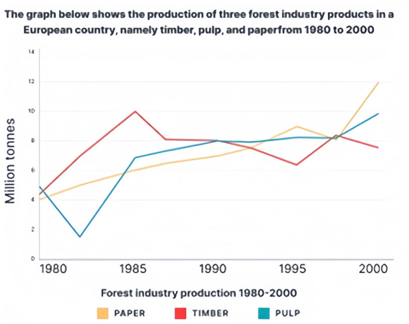
Sample 1:
The graph below shows the production of three forest industry products in a European country, namely timber, pulp, and paper, from 1980 to 2000.
Overall, while all three categories fluctuated wildly throughout the period, they ultimately increased substantially.
In 1980, even though pulp had the highest production initially (roughly 5.5 million tons), it plummeted to just over 2 million tons and was immediately overtaken by timber in the following years. From 1982 to 1985, both timber and pulp had similar increasing trends, rising sharply from 6.5 to 10 and 2.2 to 6.5 million tons, respectively. From 1985 to 1990, pulp’s figure kept growing at a slower rate while timber dipped to 8.0 million tons in 1987 and remained there till 1990. Paper consistently grew from 4.0 to 6.5 million tons during this time frame.
For the remaining period, timber declined to around 6.2 million tons before bouncing back to 8.0 in 1997 and slightly decreased to 7.8 in 2000, ultimately finishing last. In contrast, despite a slight dip in 1997, the paper almost doubled its 1990 figure and reached first place in 2000. In the same period, pulp gradually rose from 8.0 to approximately 10.0 million tons.
Sample 2:
The line chart demonstrates the production trends of three forest industry products - timber, pulp and paper - in a European country over a 20-year period, from 1980 to 2000.
Overall, it can be observed that all three categories had fluctuated throughout the period. Pulp and paper, in particular, experienced an upward trend, while timber saw a downward trend.
In terms of pulp and paper production, pulp was marginally higher than paper in 1980, with nearly 6 million tonnes and 4 million tonnes, respectively. Following a sharp decline, pulp production began to recover in 1985, climbing from 7 million tonnes to 10 million tonnes by the end of the period. Similarly, paper production rose steadily until a slight fallback in 1995, and then increased rapidly, peaking at 12 million tonnes in 2000.
Regarding timber, the production started at 5 million tonnes in 1980 and rose sharply to 10 million tonnes in 1985. However, over the following 15 years, the production figure saw a gradual decrease and eventually reached nearly 8 million tonnes at the end of the period.
Sample 3:
The given graph depicts the production of wood pulp, timber, and paper in a European country between 1980 and 2000. Overall, the growth in paper production was substantial and steady throughout the period, while the quantity of wood pulp increased moderately with some disruptions. Timber, on the other hand, was the only product to have such irregularities and experienced significant fluctuations.
In 1980, paper production began at 4 million tonnes, which climbed steadily to 9 million tonnes before experiencing a slight dip to 8 million tonnes in 1997-98. The quantity then recovered and reached its peak at 12 million tonnes in 2000.
Wood pulp started with the highest production of the three commodities, with 6 million tonnes, but dropped to about 3.6 million tonnes by 1983. It immediately rose again and tripled the previous level in 1985. However, there was not much growth in the following period, and the production remained between 7-10 million tonnes.
Between 1980 and 1985, the production of timber increased dramatically, from 5 million tonnes to 10 million tonnes, before declining to just over 6 million tonnes until 1995. Production grew once again to 8 million tonnes in the final five years of the era before rapidly falling off once more.
Sample 4:
The provided graph illustrates the production trends of timber, pulp, and paper in a European country from 1980 to 2000.
Throughout the entire period, all three categories experienced notable fluctuations, yet collectively demonstrated substantial overall growth.
The initial production of pulp slightly surpassed that of paper in 1980, with approximately 6 million tonnes for pulp and 4 million tonnes for paper. Subsequently, pulp experienced a significant decline to under 2 million tonnes in 1982 before a recovery to about 7 million tonnes in 1985 and then a substantial 10 million tonnes by the conclusion of the period. Conversely, paper production displayed a consistent increase from 4 to a high of approximately 9 million tonnes in 1995, momentarily slowing in 1995, before surging rapidly and reaching its pinnacle at 12 million tonnes by 2000.
In contrast, timber production commenced at 5 million tonnes in 1980, swiftly escalating to 10 million tonnes by 1985. However, over the ensuing 10 years, timber production exhibited a gradual decline to hit a low of about 6 million tonnes in 1995. Then, this figure rebounded before dropping again to under 8 million tonnes by 2000, concluding in the lowest position.
Lời giải
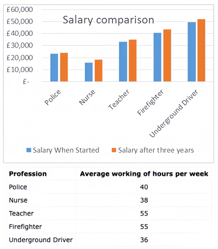
Sample 1:
The bar chart and table demonstrate the income and average weekly working hours for several occupations in the UK.
Overall, it is evident that in the UK, most professions witness a wage raise after three years of experience. However, there is a significant gap in average weekly working hours amongst careers, with teachers and firefighters having substantially higher weekly working hours than underground drivers.
According to the bar chart, underground drivers receive the highest starting income of 50,000 pounds and a salary increase to nearly 51,000 pounds after three years. Nurses, on the other hand, have the lowest earnings, starting at around 17,000 pounds and rising to over 19,000 pounds after three years. Police officers’ salaries remain relatively stable during the three-year period, hovering around 22,000 pounds.
According to the data in the table, teachers and firefighters spend the most weekly hours at work, both averaging 55 hours per week. On the contrary, underground drivers put in the fewest hours per week, clocking in at just 36 hours on average.
Sample 2:
The provided bar chart and table delineate income variations and average weekly working hours across various occupations in the UK.
Overall, the data reveals a common trend of salary escalation across most professions after a three-year tenure. However, a substantial divergence exists in the average weekly working hours among occupations, with teachers and firefighters dedicating considerably more hours per week, contrasting with underground drivers.
In the bar chart, underground drivers commence with the highest initial income, starting at £50,000, escalating marginally to nearly £51,000 after a three-year period. These figures surpass firefighters’ and teachers’ by about £10,000 and £20,000 in each corresponding year. Conversely, nurses initiate with the lowest earnings, commencing around £17,000 and progressing to over £19,000 after three years. Meanwhile, police officers maintain relatively consistent salaries, hovering near £22,000 throughout the three-year timeframe.
Examining the table data, both teachers and firefighters record the highest weekly work hours, averaging 55 hours per week. In contrast, underground drivers maintain the shortest workweek, averaging only 36 hours per week. In comparison, the average working hours of police officers are 40, compared to 38 working hours a week of nurses.
Sample 3:
The bar graph and table compare the starting salaries and salaries after three years of five different professions: underground train drivers, nurses, teachers, firefighters, and police officers. It also shows the average weekly working hours of each profession.
Several trends can be identified from the data. The underground train driver had the highest salary both at the start and after three years, earning just under £50,000 per year, while the nurse earned the least with a salary of only around £15,700. In terms of salary increments, the underground train driver received the greatest increase of £2,500 over three years, whereas the police officer received the lowest rise of £600.
Importantly, despite all professions receiving pay increases, the same professions remain at the opposite end of the salary scale after three years. The underground train driver continues to be the highest paid, while the nurse's salary remains the lowest. So, in summary, while individual salaries increased, the overall trend between the highest and lowest-paid professions persisted over the period shown.
Sample 4:
The line graph compares the average salaries and weekly working hours of four different jobs in the UK: police, nurses, firefighters, and underground drivers.
The graph clearly shows that underground drivers have both the lowest average weekly working hours and the highest salaries. They typically work 36 hours per week and earn £50,000 in their first year, rising to £51,000 after three years. In contrast, firefighters have among the highest average weekly working hours at 55.
Police officers work an average of 40 hours per week. Their starting salary of £2,100 sees a modest rise to £2,300 over three years. Firefighters have the longest weekly working hours of 55, but their salaries are the second highest. They earn £40,000 in the first year, growing to £41,000 after three years.
In summary, underground drivers benefit most from working the fewest hours yet earning the highest pay. Nurses face the opposite situation, with high working hours yet relatively low wages.
Sample 5:
The bar chart and table compare the starting salaries and earnings after three years, as well as the average weekly working hours, of several occupations in the UK. Underground drivers earn the highest starting wage of £50,000 according to the bar chart. Their salary increases slightly to just under £51,000 after three years. In contrast, nurses have the lowest pay, commencing at approximately £17,000 and rising to over £19,000 subsequently. Police officers' salaries remain relatively stable during the three years, around £22,000.
The table provides data on the average weekly working hours for each profession. Teachers and firefighters top the list with 55 hours per week on average. In stark contrast, underground drivers put in the fewest hours, only 36 per week.
In summary, the visuals demonstrate that while underground drivers enjoy the top starting salary, teachers and firefighters work significantly longer hours weekly than other occupations such as underground drivers, according to the information presented.
Lời giải
Bạn cần đăng ký gói VIP ( giá chỉ từ 250K ) để làm bài, xem đáp án và lời giải chi tiết không giới hạn.
Lời giải
Bạn cần đăng ký gói VIP ( giá chỉ từ 250K ) để làm bài, xem đáp án và lời giải chi tiết không giới hạn.
Lời giải
Bạn cần đăng ký gói VIP ( giá chỉ từ 250K ) để làm bài, xem đáp án và lời giải chi tiết không giới hạn.
Lời giải
Bạn cần đăng ký gói VIP ( giá chỉ từ 250K ) để làm bài, xem đáp án và lời giải chi tiết không giới hạn.
Lời giải
Bạn cần đăng ký gói VIP ( giá chỉ từ 250K ) để làm bài, xem đáp án và lời giải chi tiết không giới hạn.
Lời giải
Bạn cần đăng ký gói VIP ( giá chỉ từ 250K ) để làm bài, xem đáp án và lời giải chi tiết không giới hạn.
Lời giải
Bạn cần đăng ký gói VIP ( giá chỉ từ 250K ) để làm bài, xem đáp án và lời giải chi tiết không giới hạn.
Lời giải
Bạn cần đăng ký gói VIP ( giá chỉ từ 250K ) để làm bài, xem đáp án và lời giải chi tiết không giới hạn.
Lời giải
Bạn cần đăng ký gói VIP ( giá chỉ từ 250K ) để làm bài, xem đáp án và lời giải chi tiết không giới hạn.
Lời giải
Bạn cần đăng ký gói VIP ( giá chỉ từ 250K ) để làm bài, xem đáp án và lời giải chi tiết không giới hạn.
Lời giải
Bạn cần đăng ký gói VIP ( giá chỉ từ 250K ) để làm bài, xem đáp án và lời giải chi tiết không giới hạn.
Lời giải
Bạn cần đăng ký gói VIP ( giá chỉ từ 250K ) để làm bài, xem đáp án và lời giải chi tiết không giới hạn.
Xem tiếp với tài khoản VIP
Còn 92/100 câu hỏi, đáp án và lời giải chi tiết.
Bạn cần đăng ký gói VIP ( giá chỉ từ 250K ) để làm bài, xem đáp án và lời giải chi tiết không giới hạn.