


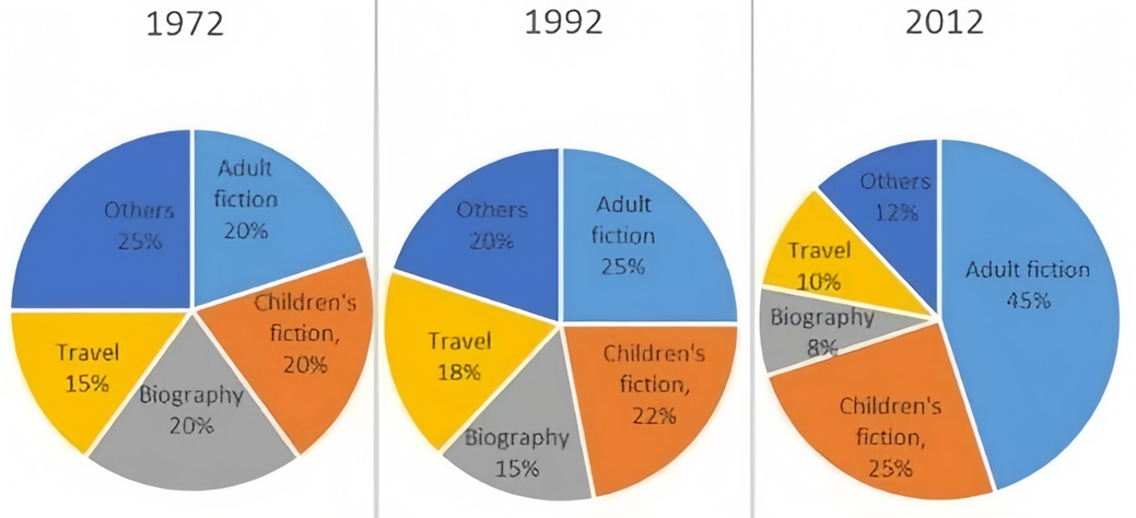
The pie charts below show the percentage of five kinds of books sold by a bookseller between 1972 and 2012.
Summarise the information by selecting and reporting the main features, and make comparisons where relevant. Write at least 150 words.
The pie charts below show the percentage of five kinds of books sold by a bookseller between 1972 and 2012.
Summarise the information by selecting and reporting the main features, and make comparisons where relevant. Write at least 150 words.
Câu hỏi trong đề: 2000 câu trắc nghiệm tổng hợp Tiếng Anh 2025 có đáp án !!
Quảng cáo
Trả lời:
Sample 1:
The pie charts detail sales by a bookseller between 1972 and 2012 according to genre.
Looking from an overall perspective, it is readily apparent that adult fiction became by far the most popular type at the expense of the genres which declined in popularity (others, biography, and travel). Interest in children’s fiction also increased.
In 1972, this particular bookseller sold relatively equal proportions of each type with others leading at 25%, followed by adult fiction, children’s fiction, and biography all at 20%, and travel lowest at 15%. By 1992, adult fiction had risen by 5%, while others and biography declined by the same number. Travel and children’s fiction grew by 3% and 2%, respectively.
In the final year surveyed, adult fiction surged to 45% and children’s fiction ticked up slightly to 25%. The rise of adult fiction was compensated for by dramatic drops for the remaining genres with others finishing at 12%, travel at 10%, and biography 8%.
Sample 2:
The pie charts illustrate the sales percentages of books across five genres sold by a bookseller from 1972 to 2012.
Overall, it is evident that the proportion of adult fiction book sales increased over the years, while the sales of biography books exhibited a declining trend.
Initially, in 1972, the ‘other’ books category dominated the market, comprising approximately 25% of total sales. In contrast, adult fiction, children’s fiction, and biography books each represented 20% of total sales. Travel books constituted a smaller segment at 15%. By 1992, adult fiction had taken the lead in sales at 25%, while children’s fiction and the ‘other’ category each accounted for around 20% of total sales. In the same year, travel and biography books made up 18% and 15% of sales, respectively.
By 2012, adult fiction books constituted 45% of book sales. Additionally, children’s fiction represented 25% of the market. Both travel and ‘other’ book categories saw a decrease, each accounting for about 10% of total sales. In contrast, biographies had the smallest share of sales at just 8%.
Sample 3:
The pie charts illustrate changes in book sales by genre for a particular bookseller in 1972, 1992, and 2012.
Overall, there was a pronounced increase in sales of adult and children's fiction. Meanwhile, biographies, travel, and other genres experienced a decline, with adult fiction emerging as the best-selling genre by 2012.
In terms of fiction, sales of books aimed at adults started at 20% of total sales in 1972, and grew impressively to 45% by 2012, making it the leading genre. Children's fiction also showed growth, starting at the same level as adult fiction but increasing more modestly to 25% by the end of the period.
Turning to other categories with a downward trend, unspecified types of books initially outsold the rest, constituting a quarter of the total sales. However, the figure then experienced a significant drop, and by 2012 had more than halved (12%). Similar changes, but to a lesser extent, were also observed in biography sales, starting at 20% before slumping by 12% in 2012.
Sample 4:
The provided pie charts compare different book genres in terms of their sales from a bookseller over a 40-year period, starting in 1972.
Overall, it is evident that in 1972, the sales of different book genres were relatively balanced. However, from 1992 onwards, adult fiction and children’s fiction gained increasing popularity, with adult fiction becoming the best-selling genre throughout this period, while other genres saw a decline in sales.
In 1972, the share of adult fiction stood at 20%, equal to the figures for children’s fiction and biographies, which also accounted for 20% each. Travel books closely followed behind and made up 15% of total sales, while the remaining 25% was distributed among other genres.
Over the next 40 years, the sales of adult fiction registered an over twofold increase to 45%, making it the most popular genre. Similar changes, but to a lesser extent, can be seen in children's fiction sales, whose sales grew modestly to 25%, securing them as the second most popular genre. Meanwhile, sales of travel books rose gently to 18%, after which they plunged to 8% at the end of the period. Biographies and other genres witnessed substantial decreases, with the former dropping to 10% and the latter halving to just 12%.
Sample 5:
The pie charts illustrate the percentage distribution of five categories of books sold by a bookseller over three different years: 1972, 1992, and the final year of the analysis 2012.
Overall, adult fiction saw a significant rise in sales over the years, becoming the dominant genre by the end. In contrast, other genres, including biography and travel, experienced declines, while children's fiction showed a modest increase in popularity.
In 1972, book sales were relatively balanced among the genres. The 'others' category led with 25%, followed by adult fiction, children's fiction, and biography, each constituting 20% of the sales, while travel was the least popular at 15%.
By 1992, adult fiction had increased its share to 25%, a 5% rise from 1972. However, the 'others' and biography categories both decreased by 5%, settling at 20% and 15%, respectively. Travel and children's fiction showed slight growth, with travel moving up to 18% and children's fiction to 22%.
In the final year of analysis, adult fiction soared to 45%, nearly doubling its share since 1992. Children's fiction also increased, reaching 25%. Conversely, the other genres saw marked declines: 'others' dropped to 12%, travel fell to 10%, and biography dwindled to 8%. This shift highlights a growing preference for adult and children's fiction over the other genres.
Sample 6:
The pie charts illustrate the books sales by a retailer in 5 different genres between 1972 and 2012
Overall, it is clear that adult fiction slowly became the most popular genre with a considerable increase in sales. The other 4 genres all experienced a moderate drop in sales in the 40-year period.
In 1972, all five genres shared the same sales figure at around a fifth of the total sales each. Books in the fiction and travel categories climbed slightly in sales at around 2-5% in the following 20 years whereas biography and other book genres were consumed less with a 5% decrease in sales.
In 2012, adults’ fiction grew dramatically in popularity and sales were twice as high as in 1992. Sales for fiction books for children also experienced a minimal growth of 3 percent and remained the second preferred book genre. Consumers were buying less biographies, travel and other types of books which is represented in the steady fall in sales to just around a tenth in all 3 categories.
Sample 7:
The pie charts illustrate the percentage distribution of five different types of books sold by a bookseller in 1972, 1992, and 2012. The book categories include adult fiction, children’s fiction, biography, travel, and others.
Overall, the most notable trend is the significant increase in the sales of adult fiction from 1972 to 2012, while the popularity of other categories like travel and biography diminished over time. Children’s fiction remained fairly stable during the period, with only a slight fluctuation in its share of sales.
In 1972, the largest share of book sales was travel and adult fiction, each accounting for 25%. This was followed by children’s fiction and biography, both making up 20%, while “others” occupied the smallest share at 15%. By 1992, the proportion of adult fiction had slightly increased to 25%, while children’s fiction sales also saw a slight rise to 22%. Travel and biography both saw a reduction, with travel decreasing to 18% and biography to 15%.
By 2012, the sales of adult fiction had surged significantly, accounting for 45% of total sales, making it by far the most popular category. Children’s fiction also increased to 25%, while the share of travel books dropped further to just 10%. Similarly, biography sales fell to 8%, and the category of “others” declined to 12%.
Sample 8:
Three diagrams, from 1972, 1992, and 2012, show the percentage of people's chosen book types in each of those three years. These choices are further broken down into five groups, including Others, Adult Fiction, Children's Fiction, Biography, and Travel. The overall pattern indicates that the changes between 1972 and 1992 were not as significant as those between 2012 and 2013.
First, compared to numbers from 1972, the "Others" and Biography categories have continuously declined. In 1972, the "Others" category had a share of the market of 25 percent of all books sold; by 1992, that percentage had dropped to 25 percent. And in 2012, it fell even further, to just 12% - a decrease of more than 50% from where it had been. Similar trends were seen in the market for biography books. It saw a decline from 20% in 1972 to 15% (a one-fourth fall) in 1992 before reaching an all-time low of 8% by the end. The categories that witnessed the most increase throughout these years were adult fiction and children's fiction. The former saw a humongous gain of 20% from the 1992 number. While the latter did not experience as much growth, increasing from 20% in 1972 to 2% and 3%, respectively, in the years 1992 and 2012. Last but not least, sales of travel-related books climbed from 15% in 1972 to 18% in 1992 before declining to 10% in 2012.
Sample 9:
The ratio of people's preferred book types in each of the three years—1972, 1992, and 2012—is depicted in three diagrams. These options are further divided into five categories: Others, Adult Fiction, Children's Fiction, Biography, and Travel. The overall pattern suggests that the differences between 2012 and 2013 were more dramatic than those between 1972 and 1992.
First off, 1972 was the year that saw the greatest sales of other publications. The adult, children's, and biography categories account for 20% of all books sold, though. However, in 1972, a very small number of travel books were actually sold. Additionally, adult fiction novels accounted for the bulk of sales in 1992. Moreover, the bookshop sold 20% or so of the children's books and other titles. However, only 18% and 15% of consumers, respectively, said they enjoyed buying travel and biography books. But, in 2012, 45% of people said they were more likely to buy adult fiction. Additionally, children's books accounted for 25% of sales. However, other categories like travel and others account for about 10% of book sales. As a result, a bookshop sold a small portion of biographies in 2012. The majority of individuals prefer to buy adult fiction. But only a small ratio of people is interested in buying travel novels throughout the course of time, it is abundantly evident from the entire information.
Sample 10:
The pie chart shows details of the bookseller who sold five different categories of books from 1972 to 2012. It includes adult fiction, children's fiction, biographies, travel, and others. The information has been converted to percentages. When viewed from a broad viewpoint, it is clear that merchants shared the most adult fiction books within the time frame.
Overall, it appears that there were more significant differences between 2012 and 2013 than there were between 1972 and 1992. Travel novels, in comparison, provided the least context. In the first year, the sales percentiles for adult literature, children's fiction, and biography books remained the same and were roughly one-fifth orderly. This is ostensibly clearly evident. The proportion of adult fiction novels broadcast on television then nearly surpassed 50% in 2012. A small difference of 3% was also seen in the percentile of travel journals sold when compared to biography books, although only insignificantly. As we look at the remaining data, we see that only 12% of the other topic notebooks were sold. In 1992, however, the sales increased by 8%. Following the previous year, salesmen sold a smaller percentage of biographies this year. Adult fiction book sales increased by double in 2012 after that. It is very clear from the data that most people choose to purchase adult fiction. Whereas just a small proportion of customers are interested in purchasing travel novels over time.
Sample 11:
The pie charts illustrate the proportion of five different types of books sold by a bookseller over a period of 40 years from 1972 to 2012.
As can be seen from the charts, the percentages of adult and children's fiction had a tendency to increase gradually. Meanwhile, the 1972-2012 period saw a continual decrease in the figures for the 3 remaining kinds. Additionally, the figure for adult fiction experienced the most significant change.
In 1972, the figures for adult and children's fiction accounted for the same proportion of the total consumption, at 20%. After 40 years, while the percentage of children's fiction increased slightly to 25%, there was a dramatic growth in the proportion of turnover of adult fiction and then this figure reached a peak of 45%.
A slight fall was witnessed in the figure for biography during the 1972-2012 period, from 20% to 8%, a difference of 12%. At the same time, there was a fluctuation in the sales of travel books. After accounting for 15% in 1972, it hit the highest point of 18% in 1992, followed by a drop to 10% in 2012. On the contrary, in terms of other types, there was a consistent change from 20% to 12%, a smooth fall of 8%.
Sample 12:
The three pie charts compare the proportion of five different kinds of books according to the sales of bookseller from 1972 to 2012.
Overall, it can be clearly seen that the rates of fiction books became the most widely sold, whereas the figure for the rest of books decreased remarkably over the given period.
In terms of adult fiction and children's fiction were sold, the datas on the former and the latter were parallel, at 20 percent in 1972. However, the rate of adult fiction vended surpassed that of children's fiction, at 25 and 22 percent, respectively in the following 20 years. Furthermore, adult fiction was the highest portion, at 45 percent, while the figure for children's fiction continued to rise mildly to 25 percent at the end of the surveryed period.
Turning to the remaining books, biography was less popular than ‘others’ books in a 40-year period, the gaps were 5, 5 and 4 percent, respectively. Meanwhile, the proporton of travel books gained the least popularity in 1972, at 15 percent, followed by a significant increase to 18 percent in 1972 before hitting the bottom at 10 percent in 2012.
Sample 13:
In 1972, there was an equal sale of adult fiction, children’s fiction and biographies, which constituted 20% each. Travel books had the least sales of 15%, whereas all other books had the maximum sales of 25%.
In 1992, a quarter of the sales were of adult fiction, which was a rise of 5% from the figures on 1972. The sales of children’s fiction and travel grew by 2% and 3% respectively, whereas those of biography and other books dropped by 5% each.
The sales of adult fiction almost doubled after another two decades (2012) and reached 45%. Children’s fiction had slightly more retail (25%) than that in 1992. Together, adult and children’s fiction, dominated the market with a sale of just under three quarters. The sales of all other categories fell markedly and together made up just over a quarter of the sales.
Overall, fiction gained popularity, while biographies, travel books and other miscellaneous books lost their public appeal over the given period of four decades.
Hot: 1000+ Đề thi cuối kì 2 file word cấu trúc mới 2026 Toán, Văn, Anh... lớp 1-12 (chỉ từ 60k). Tải ngay
CÂU HỎI HOT CÙNG CHỦ ĐỀ
Lời giải

Sample 1:
The bar graph illustrates the overseas students' spending on accommodation, tuition, and living expenses, while the table depicts information about the average weekly expenses by international students in four countries: A, B, C, and D.
Overall, foreign students need to spend the highest in country A and the lowest in D. In nearly every nation, the international students’ weekly average living expenses are the greatest, while their housing cost registers the lowest.
The costliest country for studying is A, with a weekly average expense of 875 dollars. This is followed by B, C, and D, which have weekly expenses of 735, 540, and 435 dollars, respectively. However, foreign students always pay the least for accommodation, which incurs on average weekly 220, 280, 240, and 200 dollars in the nations A, B, C, and D, respectively.
On the other hand, living expenditures account for the highest portion of average weekly costs for international students in countries A, B, and C, with 430, 350, and 275 dollars, correspondingly. Tuition fees in the same countries (A, B and C) come in second with the weekly averages of 358, 320, and 250 dollars in order. However, D is the only nation where education accounts for the highest average spending area, coming in at USD 235, followed by the cost of living (USD 225) and housing (USD 200).
Sample 2:
The table illustrates information regarding the weekly spendings by overseas students in four countries, A, B, C and D, while the bar graph depicts the students’ expenditure on the sectors, housing, education fees and living expenses.
Overall, the cost of studying abroad is the highest in country A and the lowest in D. Apart from country D, living costs account for the most part of the weekly spendings in all countries, while accommodation registers the least.
Regarding the total cost of studying, A is the most expensive country with weekly average 875 dollars, followed by B, C and D with 735, 540 and 435 dollars, respectively. On the other hand, the overseas students always spend the least on accommodation, which are on average weekly 220, 280, 240 and 200 dollars in the corresponding countries A, B, C and D.
Considering the living cost, it takes the largest share of foreign students’ average weekly expenses in countries A, B, and C with 430, 350 and 275 dollars, respectively, while tuition fees in the same countries hold the second place with weekly average 358, 320 and 250 dollars, sequentially. However, D is the only country where tuition fee occupies the highest expenditure with average weekly 235 dollars, followed by living cost (USD 225) and accommodation (USD 200.)
Sample 3:
The table and bar graph depict information regarding the weekly spendings by overseas students in countries A, B C and D.
Overall, there are three elements, housing, school fees and living costs that contribute to the total weekly spendings. The total expenditure in country A is the highest while it is the lowest in country D. Living costs account for the most part of the weekly spendings in all countries except D.
The total mean weekly cost for pupils to study in country A is US$875, next by country B at US$735, and then by country C at US$540, and finally by country D at US$435. The living costs are always the biggest component of the expenditure except for country D, with about US$10 less than the major spending which is the school fees.
Accommodation accounts for the least among all spendings in all countries. The most expensive housing is found in country B, at US$280, and the cheapest in country D at US$200. The middle range can be seen in country A at US$220 and country C at US$240, respectively. Costs of the tuition fee range between US$ 358 and US$235 in country A and D, in order.
Lời giải

Sample 1:
The bar chart and pie chart give information about why US residents travelled and what travel problems they experienced in the year 2009.
It is clear that the principal reason why Americans travelled in 2009 was to commute to and from work. In the same year, the primary concern of Americans, with regard to the trips they made, was the cost of travelling.
Looking more closely at the bar chart, we can see that 49% of the trips made by Americans in 2009 were for the purpose of commuting. By contrast, only 6% of trips were visits to friends or relatives, and one in ten trips were for social or recreation reasons. Shopping was cited as the reason for 16% of all travel, while unspecific ‘personal reasons’ accounted for the remaining 19%.
According to the pie chart, price was the key consideration for 36% of American travellers. Almost one in five people cited safety as their foremost travel concern, while aggressive driving and highway congestion were the main issues for 17% and 14% of the travelling public. Finally, a total of 14% of those surveyed thought that access to public transport or space for pedestrians were the most important travel issues.
Sample 2:
The bar chart compares the figures for Americans going out for five reasons and the pie chart illustrates the percentage of six problems that concerned them when travelling in 2009. Overall, it is clear that the main reason why people in the US went out in 2009 is to commute to work, and the cost of travelling is the problem concerning them the most.
Looking first at the bar graph, the proportion of Americans going out for commuting to work stood at 49%, while the figure for those leaving their house for personal reasons accounted for 19%. In addition, the rate of people in the US going out for shopping and recreation made up 16% and 10%, respectively, while visiting friends or relatives accounted for the lowest percentage, at only 6%.
Turning to the pie chart, the cost of travelling was the most concerning problem of Americans when going out, with the figure making up 36%, while the proportion of safety concerns is half of that, at 19%. In addition, 17% of US citizens were concerned about aggressive drivers, while highway congestion made 14% of them worried when leaving their house. Access to public transportation and places for people to walk accounted for the lowest percentages, at only 8% and 6%, respectively.
Sample 3:
The provided charts offer insights into the reasons for travel and the primary concerns faced by the traveling public in the United States during the year 2009. The data is presented through a bar chart illustrating travel purposes and a pie chart highlighting key issues.
Notably, the primary motivation for travel among Americans in 2009 was commuting to and from work. Simultaneously, the major concern for the traveling public during their trips revolved around the cost associated with travel.
Examining the bar chart in detail reveals that almost half of the trips made by Americans in 2009, precisely 49%, were attributed to commuting. Conversely, visits to friends or relatives accounted for a mere 6%, while social or recreational trips constituted one in ten journeys. Shopping emerged as the purpose for 16% of all travel, leaving the remaining 19% for unspecific ‘personal reasons.’
Turning attention to the pie chart, it becomes evident that cost was the primary consideration for 36% of American travelers. Safety closely followed, with nearly one in five people, or 19%, expressing it as their foremost travel concern. Aggressive driving and highway congestion were significant issues for 17% and 14% of the traveling public, respectively. Additionally, 14% of respondents identified access to public transport or space for pedestrians as the most crucial travel issues.
Sample 4:
The bar chart shows why American people chose to travel, and the pie chart shows the main issues for the travelling public in the USA, both for 2009. The trend suggests that the reason and price were the main issues for travel in the United States. It is clear that commuting from work was reported as the biggest contribution to travel, at 49%. People who went travelling for personal reasons and shopping accounted for 35% when these two groups are combined. However, interaction with friends and relatives only accounted for 25% less than the above categories. And social and recreational activities took up only 6%, which was the lowest figure by more than 43%. The travelling public’s main issues were related to price and safety, with 55% of respondents reporting these two issues. While other issues accounted for a relatively small part. Only 17% of the respondents reported issues with aggressive drivers, while highway congestion accounted for even less at 14% of the issues reported. The percentage of access to public transport and space for pedestrians was much lower than the other categories at less than 10% for both. To conclude, price and commuting time were the dominant factors relating to travel in the US in 2009.
Lời giải
Bạn cần đăng ký gói VIP ( giá chỉ từ 250K ) để làm bài, xem đáp án và lời giải chi tiết không giới hạn.
Lời giải
Bạn cần đăng ký gói VIP ( giá chỉ từ 250K ) để làm bài, xem đáp án và lời giải chi tiết không giới hạn.
Lời giải
Bạn cần đăng ký gói VIP ( giá chỉ từ 250K ) để làm bài, xem đáp án và lời giải chi tiết không giới hạn.
Lời giải
Bạn cần đăng ký gói VIP ( giá chỉ từ 250K ) để làm bài, xem đáp án và lời giải chi tiết không giới hạn.
Lời giải
Bạn cần đăng ký gói VIP ( giá chỉ từ 250K ) để làm bài, xem đáp án và lời giải chi tiết không giới hạn.