


The graph below shows the production levels of main fuels in a European country from 1981 to 2000.
Summarise the information by selecting and reporting the main features, and make comparisons where relevant. Write at least 150 words.
The graph below shows the production levels of main fuels in a European country from 1981 to 2000.
Summarise the information by selecting and reporting the main features, and make comparisons where relevant. Write at least 150 words.
Câu hỏi trong đề: 2000 câu trắc nghiệm tổng hợp Tiếng Anh 2025 có đáp án !!
Quảng cáo
Trả lời:
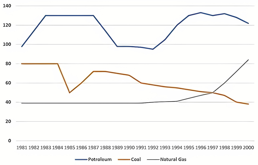
Sample 1:
The line graph illustrates the amount of petroleum, coal and natural gas manufactured in a European country between 1981 and 2000.
Looking at the graph, it is immediately obvious that the amount of petroleum production registered the highest of all three categories examined throughout the given period. It is also evident that while the amount of coal produced witnessed a downward trend, that of natural gas gradually increased.
The amount of petroleum produced in 1981 stood at nearly 100 tonnes. This figure climbed to around 130 tonnes in 1987, before witnessing a fall to approximately 90 tonnes in 1992. At the end of the given period, it went up slowly to 120 tonnes.
Regarding coal production, 80 tonnes was the amount recorded in 1981. After plummeting to 50 tonnes in 1985, this figure experienced a considerable increase of 20 tonnes in 1987, followed by a steady fall to 40 tonnes in 2000.
Natural gas was produced the least at the beginning of the period, at only 40 tonnes. This figure remained relatively unchanged by 1997 and then doubled until 2000.
Sample 2:
The given line graph shows the production levels of three main types of fuel (petroleum, coal, and natural gas) in a particular European country, from 1981 to 2000.
Overall, it can be seen that petroleum was by far the most produced type of fuel, while the amount of natural gas being produced was increasing rapidly.
In 1981, the amount of petroleum being produced was around 100 tonnes. It increased steadily over the next few years to reach around 130 tonnes before dropping back to just under100 tonnes in 1989. It then rose up again to around 130 tonnes in 1995, where it fluctuated slightly until the end of the period.
Coal was the second most produced fuel in 1981, at 80 tonnes. Coal production remained constant until it dropped suddenly down to around 50 tonnes in 1985. It rose back up to just over 70 tonnes in 1987 before slowly declining over the next 13 years to just under 40 tonnes. The production of natural gas remained unchanged at about 40 tonnes until around 1991 when it began to rise exponentially.
Sample 3:
The line graph illustrates the production output of petroleum, coal, and natural gas in the UK over a 20-year period commencing in 1981.
Overall, the UK consistently produced more petroleum compared to the other fuel types during the depicted period. While petroleum and coal production experienced fluctuations, natural gas yield witnessed a negligible increase.
Among the three kinds of fuel, the production level of petroleum consistently led the way. Its figure started at roughly 100 tonnes, rose to about 130 tonnes in the two ensuing years, stayed unchanged till 1987 before dropping back to the initial level in around 1988. After a trivial fall, the amount of petroleum generated in the UK rebounded to its peak of 130 tonnes in 1996 and then marginally descended to approximately 120 tonnes by the conclusion of the period.
In 1981, coal production in the UK was 80 tonnes, double the output of natural gas. Despite fluctuations in the initial six years, coal production decreased to slightly under 40 tonnes by the end of the period. Concurrently, natural gas production remained stable from 1981 to 1994, and then ascended to surpass coal’s figure since 1997, reaching the second rank in 2000 with over 80 tonnes produced.
Sample 4:
The graph illustrates the production levels of petroleum, coal, and natural gas in a European country from 1981 to 2000, measured in tonnes.
Overall, petroleum had the highest and most volatile production levels, coal saw a steady decline, and natural gas experienced substantial growth towards the end of the period.
From 1981 to 1985, petroleum production saw a sharp increase from 100 to 120 tonnes, plateaued for two years, then dropped to around 100 tonnes by 1990. It fluctuated significantly in the following decade, peaking at 125 tonnes in 1995 before decreasing to 110 tonnes by 2000.
Coal production started at 80 tonnes in 1981, declined to 60 tonnes by 1985, and remained relatively stable around 55-60 tonnes until 1995. However, it experienced a steady decrease afterwards, reaching approximately 45 tonnes in 2000. Natural gas production was the lowest initially at 40 tonnes in 1981, stayed constant until 1987, and then gradually increased to about 50 tonnes by 1995. After a brief dip, it surged to 100 tonnes by 2000, marking the most significant growth among the three fuels.
Sample 5:
The line chart illustrates the volume of three kinds of fuel manufactured in a European nation, between 1981 and 2000. Overall, the production of petroleum and natural gas increased over the period, whereas coal witnessed a reverse trend. Additionally, the production level of petroleum was constantly the highest.
Petroleum production began the highest at nearly 100 tonnes and surged to roughly 130 tonnes around 1984, before leveling off for about three years. Subsequently, it dropped significantly to approximately 95 tonnes by 1991, followed by a remarkable rise to peak at about 135 tonnes in 1995, prior to a decline to 120 tonnes by 2000.
As for coal, 80 tonnes of this fuel were produced each year from 1981 to 1984. After the figure plunged to around 50 tonnes in 1985, it recovered to roughly 70 tonnes in 1987. From this point, coal production declined gradually and finished at nearly 40 tonnes by the end.
Lastly, the level of natural gas produced documented a plateau at 40 tonnes over the first ten years of the surveyed period. After this, it ascended moderately and converged with coal production at approximately 50 tonnes in 1997. Finally, a sharp increase saw the production of natural gas surpass that of coal and reach slightly over 85 tonnes by 2000.
Sample 6:
The line graph details the production of three different fossil fuels in an unspecified country between 1981 and 2000.
Looking at the graph from an overall perspective, it is clear that the production of petroleum and coal followed an erratic pattern, whereas natural gas stayed at the same production level for most of the period. Among three types of fuels researched, petroleum always headed the list of production levels.
In 1981, nearly 100 tonnes of petroleum was produced, outstripping the production of coal (80 tonnes) and natural gas (40 tonnes). In 1983, the figure for petroleum grew sharply by 30 tonnes and remained at the same level for 5 years before a pullback to around 95 tonnes in 1989. It thereafter underwent a noticeable recovery, albeit slight fluctuations, to reach 120 tonnes in 2000.
At the same time, coal production plateaued until 1984, which was followed by a precipitous decline to 50 tonnes in 1985. Having jumped back to above 70 tonnes in 1987, the amount of coal produced still steadily dropped, hitting a low of less than 40 tonnes at the end of the period.
Despite staying relatively stable at 40 tonnes until 1994, the figure for natural gas surged to 85 tonnes in 2000.
Hot: 1000+ Đề thi cuối kì 2 file word cấu trúc mới 2026 Toán, Văn, Anh... lớp 1-12 (chỉ từ 60k). Tải ngay
CÂU HỎI HOT CÙNG CHỦ ĐỀ
Lời giải

Sample 1:
The bar graph illustrates the overseas students' spending on accommodation, tuition, and living expenses, while the table depicts information about the average weekly expenses by international students in four countries: A, B, C, and D.
Overall, foreign students need to spend the highest in country A and the lowest in D. In nearly every nation, the international students’ weekly average living expenses are the greatest, while their housing cost registers the lowest.
The costliest country for studying is A, with a weekly average expense of 875 dollars. This is followed by B, C, and D, which have weekly expenses of 735, 540, and 435 dollars, respectively. However, foreign students always pay the least for accommodation, which incurs on average weekly 220, 280, 240, and 200 dollars in the nations A, B, C, and D, respectively.
On the other hand, living expenditures account for the highest portion of average weekly costs for international students in countries A, B, and C, with 430, 350, and 275 dollars, correspondingly. Tuition fees in the same countries (A, B and C) come in second with the weekly averages of 358, 320, and 250 dollars in order. However, D is the only nation where education accounts for the highest average spending area, coming in at USD 235, followed by the cost of living (USD 225) and housing (USD 200).
Sample 2:
The table illustrates information regarding the weekly spendings by overseas students in four countries, A, B, C and D, while the bar graph depicts the students’ expenditure on the sectors, housing, education fees and living expenses.
Overall, the cost of studying abroad is the highest in country A and the lowest in D. Apart from country D, living costs account for the most part of the weekly spendings in all countries, while accommodation registers the least.
Regarding the total cost of studying, A is the most expensive country with weekly average 875 dollars, followed by B, C and D with 735, 540 and 435 dollars, respectively. On the other hand, the overseas students always spend the least on accommodation, which are on average weekly 220, 280, 240 and 200 dollars in the corresponding countries A, B, C and D.
Considering the living cost, it takes the largest share of foreign students’ average weekly expenses in countries A, B, and C with 430, 350 and 275 dollars, respectively, while tuition fees in the same countries hold the second place with weekly average 358, 320 and 250 dollars, sequentially. However, D is the only country where tuition fee occupies the highest expenditure with average weekly 235 dollars, followed by living cost (USD 225) and accommodation (USD 200.)
Sample 3:
The table and bar graph depict information regarding the weekly spendings by overseas students in countries A, B C and D.
Overall, there are three elements, housing, school fees and living costs that contribute to the total weekly spendings. The total expenditure in country A is the highest while it is the lowest in country D. Living costs account for the most part of the weekly spendings in all countries except D.
The total mean weekly cost for pupils to study in country A is US$875, next by country B at US$735, and then by country C at US$540, and finally by country D at US$435. The living costs are always the biggest component of the expenditure except for country D, with about US$10 less than the major spending which is the school fees.
Accommodation accounts for the least among all spendings in all countries. The most expensive housing is found in country B, at US$280, and the cheapest in country D at US$200. The middle range can be seen in country A at US$220 and country C at US$240, respectively. Costs of the tuition fee range between US$ 358 and US$235 in country A and D, in order.
Lời giải

Sample 1:
The bar chart and pie chart give information about why US residents travelled and what travel problems they experienced in the year 2009.
It is clear that the principal reason why Americans travelled in 2009 was to commute to and from work. In the same year, the primary concern of Americans, with regard to the trips they made, was the cost of travelling.
Looking more closely at the bar chart, we can see that 49% of the trips made by Americans in 2009 were for the purpose of commuting. By contrast, only 6% of trips were visits to friends or relatives, and one in ten trips were for social or recreation reasons. Shopping was cited as the reason for 16% of all travel, while unspecific ‘personal reasons’ accounted for the remaining 19%.
According to the pie chart, price was the key consideration for 36% of American travellers. Almost one in five people cited safety as their foremost travel concern, while aggressive driving and highway congestion were the main issues for 17% and 14% of the travelling public. Finally, a total of 14% of those surveyed thought that access to public transport or space for pedestrians were the most important travel issues.
Sample 2:
The bar chart compares the figures for Americans going out for five reasons and the pie chart illustrates the percentage of six problems that concerned them when travelling in 2009. Overall, it is clear that the main reason why people in the US went out in 2009 is to commute to work, and the cost of travelling is the problem concerning them the most.
Looking first at the bar graph, the proportion of Americans going out for commuting to work stood at 49%, while the figure for those leaving their house for personal reasons accounted for 19%. In addition, the rate of people in the US going out for shopping and recreation made up 16% and 10%, respectively, while visiting friends or relatives accounted for the lowest percentage, at only 6%.
Turning to the pie chart, the cost of travelling was the most concerning problem of Americans when going out, with the figure making up 36%, while the proportion of safety concerns is half of that, at 19%. In addition, 17% of US citizens were concerned about aggressive drivers, while highway congestion made 14% of them worried when leaving their house. Access to public transportation and places for people to walk accounted for the lowest percentages, at only 8% and 6%, respectively.
Sample 3:
The provided charts offer insights into the reasons for travel and the primary concerns faced by the traveling public in the United States during the year 2009. The data is presented through a bar chart illustrating travel purposes and a pie chart highlighting key issues.
Notably, the primary motivation for travel among Americans in 2009 was commuting to and from work. Simultaneously, the major concern for the traveling public during their trips revolved around the cost associated with travel.
Examining the bar chart in detail reveals that almost half of the trips made by Americans in 2009, precisely 49%, were attributed to commuting. Conversely, visits to friends or relatives accounted for a mere 6%, while social or recreational trips constituted one in ten journeys. Shopping emerged as the purpose for 16% of all travel, leaving the remaining 19% for unspecific ‘personal reasons.’
Turning attention to the pie chart, it becomes evident that cost was the primary consideration for 36% of American travelers. Safety closely followed, with nearly one in five people, or 19%, expressing it as their foremost travel concern. Aggressive driving and highway congestion were significant issues for 17% and 14% of the traveling public, respectively. Additionally, 14% of respondents identified access to public transport or space for pedestrians as the most crucial travel issues.
Sample 4:
The bar chart shows why American people chose to travel, and the pie chart shows the main issues for the travelling public in the USA, both for 2009. The trend suggests that the reason and price were the main issues for travel in the United States. It is clear that commuting from work was reported as the biggest contribution to travel, at 49%. People who went travelling for personal reasons and shopping accounted for 35% when these two groups are combined. However, interaction with friends and relatives only accounted for 25% less than the above categories. And social and recreational activities took up only 6%, which was the lowest figure by more than 43%. The travelling public’s main issues were related to price and safety, with 55% of respondents reporting these two issues. While other issues accounted for a relatively small part. Only 17% of the respondents reported issues with aggressive drivers, while highway congestion accounted for even less at 14% of the issues reported. The percentage of access to public transport and space for pedestrians was much lower than the other categories at less than 10% for both. To conclude, price and commuting time were the dominant factors relating to travel in the US in 2009.
Lời giải
Bạn cần đăng ký gói VIP ( giá chỉ từ 250K ) để làm bài, xem đáp án và lời giải chi tiết không giới hạn.
Lời giải
Bạn cần đăng ký gói VIP ( giá chỉ từ 250K ) để làm bài, xem đáp án và lời giải chi tiết không giới hạn.
Lời giải
Bạn cần đăng ký gói VIP ( giá chỉ từ 250K ) để làm bài, xem đáp án và lời giải chi tiết không giới hạn.
Lời giải
Bạn cần đăng ký gói VIP ( giá chỉ từ 250K ) để làm bài, xem đáp án và lời giải chi tiết không giới hạn.
Lời giải
Bạn cần đăng ký gói VIP ( giá chỉ từ 250K ) để làm bài, xem đáp án và lời giải chi tiết không giới hạn.