


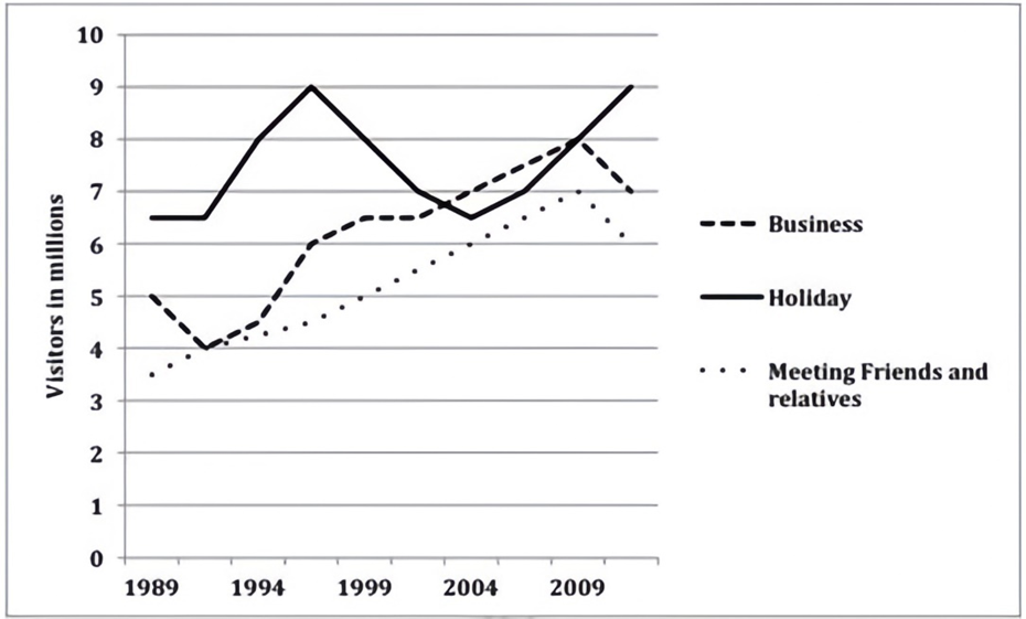
The graph below shows the number of overseas visitors who came to the UK for different purposes between 1989 and 2009.
Summarise the information by selecting and reporting the main features, and make comparisons where relevant. Write at least 150 words.
The graph below shows the number of overseas visitors who came to the UK for different purposes between 1989 and 2009.
Summarise the information by selecting and reporting the main features, and make comparisons where relevant. Write at least 150 words.
Câu hỏi trong đề: 2000 câu trắc nghiệm tổng hợp Tiếng Anh 2025 có đáp án !!
Quảng cáo
Trả lời:
Sample 1:
The given line graph illustrates the number of foreign visitors who came to the United Kingdom for business, holiday and for meeting kith and kin, from 1989 to 2009. It can be seen that tourists who came for holiday were more than those for the other given purposes for a major part of the given two decades.
About 6.5 million people travelled to the UK for holidays in 1989. This number rose rapidly and peaked at 9 million by 1997, but after that fell dramatically and reached 6.5 million in 2004. After that the number of visitors picked up again and again reached a high of 9 million in 2009.
Meanwhile, business and socializing trips to the UK showed almost similar trends, starting from 3.5 million and 5 million respectively in 1989 and then rising moderately to reach 6 – 7 million in 2009. After that a fall in the number of visitors can be seen in both these cases. Throughout the given period, more people did business than those who visited their family and friends.
Overall, an upward trend can be seen in all three reasons for visiting abroad.
Sample 2:
The provided line graph illustrates the reasons why international visitors traveled to Britain during a two-decade period starting from 1989.
In general, this nation attracted an increasing number of foreign travelers for all documented motives. Moreover, vacation trips, despite their fluctuation, consistently ranked highest.
6.5 million holidaymakers came to Britain at the start of the period, followed by a surge to 9 million in 1998 but later a six-year plunge to its starting point. After a passing plummet from the initial 5 million, the figure for work-related visits soared to 7 million in 2004 and outdid that for the previously mentioned group. Despite a consistent 3.5-million increase, the number of visitors who arrived in the UK for family and friend reunions still ranked last at 6 million at the same time.
The UK subsequently welcomed a wave of tourists, which climbed to the formerly recorded peak of 9 million, in 2009. The figures for the other categories showed clear similarities in the remaining years. They witnessed proportional rises before declines and ended at 7 million for those going on business trips and 6 million for those visiting friends and relatives.
Sample 3:
The line graph illustrates the trends in activities performed by foreign visitors for three main purposes in the UK from 1989 to 2009. Overall, there was a remarkable increase in the number of foreign travelers visiting the UK for all three purposes. It is also clear that while business remained the most popular reason for visiting, with the exception of the period between 2000 and 2007, meeting friends and relatives was the least common purpose for visitors to visit the UK.
Regarding the leading business category, in 1989, approximately 6.5 million foreigners visited the UK for business purposes, and this number increased to just under 9 million by the mid-1990s. However, the number then dropped sharply to around 6.5 million in 2003 before picking up again in subsequent years. By 2009, the number of visitors for business purposes had surged to around 8.3 million, surpassing holiday to once again become the leading purpose for foreign visitors to the UK.
Regarding the two remaining categories, in 1989 the number of foreigners who came to the UK to enjoy holidays was 5 million. After a sudden drop to 4 million people in 1992, the figure then considerably increased to around 8 million visitors in 2007 before an unexpected decline to around 7 million people after 2009. By contrast, there was a constant growth in the number of visitors who traveled to the UK to meet their friends and relatives from 3.5 million in 1989 to around 7 million travelers in 2007, before declining slightly to around 6.5 million in 2009.
Sample 4:
The given line graph provides information about why international visitors travelled to Britain over a two-decade period starting from 1989.
Overall, this country attracted a growing number of overseas travellers for all reported reasons. In addition, the data on holiday trips, though erratic, nearly always topped the chart.
6.5 million holidaymakers came to Britain at the start of the period, followed by a surge to 9 million in 1998 but later a six-year plunge to its starting point. After a passing plummet from the initial 5 million, the figure for work-related visits soared to 7 million in 2004 and outdid that for the previously mentioned group. Despite a consistent 3.5-million increase, the number of visitors who arrived in the UK for family and friend reunions still ranked last at 6 million at the same time.
The UK subsequently welcomed a wave of tourists, which climbed to the formerly recorded peak of 9 million, in 2009. The figures for the other categories showed clear similarities in the remaining years. They witnessed proportional rises before declines and ended at 7 million for those going on business trips and 6 million for those visiting friends and relatives.
Sample 5:
The line graph illustrates how many foreigners visited the UK for business, holiday and socializing purposes in a period of two decades from 1989 to 2009. Units are measured in millions.
Overall, the number of overseas people who came to the UK for all three reasons soared over the period shown although figures for business travelers were more erratic. Interestingly, this group of tourists generally dominated the chart while those visiting this country for friends and family gathering remained the least.
Business visits to the UK, the largest category of foreign visitors, were impacted by a wild fluctuation in number. In 1989, this figure was far higher than those of the others (around 6.5) despite remaining flat during the first two years. It then fluctuated wildly between this initial level and the highest point of exactly 9 for the next 18 years, running to end at its peak in 2009.
In contrast, the proportion of tourists who paid a visit to the UK for holidays and socialization underwent a surge. As for the former, even after an initial dip, in 2002 and mid 2008 it spiked to overtake business goers before declining to just over 7. Finally, the latter doubled, rising from roughly 3.5 to a peak of 7 in 2008. This figure then experienced a similar trend as the former, downing slightly to finish at well over 6.
Hot: 1000+ Đề thi cuối kì 2 file word cấu trúc mới 2026 Toán, Văn, Anh... lớp 1-12 (chỉ từ 60k). Tải ngay
CÂU HỎI HOT CÙNG CHỦ ĐỀ
Lời giải

Sample 1:
The bar graph illustrates the overseas students' spending on accommodation, tuition, and living expenses, while the table depicts information about the average weekly expenses by international students in four countries: A, B, C, and D.
Overall, foreign students need to spend the highest in country A and the lowest in D. In nearly every nation, the international students’ weekly average living expenses are the greatest, while their housing cost registers the lowest.
The costliest country for studying is A, with a weekly average expense of 875 dollars. This is followed by B, C, and D, which have weekly expenses of 735, 540, and 435 dollars, respectively. However, foreign students always pay the least for accommodation, which incurs on average weekly 220, 280, 240, and 200 dollars in the nations A, B, C, and D, respectively.
On the other hand, living expenditures account for the highest portion of average weekly costs for international students in countries A, B, and C, with 430, 350, and 275 dollars, correspondingly. Tuition fees in the same countries (A, B and C) come in second with the weekly averages of 358, 320, and 250 dollars in order. However, D is the only nation where education accounts for the highest average spending area, coming in at USD 235, followed by the cost of living (USD 225) and housing (USD 200).
Sample 2:
The table illustrates information regarding the weekly spendings by overseas students in four countries, A, B, C and D, while the bar graph depicts the students’ expenditure on the sectors, housing, education fees and living expenses.
Overall, the cost of studying abroad is the highest in country A and the lowest in D. Apart from country D, living costs account for the most part of the weekly spendings in all countries, while accommodation registers the least.
Regarding the total cost of studying, A is the most expensive country with weekly average 875 dollars, followed by B, C and D with 735, 540 and 435 dollars, respectively. On the other hand, the overseas students always spend the least on accommodation, which are on average weekly 220, 280, 240 and 200 dollars in the corresponding countries A, B, C and D.
Considering the living cost, it takes the largest share of foreign students’ average weekly expenses in countries A, B, and C with 430, 350 and 275 dollars, respectively, while tuition fees in the same countries hold the second place with weekly average 358, 320 and 250 dollars, sequentially. However, D is the only country where tuition fee occupies the highest expenditure with average weekly 235 dollars, followed by living cost (USD 225) and accommodation (USD 200.)
Sample 3:
The table and bar graph depict information regarding the weekly spendings by overseas students in countries A, B C and D.
Overall, there are three elements, housing, school fees and living costs that contribute to the total weekly spendings. The total expenditure in country A is the highest while it is the lowest in country D. Living costs account for the most part of the weekly spendings in all countries except D.
The total mean weekly cost for pupils to study in country A is US$875, next by country B at US$735, and then by country C at US$540, and finally by country D at US$435. The living costs are always the biggest component of the expenditure except for country D, with about US$10 less than the major spending which is the school fees.
Accommodation accounts for the least among all spendings in all countries. The most expensive housing is found in country B, at US$280, and the cheapest in country D at US$200. The middle range can be seen in country A at US$220 and country C at US$240, respectively. Costs of the tuition fee range between US$ 358 and US$235 in country A and D, in order.
Lời giải

Sample 1:
The bar chart and pie chart give information about why US residents travelled and what travel problems they experienced in the year 2009.
It is clear that the principal reason why Americans travelled in 2009 was to commute to and from work. In the same year, the primary concern of Americans, with regard to the trips they made, was the cost of travelling.
Looking more closely at the bar chart, we can see that 49% of the trips made by Americans in 2009 were for the purpose of commuting. By contrast, only 6% of trips were visits to friends or relatives, and one in ten trips were for social or recreation reasons. Shopping was cited as the reason for 16% of all travel, while unspecific ‘personal reasons’ accounted for the remaining 19%.
According to the pie chart, price was the key consideration for 36% of American travellers. Almost one in five people cited safety as their foremost travel concern, while aggressive driving and highway congestion were the main issues for 17% and 14% of the travelling public. Finally, a total of 14% of those surveyed thought that access to public transport or space for pedestrians were the most important travel issues.
Sample 2:
The bar chart compares the figures for Americans going out for five reasons and the pie chart illustrates the percentage of six problems that concerned them when travelling in 2009. Overall, it is clear that the main reason why people in the US went out in 2009 is to commute to work, and the cost of travelling is the problem concerning them the most.
Looking first at the bar graph, the proportion of Americans going out for commuting to work stood at 49%, while the figure for those leaving their house for personal reasons accounted for 19%. In addition, the rate of people in the US going out for shopping and recreation made up 16% and 10%, respectively, while visiting friends or relatives accounted for the lowest percentage, at only 6%.
Turning to the pie chart, the cost of travelling was the most concerning problem of Americans when going out, with the figure making up 36%, while the proportion of safety concerns is half of that, at 19%. In addition, 17% of US citizens were concerned about aggressive drivers, while highway congestion made 14% of them worried when leaving their house. Access to public transportation and places for people to walk accounted for the lowest percentages, at only 8% and 6%, respectively.
Sample 3:
The provided charts offer insights into the reasons for travel and the primary concerns faced by the traveling public in the United States during the year 2009. The data is presented through a bar chart illustrating travel purposes and a pie chart highlighting key issues.
Notably, the primary motivation for travel among Americans in 2009 was commuting to and from work. Simultaneously, the major concern for the traveling public during their trips revolved around the cost associated with travel.
Examining the bar chart in detail reveals that almost half of the trips made by Americans in 2009, precisely 49%, were attributed to commuting. Conversely, visits to friends or relatives accounted for a mere 6%, while social or recreational trips constituted one in ten journeys. Shopping emerged as the purpose for 16% of all travel, leaving the remaining 19% for unspecific ‘personal reasons.’
Turning attention to the pie chart, it becomes evident that cost was the primary consideration for 36% of American travelers. Safety closely followed, with nearly one in five people, or 19%, expressing it as their foremost travel concern. Aggressive driving and highway congestion were significant issues for 17% and 14% of the traveling public, respectively. Additionally, 14% of respondents identified access to public transport or space for pedestrians as the most crucial travel issues.
Sample 4:
The bar chart shows why American people chose to travel, and the pie chart shows the main issues for the travelling public in the USA, both for 2009. The trend suggests that the reason and price were the main issues for travel in the United States. It is clear that commuting from work was reported as the biggest contribution to travel, at 49%. People who went travelling for personal reasons and shopping accounted for 35% when these two groups are combined. However, interaction with friends and relatives only accounted for 25% less than the above categories. And social and recreational activities took up only 6%, which was the lowest figure by more than 43%. The travelling public’s main issues were related to price and safety, with 55% of respondents reporting these two issues. While other issues accounted for a relatively small part. Only 17% of the respondents reported issues with aggressive drivers, while highway congestion accounted for even less at 14% of the issues reported. The percentage of access to public transport and space for pedestrians was much lower than the other categories at less than 10% for both. To conclude, price and commuting time were the dominant factors relating to travel in the US in 2009.
Lời giải
Bạn cần đăng ký gói VIP ( giá chỉ từ 250K ) để làm bài, xem đáp án và lời giải chi tiết không giới hạn.
Lời giải
Bạn cần đăng ký gói VIP ( giá chỉ từ 250K ) để làm bài, xem đáp án và lời giải chi tiết không giới hạn.
Lời giải
Bạn cần đăng ký gói VIP ( giá chỉ từ 250K ) để làm bài, xem đáp án và lời giải chi tiết không giới hạn.
Lời giải
Bạn cần đăng ký gói VIP ( giá chỉ từ 250K ) để làm bài, xem đáp án và lời giải chi tiết không giới hạn.
Lời giải
Bạn cần đăng ký gói VIP ( giá chỉ từ 250K ) để làm bài, xem đáp án và lời giải chi tiết không giới hạn.