


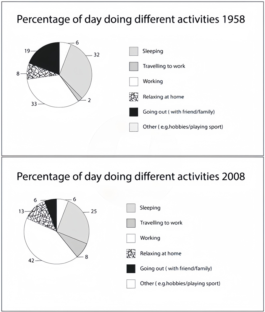
The charts below show the percentage of time working adults spent on different activities in a particular country in 1958 and 2008.
Summarise the information by selecting and reporting the main features, and make comparisons where relevant. Write at least 150 words.
The charts below show the percentage of time working adults spent on different activities in a particular country in 1958 and 2008.
Summarise the information by selecting and reporting the main features, and make comparisons where relevant. Write at least 150 words.
Câu hỏi trong đề: 2000 câu trắc nghiệm tổng hợp Tiếng Anh 2025 có đáp án !!
Quảng cáo
Trả lời:
Sample 1:
The pie charts illustrate the average percentage of an employed person’s day spent doing different activities in 1958 and 2008, in a particular country.
Overall, employed people in this particular country spent the most amount of time in a day, in both 1958 and 2008, at work. Furthermore, there was an inverse relationship between working and sleeping over the 50 years.
In 1958, working people in this country spent one-third of their day at work, followed by just under one-third of their day sleeping. Going out with friends or family took up the next largest portion of time in a day, at 19%. Meanwhile, travelling to work was the activity that took up the least percentage of time in someone’s day.
Fifty years later, the percentage of a day that people spent at work increased to 42%, while the figure for sleeping had dropped to 25%. Less time was spent going out with family and friends (6%), but more time was allocated to relaxing at home (13%). In addition, the figure for the portion of the day that people spent travelling to work quadrupled to 8% over the period.
Sample 2:
The pie charts illustrate the percentage of time adults waste during their working day on various tasks in a particular nation between 1958 and 2008.
Overall, the percentage of time spent working and sleeping was the highest in 1958. Additionally, while the time spent on every other activity increased, the percentage spent going out and sleeping declined.
According to the first chart, the percentage of time spent on working and sleeping was similarly the highest, at 33% and 32%, respectively. Going out accounted for 19%, while relaxing at home was 11% less. Furthermore, the total percentage of time spent on other activities, such as playing sports (6%) and traveling to work (2%), was equal to the percentage of time spent relaxing at home (8%).
In the second chart, the working percentage increased significantly to 40%. Meanwhile, the percentage of time spent sleeping decreased by 7%. Moreover, the percentage spent relaxing at home was 5% larger in 2008. The percentage of time spent on other activities was identical to time spent on going out with friends, at 6%. Finally, the time spent travelling to work increased to 8% in 2008.
Sample 3:
The provided pie charts outline the average time distribution of an employed individual to daily activities in a specific country during 1958 and 2008.
Overall, work and sleep constituted the most significant portions of a working adult’s time in both 1958 and 2008. While the percentages allocated for traveling to work, working and relaxing at home ascended, the time spent socializing and sleeping experienced a decline.
In 1958, approximately one-third of the day was devoted to work (33%), followed by an almost similar duration spent on sleep (32%). Going out with friends or family accounted for 19% of their daily routine. Meanwhile, commuting to work and relaxing at home occupied smaller segments, comprising only 2% and 8%, and the residual 6% was attributed to other activities such as hobbies or sports.
From that time to 2008, the proportion of time dedicated to work significantly increased to 42%. Simultaneously, the duration allocated for relaxation at home saw a notable rise, representing 13% of the day, and the time spent commuting also quadrupled to 8%. Conversely, the time distribution for sleep diminished to 25%, while socializing with family and friends also reduced to 6%. The sole category which stayed unaltered was others, at 6%.
Sample 4:
The pie charts illustrate changes in the proportion of time that working adults spent on different activities in 1958 and 2008.
It is clear that in both years, working accounted for the largest percentage of time, while the surveyed people spent the least proportion of time on commuting. Also, the figure for going out witnessed the most dramatic change.
Looking at the information in more detail, we can see that in the initial year, 33% of the time was allocated to working, closely followed by the figure for sleeping (32%). By contrast, people only spent 2% of their time on commuting. Going out took up 19% of a day, and this figure was more than twice the figure for relaxing at home. The proportion of time distributed to other activities such as hobbies and playing sports was 6%.
In the year 2008, the proportion of time people spent on working and relaxing at home saw a remarkable rise to 42% and 13% respectively. The most drastic change could be found in the time allocated for commuting, with the figure growing by 4-fold. By contrast, there was a sharp decline in the percentage of time distributed to going out and sleeping by 13% and 7%. In this year, people still spent 6% of their time on other activities.
Sample 5:
The provided charts illustrate the percentage of the day working from those who were experiencing adulthood, in terms of activities in 1958 and 50 years later.
Taken as a whole, a brief assessment of the information reveals that the working adults relied on almost all their time for work. The time dependent on working and sleeping has an inverse bond over 50 years.
To begin with, in 1958, workers spent roughly 1/3 of their days at work and less than 1/3 of their days sleeping. After that, outdoor activities with friends and family accounted for 19%. Additionally, spending time reaching the workplace had the lowest percentage of traveling to work at 2%.
Besides, in 2008, the statistics of working days witnessed a significant increase. This figure rose to 42%, and the sleeping days, in contrast, declined to 25%. Furthermore, the percentage of commuting days experienced had increased four times to 8%.
Hot: 1000+ Đề thi cuối kì 2 file word cấu trúc mới 2026 Toán, Văn, Anh... lớp 1-12 (chỉ từ 60k). Tải ngay
CÂU HỎI HOT CÙNG CHỦ ĐỀ
Lời giải

Sample 1:
The bar graph illustrates the overseas students' spending on accommodation, tuition, and living expenses, while the table depicts information about the average weekly expenses by international students in four countries: A, B, C, and D.
Overall, foreign students need to spend the highest in country A and the lowest in D. In nearly every nation, the international students’ weekly average living expenses are the greatest, while their housing cost registers the lowest.
The costliest country for studying is A, with a weekly average expense of 875 dollars. This is followed by B, C, and D, which have weekly expenses of 735, 540, and 435 dollars, respectively. However, foreign students always pay the least for accommodation, which incurs on average weekly 220, 280, 240, and 200 dollars in the nations A, B, C, and D, respectively.
On the other hand, living expenditures account for the highest portion of average weekly costs for international students in countries A, B, and C, with 430, 350, and 275 dollars, correspondingly. Tuition fees in the same countries (A, B and C) come in second with the weekly averages of 358, 320, and 250 dollars in order. However, D is the only nation where education accounts for the highest average spending area, coming in at USD 235, followed by the cost of living (USD 225) and housing (USD 200).
Sample 2:
The table illustrates information regarding the weekly spendings by overseas students in four countries, A, B, C and D, while the bar graph depicts the students’ expenditure on the sectors, housing, education fees and living expenses.
Overall, the cost of studying abroad is the highest in country A and the lowest in D. Apart from country D, living costs account for the most part of the weekly spendings in all countries, while accommodation registers the least.
Regarding the total cost of studying, A is the most expensive country with weekly average 875 dollars, followed by B, C and D with 735, 540 and 435 dollars, respectively. On the other hand, the overseas students always spend the least on accommodation, which are on average weekly 220, 280, 240 and 200 dollars in the corresponding countries A, B, C and D.
Considering the living cost, it takes the largest share of foreign students’ average weekly expenses in countries A, B, and C with 430, 350 and 275 dollars, respectively, while tuition fees in the same countries hold the second place with weekly average 358, 320 and 250 dollars, sequentially. However, D is the only country where tuition fee occupies the highest expenditure with average weekly 235 dollars, followed by living cost (USD 225) and accommodation (USD 200.)
Sample 3:
The table and bar graph depict information regarding the weekly spendings by overseas students in countries A, B C and D.
Overall, there are three elements, housing, school fees and living costs that contribute to the total weekly spendings. The total expenditure in country A is the highest while it is the lowest in country D. Living costs account for the most part of the weekly spendings in all countries except D.
The total mean weekly cost for pupils to study in country A is US$875, next by country B at US$735, and then by country C at US$540, and finally by country D at US$435. The living costs are always the biggest component of the expenditure except for country D, with about US$10 less than the major spending which is the school fees.
Accommodation accounts for the least among all spendings in all countries. The most expensive housing is found in country B, at US$280, and the cheapest in country D at US$200. The middle range can be seen in country A at US$220 and country C at US$240, respectively. Costs of the tuition fee range between US$ 358 and US$235 in country A and D, in order.
Lời giải

Sample 1:
The bar chart and pie chart give information about why US residents travelled and what travel problems they experienced in the year 2009.
It is clear that the principal reason why Americans travelled in 2009 was to commute to and from work. In the same year, the primary concern of Americans, with regard to the trips they made, was the cost of travelling.
Looking more closely at the bar chart, we can see that 49% of the trips made by Americans in 2009 were for the purpose of commuting. By contrast, only 6% of trips were visits to friends or relatives, and one in ten trips were for social or recreation reasons. Shopping was cited as the reason for 16% of all travel, while unspecific ‘personal reasons’ accounted for the remaining 19%.
According to the pie chart, price was the key consideration for 36% of American travellers. Almost one in five people cited safety as their foremost travel concern, while aggressive driving and highway congestion were the main issues for 17% and 14% of the travelling public. Finally, a total of 14% of those surveyed thought that access to public transport or space for pedestrians were the most important travel issues.
Sample 2:
The bar chart compares the figures for Americans going out for five reasons and the pie chart illustrates the percentage of six problems that concerned them when travelling in 2009. Overall, it is clear that the main reason why people in the US went out in 2009 is to commute to work, and the cost of travelling is the problem concerning them the most.
Looking first at the bar graph, the proportion of Americans going out for commuting to work stood at 49%, while the figure for those leaving their house for personal reasons accounted for 19%. In addition, the rate of people in the US going out for shopping and recreation made up 16% and 10%, respectively, while visiting friends or relatives accounted for the lowest percentage, at only 6%.
Turning to the pie chart, the cost of travelling was the most concerning problem of Americans when going out, with the figure making up 36%, while the proportion of safety concerns is half of that, at 19%. In addition, 17% of US citizens were concerned about aggressive drivers, while highway congestion made 14% of them worried when leaving their house. Access to public transportation and places for people to walk accounted for the lowest percentages, at only 8% and 6%, respectively.
Sample 3:
The provided charts offer insights into the reasons for travel and the primary concerns faced by the traveling public in the United States during the year 2009. The data is presented through a bar chart illustrating travel purposes and a pie chart highlighting key issues.
Notably, the primary motivation for travel among Americans in 2009 was commuting to and from work. Simultaneously, the major concern for the traveling public during their trips revolved around the cost associated with travel.
Examining the bar chart in detail reveals that almost half of the trips made by Americans in 2009, precisely 49%, were attributed to commuting. Conversely, visits to friends or relatives accounted for a mere 6%, while social or recreational trips constituted one in ten journeys. Shopping emerged as the purpose for 16% of all travel, leaving the remaining 19% for unspecific ‘personal reasons.’
Turning attention to the pie chart, it becomes evident that cost was the primary consideration for 36% of American travelers. Safety closely followed, with nearly one in five people, or 19%, expressing it as their foremost travel concern. Aggressive driving and highway congestion were significant issues for 17% and 14% of the traveling public, respectively. Additionally, 14% of respondents identified access to public transport or space for pedestrians as the most crucial travel issues.
Sample 4:
The bar chart shows why American people chose to travel, and the pie chart shows the main issues for the travelling public in the USA, both for 2009. The trend suggests that the reason and price were the main issues for travel in the United States. It is clear that commuting from work was reported as the biggest contribution to travel, at 49%. People who went travelling for personal reasons and shopping accounted for 35% when these two groups are combined. However, interaction with friends and relatives only accounted for 25% less than the above categories. And social and recreational activities took up only 6%, which was the lowest figure by more than 43%. The travelling public’s main issues were related to price and safety, with 55% of respondents reporting these two issues. While other issues accounted for a relatively small part. Only 17% of the respondents reported issues with aggressive drivers, while highway congestion accounted for even less at 14% of the issues reported. The percentage of access to public transport and space for pedestrians was much lower than the other categories at less than 10% for both. To conclude, price and commuting time were the dominant factors relating to travel in the US in 2009.
Lời giải
Bạn cần đăng ký gói VIP ( giá chỉ từ 250K ) để làm bài, xem đáp án và lời giải chi tiết không giới hạn.
Lời giải
Bạn cần đăng ký gói VIP ( giá chỉ từ 250K ) để làm bài, xem đáp án và lời giải chi tiết không giới hạn.
Lời giải
Bạn cần đăng ký gói VIP ( giá chỉ từ 250K ) để làm bài, xem đáp án và lời giải chi tiết không giới hạn.
Lời giải
Bạn cần đăng ký gói VIP ( giá chỉ từ 250K ) để làm bài, xem đáp án và lời giải chi tiết không giới hạn.
Lời giải
Bạn cần đăng ký gói VIP ( giá chỉ từ 250K ) để làm bài, xem đáp án và lời giải chi tiết không giới hạn.