


The charts below show the percentage of workers in three sectors across four countries in 1980 and 2010.
Summarise the information by selecting and reporting the main features, and make comparisons where relevant. Write at least 150 words.
The charts below show the percentage of workers in three sectors across four countries in 1980 and 2010.
Summarise the information by selecting and reporting the main features, and make comparisons where relevant. Write at least 150 words.
Câu hỏi trong đề: 2000 câu trắc nghiệm tổng hợp Tiếng Anh 2025 có đáp án !!
Quảng cáo
Trả lời:
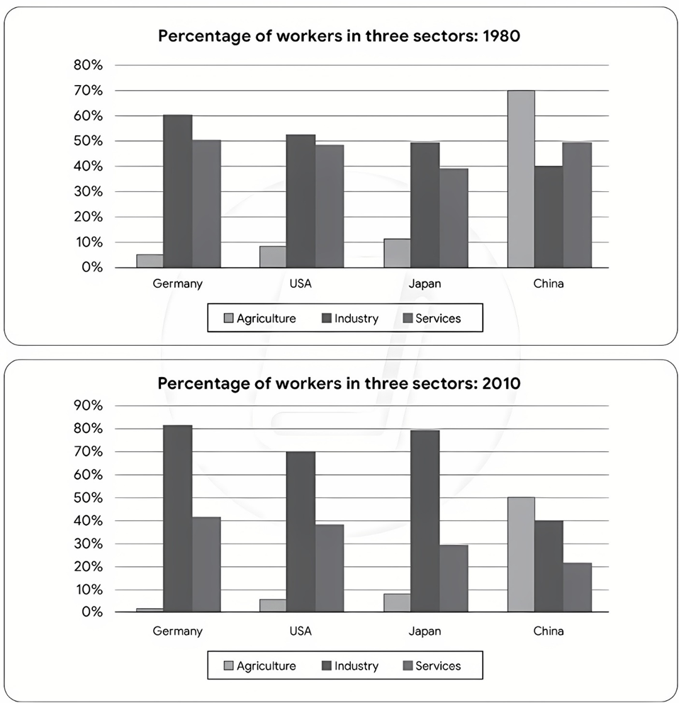
Sample 1:
The bar charts illustrate the distribution of the labour force in four different countries across agricultural, industrial, and service industries in two separate years.
Overall, Germany, the USA, and Japan had very similar workforce distribution trends, compared with China. In addition, the industrial sector accounted for the highest proportion of jobs in all countries besides China, in both years.
In 1980, 60% of the German workforce were employed in the industrial sector, compared to around 50% in Japan and the USA, and 40% in China. Meanwhile, approximately half of the German, US, and Chinese workforce worked in service industries, followed by Japan, with a figure of nearly 40%. Agricultural jobs, on the other hand, dominated the Chinese labour market, accounting for 70% of the workforce, while figures for the other three countries ranged between 5 and 10%.
By 2010, the German and Japanese industrial sectors had witnessed increases, making up 80% of their workforces, which was about 10% more than the figure for the USA, and double that of China. In contrast, a downward trend could be seen in the percentage of the workforce in the service industry, with Germany and the USA sitting at 40%, and Japan and China at 30% and 20% respectively. Jobs in the agricultural sector also saw a significant decline in all countries, with China dropping to 50%, and Germany declining to almost 1%.
Sample 2:
The bar charts depict the proportion of individuals employed in three different sectors across four countries in two years, 1980 and 2010.
Overall, there was a decline in the percentage of employment in agriculture and services, while industry in all countries generally experienced an upward trend except for China. In both years, agriculture held the highest percentage of employment in China, while industry dominated in the other nations.
In 1980, the workforce distribution in Germany showed that 60% of individuals were employed in industry, with services and agriculture accounting for 50% and 5% respectively. Similarly, the USA and India had comparable distribution patterns, with roughly half of the workforce employed in industry and a small minority in agriculture. Conversely, China had a predominant agricultural workforce, at 70%, surpassing services and industry by 20% and 30% respectively.
Thirty years later, there was a notable increase in industry in Germany, the US, and Japan, ranging from 70% to 80%, while China's industry sector remained relatively stable at 40%. There was a significant decrease of 30% in services in China, compared to a less significant drop of approximately 10% in the other countries. This trend also applied to agriculture, with China experiencing a decline of 20%, while the figures for the other three countries remained negligible, accounting for less than 10%.
Sample 3:
The bar charts illustrate the employment distribution across sectors in four nations between 1980 and 2010.
Overall, there was a downturn in agricultural and service employment, while industrial employment generally surged across all countries except China. In China, agriculture maintained the highest employment share in both years, while industry dominated in the other countries.
In 1980, Germany exhibited a predominant industrial workforce at 60%, with services and agriculture at 50% and 5% respectively. Similarly, the USA and India had comparable patterns, with roughly half in industry and nearly another half in services and a small minority in agriculture. In contrast, China’s workforce was primarily agricultural, at 70%, exceeding services and industry by 20% and 30% respectively.
By 2010, there was a surge in industrial employment in Germany, the US, and Japan, reaching 70% to 80%, while China’s industrial sector remained stable at 40%. China experienced a notable 30% decline in services, compared to around 10% in the other countries. Agricultural employment in China also dropped by 20%, contrasting with negligible changes in the other nations, each accounting for less than 10%.
Sample 4:
The bar charts illustrate the percentage of workers in three sectors - agriculture, industry, and services - across four countries (Germany, USA, Japan, and China) in 1980 and 2010.
Overall, the period saw a shift towards services, with agriculture and industry declining across all four countries.
In 1980, agriculture had the highest workforce in China, accounting for around 70%, while the USA, Japan, and Germany had significantly lower percentages at about 3%, 4%, and 6% respectively. Industry was prominent in Germany with 40%, followed by Japan and the USA with roughly 30%. Services dominated the USA at 50%, and were also significant in Japan and Germany, with 45% and 40% respectively.
By 2010, the workforce distribution changed notably. In China, agriculture's share fell to about 35%, while services rose to 45%. Germany saw a rise in services to 70%, with industry dropping to 25% and agriculture remaining low. Similarly, the services sector in the USA and Japan increased to approximately 70% and 60%, respectively, with declines in agriculture and industry in both countries.
Sample 5:
The bar charts depict the proportion of workers employed in agriculture, industry, and services in Germany, the USA, Japan, and China in 1980 and 2010.
Overall, industry and services were the primary sectors attracting workers in most countries, except for China, where agriculture employed the largest workforce. While the proportion of agricultural workers decreased in all four countries between 1980 and 2010, the number of workers in the industrial sector increased in all countries excluding China.
In 1980, Germany had over 50% of its workforce engaged in industry, with services closely following at 50%. By 2010, the industrial sector in Germany continued to grow, reaching 80%, an increase of 20% from the initial data. A similar pattern was observed in the USA, where industry and services remained dominant, with minimal representation in agriculture.
Japan, in 1980, had half of its workforce in the industrial sector, which increased to nearly 80% by 2010. The percentage of individuals in services decreased from 40% to around 30%, while agriculture had a negligible presence. China stood out as the only country where agriculture accounted for the majority of its workforce at 70% in 1980. Over the next three decades, the proportion of Chinese individuals in industry remained stable, while agriculture and services experienced significant declines to 50% and 20%, respectively.
Sample 6:
The bar charts give information about the proportion of individuals who got a job in three different sectors across four countries in two separate years, namely 1980 and 2010.
Overall, declining trends were seen in the percentage of workers in agriculture and services, while industry in all countries generally experienced rising trends, with the exception of China. It is also noticeable that in both years, agriculture accounted for the highest proportion of employment in China, while industry dominated in the other nations.
In 1980, 60% of the workforce in Germany was made up of industrial workers, while the figures for services were marginally lower, at 50%, and only 5% worked in the agricultural sector. Similar distribution patterns can be seen in the USA and India, where roughly half of the workforce were employed in industry and agricultural workers made up a small proportion. By contrast, China was the leading country in terms of employees holding agricultural jobs, at a striking 70%, in contrast to slightly under 50% and 40% for services and industry respectively.
Over the following 30 years, there was a marked increase in the percentage of people working in the industrial field in Germany, the US, and Japan, with figures ranging from 70% to 80%, while China’s industry sector remained relatively constant at 40%. The most significant decrease of 30% in services was recorded in China, whereas the corresponding figures for the remaining countries dropped by a lesser amount (around 10%). Finally, the agricultural sector experienced a similar pattern to that of services, with China again experiencing the most noticeable decline of 20%, while the figures for the other three countries remained relatively low, making up less than 10%.
Sample 7:
The bar charts give information about the proportion of individuals who got a job in three different sectors across four countries in two separate years, namely 1980 and 2010.
Overall, there were decreasing trends in the proportion of workers in agriculture and services, while industry generally saw an upward trend across all countries except China. It is noteworthy that agriculture constituted the largest share of employment in China in both years, whereas industry dominated in other nations.
In 1980, Germany had 60% of its workforce in industry, slightly lower figures for services at 50%, and only 5% in agriculture. Similar distribution patterns were observed in the USA and India, where around half of the workforce was in industry, and agriculture had a smaller share. In contrast, China stood out with 70% of its workforce in agriculture, compared to just under 50% in services and 40% in industry.
Over the next three decades, there was a significant rise in the proportion of industrial workers in Germany, the US, and Japan, ranging from 70% to 80%, while China's industrial sector remained relatively stable at 40%. China also saw the most substantial decrease of 30% in the services sector, whereas the other countries experienced smaller declines (around 10%). The agricultural sector followed a similar pattern to services, with China again showing the largest decline of 20%, while the other countries remained below 10%.
Hot: 1000+ Đề thi cuối kì 2 file word cấu trúc mới 2026 Toán, Văn, Anh... lớp 1-12 (chỉ từ 60k). Tải ngay
CÂU HỎI HOT CÙNG CHỦ ĐỀ
Lời giải

Sample 1:
The bar graph illustrates the overseas students' spending on accommodation, tuition, and living expenses, while the table depicts information about the average weekly expenses by international students in four countries: A, B, C, and D.
Overall, foreign students need to spend the highest in country A and the lowest in D. In nearly every nation, the international students’ weekly average living expenses are the greatest, while their housing cost registers the lowest.
The costliest country for studying is A, with a weekly average expense of 875 dollars. This is followed by B, C, and D, which have weekly expenses of 735, 540, and 435 dollars, respectively. However, foreign students always pay the least for accommodation, which incurs on average weekly 220, 280, 240, and 200 dollars in the nations A, B, C, and D, respectively.
On the other hand, living expenditures account for the highest portion of average weekly costs for international students in countries A, B, and C, with 430, 350, and 275 dollars, correspondingly. Tuition fees in the same countries (A, B and C) come in second with the weekly averages of 358, 320, and 250 dollars in order. However, D is the only nation where education accounts for the highest average spending area, coming in at USD 235, followed by the cost of living (USD 225) and housing (USD 200).
Sample 2:
The table illustrates information regarding the weekly spendings by overseas students in four countries, A, B, C and D, while the bar graph depicts the students’ expenditure on the sectors, housing, education fees and living expenses.
Overall, the cost of studying abroad is the highest in country A and the lowest in D. Apart from country D, living costs account for the most part of the weekly spendings in all countries, while accommodation registers the least.
Regarding the total cost of studying, A is the most expensive country with weekly average 875 dollars, followed by B, C and D with 735, 540 and 435 dollars, respectively. On the other hand, the overseas students always spend the least on accommodation, which are on average weekly 220, 280, 240 and 200 dollars in the corresponding countries A, B, C and D.
Considering the living cost, it takes the largest share of foreign students’ average weekly expenses in countries A, B, and C with 430, 350 and 275 dollars, respectively, while tuition fees in the same countries hold the second place with weekly average 358, 320 and 250 dollars, sequentially. However, D is the only country where tuition fee occupies the highest expenditure with average weekly 235 dollars, followed by living cost (USD 225) and accommodation (USD 200.)
Sample 3:
The table and bar graph depict information regarding the weekly spendings by overseas students in countries A, B C and D.
Overall, there are three elements, housing, school fees and living costs that contribute to the total weekly spendings. The total expenditure in country A is the highest while it is the lowest in country D. Living costs account for the most part of the weekly spendings in all countries except D.
The total mean weekly cost for pupils to study in country A is US$875, next by country B at US$735, and then by country C at US$540, and finally by country D at US$435. The living costs are always the biggest component of the expenditure except for country D, with about US$10 less than the major spending which is the school fees.
Accommodation accounts for the least among all spendings in all countries. The most expensive housing is found in country B, at US$280, and the cheapest in country D at US$200. The middle range can be seen in country A at US$220 and country C at US$240, respectively. Costs of the tuition fee range between US$ 358 and US$235 in country A and D, in order.
Lời giải

Sample 1:
The bar chart and pie chart give information about why US residents travelled and what travel problems they experienced in the year 2009.
It is clear that the principal reason why Americans travelled in 2009 was to commute to and from work. In the same year, the primary concern of Americans, with regard to the trips they made, was the cost of travelling.
Looking more closely at the bar chart, we can see that 49% of the trips made by Americans in 2009 were for the purpose of commuting. By contrast, only 6% of trips were visits to friends or relatives, and one in ten trips were for social or recreation reasons. Shopping was cited as the reason for 16% of all travel, while unspecific ‘personal reasons’ accounted for the remaining 19%.
According to the pie chart, price was the key consideration for 36% of American travellers. Almost one in five people cited safety as their foremost travel concern, while aggressive driving and highway congestion were the main issues for 17% and 14% of the travelling public. Finally, a total of 14% of those surveyed thought that access to public transport or space for pedestrians were the most important travel issues.
Sample 2:
The bar chart compares the figures for Americans going out for five reasons and the pie chart illustrates the percentage of six problems that concerned them when travelling in 2009. Overall, it is clear that the main reason why people in the US went out in 2009 is to commute to work, and the cost of travelling is the problem concerning them the most.
Looking first at the bar graph, the proportion of Americans going out for commuting to work stood at 49%, while the figure for those leaving their house for personal reasons accounted for 19%. In addition, the rate of people in the US going out for shopping and recreation made up 16% and 10%, respectively, while visiting friends or relatives accounted for the lowest percentage, at only 6%.
Turning to the pie chart, the cost of travelling was the most concerning problem of Americans when going out, with the figure making up 36%, while the proportion of safety concerns is half of that, at 19%. In addition, 17% of US citizens were concerned about aggressive drivers, while highway congestion made 14% of them worried when leaving their house. Access to public transportation and places for people to walk accounted for the lowest percentages, at only 8% and 6%, respectively.
Sample 3:
The provided charts offer insights into the reasons for travel and the primary concerns faced by the traveling public in the United States during the year 2009. The data is presented through a bar chart illustrating travel purposes and a pie chart highlighting key issues.
Notably, the primary motivation for travel among Americans in 2009 was commuting to and from work. Simultaneously, the major concern for the traveling public during their trips revolved around the cost associated with travel.
Examining the bar chart in detail reveals that almost half of the trips made by Americans in 2009, precisely 49%, were attributed to commuting. Conversely, visits to friends or relatives accounted for a mere 6%, while social or recreational trips constituted one in ten journeys. Shopping emerged as the purpose for 16% of all travel, leaving the remaining 19% for unspecific ‘personal reasons.’
Turning attention to the pie chart, it becomes evident that cost was the primary consideration for 36% of American travelers. Safety closely followed, with nearly one in five people, or 19%, expressing it as their foremost travel concern. Aggressive driving and highway congestion were significant issues for 17% and 14% of the traveling public, respectively. Additionally, 14% of respondents identified access to public transport or space for pedestrians as the most crucial travel issues.
Sample 4:
The bar chart shows why American people chose to travel, and the pie chart shows the main issues for the travelling public in the USA, both for 2009. The trend suggests that the reason and price were the main issues for travel in the United States. It is clear that commuting from work was reported as the biggest contribution to travel, at 49%. People who went travelling for personal reasons and shopping accounted for 35% when these two groups are combined. However, interaction with friends and relatives only accounted for 25% less than the above categories. And social and recreational activities took up only 6%, which was the lowest figure by more than 43%. The travelling public’s main issues were related to price and safety, with 55% of respondents reporting these two issues. While other issues accounted for a relatively small part. Only 17% of the respondents reported issues with aggressive drivers, while highway congestion accounted for even less at 14% of the issues reported. The percentage of access to public transport and space for pedestrians was much lower than the other categories at less than 10% for both. To conclude, price and commuting time were the dominant factors relating to travel in the US in 2009.
Lời giải
Bạn cần đăng ký gói VIP ( giá chỉ từ 250K ) để làm bài, xem đáp án và lời giải chi tiết không giới hạn.
Lời giải
Bạn cần đăng ký gói VIP ( giá chỉ từ 250K ) để làm bài, xem đáp án và lời giải chi tiết không giới hạn.
Lời giải
Bạn cần đăng ký gói VIP ( giá chỉ từ 250K ) để làm bài, xem đáp án và lời giải chi tiết không giới hạn.
Lời giải
Bạn cần đăng ký gói VIP ( giá chỉ từ 250K ) để làm bài, xem đáp án và lời giải chi tiết không giới hạn.
Lời giải
Bạn cần đăng ký gói VIP ( giá chỉ từ 250K ) để làm bài, xem đáp án và lời giải chi tiết không giới hạn.