


The chart below shows the percentage of people born in and outside of Australia living in cities, towns, and rural areas in 1950 and 2010.
Summarise the information by selecting and reporting the main features, and make comparisons where relevant. Write at least 150 words.
The chart below shows the percentage of people born in and outside of Australia living in cities, towns, and rural areas in 1950 and 2010.
Summarise the information by selecting and reporting the main features, and make comparisons where relevant. Write at least 150 words.
Câu hỏi trong đề: 2000 câu trắc nghiệm tổng hợp Tiếng Anh 2025 có đáp án !!
Quảng cáo
Trả lời:
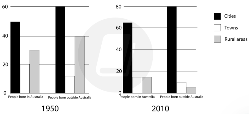
Sample 1:
The chart gives information about the percentage of people living in cities, towns, and rural areas in Australia in 1950 and 2010, in terms of those born in Australia and those born elsewhere.
Overall, it is clear that living in a city was far more common for both groups of people in both 1950 and 2010. Furthermore, the percentage of both groups of people living in cities increased over the period.
In 1950, around 50% of people born in Australia lived in a city. Meanwhile, 20% of people born in Australia lived in a town, compared with around 30% living in rural areas. By 2010, the number of those living in cities had increased to approximately 65%, while the percentage of those living in towns and rural areas dropped to a little over 15% each.
On the other hand, the percentage of people born outside of Australia that lived in cities was around 60% in 1950, and 80% in 2010. Notably, a significant portion of those who weren’t born in Australia lived in rural areas in 1950 (40%); however, this figure dropped substantially in 2010 to around 5%.
Sample 2:
The graph depicts the proportion of Australians living in cities, towns, and rural regions between 1950 and 2010 based on whether they were born in Australia or overseas.
Overall, it is evident that city life was far more prevalent for both categories in both 1950 and 2010. Moreover, the proportion of both populations residing in urban areas rose over time.
In 1950, over fifty percent of Australians were born in cities. Around 30% of those born in Australia resided in rural regions, whereas 20% lived in cities. In 2010, roughly 65% of the population resided in cities, while the percentages of people residing in towns and rural regions fell to around 15% each.
In contrast, over 60% of those born outside of Australia resided in cities in 1950, compared to 80% in 2010. Interestingly, a large proportion of non-Australians (40% in 1950) resided in rural regions; nevertheless, this percentage declined significantly to 5% in 2010.
Sample 3:
The given bar chart depicts the living area of Australian and non-Australian from 1995 to 2010. Overall, there was significant shift towards urban living amonth both groups, as opposed to a dramatic decline in rural populations, with those living metropolitans dominating the chart in both years.
Regarding 1995 residential preferences, nearly half of the Australian-born citizens lived in cities, which was approximately 15% lower than the figure for their foreign counterparts. Rural areas ranked second in both charts, with 30% and 40% of local and overseas inhabitants, respectively. Only about 10% of the non-Australian nationals preferred to stay within urban areas, while the corresponding figure for native Australians was double the former in the same year.
In terms of 2010 tendency, both local and foreign inhabitants living in cities remain dominante in the chart, after substaintial rises to around 66% of native Australians and 80% of their foreign counterparts. In contrast, the rural population underwent the most dramatic drops in 2010 when rural regions became the least popular, at about 17% of native Australians and 5% of foreign residents. A less remarkable decline was seen in the percentage of Australian and non-Australian citizens opting for towns, to below 20% in 2010, at about 17% and 10% in order.
Sample 4:
The graph delineates the distribution of Australians in cities, towns, and rural areas from 1950 to 2010 based on their birthplaces, whether in Australia or overseas.
Overall, city dwelling emerged as the dominant trend for both native-born and overseas-born Australians in 1950 and 2010. Furthermore, there was a surge in the urban population over the years while the percentage of living in town and rural areas decreased.
In 1950, cities hosted more than half of the Australian-born population, compared to nearly 30% residing in rural areas and about 20% in towns. By 2010, the urban population had increased substantially to approximately 65%, while the proportions in towns and rural regions dropped to nearly 15% each.
60% of non-Australians resided in cities in 1950, which surged to 80% by 2010. Notably, a significant percentage of foreign-born Australian nationals (40% in 1950) lived in rural areas, yet this declined remarkably to a mere 5% by 2010. Living in towns was the least preferred option of people born outside Australia in 1950, amounting to just over 10%, which stayed unchanged in 2010 but became the second favorite living site before rural areas.
Sample 5:
The bar charts illustrate the percentage of Australia-born and foreign-born people who reside in cities, towns, and rural areas in Australia from 1995 to 2010.
Overall, the percentages of people living in cities both in and outside Australia were highest and moderately increased over the years. Meanwhile, the percentages of residents in towns and rural areas both in and outside Australia significantly decreased.
Regarding the Australia-born population, the figure for city dwellers in Australia was 50% in 1995, compared to 20% of people living in towns and 30% of those residing in rural areas. 15 years later, while the percentage of urbanites rose by 10%, the figures for town and rural residents experienced declines of 3% and 13%, respectively, to both end at 17%.
Moving on to the foreign-born populations in Australia, 60% of people dwelled in cities, followed by 40% of town residents and 10% of people inhabiting rural areas in 1995. In 2010, the figure for city dwellers grew to 80%, while the percentages of people settling down in towns and rural areas dropped to 10% and 8%, respectively.
Sample 6:
The provided charts illustrate the proportion of individuals living in cities, towns, and rural areas in Australia in 1950 and 2010, in terms of those born in Australia and those born everywhere.
Taken as a whole, a brief assessment of the information reveals that living in a city was far more common for both groups of people in both 1950 and 2010.
To begin with, the statistics of citizens in 1950 who were born in Australia accounted for roughly 50% and experienced substantial growth of approximately 65% after exactly 60 years in cities. Meanwhile, the figures for people born in Australia witness a downward trend, from 20% in 1950 to approximately 17% in 2010. Furthermore, there was a substantial decline in the ratio of rural areas in Australia, which dropped moderately from roughly 30% to around 17% during the period from 1950 to 2010.
For the rest of the chart, the rate of living outside Australia peaked between 60% and 80% in 1950 and 2010. There were also two downward trends in towns and rural areas, from around 15% to approximately 13% and exactly 40%, which decreased sharply by 5% in 1950 and 2010.
Hot: 1000+ Đề thi cuối kì 2 file word cấu trúc mới 2026 Toán, Văn, Anh... lớp 1-12 (chỉ từ 60k). Tải ngay
CÂU HỎI HOT CÙNG CHỦ ĐỀ
Lời giải

Sample 1:
The bar graph illustrates the overseas students' spending on accommodation, tuition, and living expenses, while the table depicts information about the average weekly expenses by international students in four countries: A, B, C, and D.
Overall, foreign students need to spend the highest in country A and the lowest in D. In nearly every nation, the international students’ weekly average living expenses are the greatest, while their housing cost registers the lowest.
The costliest country for studying is A, with a weekly average expense of 875 dollars. This is followed by B, C, and D, which have weekly expenses of 735, 540, and 435 dollars, respectively. However, foreign students always pay the least for accommodation, which incurs on average weekly 220, 280, 240, and 200 dollars in the nations A, B, C, and D, respectively.
On the other hand, living expenditures account for the highest portion of average weekly costs for international students in countries A, B, and C, with 430, 350, and 275 dollars, correspondingly. Tuition fees in the same countries (A, B and C) come in second with the weekly averages of 358, 320, and 250 dollars in order. However, D is the only nation where education accounts for the highest average spending area, coming in at USD 235, followed by the cost of living (USD 225) and housing (USD 200).
Sample 2:
The table illustrates information regarding the weekly spendings by overseas students in four countries, A, B, C and D, while the bar graph depicts the students’ expenditure on the sectors, housing, education fees and living expenses.
Overall, the cost of studying abroad is the highest in country A and the lowest in D. Apart from country D, living costs account for the most part of the weekly spendings in all countries, while accommodation registers the least.
Regarding the total cost of studying, A is the most expensive country with weekly average 875 dollars, followed by B, C and D with 735, 540 and 435 dollars, respectively. On the other hand, the overseas students always spend the least on accommodation, which are on average weekly 220, 280, 240 and 200 dollars in the corresponding countries A, B, C and D.
Considering the living cost, it takes the largest share of foreign students’ average weekly expenses in countries A, B, and C with 430, 350 and 275 dollars, respectively, while tuition fees in the same countries hold the second place with weekly average 358, 320 and 250 dollars, sequentially. However, D is the only country where tuition fee occupies the highest expenditure with average weekly 235 dollars, followed by living cost (USD 225) and accommodation (USD 200.)
Sample 3:
The table and bar graph depict information regarding the weekly spendings by overseas students in countries A, B C and D.
Overall, there are three elements, housing, school fees and living costs that contribute to the total weekly spendings. The total expenditure in country A is the highest while it is the lowest in country D. Living costs account for the most part of the weekly spendings in all countries except D.
The total mean weekly cost for pupils to study in country A is US$875, next by country B at US$735, and then by country C at US$540, and finally by country D at US$435. The living costs are always the biggest component of the expenditure except for country D, with about US$10 less than the major spending which is the school fees.
Accommodation accounts for the least among all spendings in all countries. The most expensive housing is found in country B, at US$280, and the cheapest in country D at US$200. The middle range can be seen in country A at US$220 and country C at US$240, respectively. Costs of the tuition fee range between US$ 358 and US$235 in country A and D, in order.
Lời giải

Sample 1:
The bar chart and pie chart give information about why US residents travelled and what travel problems they experienced in the year 2009.
It is clear that the principal reason why Americans travelled in 2009 was to commute to and from work. In the same year, the primary concern of Americans, with regard to the trips they made, was the cost of travelling.
Looking more closely at the bar chart, we can see that 49% of the trips made by Americans in 2009 were for the purpose of commuting. By contrast, only 6% of trips were visits to friends or relatives, and one in ten trips were for social or recreation reasons. Shopping was cited as the reason for 16% of all travel, while unspecific ‘personal reasons’ accounted for the remaining 19%.
According to the pie chart, price was the key consideration for 36% of American travellers. Almost one in five people cited safety as their foremost travel concern, while aggressive driving and highway congestion were the main issues for 17% and 14% of the travelling public. Finally, a total of 14% of those surveyed thought that access to public transport or space for pedestrians were the most important travel issues.
Sample 2:
The bar chart compares the figures for Americans going out for five reasons and the pie chart illustrates the percentage of six problems that concerned them when travelling in 2009. Overall, it is clear that the main reason why people in the US went out in 2009 is to commute to work, and the cost of travelling is the problem concerning them the most.
Looking first at the bar graph, the proportion of Americans going out for commuting to work stood at 49%, while the figure for those leaving their house for personal reasons accounted for 19%. In addition, the rate of people in the US going out for shopping and recreation made up 16% and 10%, respectively, while visiting friends or relatives accounted for the lowest percentage, at only 6%.
Turning to the pie chart, the cost of travelling was the most concerning problem of Americans when going out, with the figure making up 36%, while the proportion of safety concerns is half of that, at 19%. In addition, 17% of US citizens were concerned about aggressive drivers, while highway congestion made 14% of them worried when leaving their house. Access to public transportation and places for people to walk accounted for the lowest percentages, at only 8% and 6%, respectively.
Sample 3:
The provided charts offer insights into the reasons for travel and the primary concerns faced by the traveling public in the United States during the year 2009. The data is presented through a bar chart illustrating travel purposes and a pie chart highlighting key issues.
Notably, the primary motivation for travel among Americans in 2009 was commuting to and from work. Simultaneously, the major concern for the traveling public during their trips revolved around the cost associated with travel.
Examining the bar chart in detail reveals that almost half of the trips made by Americans in 2009, precisely 49%, were attributed to commuting. Conversely, visits to friends or relatives accounted for a mere 6%, while social or recreational trips constituted one in ten journeys. Shopping emerged as the purpose for 16% of all travel, leaving the remaining 19% for unspecific ‘personal reasons.’
Turning attention to the pie chart, it becomes evident that cost was the primary consideration for 36% of American travelers. Safety closely followed, with nearly one in five people, or 19%, expressing it as their foremost travel concern. Aggressive driving and highway congestion were significant issues for 17% and 14% of the traveling public, respectively. Additionally, 14% of respondents identified access to public transport or space for pedestrians as the most crucial travel issues.
Sample 4:
The bar chart shows why American people chose to travel, and the pie chart shows the main issues for the travelling public in the USA, both for 2009. The trend suggests that the reason and price were the main issues for travel in the United States. It is clear that commuting from work was reported as the biggest contribution to travel, at 49%. People who went travelling for personal reasons and shopping accounted for 35% when these two groups are combined. However, interaction with friends and relatives only accounted for 25% less than the above categories. And social and recreational activities took up only 6%, which was the lowest figure by more than 43%. The travelling public’s main issues were related to price and safety, with 55% of respondents reporting these two issues. While other issues accounted for a relatively small part. Only 17% of the respondents reported issues with aggressive drivers, while highway congestion accounted for even less at 14% of the issues reported. The percentage of access to public transport and space for pedestrians was much lower than the other categories at less than 10% for both. To conclude, price and commuting time were the dominant factors relating to travel in the US in 2009.
Lời giải
Bạn cần đăng ký gói VIP ( giá chỉ từ 250K ) để làm bài, xem đáp án và lời giải chi tiết không giới hạn.
Lời giải
Bạn cần đăng ký gói VIP ( giá chỉ từ 250K ) để làm bài, xem đáp án và lời giải chi tiết không giới hạn.
Lời giải
Bạn cần đăng ký gói VIP ( giá chỉ từ 250K ) để làm bài, xem đáp án và lời giải chi tiết không giới hạn.
Lời giải
Bạn cần đăng ký gói VIP ( giá chỉ từ 250K ) để làm bài, xem đáp án và lời giải chi tiết không giới hạn.
Lời giải
Bạn cần đăng ký gói VIP ( giá chỉ từ 250K ) để làm bài, xem đáp án và lời giải chi tiết không giới hạn.