


The graphs below show the percentage of math graduates and all graduates who got full-time jobs after graduating from a university in Australia and also show the average salary of both these types of grads, from 2004 to 2012.
Summarise the information by selecting and reporting the main features, and make comparisons where relevant. Write at least 150 words.
Câu hỏi trong đề: 2000 câu trắc nghiệm tổng hợp Tiếng Anh 2025 có đáp án !!
Quảng cáo
Trả lời:
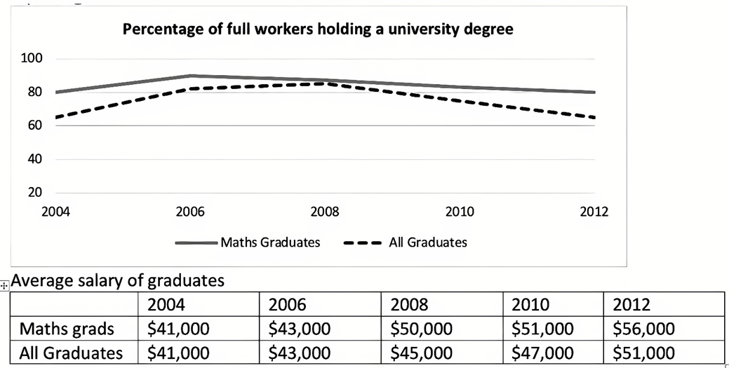
Sample 1:
The provided line and table chart show a comparison between the statistics of full-time employment and average annual salary for graduates in mathematics and all majors in Australian universities between 2004 and 2012.
In general, math graduates performed better than graduates in terms of both average salary and full-time employment. Although the percentage of math graduates securing full-time employment remained stable, salaries increased over time for both math and general graduates.
To elaborate, approximately 60% of all graduates obtained full-time employment in 2004, while around 80% of mathematics graduates found a full-time job. These percentages rose by roughly 10% in the following two to three years. Nevertheless, the proportion decreased for both groups thereafter, and by 2012, the figures were nearly identical to those of 2004.
Regarding the average annual income, in 2004 the average annual salary for all graduates was approximately $41,000, which was also the same figure for math graduates. Over the following eight years, salaries increased for both groups, but the salaries for math graduates increased more than those for all graduates. Eventually, in 2012, math graduates earned a yearly salary of $56,000, while general graduates received around $51,000.
Sample 2:
The line graph illustrates the proportion of full-time workers with a university degree, divided into Maths graduates and all graduates while the table provides a breakdown of their income over an eight-year period. Overall, Maths graduates tended to have a higher employment rate and salary than their counterparts. While the percentage of full-time employees fluctuated wildly, the average income observed an upward trend over time.
Regarding the proportion of graduates with a full-time job, in 2004, roughly 65% of the total workforce were fully employed, being moderately lower than their Maths counterparts, at 80%. Three years later, both groups experienced a similar increasing trend to over 80% and 90% respectively. However, while the percentage of all graduates climbed slightly to 83% in 2008 before a plunge to roughly 65%, that of Maths graduates decreased gradually to 80% till the end of the period.
Concerning the average earnings, in 2004, both groups had the same starting salary at $41.000. Over the following eight years, Maths graduates recorded a more significant growth rate, with figures rocketing to $56.000 compared to a $10.000 rise to $51.000 of all graduates.
Sample 3:
The graphs provide information on the percentage of math and all graduates securing full-time jobs after graduating from Australian universities, along with the average salaries of these graduates from 2004 to 2012.
Overall, the percentage of math and all graduates obtaining full-time employment showed a declining trend from 2004 to 2012. In terms of average salaries, both math and all graduates experienced an increase over the same period.
Regarding the graph, the employment rate for both math graduates and all graduates fluctuated during the period under review. Initially, in 2004, math graduates had a higher percentage of full-time employment at roughly 80% compared to all graduates at nearly 60%. The percentages for both categories increased steadily over the next 2 years. However, the proportion decreased for both groups thereafter, with math graduates consistently surpassing all graduates, and by 2012, the figures were nearly identical to those of 2004.
Concerning the table, both math graduates and all graduates experienced salary increases from 2004 to 2012. In 2004, the average salary for math graduates stood at $41,000, whereas all graduates earned the same amount. Over the following eight years, salaries increased for both groups, but the salaries for math graduates increased more than those for all graduates. Conversely, in 2012, the average salary for math graduates had increased to $56,000, while all graduates’ average salary was $51,000.
Sample 4:
The given line and table graph compare the full-time employment and average yearly salary statistics for maths and all university Australian graduates from 2004 to 2012.
Overall, it can be seen that maths graduates outdid graduates in general both for average salary and full-time employment. Also, while the proportion securing full-time employment remained relatively stable, the salaries rose with time for both maths and all graduates.
In detail, in 2004, about 60% of all graduates got full time employment, whereas about 80% of maths graduates secured a full-time job. Both the figures increased slightly by approximately 10% in the next two or three years. However, after that the proportion fell for both and in 2012, figures stood at nearly the same value as in 2004.
Coming to the average yearly salary, in 2004 the average yearly salary for all graduates was about $41,000 and the figure was the same for maths graduates as well. In the next 8 years, the salaries went up for both, but the salaries rose more for maths graduates as compared to the figures for general salaries for all graduates. Finally, in 2012, maths graduates secured a yearly pay of $56000, whereas graduates, in general, got about $51000.
Sample 5:
The provided line graph compares the proportion of graduates from math and other majors who could have a full-time job after their graduation from 2004 and 2012 while the table shows how their salary changed throughout that period of time.
Overall, it is readily apparent that the percentage of full-time employees graduating from the math department was always higher than that of others. Moreover, although all graduates experienced an upward trend in their salary, it was the ones from Math who got the higher amount of money.
As regards the line graph, around 80% of full-time employees in 2004 graduated from the Math faculty, which was 15% higher than the figure of one from other departments. Two years later, both data experienced a slight increase of 10%. After that, while the percentage of math graduates declined marginally to end at 80% in the last year, that of other graduates grew slightly to hit a peak of 85% in 2008 before dropping gradually to under 70% in 2012.
With regard to the table, both the salaries of math and other graduates started at 41000 dollars in 2004 and grew 2000 more dollars two years later. After that, however, that of math graduates was higher than others. In particular, a significant increase of 13000 dollars was witnessed in the former whereas there was a slow rise of 8000 dollars in the latter in the last year surveyed.
Sample 6:
The graphs illustrate the percentage of math graduates and all graduates who obtained full-time employment after graduating from universities in Australia, as well as their average salaries, from 2004 to 2012.
Overall, math graduates surpassed general graduates in both average salary and full-time employment rates. While the proportion of graduates securing full-time employment remained relatively stable, salaries for both groups increased over time.
In 2004, approximately 62% of all graduates found full-time employment, compared to about 80% of math graduates. Over the next three years, both percentages rose by around 10%. However, the proportions declined for both groups afterward, returning to levels similar to those in 2004 by 2012.
Regarding salaries, the average annual income for all graduates in 2004 was roughly $41,000, which was also the starting figure for math graduates. Over the following eight years, salaries increased for both groups, with math graduates experiencing a more pronounced rise. By 2012, math graduates earned an average annual salary of $56,000, while all graduates earned approximately $51,000.
Hot: 1000+ Đề thi cuối kì 2 file word cấu trúc mới 2026 Toán, Văn, Anh... lớp 1-12 (chỉ từ 60k). Tải ngay
CÂU HỎI HOT CÙNG CHỦ ĐỀ
Lời giải

Sample 1:
The bar graph illustrates the overseas students' spending on accommodation, tuition, and living expenses, while the table depicts information about the average weekly expenses by international students in four countries: A, B, C, and D.
Overall, foreign students need to spend the highest in country A and the lowest in D. In nearly every nation, the international students’ weekly average living expenses are the greatest, while their housing cost registers the lowest.
The costliest country for studying is A, with a weekly average expense of 875 dollars. This is followed by B, C, and D, which have weekly expenses of 735, 540, and 435 dollars, respectively. However, foreign students always pay the least for accommodation, which incurs on average weekly 220, 280, 240, and 200 dollars in the nations A, B, C, and D, respectively.
On the other hand, living expenditures account for the highest portion of average weekly costs for international students in countries A, B, and C, with 430, 350, and 275 dollars, correspondingly. Tuition fees in the same countries (A, B and C) come in second with the weekly averages of 358, 320, and 250 dollars in order. However, D is the only nation where education accounts for the highest average spending area, coming in at USD 235, followed by the cost of living (USD 225) and housing (USD 200).
Sample 2:
The table illustrates information regarding the weekly spendings by overseas students in four countries, A, B, C and D, while the bar graph depicts the students’ expenditure on the sectors, housing, education fees and living expenses.
Overall, the cost of studying abroad is the highest in country A and the lowest in D. Apart from country D, living costs account for the most part of the weekly spendings in all countries, while accommodation registers the least.
Regarding the total cost of studying, A is the most expensive country with weekly average 875 dollars, followed by B, C and D with 735, 540 and 435 dollars, respectively. On the other hand, the overseas students always spend the least on accommodation, which are on average weekly 220, 280, 240 and 200 dollars in the corresponding countries A, B, C and D.
Considering the living cost, it takes the largest share of foreign students’ average weekly expenses in countries A, B, and C with 430, 350 and 275 dollars, respectively, while tuition fees in the same countries hold the second place with weekly average 358, 320 and 250 dollars, sequentially. However, D is the only country where tuition fee occupies the highest expenditure with average weekly 235 dollars, followed by living cost (USD 225) and accommodation (USD 200.)
Sample 3:
The table and bar graph depict information regarding the weekly spendings by overseas students in countries A, B C and D.
Overall, there are three elements, housing, school fees and living costs that contribute to the total weekly spendings. The total expenditure in country A is the highest while it is the lowest in country D. Living costs account for the most part of the weekly spendings in all countries except D.
The total mean weekly cost for pupils to study in country A is US$875, next by country B at US$735, and then by country C at US$540, and finally by country D at US$435. The living costs are always the biggest component of the expenditure except for country D, with about US$10 less than the major spending which is the school fees.
Accommodation accounts for the least among all spendings in all countries. The most expensive housing is found in country B, at US$280, and the cheapest in country D at US$200. The middle range can be seen in country A at US$220 and country C at US$240, respectively. Costs of the tuition fee range between US$ 358 and US$235 in country A and D, in order.
Lời giải

Sample 1:
The bar chart and pie chart give information about why US residents travelled and what travel problems they experienced in the year 2009.
It is clear that the principal reason why Americans travelled in 2009 was to commute to and from work. In the same year, the primary concern of Americans, with regard to the trips they made, was the cost of travelling.
Looking more closely at the bar chart, we can see that 49% of the trips made by Americans in 2009 were for the purpose of commuting. By contrast, only 6% of trips were visits to friends or relatives, and one in ten trips were for social or recreation reasons. Shopping was cited as the reason for 16% of all travel, while unspecific ‘personal reasons’ accounted for the remaining 19%.
According to the pie chart, price was the key consideration for 36% of American travellers. Almost one in five people cited safety as their foremost travel concern, while aggressive driving and highway congestion were the main issues for 17% and 14% of the travelling public. Finally, a total of 14% of those surveyed thought that access to public transport or space for pedestrians were the most important travel issues.
Sample 2:
The bar chart compares the figures for Americans going out for five reasons and the pie chart illustrates the percentage of six problems that concerned them when travelling in 2009. Overall, it is clear that the main reason why people in the US went out in 2009 is to commute to work, and the cost of travelling is the problem concerning them the most.
Looking first at the bar graph, the proportion of Americans going out for commuting to work stood at 49%, while the figure for those leaving their house for personal reasons accounted for 19%. In addition, the rate of people in the US going out for shopping and recreation made up 16% and 10%, respectively, while visiting friends or relatives accounted for the lowest percentage, at only 6%.
Turning to the pie chart, the cost of travelling was the most concerning problem of Americans when going out, with the figure making up 36%, while the proportion of safety concerns is half of that, at 19%. In addition, 17% of US citizens were concerned about aggressive drivers, while highway congestion made 14% of them worried when leaving their house. Access to public transportation and places for people to walk accounted for the lowest percentages, at only 8% and 6%, respectively.
Sample 3:
The provided charts offer insights into the reasons for travel and the primary concerns faced by the traveling public in the United States during the year 2009. The data is presented through a bar chart illustrating travel purposes and a pie chart highlighting key issues.
Notably, the primary motivation for travel among Americans in 2009 was commuting to and from work. Simultaneously, the major concern for the traveling public during their trips revolved around the cost associated with travel.
Examining the bar chart in detail reveals that almost half of the trips made by Americans in 2009, precisely 49%, were attributed to commuting. Conversely, visits to friends or relatives accounted for a mere 6%, while social or recreational trips constituted one in ten journeys. Shopping emerged as the purpose for 16% of all travel, leaving the remaining 19% for unspecific ‘personal reasons.’
Turning attention to the pie chart, it becomes evident that cost was the primary consideration for 36% of American travelers. Safety closely followed, with nearly one in five people, or 19%, expressing it as their foremost travel concern. Aggressive driving and highway congestion were significant issues for 17% and 14% of the traveling public, respectively. Additionally, 14% of respondents identified access to public transport or space for pedestrians as the most crucial travel issues.
Sample 4:
The bar chart shows why American people chose to travel, and the pie chart shows the main issues for the travelling public in the USA, both for 2009. The trend suggests that the reason and price were the main issues for travel in the United States. It is clear that commuting from work was reported as the biggest contribution to travel, at 49%. People who went travelling for personal reasons and shopping accounted for 35% when these two groups are combined. However, interaction with friends and relatives only accounted for 25% less than the above categories. And social and recreational activities took up only 6%, which was the lowest figure by more than 43%. The travelling public’s main issues were related to price and safety, with 55% of respondents reporting these two issues. While other issues accounted for a relatively small part. Only 17% of the respondents reported issues with aggressive drivers, while highway congestion accounted for even less at 14% of the issues reported. The percentage of access to public transport and space for pedestrians was much lower than the other categories at less than 10% for both. To conclude, price and commuting time were the dominant factors relating to travel in the US in 2009.
Lời giải
Bạn cần đăng ký gói VIP ( giá chỉ từ 250K ) để làm bài, xem đáp án và lời giải chi tiết không giới hạn.
Lời giải
Bạn cần đăng ký gói VIP ( giá chỉ từ 250K ) để làm bài, xem đáp án và lời giải chi tiết không giới hạn.
Lời giải
Bạn cần đăng ký gói VIP ( giá chỉ từ 250K ) để làm bài, xem đáp án và lời giải chi tiết không giới hạn.
Lời giải
Bạn cần đăng ký gói VIP ( giá chỉ từ 250K ) để làm bài, xem đáp án và lời giải chi tiết không giới hạn.
Lời giải
Bạn cần đăng ký gói VIP ( giá chỉ từ 250K ) để làm bài, xem đáp án và lời giải chi tiết không giới hạn.