


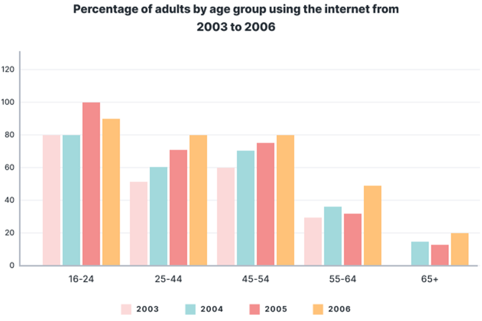
The chart below shows the percentage of adults of different ages in the UK who used the Internet every day from 2003-2006.
Summarise the information by selecting and reporting the main features, and make comparisons where relevant. Write at least 150 words.
The chart below shows the percentage of adults of different ages in the UK who used the Internet every day from 2003-2006.
Summarise the information by selecting and reporting the main features, and make comparisons where relevant. Write at least 150 words.
Câu hỏi trong đề: 2000 câu trắc nghiệm tổng hợp Tiếng Anh 2025 có đáp án !!
Quảng cáo
Trả lời:
Sample 1:
The chart displays the ratio of daily adult Internet users across various age groups in the UK between 2003 and 2006
Overall, it is clear that the younger the participants were, the more they used the Internet. Furthermore, the number of people who enjoyed the Internet has an upward trend over the studied period.
First, the 16-24 years old participants were the most active Internet users with the general percentage of 80% and over throughout the four-year period, even peaking at 100% in 2005. However, the figure for this age group dropped slightly to 90% in the next year.
The second and third most avid Internet users were citizens aged 25-44 and 45-54, with relatively similar rates, increasing steadily from approximately 50% and 60%, in turn, to 80% by the end of 2006. The figure was slightly higher in the 45-54 years old group in the first two years, whose difference with the 25-44 age group was 10% in both years.
The statistics for the remaining groups were considerably less, with only about half of the people from 55-64 years old that were interested in using the Internet daily in 2006. However, the figure for this age group was lower in previous years, standing at around a third of its population. The least engaged Internet users were the 65+ age group with a moderate increase from 18% to 20% between 2003-2006. Notably, in 2003, people aged 65 and above did not use the Internet.
Sample 2:
The given bar graph illustrates the ratio of people of various age categories in the UK being reported to use internet between 2003 to 2006.
It is crystal clear that the ratio of young people from age 16 to 24 was highest among any other age group in terminal years. On the other hand, the least users of internet were the adults of 65+ in the whole time zones.
The masses between 16 to 24 were the major users of internet as the percentage climbed to 80 in 2003 and 2003. Moreover, in 2005 it escalated to 100 but slightly decreased at 90 in 2006. Preceding further, adults between 25-44 reported that the percentage rose from 50 to 80 every year, respectively. Similarly, the same trend was observed between the age group of 45-54 but this time the ratio increased from 60 to 80 with minimal difference.
On the other hand, the experienced individuals of age 55-64 used 30,38,37 and 45 percent of internet in the given time, respectively. At the end, people of age 65 and above surfed the least internet at the ratio of 15 in 2003, 14 in 2004 and one fifth in 2005 but no record of 2006.
Sample 3:
The bar chart illustrates the percentage of Internet users in the UK over the 4-year period from 2003 to 2006. The initial impression from the chart is that the rates of people using the Internet in the UK generally enjoyed upswings in most age brackets. It is also clear that a much larger percentage of people aged between 16 and 24 used the Internet compared to the other age groups.
In 2003, the figure for 16-to-24-year-old Internet users ranked first at 80%, followed by the 45-to-54-year-olds (60%), the 25-to-44-year-olds (50%) and the 55-to-64-year-olds (30%); no data was recorded for the 65+age group this year. In 2004, whilst internet usage of the 25-to-44, the 45-to-54, the 55-to-64 and the 65+ all rose to 60%, 70%, 55% and 15% respectively, the figure for the youngest age bracket plateaued.
In 2005, the figure for Internet users at the age of 16 to 24 reached a remarkable 100% – the highest of any age group, in any year – before undergoing a drop to 90% in 2006. In the meantime, the proportions of Internet users belonging to the remaining age groups saw similar increases to 80% (the 25-to-44 and the 45-to-54), 50% (the 55-to-64), and 20% (the 65+).
Sample 4:
The given bar graph illustrates the percentage of netizens of different age groups, between 2003 and 2006, in Great Britain.
Overall, the maximum internet users belonged to the youngest age group (16-24years), whereas the oldest age group (the over 65's) had the least percentage of Internet users. All age groups experienced an upward trend as far as their daily use of the Internet is concerned.
In detail, in 2003 and 2004, the internet users in the 16-24 age group were 80%. In 2005, this figure increased significantly to 100% but decreased slightly to 90% in 2006. In the 25-54 group, there was a gradual growth in the percentage of internet users, from about 50% to 60% in 2003 to 80% in 2006.
The percentage of 55–64-year-olds who used the net ranged between 30 and 35% from 2003- 2005 but grew significantly by 15% by 2006. With regard to the over 65-year-olds, their percentage increased slightly from 18 to 20% over the four-year period.
Hot: 1000+ Đề thi cuối kì 2 file word cấu trúc mới 2026 Toán, Văn, Anh... lớp 1-12 (chỉ từ 60k). Tải ngay
CÂU HỎI HOT CÙNG CHỦ ĐỀ
Lời giải

Sample 1:
The bar graph illustrates the overseas students' spending on accommodation, tuition, and living expenses, while the table depicts information about the average weekly expenses by international students in four countries: A, B, C, and D.
Overall, foreign students need to spend the highest in country A and the lowest in D. In nearly every nation, the international students’ weekly average living expenses are the greatest, while their housing cost registers the lowest.
The costliest country for studying is A, with a weekly average expense of 875 dollars. This is followed by B, C, and D, which have weekly expenses of 735, 540, and 435 dollars, respectively. However, foreign students always pay the least for accommodation, which incurs on average weekly 220, 280, 240, and 200 dollars in the nations A, B, C, and D, respectively.
On the other hand, living expenditures account for the highest portion of average weekly costs for international students in countries A, B, and C, with 430, 350, and 275 dollars, correspondingly. Tuition fees in the same countries (A, B and C) come in second with the weekly averages of 358, 320, and 250 dollars in order. However, D is the only nation where education accounts for the highest average spending area, coming in at USD 235, followed by the cost of living (USD 225) and housing (USD 200).
Sample 2:
The table illustrates information regarding the weekly spendings by overseas students in four countries, A, B, C and D, while the bar graph depicts the students’ expenditure on the sectors, housing, education fees and living expenses.
Overall, the cost of studying abroad is the highest in country A and the lowest in D. Apart from country D, living costs account for the most part of the weekly spendings in all countries, while accommodation registers the least.
Regarding the total cost of studying, A is the most expensive country with weekly average 875 dollars, followed by B, C and D with 735, 540 and 435 dollars, respectively. On the other hand, the overseas students always spend the least on accommodation, which are on average weekly 220, 280, 240 and 200 dollars in the corresponding countries A, B, C and D.
Considering the living cost, it takes the largest share of foreign students’ average weekly expenses in countries A, B, and C with 430, 350 and 275 dollars, respectively, while tuition fees in the same countries hold the second place with weekly average 358, 320 and 250 dollars, sequentially. However, D is the only country where tuition fee occupies the highest expenditure with average weekly 235 dollars, followed by living cost (USD 225) and accommodation (USD 200.)
Sample 3:
The table and bar graph depict information regarding the weekly spendings by overseas students in countries A, B C and D.
Overall, there are three elements, housing, school fees and living costs that contribute to the total weekly spendings. The total expenditure in country A is the highest while it is the lowest in country D. Living costs account for the most part of the weekly spendings in all countries except D.
The total mean weekly cost for pupils to study in country A is US$875, next by country B at US$735, and then by country C at US$540, and finally by country D at US$435. The living costs are always the biggest component of the expenditure except for country D, with about US$10 less than the major spending which is the school fees.
Accommodation accounts for the least among all spendings in all countries. The most expensive housing is found in country B, at US$280, and the cheapest in country D at US$200. The middle range can be seen in country A at US$220 and country C at US$240, respectively. Costs of the tuition fee range between US$ 358 and US$235 in country A and D, in order.
Lời giải

Sample 1:
The bar chart and pie chart give information about why US residents travelled and what travel problems they experienced in the year 2009.
It is clear that the principal reason why Americans travelled in 2009 was to commute to and from work. In the same year, the primary concern of Americans, with regard to the trips they made, was the cost of travelling.
Looking more closely at the bar chart, we can see that 49% of the trips made by Americans in 2009 were for the purpose of commuting. By contrast, only 6% of trips were visits to friends or relatives, and one in ten trips were for social or recreation reasons. Shopping was cited as the reason for 16% of all travel, while unspecific ‘personal reasons’ accounted for the remaining 19%.
According to the pie chart, price was the key consideration for 36% of American travellers. Almost one in five people cited safety as their foremost travel concern, while aggressive driving and highway congestion were the main issues for 17% and 14% of the travelling public. Finally, a total of 14% of those surveyed thought that access to public transport or space for pedestrians were the most important travel issues.
Sample 2:
The bar chart compares the figures for Americans going out for five reasons and the pie chart illustrates the percentage of six problems that concerned them when travelling in 2009. Overall, it is clear that the main reason why people in the US went out in 2009 is to commute to work, and the cost of travelling is the problem concerning them the most.
Looking first at the bar graph, the proportion of Americans going out for commuting to work stood at 49%, while the figure for those leaving their house for personal reasons accounted for 19%. In addition, the rate of people in the US going out for shopping and recreation made up 16% and 10%, respectively, while visiting friends or relatives accounted for the lowest percentage, at only 6%.
Turning to the pie chart, the cost of travelling was the most concerning problem of Americans when going out, with the figure making up 36%, while the proportion of safety concerns is half of that, at 19%. In addition, 17% of US citizens were concerned about aggressive drivers, while highway congestion made 14% of them worried when leaving their house. Access to public transportation and places for people to walk accounted for the lowest percentages, at only 8% and 6%, respectively.
Sample 3:
The provided charts offer insights into the reasons for travel and the primary concerns faced by the traveling public in the United States during the year 2009. The data is presented through a bar chart illustrating travel purposes and a pie chart highlighting key issues.
Notably, the primary motivation for travel among Americans in 2009 was commuting to and from work. Simultaneously, the major concern for the traveling public during their trips revolved around the cost associated with travel.
Examining the bar chart in detail reveals that almost half of the trips made by Americans in 2009, precisely 49%, were attributed to commuting. Conversely, visits to friends or relatives accounted for a mere 6%, while social or recreational trips constituted one in ten journeys. Shopping emerged as the purpose for 16% of all travel, leaving the remaining 19% for unspecific ‘personal reasons.’
Turning attention to the pie chart, it becomes evident that cost was the primary consideration for 36% of American travelers. Safety closely followed, with nearly one in five people, or 19%, expressing it as their foremost travel concern. Aggressive driving and highway congestion were significant issues for 17% and 14% of the traveling public, respectively. Additionally, 14% of respondents identified access to public transport or space for pedestrians as the most crucial travel issues.
Sample 4:
The bar chart shows why American people chose to travel, and the pie chart shows the main issues for the travelling public in the USA, both for 2009. The trend suggests that the reason and price were the main issues for travel in the United States. It is clear that commuting from work was reported as the biggest contribution to travel, at 49%. People who went travelling for personal reasons and shopping accounted for 35% when these two groups are combined. However, interaction with friends and relatives only accounted for 25% less than the above categories. And social and recreational activities took up only 6%, which was the lowest figure by more than 43%. The travelling public’s main issues were related to price and safety, with 55% of respondents reporting these two issues. While other issues accounted for a relatively small part. Only 17% of the respondents reported issues with aggressive drivers, while highway congestion accounted for even less at 14% of the issues reported. The percentage of access to public transport and space for pedestrians was much lower than the other categories at less than 10% for both. To conclude, price and commuting time were the dominant factors relating to travel in the US in 2009.
Lời giải
Bạn cần đăng ký gói VIP ( giá chỉ từ 250K ) để làm bài, xem đáp án và lời giải chi tiết không giới hạn.
Lời giải
Bạn cần đăng ký gói VIP ( giá chỉ từ 250K ) để làm bài, xem đáp án và lời giải chi tiết không giới hạn.
Lời giải
Bạn cần đăng ký gói VIP ( giá chỉ từ 250K ) để làm bài, xem đáp án và lời giải chi tiết không giới hạn.
Lời giải
Bạn cần đăng ký gói VIP ( giá chỉ từ 250K ) để làm bài, xem đáp án và lời giải chi tiết không giới hạn.
Lời giải
Bạn cần đăng ký gói VIP ( giá chỉ từ 250K ) để làm bài, xem đáp án và lời giải chi tiết không giới hạn.