


The pie charts show the reasons for immigrants to and from a European country in 2009.
Summarise the information by selecting and reporting the main features, and make comparisons where relevant. Write at least 150 words.
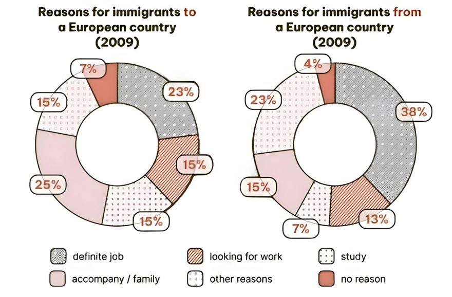
The pie charts show the reasons for immigrants to and from a European country in 2009.
Summarise the information by selecting and reporting the main features, and make comparisons where relevant. Write at least 150 words.
Câu hỏi trong đề: 2000 câu trắc nghiệm tổng hợp Tiếng Anh 2025 có đáp án !!
Quảng cáo
Trả lời:
Sample 1:
The given pie charts state different justifications for migrating to and out of a European country within the year of 2009. Overall, most of the newly arrived immigrants came to live with their relatives and friends, while those who left the country were mainly for job security.
A closer look at the chart revealed that in 2009, migrants entered the European country primarily for fixed occupational roles and co-living with menage, with 25% and 23%, respectively. Meanwhile, those who settled in the country to seek jobs and pursue education share an equal share of 15%. Lastly, only 7% of citizens relocated to the country without a specific reason.
Regarding the emigrant group, a large proportion of citizens leaving the European country were those having secured a permanent job, with 38%. This figure was doubling the group reporting that they entered another country to stay with relatives or participate in the job market here. Whereas less than 10% of settlers were said to migrate out of their country in order to commence an educational course.
Sample 2:
The two pie charts illustrate the reasons why people immigrated to and from a European country in 2009.
Overall, the primary reasons for both immigration to and emigration from the country in 2009 were family and job-related factors.
Regarding immigration to this European country, the largest share of people (25%) relocated to accompany or join family members. Close behind, 23% moved for a definite job. Similarly, 15% immigrated in search of work, while an equal percentage (15%) came for educational purposes. Another 15% cited other reasons for their move, and the smallest group, at 7%, indicated no specific reason for their immigration.
As for those leaving the country, the majority (38%) did so to secure a definite job. Similar to immigration, 23% emigrated to accompany or join family members. Another 15% left for educational reasons, while 13% sought work opportunities abroad. Other reasons accounted for 7%, and a minority (4%) left without giving any particular reason.
Sample 3:
The pie graphs illustrate the purposes for migration to and from a particular nation in Europe in 2009. Overall, individuals joining their families accounted for the largest share of immigrants to this country, while secured employment was the most popular cause for emigrants.
Regarding immigration, a quarter of people entering this nation came for family unions, followed by those who had obtained definite work at 23%. Furthermore, the figures for job seeking, academic pursuit and other objectives were identical at 15%, whereas the lowest proportion was from people who did not specify a reason at 7%.
Concerning emigration, the two most common motivations for leaving this country were confirmed career opportunities and other reasons at 38% and 23%, respectively. Moreover, fairly similar percentages were witnessed for accompaniment of relatives and job finding at around 14%, which was approximately double that of study. Similarly to immigration, the lowest result was exhibited from the 4% of individuals who left without a reason stated.
Sample 4:
The pie charts illustrate the reasons for immigration to and from a European country in 2009.
Overall, accompanying family or loved ones was the primary reason for immigrating to the country, whereas definite employment was the main factor driving people to leave. Notably, very few individuals cited no specific reason for their migration in either direction.
To begin, 25% of those immigrating to the European country did so to join family or loved ones, making it the leading reason, followed closely by definite employment at 23%. The pursuit of a new job, education, and other miscellaneous reasons each accounted for 15%. Meanwhile, only 7% of individuals moved without a clear motive.
In contrast, the most significant reason for leaving the country was definite employment, which made up 38%. Other miscellaneous reasons were next at 23%, followed by accompanying family or loved ones (15%) and job-seeking (13%). Education and lack of a specific motive were the least common reasons, at 7% and 4%, respectively.
Sample 5:
The given pie charts provide information on the percentage of people immigrating to and from a European country in 2009, categorized by different purposes.
Overall, employment and family-related reasons were the predominant factors influencing immigration. Meanwhile, the majority of emigrants left the country to pursue job opportunities.
In terms of immigration, a significant portion, at 25%, moved to the country for family reasons. This was closely followed by those who migrated for work, accounting for 23% of the total. An equal share of 15% was observed among individuals immigrating to seek employment and those arriving for educational purposes. Meanwhile, 15% of immigrants cited other reasons for their move, and a minor 7% did not disclose their reasons by choosing not to participate in the survey.
When it comes to emigration, work was the most compelling factor, with 40% of individuals leaving the country for employment purposes. Family reasons and job hunting accounted for 15% and 13%, respectively, indicating a slight variation. These figures were approximately double the 8% of emigrants who left the country to pursue their studies abroad. Additionally, 23% of people emigrated due to various other reasons, while a mere 4% did not respond to the survey.
Sample 6:
The pie chart illustrates information about the reasons for immigration to a European country in 2009 and the reasons for immigration from a European country in 2009.
Overall, we see the reasons for leaving the country of immigrants. Besides, work is essential for migrants. In contrast, the reasons play the least important role for both purposes.
The pie chart shows that autonomy and family are the main reasons for immigration, with 25% of immigrants. Next to that is 23% with a definite job as the reason. A total of 45% divided equally between 3 reasons: other reasons, study, and looking for a job. Finally, 7% have no reason.
However, the remaining chart shows a rather contrasting picture when a definite job accounts for the largest proportion with 38% of individuals considering it as the reason for their departure. This is followed by 23% with the remaining reasons. While only 15% are because of autonomy and family.
Following that is 13% with the reason being looking for a job. The reason for studying drops to only 7% and rounding up to 4% with no reason.
Hot: 1000+ Đề thi cuối kì 2 file word cấu trúc mới 2026 Toán, Văn, Anh... lớp 1-12 (chỉ từ 60k). Tải ngay
CÂU HỎI HOT CÙNG CHỦ ĐỀ
Lời giải

Sample 1:
The bar graph illustrates the overseas students' spending on accommodation, tuition, and living expenses, while the table depicts information about the average weekly expenses by international students in four countries: A, B, C, and D.
Overall, foreign students need to spend the highest in country A and the lowest in D. In nearly every nation, the international students’ weekly average living expenses are the greatest, while their housing cost registers the lowest.
The costliest country for studying is A, with a weekly average expense of 875 dollars. This is followed by B, C, and D, which have weekly expenses of 735, 540, and 435 dollars, respectively. However, foreign students always pay the least for accommodation, which incurs on average weekly 220, 280, 240, and 200 dollars in the nations A, B, C, and D, respectively.
On the other hand, living expenditures account for the highest portion of average weekly costs for international students in countries A, B, and C, with 430, 350, and 275 dollars, correspondingly. Tuition fees in the same countries (A, B and C) come in second with the weekly averages of 358, 320, and 250 dollars in order. However, D is the only nation where education accounts for the highest average spending area, coming in at USD 235, followed by the cost of living (USD 225) and housing (USD 200).
Sample 2:
The table illustrates information regarding the weekly spendings by overseas students in four countries, A, B, C and D, while the bar graph depicts the students’ expenditure on the sectors, housing, education fees and living expenses.
Overall, the cost of studying abroad is the highest in country A and the lowest in D. Apart from country D, living costs account for the most part of the weekly spendings in all countries, while accommodation registers the least.
Regarding the total cost of studying, A is the most expensive country with weekly average 875 dollars, followed by B, C and D with 735, 540 and 435 dollars, respectively. On the other hand, the overseas students always spend the least on accommodation, which are on average weekly 220, 280, 240 and 200 dollars in the corresponding countries A, B, C and D.
Considering the living cost, it takes the largest share of foreign students’ average weekly expenses in countries A, B, and C with 430, 350 and 275 dollars, respectively, while tuition fees in the same countries hold the second place with weekly average 358, 320 and 250 dollars, sequentially. However, D is the only country where tuition fee occupies the highest expenditure with average weekly 235 dollars, followed by living cost (USD 225) and accommodation (USD 200.)
Sample 3:
The table and bar graph depict information regarding the weekly spendings by overseas students in countries A, B C and D.
Overall, there are three elements, housing, school fees and living costs that contribute to the total weekly spendings. The total expenditure in country A is the highest while it is the lowest in country D. Living costs account for the most part of the weekly spendings in all countries except D.
The total mean weekly cost for pupils to study in country A is US$875, next by country B at US$735, and then by country C at US$540, and finally by country D at US$435. The living costs are always the biggest component of the expenditure except for country D, with about US$10 less than the major spending which is the school fees.
Accommodation accounts for the least among all spendings in all countries. The most expensive housing is found in country B, at US$280, and the cheapest in country D at US$200. The middle range can be seen in country A at US$220 and country C at US$240, respectively. Costs of the tuition fee range between US$ 358 and US$235 in country A and D, in order.
Lời giải

Sample 1:
The bar chart and pie chart give information about why US residents travelled and what travel problems they experienced in the year 2009.
It is clear that the principal reason why Americans travelled in 2009 was to commute to and from work. In the same year, the primary concern of Americans, with regard to the trips they made, was the cost of travelling.
Looking more closely at the bar chart, we can see that 49% of the trips made by Americans in 2009 were for the purpose of commuting. By contrast, only 6% of trips were visits to friends or relatives, and one in ten trips were for social or recreation reasons. Shopping was cited as the reason for 16% of all travel, while unspecific ‘personal reasons’ accounted for the remaining 19%.
According to the pie chart, price was the key consideration for 36% of American travellers. Almost one in five people cited safety as their foremost travel concern, while aggressive driving and highway congestion were the main issues for 17% and 14% of the travelling public. Finally, a total of 14% of those surveyed thought that access to public transport or space for pedestrians were the most important travel issues.
Sample 2:
The bar chart compares the figures for Americans going out for five reasons and the pie chart illustrates the percentage of six problems that concerned them when travelling in 2009. Overall, it is clear that the main reason why people in the US went out in 2009 is to commute to work, and the cost of travelling is the problem concerning them the most.
Looking first at the bar graph, the proportion of Americans going out for commuting to work stood at 49%, while the figure for those leaving their house for personal reasons accounted for 19%. In addition, the rate of people in the US going out for shopping and recreation made up 16% and 10%, respectively, while visiting friends or relatives accounted for the lowest percentage, at only 6%.
Turning to the pie chart, the cost of travelling was the most concerning problem of Americans when going out, with the figure making up 36%, while the proportion of safety concerns is half of that, at 19%. In addition, 17% of US citizens were concerned about aggressive drivers, while highway congestion made 14% of them worried when leaving their house. Access to public transportation and places for people to walk accounted for the lowest percentages, at only 8% and 6%, respectively.
Sample 3:
The provided charts offer insights into the reasons for travel and the primary concerns faced by the traveling public in the United States during the year 2009. The data is presented through a bar chart illustrating travel purposes and a pie chart highlighting key issues.
Notably, the primary motivation for travel among Americans in 2009 was commuting to and from work. Simultaneously, the major concern for the traveling public during their trips revolved around the cost associated with travel.
Examining the bar chart in detail reveals that almost half of the trips made by Americans in 2009, precisely 49%, were attributed to commuting. Conversely, visits to friends or relatives accounted for a mere 6%, while social or recreational trips constituted one in ten journeys. Shopping emerged as the purpose for 16% of all travel, leaving the remaining 19% for unspecific ‘personal reasons.’
Turning attention to the pie chart, it becomes evident that cost was the primary consideration for 36% of American travelers. Safety closely followed, with nearly one in five people, or 19%, expressing it as their foremost travel concern. Aggressive driving and highway congestion were significant issues for 17% and 14% of the traveling public, respectively. Additionally, 14% of respondents identified access to public transport or space for pedestrians as the most crucial travel issues.
Sample 4:
The bar chart shows why American people chose to travel, and the pie chart shows the main issues for the travelling public in the USA, both for 2009. The trend suggests that the reason and price were the main issues for travel in the United States. It is clear that commuting from work was reported as the biggest contribution to travel, at 49%. People who went travelling for personal reasons and shopping accounted for 35% when these two groups are combined. However, interaction with friends and relatives only accounted for 25% less than the above categories. And social and recreational activities took up only 6%, which was the lowest figure by more than 43%. The travelling public’s main issues were related to price and safety, with 55% of respondents reporting these two issues. While other issues accounted for a relatively small part. Only 17% of the respondents reported issues with aggressive drivers, while highway congestion accounted for even less at 14% of the issues reported. The percentage of access to public transport and space for pedestrians was much lower than the other categories at less than 10% for both. To conclude, price and commuting time were the dominant factors relating to travel in the US in 2009.
Lời giải
Bạn cần đăng ký gói VIP ( giá chỉ từ 250K ) để làm bài, xem đáp án và lời giải chi tiết không giới hạn.
Lời giải
Bạn cần đăng ký gói VIP ( giá chỉ từ 250K ) để làm bài, xem đáp án và lời giải chi tiết không giới hạn.
Lời giải
Bạn cần đăng ký gói VIP ( giá chỉ từ 250K ) để làm bài, xem đáp án và lời giải chi tiết không giới hạn.
Lời giải
Bạn cần đăng ký gói VIP ( giá chỉ từ 250K ) để làm bài, xem đáp án và lời giải chi tiết không giới hạn.
Lời giải
Bạn cần đăng ký gói VIP ( giá chỉ từ 250K ) để làm bài, xem đáp án và lời giải chi tiết không giới hạn.