


The graph below shows the percentage of workers from five different European countries that were absent for a day or more due to illness from 1991 to 2001.
Summarise the information by selecting and reporting the main features, and make comparisons where relevant. Write at least 150 words.
The graph below shows the percentage of workers from five different European countries that were absent for a day or more due to illness from 1991 to 2001.
Summarise the information by selecting and reporting the main features, and make comparisons where relevant. Write at least 150 words.
Câu hỏi trong đề: 2000 câu trắc nghiệm tổng hợp Tiếng Anh 2025 có đáp án !!
Quảng cáo
Trả lời:
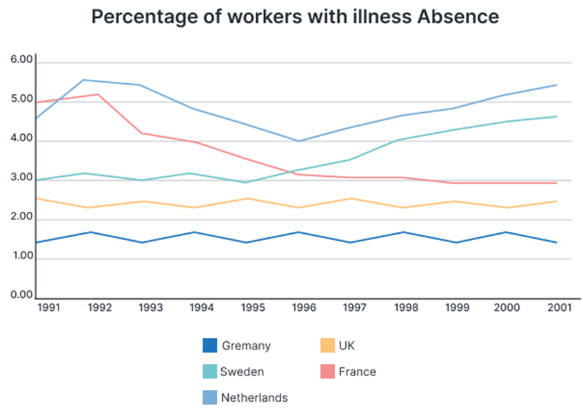
Sample 1:
The line graph shows the proportion of employees in five European nations who took a day or more off due to illness between 1991 and 2001.
Overall, despite significant changes, the proportion of sick days taken by Dutch workers remains higher than in any other country. On the other hand, France showed a declining tendency, while Sweden showed an increasing trend. The trends in the UK and Germany were quite similar, with the UK's numbers being slightly higher.
From 1992 and 2001, the Dutch had the highest rate of employees out sick, ranging from just under 6% to just over 8%. The French economy also steadily declined throughout this time, dropping to a low of 3% in 1999 and staying at that level until the conclusion of the decade.
In comparison, the percentage of Swedish employees off sick rose by 1.75 percentage points between 1999 and 2001, hitting a high of 4.75 percent that year. The United Kingdom and Germany, the only nations to see no change, had their rates steady at around 3.75 and 1.5 percent, respectively.
Sample 2:
The line chart illustrates the rate of employees who took at least one day of sick leave in different European nations from 1991 to 2001. Overall, while the proportion of workers who were absent by sickness in the Netherlands and Sweden increased over the given period, France had a reverse trend. Additionally, the UK and Germany remained fairly constant during the period examined.
France and the Netherlands started the period around 5%. One year later, the rate of workers with illness absence in the Netherlands increased by approximately 0.5%, before plummeting to just over 4% in 1996. The figure then recovered gradually to about 5.4%, being the highest among the five nations. Furthermore, after standing at around 5% for the first two years, France witnessed a plunge to 3% by 1999, followed by a plateau for the rest of the period.
Turning to the remainder, the proportion of laborers with sick leave in Sweden remained nearly stable at roughly 3% from 1991 to 1995, after which it ascended significantly to about 4.7% by 2001. Both the UK and Germany experienced almost no change throughout the period, with the former being around 2.5% and the latter being relatively smaller at approximately 1.5%.
Sample 3:
The graph depicts the proportion of workers from five European nations who took sick leave for a day or more between 1991 and 2001.
Overall, it is obvious that the Netherlands almost always accounted for the highest percentage, despite fluctuations. France and Sweden showed opposite trends, with a slide for the former and a climb for the latter. Only the UK and Germany shared the same pattern, even though the UK’s figure was noticeably higher.
Specifically, the Netherlands led in the percentage of employees who missed work due to illness, fluctuating between 4% (in 1996) and approximately 5.75% (in 1992 and 2001). During that time, France saw a steady decline, hitting its lowest point of 3% in 1999 and remaining there until the end of the period. In contrast, the proportion of workers with sickness absence in Sweden significantly increased by 1.75%, peaking at 4.75% in 2001. The two remaining countries, the UK and Germany, witnessed little variation as their figures stabilized, respectively, at about 3.75% and around 1.5%.
Sample 4:
The presented line chart delineates the fluctuating rates of employees taking sick leave across several European nations from 1991 to 2001.
Overall, variations in sickness absence rates are evident in different countries. The Netherlands consistently registered the highest rate of individuals taking sick leave from work, whereas Germany reported the lowest rate among all years examined.
The Netherlands and France commenced the period with a comparable rate of around 5%. Subsequently, the former witnessed a slight increase by approximately 0.5% within a year before undergoing a substantial decline to just over 4% by 1996. However, a gradual recovery ensued, reaching a peak of approximately 5.4% in 2001. In contrast, the latter experienced a substantial drop to 3% by 1999 and thereafter plateaued for the remainder of the period.
In Sweden, the rate of sick leave among laborers remained relatively steady at about 3% between 1991 and 1995, before undergoing a surge to approximately 4.7% by 2001. On the other hand, both the UK and Germany demonstrated minimal fluctuations over the period. The UK remained consistent around 2.5%, while Germany sustained a notably lower rate of around 1.5%.
Sample 5:
The line graph illustrates the percentage of workers who took sickness absences in five European countries - Germany, Sweden, the Netherlands, the UK, and France - between 1991 and 2001.
Overall, the Netherlands consistently had the highest percentage of workers taking sickness absences, while Germany had the lowest. Over the decade, the percentage of workers taking sickness absences decreased in the Netherlands and France, while it showed an upward trend in Sweden and the UK. Germany experienced a slight decline followed by stability.
In 1991, the Netherlands had the highest percentage of workers with sickness absences at around 5.5%, followed closely by France at approximately 4.5%. Both countries experienced a downward trend over the following years, with the Netherlands seeing a significant drop to about 3.5% in 1996 before gradually increasing again to around 4.8% by 2001. France, on the other hand, showed a consistent decrease throughout the decade, reaching its lowest point of around 3% by the end of the period.
Germany started with the lowest percentage of workers taking sickness absences at just over 1.5% in 1991. This figure decreased slightly over the next few years and then remained stable at around 1.25% from 1995 onwards. In contrast, Sweden and the UK, which began with similar percentages to Germany, experienced different trends. Sweden saw a steady rise, overtaking Germany and the UK by the late 1990s and reaching nearly 4% by 2001. The UK’s percentage also increased slightly from about 2% in 1991 to just over 3% in 2001.
Hot: 1000+ Đề thi cuối kì 2 file word cấu trúc mới 2026 Toán, Văn, Anh... lớp 1-12 (chỉ từ 60k). Tải ngay
CÂU HỎI HOT CÙNG CHỦ ĐỀ
Lời giải

Sample 1:
The bar graph illustrates the overseas students' spending on accommodation, tuition, and living expenses, while the table depicts information about the average weekly expenses by international students in four countries: A, B, C, and D.
Overall, foreign students need to spend the highest in country A and the lowest in D. In nearly every nation, the international students’ weekly average living expenses are the greatest, while their housing cost registers the lowest.
The costliest country for studying is A, with a weekly average expense of 875 dollars. This is followed by B, C, and D, which have weekly expenses of 735, 540, and 435 dollars, respectively. However, foreign students always pay the least for accommodation, which incurs on average weekly 220, 280, 240, and 200 dollars in the nations A, B, C, and D, respectively.
On the other hand, living expenditures account for the highest portion of average weekly costs for international students in countries A, B, and C, with 430, 350, and 275 dollars, correspondingly. Tuition fees in the same countries (A, B and C) come in second with the weekly averages of 358, 320, and 250 dollars in order. However, D is the only nation where education accounts for the highest average spending area, coming in at USD 235, followed by the cost of living (USD 225) and housing (USD 200).
Sample 2:
The table illustrates information regarding the weekly spendings by overseas students in four countries, A, B, C and D, while the bar graph depicts the students’ expenditure on the sectors, housing, education fees and living expenses.
Overall, the cost of studying abroad is the highest in country A and the lowest in D. Apart from country D, living costs account for the most part of the weekly spendings in all countries, while accommodation registers the least.
Regarding the total cost of studying, A is the most expensive country with weekly average 875 dollars, followed by B, C and D with 735, 540 and 435 dollars, respectively. On the other hand, the overseas students always spend the least on accommodation, which are on average weekly 220, 280, 240 and 200 dollars in the corresponding countries A, B, C and D.
Considering the living cost, it takes the largest share of foreign students’ average weekly expenses in countries A, B, and C with 430, 350 and 275 dollars, respectively, while tuition fees in the same countries hold the second place with weekly average 358, 320 and 250 dollars, sequentially. However, D is the only country where tuition fee occupies the highest expenditure with average weekly 235 dollars, followed by living cost (USD 225) and accommodation (USD 200.)
Sample 3:
The table and bar graph depict information regarding the weekly spendings by overseas students in countries A, B C and D.
Overall, there are three elements, housing, school fees and living costs that contribute to the total weekly spendings. The total expenditure in country A is the highest while it is the lowest in country D. Living costs account for the most part of the weekly spendings in all countries except D.
The total mean weekly cost for pupils to study in country A is US$875, next by country B at US$735, and then by country C at US$540, and finally by country D at US$435. The living costs are always the biggest component of the expenditure except for country D, with about US$10 less than the major spending which is the school fees.
Accommodation accounts for the least among all spendings in all countries. The most expensive housing is found in country B, at US$280, and the cheapest in country D at US$200. The middle range can be seen in country A at US$220 and country C at US$240, respectively. Costs of the tuition fee range between US$ 358 and US$235 in country A and D, in order.
Lời giải

Sample 1:
The bar chart and pie chart give information about why US residents travelled and what travel problems they experienced in the year 2009.
It is clear that the principal reason why Americans travelled in 2009 was to commute to and from work. In the same year, the primary concern of Americans, with regard to the trips they made, was the cost of travelling.
Looking more closely at the bar chart, we can see that 49% of the trips made by Americans in 2009 were for the purpose of commuting. By contrast, only 6% of trips were visits to friends or relatives, and one in ten trips were for social or recreation reasons. Shopping was cited as the reason for 16% of all travel, while unspecific ‘personal reasons’ accounted for the remaining 19%.
According to the pie chart, price was the key consideration for 36% of American travellers. Almost one in five people cited safety as their foremost travel concern, while aggressive driving and highway congestion were the main issues for 17% and 14% of the travelling public. Finally, a total of 14% of those surveyed thought that access to public transport or space for pedestrians were the most important travel issues.
Sample 2:
The bar chart compares the figures for Americans going out for five reasons and the pie chart illustrates the percentage of six problems that concerned them when travelling in 2009. Overall, it is clear that the main reason why people in the US went out in 2009 is to commute to work, and the cost of travelling is the problem concerning them the most.
Looking first at the bar graph, the proportion of Americans going out for commuting to work stood at 49%, while the figure for those leaving their house for personal reasons accounted for 19%. In addition, the rate of people in the US going out for shopping and recreation made up 16% and 10%, respectively, while visiting friends or relatives accounted for the lowest percentage, at only 6%.
Turning to the pie chart, the cost of travelling was the most concerning problem of Americans when going out, with the figure making up 36%, while the proportion of safety concerns is half of that, at 19%. In addition, 17% of US citizens were concerned about aggressive drivers, while highway congestion made 14% of them worried when leaving their house. Access to public transportation and places for people to walk accounted for the lowest percentages, at only 8% and 6%, respectively.
Sample 3:
The provided charts offer insights into the reasons for travel and the primary concerns faced by the traveling public in the United States during the year 2009. The data is presented through a bar chart illustrating travel purposes and a pie chart highlighting key issues.
Notably, the primary motivation for travel among Americans in 2009 was commuting to and from work. Simultaneously, the major concern for the traveling public during their trips revolved around the cost associated with travel.
Examining the bar chart in detail reveals that almost half of the trips made by Americans in 2009, precisely 49%, were attributed to commuting. Conversely, visits to friends or relatives accounted for a mere 6%, while social or recreational trips constituted one in ten journeys. Shopping emerged as the purpose for 16% of all travel, leaving the remaining 19% for unspecific ‘personal reasons.’
Turning attention to the pie chart, it becomes evident that cost was the primary consideration for 36% of American travelers. Safety closely followed, with nearly one in five people, or 19%, expressing it as their foremost travel concern. Aggressive driving and highway congestion were significant issues for 17% and 14% of the traveling public, respectively. Additionally, 14% of respondents identified access to public transport or space for pedestrians as the most crucial travel issues.
Sample 4:
The bar chart shows why American people chose to travel, and the pie chart shows the main issues for the travelling public in the USA, both for 2009. The trend suggests that the reason and price were the main issues for travel in the United States. It is clear that commuting from work was reported as the biggest contribution to travel, at 49%. People who went travelling for personal reasons and shopping accounted for 35% when these two groups are combined. However, interaction with friends and relatives only accounted for 25% less than the above categories. And social and recreational activities took up only 6%, which was the lowest figure by more than 43%. The travelling public’s main issues were related to price and safety, with 55% of respondents reporting these two issues. While other issues accounted for a relatively small part. Only 17% of the respondents reported issues with aggressive drivers, while highway congestion accounted for even less at 14% of the issues reported. The percentage of access to public transport and space for pedestrians was much lower than the other categories at less than 10% for both. To conclude, price and commuting time were the dominant factors relating to travel in the US in 2009.
Lời giải
Bạn cần đăng ký gói VIP ( giá chỉ từ 250K ) để làm bài, xem đáp án và lời giải chi tiết không giới hạn.
Lời giải
Bạn cần đăng ký gói VIP ( giá chỉ từ 250K ) để làm bài, xem đáp án và lời giải chi tiết không giới hạn.
Lời giải
Bạn cần đăng ký gói VIP ( giá chỉ từ 250K ) để làm bài, xem đáp án và lời giải chi tiết không giới hạn.
Lời giải
Bạn cần đăng ký gói VIP ( giá chỉ từ 250K ) để làm bài, xem đáp án và lời giải chi tiết không giới hạn.
Lời giải
Bạn cần đăng ký gói VIP ( giá chỉ từ 250K ) để làm bài, xem đáp án và lời giải chi tiết không giới hạn.