


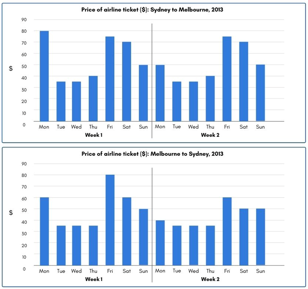
The charts below give information about the price of tickets on one airline between Sydney and Melbourne, Australia, over a two-week period in 2013.
Summarise the information by selecting and reporting the main features, and make comparisons where relevant. Write at least 150 words.
The charts below give information about the price of tickets on one airline between Sydney and Melbourne, Australia, over a two-week period in 2013.
Summarise the information by selecting and reporting the main features, and make comparisons where relevant. Write at least 150 words.
Câu hỏi trong đề: 2000 câu trắc nghiệm tổng hợp Tiếng Anh 2025 có đáp án !!
Quảng cáo
Trả lời:
Sample 1:
The given bar charts illustrate how much flight tickets cost between Sydney and Melbourne over a two-week period in 2013.
In general, it is obvious that higher prices were recorded on weekends and Mondays in spite of being almost constant during the weekdays.
Regarding flights from Sydney to Melbourne in week 1, Monday witnessed an all-time high of $80, which then fell below $40 in the next three days before bouncing back to $75, $70 and $50 on Friday, Saturday and Sunday, respectively. Week 2 shared an identical price pattern, with the only exception of Monday’s 50-dollar tickets.
With respect to week 1 reverse flights from Melbourne to Sydney, flyers had to pay $60 per ticket on Monday. The three following days reported an equal price level of $35, which more than doubled itself to reach a peak of $80 on Friday. A downswing to $60 and $50 was experienced on the last two days of the week. Less robust fluctuations can be seen in week 2, when airline flights cost under $40 in the first half of the week and grew to the range of $50-60 from Friday to Sunday.
Sample 2:
The charts compare the cost of flight tickets between Sydney and Melbourne for two weeks in 2013.
Overall, flights from both directions shared a similar pattern with higher prices from Friday through Monday and lower and more stable prices during weekdays.
To begin, in week 1, the ticket cost peaked at $80 on Monday and Friday, departing respectively from Sydney and Melbourne. From Tuesday to Thursday, the fares were steady, fluctuating between $35 to $40 at both ends. A sharp rise in price point was on Friday by a gap of $35 to $45. The rate gradually decreased towards the end of the week from around $80 to $50.
In Week 2, the cost of traveling from both cities experienced the same trend. However, the average ticket price from Melbourne was slightly lower than flying from Sydney, with the lowest remaining $35 and the highest being $75. When taking the ticket price into comparison day by day, it is evident that traveling from Melbourne is cheaper, except on Friday of week 1. Fares on Monday significantly dropped to $50 departing from Sydney and $40 taking off from Melbourne.
Sample 3:
The given bar charts compare airfares of one carrier between Sydney and Melbourne in two separate weeks in 2013.
According to the data, the price of flight tickets between the two destinations experienced the same pattern in both surveyed weeks, with more expensive fares during the four-day weekend and cheaper ones on weekdays. It is also noticeable that the price discrepancy in Week 1 was more significant than that in ant than t Week 2.
In week 1, the best days to fly were Tuesday to Thursday, as fares were the cheapest, averaging $35 for each direction. However, travelers wishing to spend their long weekend in either of the two mentioned cities had to pay virtually double for their flights, ranging from $50-80 per ticket. Particularly, the price hike was on Monday for Melbourne-bound flights while it was on Friday for Sydney ones.
Similar to Week 1, flyers paid the same lowest price ($35) for their airfares on Tuesday through Thursday in Week 2. The long weekend also witnessed substantial price increases, with $50-75 for flights departing from Sydney and $40-60 for ones from Melbourne, both of which peaked on Friday.
Sample 4:
The given charts highlight the differences between the cost of one airline’s tickets between Sydney and Melbourne in two weeks in 2013.
By and large, the price did not differ significantly between the two cities and people generally had to pay more for tickets on the weekends than on weekdays.
From Sydney to Melbourne, the ticket's cost on Monday witnessed a sharp drop from 80 dollars in the first week to 50 dollars in the second week. However, from Tuesday to Sunday, there was no discrepancy. Additionally, except for Mondays, people had to pay the most for air tickets on Fridays, at 75 dollars, and the least on Tuesdays and Wednesdays, at merely 35 dollars.
Regarding flights from Melbourne to Sydney, a mildly similar pattern could be observed. In both weeks, air tickets cost the most on Fridays. However, Fridays’ prices recorded a sharp decrease from 80 dollars to 60 dollars over the period. There was a downward trend on Mondays and Saturdays’ ticket prices, which experienced a fall of 20 dollars and 10 dollars, respectively. In terms of the rest of the week, the cost remained stable.
Sample 5:
The bar charts compare the price of roundtrip airfare between Sydney and Melbourne in two weeks in 2013. Overall, there is a considerable disparity in flight prices between two destinations, as travelling at the weekend is far more expensive than on weekdays.
Regarding flights departing from Sydney to Melbourne, in the first week, flights on Monday incur the highest expenses, at $80 for a one-way journey. In comparison, the cheapest tickets are available on Tuesday, Wednesday, and Thursday, which cost roughly $35 to $40 before a surge to $75, $70, and $50 on Friday, Saturday, and Sunday respectively. A similar pattern can be observed in the second week, except for a slight decline in Monday’s flights to $50.
Concerning journeys from Melbourne to Sydney, in the first week, travellers pay $60 for their flights on Monday, which is nearly double that of midweek, at approximately $35. Friday records the highest ticket price, at $80, while flights at the weekend are also costly, at $60 and $50. In the second week, the price on Monday plunges to $40 and it is also more affordable to travel at the weekend, with figures ranging from $50 to $60.
Sample 6:
The given bar charts illustrate how much an airfare for a round trip from 2 cities in Australia, Sydney and Melbourne, would cost in 2 weeks in 2013.
Overall, there was no considerable difference in the money paid for flights between Sydney and Melbourne over 2 weeks. Noticeably, passengers mostly had to pay a significantly higher price on the weekends than during the weekdays, except for that in week 1 from Sydney to Melbourne.
Regarding the price of week 1 for the above-mentioned route, the cost for a Monday flight was $80, which was by far the highest price over the period, before plummeting for over a half to about $35 in the next 2 days. $40 was the amount of money for flying on Thursday in week 1, followed by a surge to around $75 on Friday before bouncing back to $50 at the end of the week. Similarly, week 2 witnessed nearly identical airfares for all days, with the exception of that for Monday, at only $50.
As for the opposite route, the price of a ticket started at $60 on Monday in week 1, after which it decreased significantly and remained stable in the subsequent 3 days at $35 before hitting the peak of $80 on Friday. After that, the price of week 1 gradually declined to $50 on Sunday. In the following week, passengers paid a relatively lower cost to fly from Melbourne to Sydney, with around $38 for weekdays and approximately $55 for weekends.
Sample 7:
The provided bar charts give data about ticket fares on one airline travelling between Sydney and Melbourne in 2 weeks in 2013.
It is noticeable that the price of tickets was lowest on Tuesdays, Wednesdays, and Thursdays while people had to pay more on Fridays and weekends. Flights between the two cities on Fridays were most expensive except for week 1 from Sydney to Melbourne.
With regard to flights from Sydney, people spent $80 on Monday in the first week whereas the ticket price was significantly lower, at $50 in the second week. The figures for Tuesdays, Wednesdays, and Thursdays were not higher than $40 in both weeks while it cost people almost twice as much on Fridays, at $76. Tickets on Saturdays and Sundays were offered at a remarkably lower rate, at $66 and $50, respectively.
Regarding flights from Melbourne to Sydney, there was a similar pattern as ticket fares stayed lowest at $35 from Tuesdays to Thursdays in both weeks. There was a sharp decline of 20 percentile in ticket prices on Mondays and Fridays between the two weeks while the travelling cost was no more than $60 on Saturdays and Sundays.
Sample 8:
The bar charts display the daily pricing trends for airline tickets on the Sydney to Melbourne route and vice versa, over two weeks in 2013.
Overall, across both weeks and directions, the trend indicated that flying midweek from Tuesday to Thursday would generally be more economical, with prices notably lower than at the beginning and end of the week, while higher fares were consistent. The most expensive days to fly varied but typically fell on a weekend day, and Friday consistently offered the highest prices.
Initially, the first week unfolds with Sydney to Melbourne fares priced at $80 on Monday, dipping to a weekly low from Tuesday to Thursday, averaging just under $40. In contrast, the weekend witnessed a surge, with Friday tickets escalating to a high of almost $80, then gradually decreasing. As can be seen from the chart, flights originating from Melbourne mirrored this midweek economy, with prices maintaining a trough under $40 during the same period, despite Friday's fare peaking at $80. Prices plummeted on Saturday, down to $60, before moderately descending to $50 by Sunday.
When it comes to the second week data, starting the week at a high of roughly $50 on Monday, showed a slight decrease on Tuesday for the Sydney to Melbourne route. The most significant peak occurred on Friday at close to $80, followed by a marked drop on the weekend and Sunday which shared the same price with Monday at $50. Meanwhile, the flight’s airfare Melbourne to Sydney in week two fluctuated less than any week and direction, from Monday to Thursday with minimum fare around or under $40 and Friday still offered the most expensive budget at $60.
Sample 9:
The given bar graphs show data for the cost of airline tickets for flights between Sydney and Melbourne in both directions over two weeks in 2013.
Overall, flights in both directions generally displayed patterns that are similar to one another, with higher prices from Friday through Monday. Week 2 flight prices were either significantly reduced from week 1 or remained identical.
In week 1, airfares from Sydney to Melbourne began at $80 on Monday and remained under $40 for the following three days before rising to $75, $70, and $50, respectively, on Friday, Saturday, and Sunday. The costs remained the same during the second week, with the notable exception of a drop on Monday to $50.
The trend was similar for flights from Melbourne to Sydney, with the most expensive flight being on Friday at $80 (week 1) while the lowest rate was at 35$ on Tuesday, Wednesday, and Thursday (week 1 and 2). Finally, there were declines of 10 to 20$ across Saturday, Sunday, and Monday in the second week.
Sample 10:
The bar charts illustrate the changes in the airfares on one airline between Sydney and Melbourne over two consecutive weeks in 2013.
Overall, passengers paid more for tickets on the weekends than on weekdays. Furthermore, there was a slight decrease in certain fares from the first to the second week in both cities.
For flights from Sydney to Melbourne, the prices on Mondays were lower in the second week, plummeting from 80 dollars to 50 dollars. Meanwhile, there were no differences between the airfares from Tuesday to Sunday in both weeks. Notably, people had to pay the most on tickets at over 70 dollars on Mondays, Fridays and Saturdays, while they only spent around 35 dollars for the remaining days.
For the return flights from Melbourne to Sydney, airfares on Mondays declined from 60 dollars in the first week to 40 dollars in the second week. From Tuesday to Thursday, the price remained the lowest at 35 dollars in both weeks. The highest price was on Friday in the first week at 80 dollars, which dropped to 60 dollars in the following week. The price on Saturdays decreased by 10 dollars, but the figure for Sundays remained unchanged.
Sample 11:
The two provided bar charts illustrate the ticket prices for flights between Sydney and Melbourne, as well as Melbourne and Sydney, during a period of two weeks in 2013.
Overall, airline ticket prices in the second week were generally lower than in the first week for both directions. It is also clear that flights from Sydney to Melbourne were most expensive on Monday, whereas the reverse route charged the highest price on Friday.
The airfare for flights from Sydney to Melbourne on Monday in the first week was much higher than the second week, at $80 and $50, respectively. In contrast, ticket prices towards the end of both weeks were the same, remaining lower than $40 from Tuesday to Friday and recovering to $75, $70, and $50, in that order.
$60 was charged for those taking flights from Melbourne to Sydney on Monday in the first week, compared to $40 in the second week. Flights booked on Tuesday-Thursday during both weeks cost exactly the same at $35, while flights on Friday in the first week charged higher than the second week by $20, with the respective figures being $80 and $60. Lastly, airline ticket prices for Saturday and Sunday hovered around $55.
Sample 12:
The bar charts display information for the price of airline tickets from Sydney to Melbourne and the reverse flight over a two-week period in 2013. Looking from an overall perspective, it is readily apparent that flights in both directions displayed broadly similar patterns with higher prices Friday through Monday. Compared to week 1, week 2 prices were either greatly deflated or identical for nearly all flights.
In week 1, flights from Sydney to Melbourne started at 80$ on Monday, were all under $40 over the next 3 days before a spike to $75, $70, and $50 on Friday, Saturday and Sunday, respectively. During the second week, the prices were unchanged with the notable exception of a decline on Monday to $50 fares.
In terms of flights from Melbourne to Sydney, the trend was comparable with flights on Monday of week 1 elevated to $60, sub-$40 flights on Tuesday, Wednesday, and Thursday and the most expensive flight on Friday at $80. Flights on Saturday and Sunday were also relatively costly at $60 and $50 each day. In week 2, Monday prices displayed a dramatic decline to $40 and there was more variance later in the week. Friday fell to $50 and Saturday to $50. All other tickets remained the same in week 2.
Sample 13:
The given columns graphs compare the price of tickets in an airline between Sydney and Melbourne over a two-week period in 2013. On Monday of the 1st week, the airline ticket prices rise to $80, and on the 2nd week of Monday, it falls down to $50.
As shown above, the prices only fluctuate on Monday, and the rest of the weekdays are rather the same in the airline which travels Sydney to Melbourne in 2013. It can be clearly seen from the graph; the price of airline tickets is highest on Fridays.
In contrast, the highest price date when travelling from Melbourne to Sydney in week 1 was Friday with $80, followed by Monday and Saturday with $60. Moving forward to next week, there were declines in prices but Tuesday, Wednesday, Thursday became stagnant with $35.
In terms of the ticket price in an airline in week two, they showed the similarity when the weekend days ticket price seems to be higher more than those on other days while middle days price did not show any clear price difference which constantly accounted for the lowest cost.
Sample 14:
The two bar charts show the discrepancies in the price of round tickets between Melbourne and Sydney of an undefined airline within a two-week period in 2013.
In general, the flying cost between the two cities did not seem to be distinctively different, and the price of flight tickets was relatively higher on weekends than on weekdays.
Regarding the trip from Sydney to Melbourne, the ticket price of the first-week Monday reached $80, which was by far the highest price to be paid. This experienced a significant fall of $30 in the following week, making it the only difference throughout the period. In other words, almost no changes were recorded in the ticket prices on the remaining days. Whilst passengers could pay a lower price of $35 on Tuesdays and Wednesdays, they were required to spend an extra 5 dollars to fly to Melbourne on Thursdays. The prices were more costly at the weekends as they could go up to $75.
A similar pattern could be seen in the cost of airplane tickets from Melbourne to Sydney. Flight-goers could buy tickets at the most affordable price of around $35 from Tuesday to Thursday, which showed no changes between the bar graphs. The first week’s Friday ticket price ranked first at 80$, followed by 60$ tickets for flights departing on Monday and Saturday. A week later showed a $20 decrease in the price of Monday tickets, but a stable price range at $50 for Saturday and Sunday.
Sample 15:
The chart compares the flyingcost of an airline betweenSydney and Melbourne, Australia in 2 weeks, in 2013.
Overall, flights in both directions generally displayedsimilar patterms, with higher prices from Friday to Monday. In addition, Week 2 flight prices either showed a slightdrop from week 1 or remainedidentical.
Regaring flying from Sydneyto Melbourne, the ticket pricemarked a stating point of 80$on Monday, remained under 40$ for the 3 following days, and eventually rose to 75$,70$, and 50$ on Friday, Saturday, and Sunday. Onweek 2, the flying costremained stable with the exception on Monday with the 30-dollar decrease.
Finally, flying pasengers from Melbourne to Sydney paid most on Friday with 80$, compared with the lowest price recorded - 35$ from Tuesday to Thursday. Week 2 witnessed a decrease in inflying price on Friday, Saturday, and Monday for 10% to 20$, whereas the other days flying feestayed unchanged.
Sample 16:
The two given charts show how much it cost to fly on one particular airline between Sydney and Melbourne, both ways, over a period of two weeks in 2013.
Overall, airfares experienced a price surge on Fridays, and flights from Melbourne to Sydney were cheaper than those in the other direction for most of the period.
In the first week, passengers had to pay a two-week high of $80 on Monday for a one-way flight from Sydney to Melbourne, $20 more than the opposite direction. The next day, the price of the former route halved and then remained in the $35-40 range for two more days, before rising sharply to $75 on Friday and falling gradually back to $50 on Sunday. Similarly, the airfare of the return route also dropped to $35 on Tuesday and maintained this level until Thursday. On Friday, it more than doubled, reaching a peak of $80, before dropping back to $60 on Saturday and $50 on Sunday.
At the beginning of the second week, tickets from Sydney to Melbourne came in at $50 each, $10 higher than the return flight. The Sydney-Melbourne route then repeated exactly the same price pattern as the first week. However, from Tuesday through Thursday, flights in the other direction showed a slightly different trend, bottoming out at $35, then rising to $60 by Friday and leveling off at $50 towards the weekend.
Hot: 1000+ Đề thi cuối kì 2 file word cấu trúc mới 2026 Toán, Văn, Anh... lớp 1-12 (chỉ từ 60k). Tải ngay
CÂU HỎI HOT CÙNG CHỦ ĐỀ
Lời giải

Sample 1:
The bar graph illustrates the overseas students' spending on accommodation, tuition, and living expenses, while the table depicts information about the average weekly expenses by international students in four countries: A, B, C, and D.
Overall, foreign students need to spend the highest in country A and the lowest in D. In nearly every nation, the international students’ weekly average living expenses are the greatest, while their housing cost registers the lowest.
The costliest country for studying is A, with a weekly average expense of 875 dollars. This is followed by B, C, and D, which have weekly expenses of 735, 540, and 435 dollars, respectively. However, foreign students always pay the least for accommodation, which incurs on average weekly 220, 280, 240, and 200 dollars in the nations A, B, C, and D, respectively.
On the other hand, living expenditures account for the highest portion of average weekly costs for international students in countries A, B, and C, with 430, 350, and 275 dollars, correspondingly. Tuition fees in the same countries (A, B and C) come in second with the weekly averages of 358, 320, and 250 dollars in order. However, D is the only nation where education accounts for the highest average spending area, coming in at USD 235, followed by the cost of living (USD 225) and housing (USD 200).
Sample 2:
The table illustrates information regarding the weekly spendings by overseas students in four countries, A, B, C and D, while the bar graph depicts the students’ expenditure on the sectors, housing, education fees and living expenses.
Overall, the cost of studying abroad is the highest in country A and the lowest in D. Apart from country D, living costs account for the most part of the weekly spendings in all countries, while accommodation registers the least.
Regarding the total cost of studying, A is the most expensive country with weekly average 875 dollars, followed by B, C and D with 735, 540 and 435 dollars, respectively. On the other hand, the overseas students always spend the least on accommodation, which are on average weekly 220, 280, 240 and 200 dollars in the corresponding countries A, B, C and D.
Considering the living cost, it takes the largest share of foreign students’ average weekly expenses in countries A, B, and C with 430, 350 and 275 dollars, respectively, while tuition fees in the same countries hold the second place with weekly average 358, 320 and 250 dollars, sequentially. However, D is the only country where tuition fee occupies the highest expenditure with average weekly 235 dollars, followed by living cost (USD 225) and accommodation (USD 200.)
Sample 3:
The table and bar graph depict information regarding the weekly spendings by overseas students in countries A, B C and D.
Overall, there are three elements, housing, school fees and living costs that contribute to the total weekly spendings. The total expenditure in country A is the highest while it is the lowest in country D. Living costs account for the most part of the weekly spendings in all countries except D.
The total mean weekly cost for pupils to study in country A is US$875, next by country B at US$735, and then by country C at US$540, and finally by country D at US$435. The living costs are always the biggest component of the expenditure except for country D, with about US$10 less than the major spending which is the school fees.
Accommodation accounts for the least among all spendings in all countries. The most expensive housing is found in country B, at US$280, and the cheapest in country D at US$200. The middle range can be seen in country A at US$220 and country C at US$240, respectively. Costs of the tuition fee range between US$ 358 and US$235 in country A and D, in order.
Lời giải

Sample 1:
The bar chart and pie chart give information about why US residents travelled and what travel problems they experienced in the year 2009.
It is clear that the principal reason why Americans travelled in 2009 was to commute to and from work. In the same year, the primary concern of Americans, with regard to the trips they made, was the cost of travelling.
Looking more closely at the bar chart, we can see that 49% of the trips made by Americans in 2009 were for the purpose of commuting. By contrast, only 6% of trips were visits to friends or relatives, and one in ten trips were for social or recreation reasons. Shopping was cited as the reason for 16% of all travel, while unspecific ‘personal reasons’ accounted for the remaining 19%.
According to the pie chart, price was the key consideration for 36% of American travellers. Almost one in five people cited safety as their foremost travel concern, while aggressive driving and highway congestion were the main issues for 17% and 14% of the travelling public. Finally, a total of 14% of those surveyed thought that access to public transport or space for pedestrians were the most important travel issues.
Sample 2:
The bar chart compares the figures for Americans going out for five reasons and the pie chart illustrates the percentage of six problems that concerned them when travelling in 2009. Overall, it is clear that the main reason why people in the US went out in 2009 is to commute to work, and the cost of travelling is the problem concerning them the most.
Looking first at the bar graph, the proportion of Americans going out for commuting to work stood at 49%, while the figure for those leaving their house for personal reasons accounted for 19%. In addition, the rate of people in the US going out for shopping and recreation made up 16% and 10%, respectively, while visiting friends or relatives accounted for the lowest percentage, at only 6%.
Turning to the pie chart, the cost of travelling was the most concerning problem of Americans when going out, with the figure making up 36%, while the proportion of safety concerns is half of that, at 19%. In addition, 17% of US citizens were concerned about aggressive drivers, while highway congestion made 14% of them worried when leaving their house. Access to public transportation and places for people to walk accounted for the lowest percentages, at only 8% and 6%, respectively.
Sample 3:
The provided charts offer insights into the reasons for travel and the primary concerns faced by the traveling public in the United States during the year 2009. The data is presented through a bar chart illustrating travel purposes and a pie chart highlighting key issues.
Notably, the primary motivation for travel among Americans in 2009 was commuting to and from work. Simultaneously, the major concern for the traveling public during their trips revolved around the cost associated with travel.
Examining the bar chart in detail reveals that almost half of the trips made by Americans in 2009, precisely 49%, were attributed to commuting. Conversely, visits to friends or relatives accounted for a mere 6%, while social or recreational trips constituted one in ten journeys. Shopping emerged as the purpose for 16% of all travel, leaving the remaining 19% for unspecific ‘personal reasons.’
Turning attention to the pie chart, it becomes evident that cost was the primary consideration for 36% of American travelers. Safety closely followed, with nearly one in five people, or 19%, expressing it as their foremost travel concern. Aggressive driving and highway congestion were significant issues for 17% and 14% of the traveling public, respectively. Additionally, 14% of respondents identified access to public transport or space for pedestrians as the most crucial travel issues.
Sample 4:
The bar chart shows why American people chose to travel, and the pie chart shows the main issues for the travelling public in the USA, both for 2009. The trend suggests that the reason and price were the main issues for travel in the United States. It is clear that commuting from work was reported as the biggest contribution to travel, at 49%. People who went travelling for personal reasons and shopping accounted for 35% when these two groups are combined. However, interaction with friends and relatives only accounted for 25% less than the above categories. And social and recreational activities took up only 6%, which was the lowest figure by more than 43%. The travelling public’s main issues were related to price and safety, with 55% of respondents reporting these two issues. While other issues accounted for a relatively small part. Only 17% of the respondents reported issues with aggressive drivers, while highway congestion accounted for even less at 14% of the issues reported. The percentage of access to public transport and space for pedestrians was much lower than the other categories at less than 10% for both. To conclude, price and commuting time were the dominant factors relating to travel in the US in 2009.
Lời giải
Bạn cần đăng ký gói VIP ( giá chỉ từ 250K ) để làm bài, xem đáp án và lời giải chi tiết không giới hạn.
Lời giải
Bạn cần đăng ký gói VIP ( giá chỉ từ 250K ) để làm bài, xem đáp án và lời giải chi tiết không giới hạn.
Lời giải
Bạn cần đăng ký gói VIP ( giá chỉ từ 250K ) để làm bài, xem đáp án và lời giải chi tiết không giới hạn.
Lời giải
Bạn cần đăng ký gói VIP ( giá chỉ từ 250K ) để làm bài, xem đáp án và lời giải chi tiết không giới hạn.
Lời giải
Bạn cần đăng ký gói VIP ( giá chỉ từ 250K ) để làm bài, xem đáp án và lời giải chi tiết không giới hạn.