


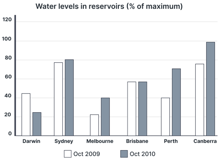
The charts below show the water levels of 6 cities in Australia in October 2009 and 2010.
Summarise the information by selecting and reporting the main features, and make comparisons where relevant. Write at least 150 words.
The charts below show the water levels of 6 cities in Australia in October 2009 and 2010.
Summarise the information by selecting and reporting the main features, and make comparisons where relevant. Write at least 150 words.
Câu hỏi trong đề: 2000 câu trắc nghiệm tổng hợp Tiếng Anh 2025 có đáp án !!
Quảng cáo
Trả lời:
Sample 1:
The presented bar chart illustrates the variations in water levels across six Australian cities during October 2009 and 2010.
Overall, the majority of the surveyed cities witnessed an upward trend in the water levels in the reservoirs in October 2010 compared to the preceding year. The only two exceptions were Darwin, where the water level decreased, and Brisbane which recorded no change. In addition, Canberra was the city with the highest percentage of water stored in its reservoirs in both years.
In October 2009, Sydney and Canberra had the most abundant water reserves, with approximately 75% water capacity each. Brisbane, Darwin, and Perth followed, registering figures ranging from 40% to approximately 55%. In contrast, Melbourne recorded the lowest water percentage in its reservoirs, hovering around 25%.
One year later, Perth witnessed the largest increase in water levels, hitting a high of just above 70%. Having a similar trend, the figure for Canberra reached a peak of nearly 100%, making it the city with the highest level of water. Although Sydney and Melbourne also experienced upward trends, their growth was less pronounced, with respective figures in 2010 of 80% and 40%. Conversely, Darwin encountered a notable decline in its reservoir water, decreasing to just under 30% of its capacity in October 2010. Finally, the figure for Brisbane remained unchanged compared to the previous year.
Sample 2:
The bar chart illustrates the changes in the levels of water in reservoirs across six Australian urban areas between October 2009 and the same month in 2010.
Overall, the water level in Darwin decreased over the period in question, whereas the opposite was true in the case of the other cities, except for Brisbane, where no changes were recorded. Additionally, Canberra had replaced Sydney to become the city with the highest percentage of water stored in its reservoir by the end of the period.
In October 2009, Sydney and Canberra had more water at their disposal than any other city listed, as around 75% of their reservoir levels were filled. These metropolises were followed by Brisbane, Darwin, and Perth, with their figures ranging from 40% to nearly 60%. In the last position was Melbourne, whose water reservoir was just over a fifth full.
After one year, the capital city took the lead, with its water level increasing to a high of close to 100% of the total storage capacity. Sydney and Melbourne followed similar trends, albeit at lower rates, rising to 80% and 40%, respectively. The largest rise was seen in the proportion of water stored in Perth’s reservoir, reaching approximately 70%. This contrasts starkly with the data for Darwin, where a fall to roughly 25% was reported, and lastly, the figure for Brisbane stayed the same.
Sample 3:
The bar chart delineates the fluctuations in water levels within reservoirs across six urban regions in Australia from October 2009 to the corresponding month in 2010.
Across the period, Darwin experienced a decline in water reserves, while the other cities observed an increase, except Brisbane, where no alterations were evident. Notably, Canberra surpassed Sydney to secure the position of the city with the highest water storage percentage in its reservoirs by the end of the period.
In October 2009, Sydney and Canberra boasted the highest water storage among the listed cities, with both locations holding approximately 75% of their reservoir capacities. Following them were Brisbane, Darwin, and Perth, maintaining levels varying from 40% to nearly 60%. Melbourne recorded the lowest water reserves, barely exceeding a fifth of its storage capacity.
Over the course of the year, Canberra ascended to the forefront, with its reservoirs reaching nearly 100% capacity. Meanwhile, Sydney and Melbourne exhibited growth, albeit at slower rates, achieving 80% and 40%, respectively. Perth demonstrated the most substantial rise, with its water reserves escalating to around 70%. In contrast, Darwin experienced a sharp drop to approximately 25%. Brisbane’s water storage level remained constant throughout the duration.
Sample 4:
The bar chart delineates the percentages of water in reservoirs in various cities in Australia in October 2009 and 2010.
Looking from an overall perspective, it is readily apparent that reservoirs in all cities witnessed rising water levels, except Darwin and Brisbane. Sydney and Canberra’s water levels were generally more notable, though Perth demonstrated the strongest growth.
The percentage of water in reservoirs in Sydney in October 2009 was most prominent at around 78%, followed by Canberra, Perth, and Melbourne at 76%, precisely 40%, and slightly over 20%, respectively. The figure for water levels in these cities all experienced rises over one year, with Sydney growing most marginally to roughly 81%, Canberra more substantially to 99%, Perth most dramatically to 70%, and Melbourne nearly doubling to 40%.
In October 2009, Brisbane’s water levels stood at approximately 56%, with Darwin’s data trailing slightly at 45%. Over the following year, Brisbane’s figure thereafter remained unaltered, while Darwin’s dipped considerably to about 23%.
Sample 5:
The bar chart illustrates how the water levels in reservoirs across six Australian cities - Darwin, Sydney, Melbourne, Brisbane, Perth, and Canberra - changed between October 2009 and October 2010.
Overall, water levels in most cities increased over the one-year period, with the exceptions of Darwin, which saw a decrease, and Brisbane, which remained constant. In 2009, Sydney and Canberra had the highest water levels, while in 2010, Canberra took the lead.
In October 2009, Sydney and Canberra had the highest water levels, with their reservoirs at around 75% of capacity. Brisbane followed closely with about 55%. Darwin and Perth were next, with water levels at roughly 45% and 40% respectively. Melbourne recorded the lowest levels, with just over 20% of its reservoirs filled.
By October 2010, Canberra experienced a dramatic increase, with water levels soaring to nearly 100%, the highest among all the cities. Perth and Melbourne both also saw a significant rise to around 70% and 40% respectively. Sydney’s levels, on the other hand, gained minimally to reach 80%. Conversely, the amount of water stored in Darwin dropped significantly after a year, decreasing to just under 30% of its capacity in October 2010. Finally, the number in Brisbane remained the same.
Hot: 1000+ Đề thi cuối kì 2 file word cấu trúc mới 2026 Toán, Văn, Anh... lớp 1-12 (chỉ từ 60k). Tải ngay
CÂU HỎI HOT CÙNG CHỦ ĐỀ
Lời giải

Sample 1:
The bar graph illustrates the overseas students' spending on accommodation, tuition, and living expenses, while the table depicts information about the average weekly expenses by international students in four countries: A, B, C, and D.
Overall, foreign students need to spend the highest in country A and the lowest in D. In nearly every nation, the international students’ weekly average living expenses are the greatest, while their housing cost registers the lowest.
The costliest country for studying is A, with a weekly average expense of 875 dollars. This is followed by B, C, and D, which have weekly expenses of 735, 540, and 435 dollars, respectively. However, foreign students always pay the least for accommodation, which incurs on average weekly 220, 280, 240, and 200 dollars in the nations A, B, C, and D, respectively.
On the other hand, living expenditures account for the highest portion of average weekly costs for international students in countries A, B, and C, with 430, 350, and 275 dollars, correspondingly. Tuition fees in the same countries (A, B and C) come in second with the weekly averages of 358, 320, and 250 dollars in order. However, D is the only nation where education accounts for the highest average spending area, coming in at USD 235, followed by the cost of living (USD 225) and housing (USD 200).
Sample 2:
The table illustrates information regarding the weekly spendings by overseas students in four countries, A, B, C and D, while the bar graph depicts the students’ expenditure on the sectors, housing, education fees and living expenses.
Overall, the cost of studying abroad is the highest in country A and the lowest in D. Apart from country D, living costs account for the most part of the weekly spendings in all countries, while accommodation registers the least.
Regarding the total cost of studying, A is the most expensive country with weekly average 875 dollars, followed by B, C and D with 735, 540 and 435 dollars, respectively. On the other hand, the overseas students always spend the least on accommodation, which are on average weekly 220, 280, 240 and 200 dollars in the corresponding countries A, B, C and D.
Considering the living cost, it takes the largest share of foreign students’ average weekly expenses in countries A, B, and C with 430, 350 and 275 dollars, respectively, while tuition fees in the same countries hold the second place with weekly average 358, 320 and 250 dollars, sequentially. However, D is the only country where tuition fee occupies the highest expenditure with average weekly 235 dollars, followed by living cost (USD 225) and accommodation (USD 200.)
Sample 3:
The table and bar graph depict information regarding the weekly spendings by overseas students in countries A, B C and D.
Overall, there are three elements, housing, school fees and living costs that contribute to the total weekly spendings. The total expenditure in country A is the highest while it is the lowest in country D. Living costs account for the most part of the weekly spendings in all countries except D.
The total mean weekly cost for pupils to study in country A is US$875, next by country B at US$735, and then by country C at US$540, and finally by country D at US$435. The living costs are always the biggest component of the expenditure except for country D, with about US$10 less than the major spending which is the school fees.
Accommodation accounts for the least among all spendings in all countries. The most expensive housing is found in country B, at US$280, and the cheapest in country D at US$200. The middle range can be seen in country A at US$220 and country C at US$240, respectively. Costs of the tuition fee range between US$ 358 and US$235 in country A and D, in order.
Lời giải

Sample 1:
The bar chart and pie chart give information about why US residents travelled and what travel problems they experienced in the year 2009.
It is clear that the principal reason why Americans travelled in 2009 was to commute to and from work. In the same year, the primary concern of Americans, with regard to the trips they made, was the cost of travelling.
Looking more closely at the bar chart, we can see that 49% of the trips made by Americans in 2009 were for the purpose of commuting. By contrast, only 6% of trips were visits to friends or relatives, and one in ten trips were for social or recreation reasons. Shopping was cited as the reason for 16% of all travel, while unspecific ‘personal reasons’ accounted for the remaining 19%.
According to the pie chart, price was the key consideration for 36% of American travellers. Almost one in five people cited safety as their foremost travel concern, while aggressive driving and highway congestion were the main issues for 17% and 14% of the travelling public. Finally, a total of 14% of those surveyed thought that access to public transport or space for pedestrians were the most important travel issues.
Sample 2:
The bar chart compares the figures for Americans going out for five reasons and the pie chart illustrates the percentage of six problems that concerned them when travelling in 2009. Overall, it is clear that the main reason why people in the US went out in 2009 is to commute to work, and the cost of travelling is the problem concerning them the most.
Looking first at the bar graph, the proportion of Americans going out for commuting to work stood at 49%, while the figure for those leaving their house for personal reasons accounted for 19%. In addition, the rate of people in the US going out for shopping and recreation made up 16% and 10%, respectively, while visiting friends or relatives accounted for the lowest percentage, at only 6%.
Turning to the pie chart, the cost of travelling was the most concerning problem of Americans when going out, with the figure making up 36%, while the proportion of safety concerns is half of that, at 19%. In addition, 17% of US citizens were concerned about aggressive drivers, while highway congestion made 14% of them worried when leaving their house. Access to public transportation and places for people to walk accounted for the lowest percentages, at only 8% and 6%, respectively.
Sample 3:
The provided charts offer insights into the reasons for travel and the primary concerns faced by the traveling public in the United States during the year 2009. The data is presented through a bar chart illustrating travel purposes and a pie chart highlighting key issues.
Notably, the primary motivation for travel among Americans in 2009 was commuting to and from work. Simultaneously, the major concern for the traveling public during their trips revolved around the cost associated with travel.
Examining the bar chart in detail reveals that almost half of the trips made by Americans in 2009, precisely 49%, were attributed to commuting. Conversely, visits to friends or relatives accounted for a mere 6%, while social or recreational trips constituted one in ten journeys. Shopping emerged as the purpose for 16% of all travel, leaving the remaining 19% for unspecific ‘personal reasons.’
Turning attention to the pie chart, it becomes evident that cost was the primary consideration for 36% of American travelers. Safety closely followed, with nearly one in five people, or 19%, expressing it as their foremost travel concern. Aggressive driving and highway congestion were significant issues for 17% and 14% of the traveling public, respectively. Additionally, 14% of respondents identified access to public transport or space for pedestrians as the most crucial travel issues.
Sample 4:
The bar chart shows why American people chose to travel, and the pie chart shows the main issues for the travelling public in the USA, both for 2009. The trend suggests that the reason and price were the main issues for travel in the United States. It is clear that commuting from work was reported as the biggest contribution to travel, at 49%. People who went travelling for personal reasons and shopping accounted for 35% when these two groups are combined. However, interaction with friends and relatives only accounted for 25% less than the above categories. And social and recreational activities took up only 6%, which was the lowest figure by more than 43%. The travelling public’s main issues were related to price and safety, with 55% of respondents reporting these two issues. While other issues accounted for a relatively small part. Only 17% of the respondents reported issues with aggressive drivers, while highway congestion accounted for even less at 14% of the issues reported. The percentage of access to public transport and space for pedestrians was much lower than the other categories at less than 10% for both. To conclude, price and commuting time were the dominant factors relating to travel in the US in 2009.
Lời giải
Bạn cần đăng ký gói VIP ( giá chỉ từ 250K ) để làm bài, xem đáp án và lời giải chi tiết không giới hạn.
Lời giải
Bạn cần đăng ký gói VIP ( giá chỉ từ 250K ) để làm bài, xem đáp án và lời giải chi tiết không giới hạn.
Lời giải
Bạn cần đăng ký gói VIP ( giá chỉ từ 250K ) để làm bài, xem đáp án và lời giải chi tiết không giới hạn.
Lời giải
Bạn cần đăng ký gói VIP ( giá chỉ từ 250K ) để làm bài, xem đáp án và lời giải chi tiết không giới hạn.
Lời giải
Bạn cần đăng ký gói VIP ( giá chỉ từ 250K ) để làm bài, xem đáp án và lời giải chi tiết không giới hạn.