


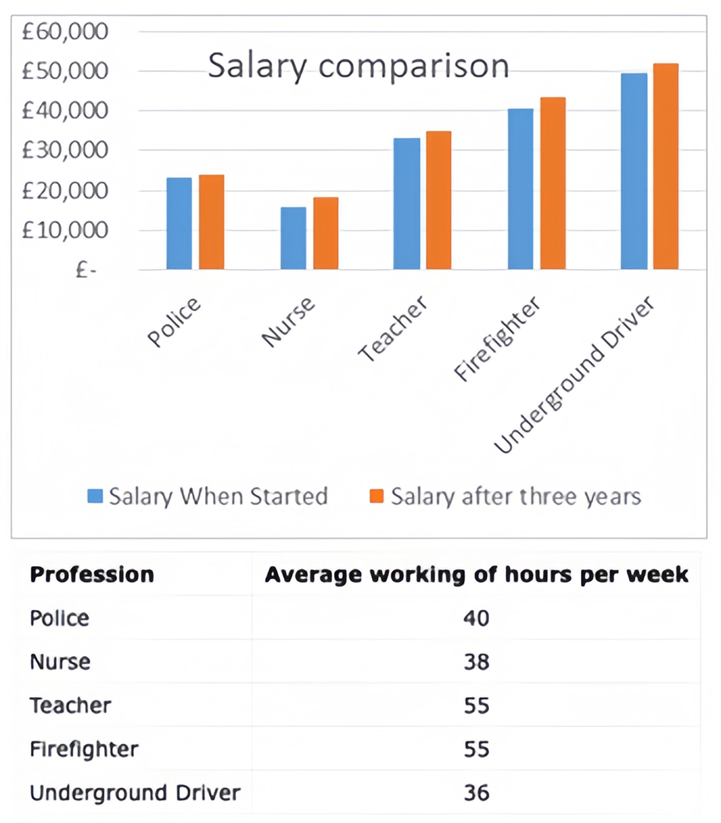
The chart below shows information about various professions in the U.K. and their salaries. The table shows the average working hours per week for each profession.
Summarise the information by selecting and reporting the main features, and make comparisons where relevant. Write at least 150 words.
The chart below shows information about various professions in the U.K. and their salaries. The table shows the average working hours per week for each profession.
Summarise the information by selecting and reporting the main features, and make comparisons where relevant. Write at least 150 words.
Câu hỏi trong đề: 2000 câu trắc nghiệm tổng hợp Tiếng Anh 2025 có đáp án !!
Quảng cáo
Trả lời:
Sample 1:
The bar chart and table demonstrate the income and average weekly working hours for several occupations in the UK.
Overall, it is evident that in the UK, most professions witness a wage raise after three years of experience. However, there is a significant gap in average weekly working hours amongst careers, with teachers and firefighters having substantially higher weekly working hours than underground drivers.
According to the bar chart, underground drivers receive the highest starting income of 50,000 pounds and a salary increase to nearly 51,000 pounds after three years. Nurses, on the other hand, have the lowest earnings, starting at around 17,000 pounds and rising to over 19,000 pounds after three years. Police officers’ salaries remain relatively stable during the three-year period, hovering around 22,000 pounds.
According to the data in the table, teachers and firefighters spend the most weekly hours at work, both averaging 55 hours per week. On the contrary, underground drivers put in the fewest hours per week, clocking in at just 36 hours on average.
Sample 2:
The provided bar chart and table delineate income variations and average weekly working hours across various occupations in the UK.
Overall, the data reveals a common trend of salary escalation across most professions after a three-year tenure. However, a substantial divergence exists in the average weekly working hours among occupations, with teachers and firefighters dedicating considerably more hours per week, contrasting with underground drivers.
In the bar chart, underground drivers commence with the highest initial income, starting at £50,000, escalating marginally to nearly £51,000 after a three-year period. These figures surpass firefighters’ and teachers’ by about £10,000 and £20,000 in each corresponding year. Conversely, nurses initiate with the lowest earnings, commencing around £17,000 and progressing to over £19,000 after three years. Meanwhile, police officers maintain relatively consistent salaries, hovering near £22,000 throughout the three-year timeframe.
Examining the table data, both teachers and firefighters record the highest weekly work hours, averaging 55 hours per week. In contrast, underground drivers maintain the shortest workweek, averaging only 36 hours per week. In comparison, the average working hours of police officers are 40, compared to 38 working hours a week of nurses.
Sample 3:
The bar graph and table compare the starting salaries and salaries after three years of five different professions: underground train drivers, nurses, teachers, firefighters, and police officers. It also shows the average weekly working hours of each profession.
Several trends can be identified from the data. The underground train driver had the highest salary both at the start and after three years, earning just under £50,000 per year, while the nurse earned the least with a salary of only around £15,700. In terms of salary increments, the underground train driver received the greatest increase of £2,500 over three years, whereas the police officer received the lowest rise of £600.
Importantly, despite all professions receiving pay increases, the same professions remain at the opposite end of the salary scale after three years. The underground train driver continues to be the highest paid, while the nurse's salary remains the lowest. So, in summary, while individual salaries increased, the overall trend between the highest and lowest-paid professions persisted over the period shown.
Sample 4:
The line graph compares the average salaries and weekly working hours of four different jobs in the UK: police, nurses, firefighters, and underground drivers.
The graph clearly shows that underground drivers have both the lowest average weekly working hours and the highest salaries. They typically work 36 hours per week and earn £50,000 in their first year, rising to £51,000 after three years. In contrast, firefighters have among the highest average weekly working hours at 55.
Police officers work an average of 40 hours per week. Their starting salary of £2,100 sees a modest rise to £2,300 over three years. Firefighters have the longest weekly working hours of 55, but their salaries are the second highest. They earn £40,000 in the first year, growing to £41,000 after three years.
In summary, underground drivers benefit most from working the fewest hours yet earning the highest pay. Nurses face the opposite situation, with high working hours yet relatively low wages.
Sample 5:
The bar chart and table compare the starting salaries and earnings after three years, as well as the average weekly working hours, of several occupations in the UK. Underground drivers earn the highest starting wage of £50,000 according to the bar chart. Their salary increases slightly to just under £51,000 after three years. In contrast, nurses have the lowest pay, commencing at approximately £17,000 and rising to over £19,000 subsequently. Police officers' salaries remain relatively stable during the three years, around £22,000.
The table provides data on the average weekly working hours for each profession. Teachers and firefighters top the list with 55 hours per week on average. In stark contrast, underground drivers put in the fewest hours, only 36 per week.
In summary, the visuals demonstrate that while underground drivers enjoy the top starting salary, teachers and firefighters work significantly longer hours weekly than other occupations such as underground drivers, according to the information presented.
Hot: 1000+ Đề thi cuối kì 2 file word cấu trúc mới 2026 Toán, Văn, Anh... lớp 1-12 (chỉ từ 60k). Tải ngay
CÂU HỎI HOT CÙNG CHỦ ĐỀ
Lời giải

Sample 1:
The bar graph illustrates the overseas students' spending on accommodation, tuition, and living expenses, while the table depicts information about the average weekly expenses by international students in four countries: A, B, C, and D.
Overall, foreign students need to spend the highest in country A and the lowest in D. In nearly every nation, the international students’ weekly average living expenses are the greatest, while their housing cost registers the lowest.
The costliest country for studying is A, with a weekly average expense of 875 dollars. This is followed by B, C, and D, which have weekly expenses of 735, 540, and 435 dollars, respectively. However, foreign students always pay the least for accommodation, which incurs on average weekly 220, 280, 240, and 200 dollars in the nations A, B, C, and D, respectively.
On the other hand, living expenditures account for the highest portion of average weekly costs for international students in countries A, B, and C, with 430, 350, and 275 dollars, correspondingly. Tuition fees in the same countries (A, B and C) come in second with the weekly averages of 358, 320, and 250 dollars in order. However, D is the only nation where education accounts for the highest average spending area, coming in at USD 235, followed by the cost of living (USD 225) and housing (USD 200).
Sample 2:
The table illustrates information regarding the weekly spendings by overseas students in four countries, A, B, C and D, while the bar graph depicts the students’ expenditure on the sectors, housing, education fees and living expenses.
Overall, the cost of studying abroad is the highest in country A and the lowest in D. Apart from country D, living costs account for the most part of the weekly spendings in all countries, while accommodation registers the least.
Regarding the total cost of studying, A is the most expensive country with weekly average 875 dollars, followed by B, C and D with 735, 540 and 435 dollars, respectively. On the other hand, the overseas students always spend the least on accommodation, which are on average weekly 220, 280, 240 and 200 dollars in the corresponding countries A, B, C and D.
Considering the living cost, it takes the largest share of foreign students’ average weekly expenses in countries A, B, and C with 430, 350 and 275 dollars, respectively, while tuition fees in the same countries hold the second place with weekly average 358, 320 and 250 dollars, sequentially. However, D is the only country where tuition fee occupies the highest expenditure with average weekly 235 dollars, followed by living cost (USD 225) and accommodation (USD 200.)
Sample 3:
The table and bar graph depict information regarding the weekly spendings by overseas students in countries A, B C and D.
Overall, there are three elements, housing, school fees and living costs that contribute to the total weekly spendings. The total expenditure in country A is the highest while it is the lowest in country D. Living costs account for the most part of the weekly spendings in all countries except D.
The total mean weekly cost for pupils to study in country A is US$875, next by country B at US$735, and then by country C at US$540, and finally by country D at US$435. The living costs are always the biggest component of the expenditure except for country D, with about US$10 less than the major spending which is the school fees.
Accommodation accounts for the least among all spendings in all countries. The most expensive housing is found in country B, at US$280, and the cheapest in country D at US$200. The middle range can be seen in country A at US$220 and country C at US$240, respectively. Costs of the tuition fee range between US$ 358 and US$235 in country A and D, in order.
Lời giải

Sample 1:
The bar chart and pie chart give information about why US residents travelled and what travel problems they experienced in the year 2009.
It is clear that the principal reason why Americans travelled in 2009 was to commute to and from work. In the same year, the primary concern of Americans, with regard to the trips they made, was the cost of travelling.
Looking more closely at the bar chart, we can see that 49% of the trips made by Americans in 2009 were for the purpose of commuting. By contrast, only 6% of trips were visits to friends or relatives, and one in ten trips were for social or recreation reasons. Shopping was cited as the reason for 16% of all travel, while unspecific ‘personal reasons’ accounted for the remaining 19%.
According to the pie chart, price was the key consideration for 36% of American travellers. Almost one in five people cited safety as their foremost travel concern, while aggressive driving and highway congestion were the main issues for 17% and 14% of the travelling public. Finally, a total of 14% of those surveyed thought that access to public transport or space for pedestrians were the most important travel issues.
Sample 2:
The bar chart compares the figures for Americans going out for five reasons and the pie chart illustrates the percentage of six problems that concerned them when travelling in 2009. Overall, it is clear that the main reason why people in the US went out in 2009 is to commute to work, and the cost of travelling is the problem concerning them the most.
Looking first at the bar graph, the proportion of Americans going out for commuting to work stood at 49%, while the figure for those leaving their house for personal reasons accounted for 19%. In addition, the rate of people in the US going out for shopping and recreation made up 16% and 10%, respectively, while visiting friends or relatives accounted for the lowest percentage, at only 6%.
Turning to the pie chart, the cost of travelling was the most concerning problem of Americans when going out, with the figure making up 36%, while the proportion of safety concerns is half of that, at 19%. In addition, 17% of US citizens were concerned about aggressive drivers, while highway congestion made 14% of them worried when leaving their house. Access to public transportation and places for people to walk accounted for the lowest percentages, at only 8% and 6%, respectively.
Sample 3:
The provided charts offer insights into the reasons for travel and the primary concerns faced by the traveling public in the United States during the year 2009. The data is presented through a bar chart illustrating travel purposes and a pie chart highlighting key issues.
Notably, the primary motivation for travel among Americans in 2009 was commuting to and from work. Simultaneously, the major concern for the traveling public during their trips revolved around the cost associated with travel.
Examining the bar chart in detail reveals that almost half of the trips made by Americans in 2009, precisely 49%, were attributed to commuting. Conversely, visits to friends or relatives accounted for a mere 6%, while social or recreational trips constituted one in ten journeys. Shopping emerged as the purpose for 16% of all travel, leaving the remaining 19% for unspecific ‘personal reasons.’
Turning attention to the pie chart, it becomes evident that cost was the primary consideration for 36% of American travelers. Safety closely followed, with nearly one in five people, or 19%, expressing it as their foremost travel concern. Aggressive driving and highway congestion were significant issues for 17% and 14% of the traveling public, respectively. Additionally, 14% of respondents identified access to public transport or space for pedestrians as the most crucial travel issues.
Sample 4:
The bar chart shows why American people chose to travel, and the pie chart shows the main issues for the travelling public in the USA, both for 2009. The trend suggests that the reason and price were the main issues for travel in the United States. It is clear that commuting from work was reported as the biggest contribution to travel, at 49%. People who went travelling for personal reasons and shopping accounted for 35% when these two groups are combined. However, interaction with friends and relatives only accounted for 25% less than the above categories. And social and recreational activities took up only 6%, which was the lowest figure by more than 43%. The travelling public’s main issues were related to price and safety, with 55% of respondents reporting these two issues. While other issues accounted for a relatively small part. Only 17% of the respondents reported issues with aggressive drivers, while highway congestion accounted for even less at 14% of the issues reported. The percentage of access to public transport and space for pedestrians was much lower than the other categories at less than 10% for both. To conclude, price and commuting time were the dominant factors relating to travel in the US in 2009.
Lời giải
Bạn cần đăng ký gói VIP ( giá chỉ từ 250K ) để làm bài, xem đáp án và lời giải chi tiết không giới hạn.
Lời giải
Bạn cần đăng ký gói VIP ( giá chỉ từ 250K ) để làm bài, xem đáp án và lời giải chi tiết không giới hạn.
Lời giải
Bạn cần đăng ký gói VIP ( giá chỉ từ 250K ) để làm bài, xem đáp án và lời giải chi tiết không giới hạn.
Lời giải
Bạn cần đăng ký gói VIP ( giá chỉ từ 250K ) để làm bài, xem đáp án và lời giải chi tiết không giới hạn.
Lời giải
Bạn cần đăng ký gói VIP ( giá chỉ từ 250K ) để làm bài, xem đáp án và lời giải chi tiết không giới hạn.