The table and pie charts below show the number of research students in Australian universities in 2001 and 2010.
Summarise the information by selecting and reporting the main features, and make comparisons where relevant. Write at least 150 words.
The table and pie charts below show the number of research students in Australian universities in 2001 and 2010.
Summarise the information by selecting and reporting the main features, and make comparisons where relevant. Write at least 150 words.
Câu hỏi trong đề: 2000 câu trắc nghiệm tổng hợp Tiếng Anh 2025 có đáp án !!
Quảng cáo
Trả lời:
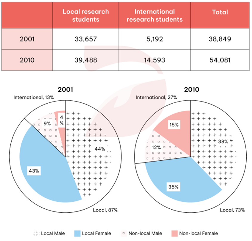
Sample 1:
The provided charts illustrate the participation of local and international students in research fields at Australian universities in 2001 and 2010, along with a breakdown of research students by gender over the same period.
Overall, there was a notable increase in the number of students pursuing research between 2001 and 2010. What also stands out from the chart is that local students showed a particularly strong interest in research, outnumbering their international counterparts in both years. Additionally, local male students dominated the major in both periods.
In 2001, approximately 34,000 Australian students engaged in research, nearly seven times the figure for their international counterparts. For the following 10 years, the number of local students grew modestly to roughly 40,000 students. Even though a threefold increase to around 15000 international students was recorded in the participation in research majors, this figure was far lower than that of local students in 2010.
Turning to gender distribution, the proportion of male and female local students in research fields was relatively balanced in 2001, at 44% and 43% respectively. Among international students, however, there was a notable gender disparity, with only 9% male and 4% female. By 2010, the gender gap among local students had widened slightly, with males accounting for 38% compared to 35% of females. A similar gap of 3% could also be seen in the percentage of international students choosing research fields. However, among these students, the proportion of females, at 15%, surpassed that of males, standing at 13%, indicating a shifting trend over a decade.
Sample 2:
The table illustrates how many local and foreign research students studied at universities in Australia in the years 2001 and 2010, while the pie charts show the proportions of gender among those same students.
Overall, there was an increase in the total number of research students in Australian universities, with local students far outnumbering their non-local counterparts in both years. Despite this, the former’s share decreased as international enrollments rose. Additionally, the gender distribution remained relatively balanced.
In 2001, Australian colleges had 33,657 domestic and 5,192 international students engaged in research, totaling 38,849. By 2010, local student numbers had risen slightly to 39,488, while that of international students had almost tripled to 14,593, bringing the total number to 54,081.
In terms of gender distribution, in 2001, local research students made up 87% of the total, with almost equal percentages across both sexes. Their international counterparts, split between 9% male and 4% female, accounted for the remaining 13%. By 2010, the proportion of domestic research students had declined to 73%, yet the gender gap widened slightly, with males and females representing 38% and 35% respectively. This fall corresponded with a two-fold rise in the percentage of foreign research students, reaching 27%, where females (15%) surpassed males (12%).
Sample 3:
The table and pie graphs depict the number of domestic and foreign students involved in research, with a further breakdown of the proportion of genders, in Australian colleges in two separate years: 2001 and 2010. Overall, the total number of students increased, which was mirrored by both nationality categories. Additionally, local students consistently accounted for the larger share, and gender distribution was fairly even across all students throughout.
Regarding student counts, 2001 recorded 33,657 domestic students and 5,192 foreign ones, totaling 38,849. A decade later, local students increased to 39,488, whereas their international counterparts nearly tripled to 14,593 individuals. Accordingly, the total number of university research students in Australia rose to 54,081.
Concerning the composition, in 2001, local undergraduates accounted for 87% of the total number, with gender distribution being almost identical. Meanwhile, international male and female students constituted 4% and 9%, respectively, making up 13% of the total. By 2010, the percentage of local students dropped to 73%, which resulted from decreases in males to 38% and females to 35%. Finally, the increases in the rate of overseas males to 12% and females to 15% ultimately led to an overall 27% representation.
Sample 4:
The table and pie chart illustrate data on the number of students doing research degrees in Australian universities in 2001 and 2010.
Overall, there was a strong growth in the total number of research students while significantly more local students enrolled in research courses compared to international students.
The number of local research students rose slightly from 33,577 to 39,488 during the 9-year period. Yet there was an almost threefold increase in that of international students, jumping from over 5,000 in 2001 to nearly 14,600 students in 2010. This resulted in an increase of around 15,000 in the total amount of research students in Australian universities, though by 2010, there still had been a huge difference of roughly 25,000 between the number of international and local students pursuing research programs.
In 2001, the proportion of international research students who were male, which accounted for 9% of the total, was more than double that of females (4%). However, 9 years later, the figures for female international students increased and overtook that of males, reaching 15% and 12% of the total respectively. By contrast, the percentages of male and female local research students stayed either equal or similar to each other in the two years surveyed.
Sample 5:
The table and pie charts give information about how many research students studied at universities in Australia in the years 2001 and 2010.
Overall, the number of research students saw a significant rise over the period given, with local research students far exceeding international ones. It is also noticeable that the figures for males and females, regardless of local and international students, were relatively the same in both years, except for those for local males in 2001, which were almost twice as high as their female counterparts.
In 2001, Australian universities recorded a total of 38,849 research students, of which a striking 33,657 students came from Australia, whereas the rest (5,192) were from other countries. Over the following nine years, considerable growth was seen in the total number, increasing to 54,081. Notably, such a growth primarily resulted from international research students, whose numbers almost tripled to 14,593, compared to a marginal increase of around 6,000 among local research students, although they still clearly dominated the table.
Regarding local students doing research in Australian universities, the percentage of males and females made up a combined 87%, with each gender accounting for around 44%. However, in 2010, both of these proportions underwent a declining pattern, falling to 38% and 35% respectively. As for foreign research students, initially 9% of them were males, as opposed to only 4% of their female counterparts, after which their enrollment rates rose noticeably, with a more significant rise seen in the number of female international research students (15% in 2010).
Sample 6:
The provided charts give information about the figures for local and international students going to Australian universities to participate in research fields in 2001 and 2010, along with a breakdown of research students by gender over the same period shown.
Overall, there was a significant increase in the number of both local and international research students between 2001 and 2010. It can also be seen that Australian students showed an intense interest in research, outnumbering their international counterparts; moreover, local males dominated the major in both years.
In 2001, the figure for Australian students specializing in research was approximately 34,000, which was tremendously higher than that of international students, with over 5,000. In the following 10 years, although the number of international research students saw a threefold increase to around 15,000 people, it was still far lower compared to the modest rise of local students, with about 40,000 people.
Looking at gender distribution, the percentage of male and female local students pursuing research was relatively balanced in 2001, at 44% and 43% respectively; however, the opposite was true for international students, with only 9% male and 4% female. 10 years later, there was a slightly wider gender gap among local students, with 38% male and 35% female. Likewise, a similar gap of 3% was witnessed in the proportion of international students choosing research fields. Nevertheless, a shifting trend could be seen when the proportion of females, at 15%, surpassed that of males, standing at 13% over ten years.
Sample 7:
The table and the pie charts show the local and international research students in Australian universities between 2001 to 2010.
In general, the strength of local research students in Australian universities remained higher than the international research students in both the years and with time the strength of both local and international students increased in universities.
According to the table, the strength of local research students in 2001 was 33,657 whereas the strength of international research students was only 5,192. On the other hand, the strength of both international and local research students increased to 39,488 and 14,593 in 2010. Overall, by 2010, 15,232 research students took admission in colleges.
The given pie charts provide an estimate of local students and international research students. The ratio of local students was 87% and international students was 13% in 2001. Whereas this ratio changed by 2010 as the strength of international students increased to 27% and local students’ strength reduced to 73%. Moreover, the pie charts are further divided into male and female categories and provide information about the amount of local and international research students based on gender. The percentage of international research students increased from 9% male and 4% female to 12% male and 15% female respectively.
Sample 8:
The given diagrams compare the quantity of research students in Australian universities in two years.
It is obvious that Australian universities experienced a significant growth in the number of research students, and this growth was mainly contributed by the rise of international ones.
In 2001, about 39,000 was the total number of research students, in which the figure for local students (about 34,000) was almost six times higher than that of foreign ones. Regarding local students, the percentages of males and females were the same, accounting for 43% of the total number of students; however, within the foreign group, the proportion of males was over twice as high as that of females.
In 2010, there were just over 54,000 research students, and the percentage of local students declined to 73% as a result of the twofold increase of international students. Among international groups, the most noticeable growth was seen in the proportion of females with a fourfold increase while the figure for males slightly went up to 12%. In contrast, both the percentages of local male and female research students dropped slightly to 39% and 35% respectively.
Hot: 1000+ Đề thi cuối kì 2 file word cấu trúc mới 2026 Toán, Văn, Anh... lớp 1-12 (chỉ từ 60k). Tải ngay
Các sản phẩm khác của Vietjack:
CÂU HỎI HOT CÙNG CHỦ ĐỀ
Lời giải

Sample 1:
The bar graph illustrates the overseas students' spending on accommodation, tuition, and living expenses, while the table depicts information about the average weekly expenses by international students in four countries: A, B, C, and D.
Overall, foreign students need to spend the highest in country A and the lowest in D. In nearly every nation, the international students’ weekly average living expenses are the greatest, while their housing cost registers the lowest.
The costliest country for studying is A, with a weekly average expense of 875 dollars. This is followed by B, C, and D, which have weekly expenses of 735, 540, and 435 dollars, respectively. However, foreign students always pay the least for accommodation, which incurs on average weekly 220, 280, 240, and 200 dollars in the nations A, B, C, and D, respectively.
On the other hand, living expenditures account for the highest portion of average weekly costs for international students in countries A, B, and C, with 430, 350, and 275 dollars, correspondingly. Tuition fees in the same countries (A, B and C) come in second with the weekly averages of 358, 320, and 250 dollars in order. However, D is the only nation where education accounts for the highest average spending area, coming in at USD 235, followed by the cost of living (USD 225) and housing (USD 200).
Sample 2:
The table illustrates information regarding the weekly spendings by overseas students in four countries, A, B, C and D, while the bar graph depicts the students’ expenditure on the sectors, housing, education fees and living expenses.
Overall, the cost of studying abroad is the highest in country A and the lowest in D. Apart from country D, living costs account for the most part of the weekly spendings in all countries, while accommodation registers the least.
Regarding the total cost of studying, A is the most expensive country with weekly average 875 dollars, followed by B, C and D with 735, 540 and 435 dollars, respectively. On the other hand, the overseas students always spend the least on accommodation, which are on average weekly 220, 280, 240 and 200 dollars in the corresponding countries A, B, C and D.
Considering the living cost, it takes the largest share of foreign students’ average weekly expenses in countries A, B, and C with 430, 350 and 275 dollars, respectively, while tuition fees in the same countries hold the second place with weekly average 358, 320 and 250 dollars, sequentially. However, D is the only country where tuition fee occupies the highest expenditure with average weekly 235 dollars, followed by living cost (USD 225) and accommodation (USD 200.)
Sample 3:
The table and bar graph depict information regarding the weekly spendings by overseas students in countries A, B C and D.
Overall, there are three elements, housing, school fees and living costs that contribute to the total weekly spendings. The total expenditure in country A is the highest while it is the lowest in country D. Living costs account for the most part of the weekly spendings in all countries except D.
The total mean weekly cost for pupils to study in country A is US$875, next by country B at US$735, and then by country C at US$540, and finally by country D at US$435. The living costs are always the biggest component of the expenditure except for country D, with about US$10 less than the major spending which is the school fees.
Accommodation accounts for the least among all spendings in all countries. The most expensive housing is found in country B, at US$280, and the cheapest in country D at US$200. The middle range can be seen in country A at US$220 and country C at US$240, respectively. Costs of the tuition fee range between US$ 358 and US$235 in country A and D, in order.
Lời giải

Sample 1:
The bar chart and pie chart give information about why US residents travelled and what travel problems they experienced in the year 2009.
It is clear that the principal reason why Americans travelled in 2009 was to commute to and from work. In the same year, the primary concern of Americans, with regard to the trips they made, was the cost of travelling.
Looking more closely at the bar chart, we can see that 49% of the trips made by Americans in 2009 were for the purpose of commuting. By contrast, only 6% of trips were visits to friends or relatives, and one in ten trips were for social or recreation reasons. Shopping was cited as the reason for 16% of all travel, while unspecific ‘personal reasons’ accounted for the remaining 19%.
According to the pie chart, price was the key consideration for 36% of American travellers. Almost one in five people cited safety as their foremost travel concern, while aggressive driving and highway congestion were the main issues for 17% and 14% of the travelling public. Finally, a total of 14% of those surveyed thought that access to public transport or space for pedestrians were the most important travel issues.
Sample 2:
The bar chart compares the figures for Americans going out for five reasons and the pie chart illustrates the percentage of six problems that concerned them when travelling in 2009. Overall, it is clear that the main reason why people in the US went out in 2009 is to commute to work, and the cost of travelling is the problem concerning them the most.
Looking first at the bar graph, the proportion of Americans going out for commuting to work stood at 49%, while the figure for those leaving their house for personal reasons accounted for 19%. In addition, the rate of people in the US going out for shopping and recreation made up 16% and 10%, respectively, while visiting friends or relatives accounted for the lowest percentage, at only 6%.
Turning to the pie chart, the cost of travelling was the most concerning problem of Americans when going out, with the figure making up 36%, while the proportion of safety concerns is half of that, at 19%. In addition, 17% of US citizens were concerned about aggressive drivers, while highway congestion made 14% of them worried when leaving their house. Access to public transportation and places for people to walk accounted for the lowest percentages, at only 8% and 6%, respectively.
Sample 3:
The provided charts offer insights into the reasons for travel and the primary concerns faced by the traveling public in the United States during the year 2009. The data is presented through a bar chart illustrating travel purposes and a pie chart highlighting key issues.
Notably, the primary motivation for travel among Americans in 2009 was commuting to and from work. Simultaneously, the major concern for the traveling public during their trips revolved around the cost associated with travel.
Examining the bar chart in detail reveals that almost half of the trips made by Americans in 2009, precisely 49%, were attributed to commuting. Conversely, visits to friends or relatives accounted for a mere 6%, while social or recreational trips constituted one in ten journeys. Shopping emerged as the purpose for 16% of all travel, leaving the remaining 19% for unspecific ‘personal reasons.’
Turning attention to the pie chart, it becomes evident that cost was the primary consideration for 36% of American travelers. Safety closely followed, with nearly one in five people, or 19%, expressing it as their foremost travel concern. Aggressive driving and highway congestion were significant issues for 17% and 14% of the traveling public, respectively. Additionally, 14% of respondents identified access to public transport or space for pedestrians as the most crucial travel issues.
Sample 4:
The bar chart shows why American people chose to travel, and the pie chart shows the main issues for the travelling public in the USA, both for 2009. The trend suggests that the reason and price were the main issues for travel in the United States. It is clear that commuting from work was reported as the biggest contribution to travel, at 49%. People who went travelling for personal reasons and shopping accounted for 35% when these two groups are combined. However, interaction with friends and relatives only accounted for 25% less than the above categories. And social and recreational activities took up only 6%, which was the lowest figure by more than 43%. The travelling public’s main issues were related to price and safety, with 55% of respondents reporting these two issues. While other issues accounted for a relatively small part. Only 17% of the respondents reported issues with aggressive drivers, while highway congestion accounted for even less at 14% of the issues reported. The percentage of access to public transport and space for pedestrians was much lower than the other categories at less than 10% for both. To conclude, price and commuting time were the dominant factors relating to travel in the US in 2009.
Lời giải
Bạn cần đăng ký gói VIP ( giá chỉ từ 250K ) để làm bài, xem đáp án và lời giải chi tiết không giới hạn.
Lời giải
Bạn cần đăng ký gói VIP ( giá chỉ từ 250K ) để làm bài, xem đáp án và lời giải chi tiết không giới hạn.
Lời giải
Bạn cần đăng ký gói VIP ( giá chỉ từ 250K ) để làm bài, xem đáp án và lời giải chi tiết không giới hạn.
Lời giải
Bạn cần đăng ký gói VIP ( giá chỉ từ 250K ) để làm bài, xem đáp án và lời giải chi tiết không giới hạn.
Lời giải
Bạn cần đăng ký gói VIP ( giá chỉ từ 250K ) để làm bài, xem đáp án và lời giải chi tiết không giới hạn.