


The charts below show the proportion of holidaymakers using four different types of accommodation in three different years.
Summarise the information by selecting and reporting the main features, and make comparisons where relevant. Write at least 150 words.
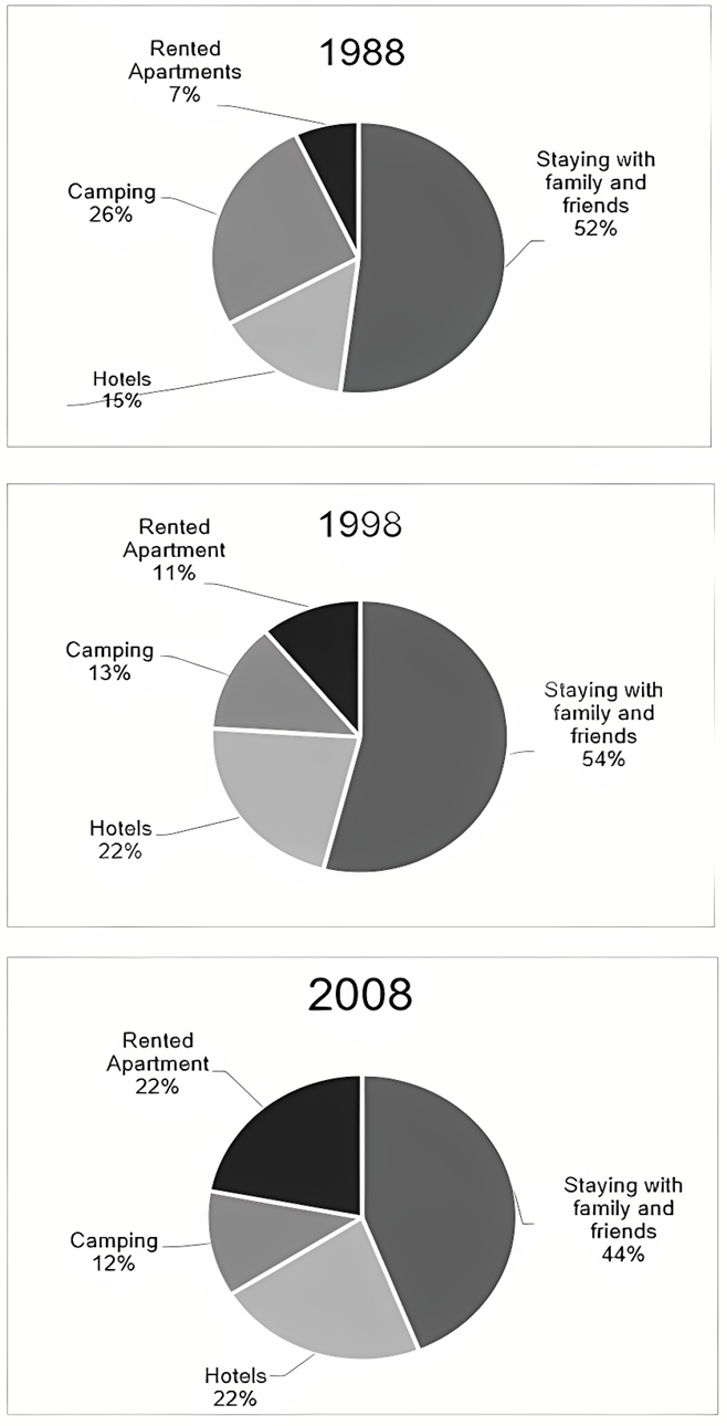
The charts below show the proportion of holidaymakers using four different types of accommodation in three different years.
Summarise the information by selecting and reporting the main features, and make comparisons where relevant. Write at least 150 words.
Câu hỏi trong đề: 2000 câu trắc nghiệm tổng hợp Tiếng Anh 2025 có đáp án !!
Quảng cáo
Trả lời:
Sample 1:
The pie charts compare the choices of accommodation when people took holidays in three separate years – 1988, 1998 and 2008.
Overall, although a large percentage of travelers still preferred to stay with people they know, the choice of renting an apartment had attracted more holidaymakers over the two decades.
In 1988, more than half (52%) of travelers chose to stay at their friends’ or family’s place, which was twice as many as the proportion of those who decided to camp outside, at 26%. The third preferable choice of accommodation turned out to be hotels which held 15% of tourists in this year. Only a small proportion (7%) of holiday makers tended to rent an apartment.
10 years later, staying with acquaintances remained as the main choice, whereas hotels and rented apartments attracted a higher proportion of travelers than in 1988, at 22% and 11% respectively. The percentage of campers had reduced by half.
This situation had obviously changed in 2008, when 22% of tourists accommodated themselves in a rented apartment, twice as many as the proportion of this group in 1998, while 44% lived with family members and friends, 10% lower than in 1998. Hotels and camping sites did not see any increase in their market share.
Sample 2:
The pie charts compare the proportion of holidaymakers who stayed with family and friends, who stayed at hotels, who stayed at rented apartments and who camped between 1988 and 2008.
Overall, it can be seen that the proportion of holidaymakers who stayed with family and friends was significantly more than those who preferred the other three types of accommodation. Moreover, the figures for those staying with family and friends and those doing camping fell, while the proportion choosing hotels and rented apartments increased.
In 1988, just over half of holidaymakers stayed with friends and family while the proportion camping out was nearly half of that. With time, both these numbers fell and in 2008, 44% stayed with family and friends and only 12% preferred to camp out on holidays.
By contrast, the percentage of holidaymakers renting places during holidays and boarding at hotels rose with time. In 1988, only 7% stayed in rented apartments, while the proportion of staying at hotels accounted for 15% of the holidaymakers. In 2008, the figure stood at 22% for both rented apartments and hotels.
Sample 3:
The pie charts illustrate four common types of accommodation that people chose when on holiday in 1988, 1998, and 2008.
Overall, the most popular choice of accommodation when on holiday was to stay with family, despite a downward trend over the twenty-year period. In contrast, while renting apartments and staying in hotels became more popular over the years, camping became less popular.
In 1988, 52% of people on holiday chose to stay with family. This figure rose to 54% ten years later; however, it dropped to 44% by 2008. Approximately a quarter of all holiday-makers chose to camp when on holiday in 1988, but this became less and less popular reaching 12% by 2008.
Staying in hotels and renting apartments were the least popular accommodation choices among holiday-makers in 1988, at 15% and 7% respectively. These figures gradually increased over the following twenty years, both reaching 22% by 2008.
Sample 4:
The pie charts compare the distribution of travelers using four different types of accommodation from 1988 to 2008, in ten-year intervals. Generally, while there was a dip in popularity, staying with family was the most common choice of accommodation. Both renting apartments and staying in hotels saw an increase throughout the period, while camping and staying with family saw a downward trend.
In 1988, 58% of holiday-goers stayed with their family while on vacation. This figure increased to 54% in 1998, followed by a 10% drop in 2008, making it the most popular choice of accommodation throughout the period. Similarly, campers accounted for 26% of all holidaymakers in 1988, before dropping to 13% in 1998. This figure saw a minor decrease to 12% in 2008.
Conversely, only 7% of travelers chose apartments as the preferred method of accommodation in 1988, which indicated that this was the least common accommodation choice in 1988. In 1998, however, this figure increased to 11%, followed by another increase to 22% in 2008. A similar rise was seen in hotels, where 15% of visitors selected this type of accommodation in 1988. Following this, hotels saw a noticeable increase in popularity, rising to 22% in 1998, and remained stable at this number until 2008.
Hot: 1000+ Đề thi cuối kì 2 file word cấu trúc mới 2026 Toán, Văn, Anh... lớp 1-12 (chỉ từ 60k). Tải ngay
CÂU HỎI HOT CÙNG CHỦ ĐỀ
Lời giải

Sample 1:
The bar graph illustrates the overseas students' spending on accommodation, tuition, and living expenses, while the table depicts information about the average weekly expenses by international students in four countries: A, B, C, and D.
Overall, foreign students need to spend the highest in country A and the lowest in D. In nearly every nation, the international students’ weekly average living expenses are the greatest, while their housing cost registers the lowest.
The costliest country for studying is A, with a weekly average expense of 875 dollars. This is followed by B, C, and D, which have weekly expenses of 735, 540, and 435 dollars, respectively. However, foreign students always pay the least for accommodation, which incurs on average weekly 220, 280, 240, and 200 dollars in the nations A, B, C, and D, respectively.
On the other hand, living expenditures account for the highest portion of average weekly costs for international students in countries A, B, and C, with 430, 350, and 275 dollars, correspondingly. Tuition fees in the same countries (A, B and C) come in second with the weekly averages of 358, 320, and 250 dollars in order. However, D is the only nation where education accounts for the highest average spending area, coming in at USD 235, followed by the cost of living (USD 225) and housing (USD 200).
Sample 2:
The table illustrates information regarding the weekly spendings by overseas students in four countries, A, B, C and D, while the bar graph depicts the students’ expenditure on the sectors, housing, education fees and living expenses.
Overall, the cost of studying abroad is the highest in country A and the lowest in D. Apart from country D, living costs account for the most part of the weekly spendings in all countries, while accommodation registers the least.
Regarding the total cost of studying, A is the most expensive country with weekly average 875 dollars, followed by B, C and D with 735, 540 and 435 dollars, respectively. On the other hand, the overseas students always spend the least on accommodation, which are on average weekly 220, 280, 240 and 200 dollars in the corresponding countries A, B, C and D.
Considering the living cost, it takes the largest share of foreign students’ average weekly expenses in countries A, B, and C with 430, 350 and 275 dollars, respectively, while tuition fees in the same countries hold the second place with weekly average 358, 320 and 250 dollars, sequentially. However, D is the only country where tuition fee occupies the highest expenditure with average weekly 235 dollars, followed by living cost (USD 225) and accommodation (USD 200.)
Sample 3:
The table and bar graph depict information regarding the weekly spendings by overseas students in countries A, B C and D.
Overall, there are three elements, housing, school fees and living costs that contribute to the total weekly spendings. The total expenditure in country A is the highest while it is the lowest in country D. Living costs account for the most part of the weekly spendings in all countries except D.
The total mean weekly cost for pupils to study in country A is US$875, next by country B at US$735, and then by country C at US$540, and finally by country D at US$435. The living costs are always the biggest component of the expenditure except for country D, with about US$10 less than the major spending which is the school fees.
Accommodation accounts for the least among all spendings in all countries. The most expensive housing is found in country B, at US$280, and the cheapest in country D at US$200. The middle range can be seen in country A at US$220 and country C at US$240, respectively. Costs of the tuition fee range between US$ 358 and US$235 in country A and D, in order.
Lời giải

Sample 1:
The bar chart and pie chart give information about why US residents travelled and what travel problems they experienced in the year 2009.
It is clear that the principal reason why Americans travelled in 2009 was to commute to and from work. In the same year, the primary concern of Americans, with regard to the trips they made, was the cost of travelling.
Looking more closely at the bar chart, we can see that 49% of the trips made by Americans in 2009 were for the purpose of commuting. By contrast, only 6% of trips were visits to friends or relatives, and one in ten trips were for social or recreation reasons. Shopping was cited as the reason for 16% of all travel, while unspecific ‘personal reasons’ accounted for the remaining 19%.
According to the pie chart, price was the key consideration for 36% of American travellers. Almost one in five people cited safety as their foremost travel concern, while aggressive driving and highway congestion were the main issues for 17% and 14% of the travelling public. Finally, a total of 14% of those surveyed thought that access to public transport or space for pedestrians were the most important travel issues.
Sample 2:
The bar chart compares the figures for Americans going out for five reasons and the pie chart illustrates the percentage of six problems that concerned them when travelling in 2009. Overall, it is clear that the main reason why people in the US went out in 2009 is to commute to work, and the cost of travelling is the problem concerning them the most.
Looking first at the bar graph, the proportion of Americans going out for commuting to work stood at 49%, while the figure for those leaving their house for personal reasons accounted for 19%. In addition, the rate of people in the US going out for shopping and recreation made up 16% and 10%, respectively, while visiting friends or relatives accounted for the lowest percentage, at only 6%.
Turning to the pie chart, the cost of travelling was the most concerning problem of Americans when going out, with the figure making up 36%, while the proportion of safety concerns is half of that, at 19%. In addition, 17% of US citizens were concerned about aggressive drivers, while highway congestion made 14% of them worried when leaving their house. Access to public transportation and places for people to walk accounted for the lowest percentages, at only 8% and 6%, respectively.
Sample 3:
The provided charts offer insights into the reasons for travel and the primary concerns faced by the traveling public in the United States during the year 2009. The data is presented through a bar chart illustrating travel purposes and a pie chart highlighting key issues.
Notably, the primary motivation for travel among Americans in 2009 was commuting to and from work. Simultaneously, the major concern for the traveling public during their trips revolved around the cost associated with travel.
Examining the bar chart in detail reveals that almost half of the trips made by Americans in 2009, precisely 49%, were attributed to commuting. Conversely, visits to friends or relatives accounted for a mere 6%, while social or recreational trips constituted one in ten journeys. Shopping emerged as the purpose for 16% of all travel, leaving the remaining 19% for unspecific ‘personal reasons.’
Turning attention to the pie chart, it becomes evident that cost was the primary consideration for 36% of American travelers. Safety closely followed, with nearly one in five people, or 19%, expressing it as their foremost travel concern. Aggressive driving and highway congestion were significant issues for 17% and 14% of the traveling public, respectively. Additionally, 14% of respondents identified access to public transport or space for pedestrians as the most crucial travel issues.
Sample 4:
The bar chart shows why American people chose to travel, and the pie chart shows the main issues for the travelling public in the USA, both for 2009. The trend suggests that the reason and price were the main issues for travel in the United States. It is clear that commuting from work was reported as the biggest contribution to travel, at 49%. People who went travelling for personal reasons and shopping accounted for 35% when these two groups are combined. However, interaction with friends and relatives only accounted for 25% less than the above categories. And social and recreational activities took up only 6%, which was the lowest figure by more than 43%. The travelling public’s main issues were related to price and safety, with 55% of respondents reporting these two issues. While other issues accounted for a relatively small part. Only 17% of the respondents reported issues with aggressive drivers, while highway congestion accounted for even less at 14% of the issues reported. The percentage of access to public transport and space for pedestrians was much lower than the other categories at less than 10% for both. To conclude, price and commuting time were the dominant factors relating to travel in the US in 2009.
Lời giải
Bạn cần đăng ký gói VIP ( giá chỉ từ 250K ) để làm bài, xem đáp án và lời giải chi tiết không giới hạn.
Lời giải
Bạn cần đăng ký gói VIP ( giá chỉ từ 250K ) để làm bài, xem đáp án và lời giải chi tiết không giới hạn.
Lời giải
Bạn cần đăng ký gói VIP ( giá chỉ từ 250K ) để làm bài, xem đáp án và lời giải chi tiết không giới hạn.
Lời giải
Bạn cần đăng ký gói VIP ( giá chỉ từ 250K ) để làm bài, xem đáp án và lời giải chi tiết không giới hạn.
Lời giải
Bạn cần đăng ký gói VIP ( giá chỉ từ 250K ) để làm bài, xem đáp án và lời giải chi tiết không giới hạn.