


The chart below gives information about car ownership in the UK from 1975 to 2005.
Summarise the information by selecting and reporting the main features, and make comparisons where relevant. Write at least 150 words.
The chart below gives information about car ownership in the UK from 1975 to 2005.
Summarise the information by selecting and reporting the main features, and make comparisons where relevant. Write at least 150 words.
Câu hỏi trong đề: 2000 câu trắc nghiệm tổng hợp Tiếng Anh 2025 có đáp án !!
Quảng cáo
Trả lời:
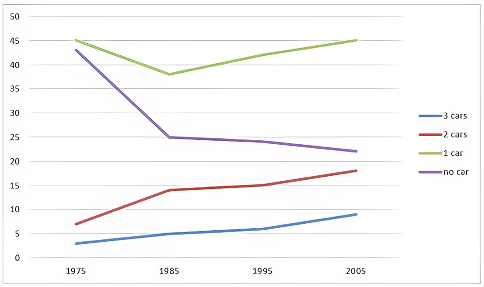
Sample 1:
The provided line graph illustrates the changes in number of cars British people owned from 1995 to 2005.
It is noticeable that more people owned cars over the period shown. Additionally, the figure for people with 1 car was consistently highest while the opposite was true for people with 3 cars.
In 1975, 45% of people in the UK owned a single car while the percentage of those with no car was 2% lower, at 43%. Over the following decade, these figures both decreased, with one-car ownership down to 38% and no-car ownership to 25%. While the proportion for British people owning 1 car steadily increased and reached its exact number in 1975 at 45%, the figure for people with no car gradually went down to only 22%.
The percentage of people with 2 and 3 cars experienced a similar pattern over the given period. The figure for people owning 2 cars stood at 7% in 1975, which was 4% higher compared to that for people owning 3 cars. They both increased steadily and reached their highs of 18% (people with 2 cars) and 4% (people with 3 cars).
Sample 2:
The line graph delineates car ownership trends among UK residents, detailing the percentages of households with no cars up to those owning three cars, over three decades starting from 1975.
Overall, there was a significant rise in car ownership during this period, with the number of households owning one car consistently higher than other categories, while the opposite was true for those owning three cars.
In 1975, 45% of households owned a single car, slightly surpassing 43% of households without any car. Over the next decade, both categories experienced a decrease, with single-car ownership falling to approximately 38% and no-car ownership sharply dropping to one quarter. However, from 1985 onwards, the figures for the former recovered and returned to the initial 1975 level of 45%, while those for the latter continued their decline, reaching roughly 22% by 2005.
The most substantial growth was observed in households owning two cars, which increased steadily from about 7% in 1975 to around 18% in 2005. The proportion of households with three cars also increased, although it remained the smallest group. This category grew from a nearly negligible percentage in 1975 to approximately 7% in 2005.
Sample 3:
The line graph shows how car ownership in the UK changed between 1975 and 2005.
Overall, the proportion of people who owned two or three cars rose while the figure for those who owned no car declined. Additionally, having one car was the most common situation during the period shown.
In 1975, nearly half of the UK population had one car while people with no car took up a smaller percentage, at roughly 43%. These figures both declined over the following ten years, to around 37% for people who have one car and 25% for those with no car. The percentage of those who owned 2 or 3 cars was approximately 7% and 3% respectively in 1975, and both experienced increases over the next 10 years to around 13% and 5% respectively.
Over the next 20 years, the percentage of those with one car gradually rose back up to 45% whereas the percentage of those with no car continued to decline to about 22%.
On the other hand, the proportion of people having 2 or 3 cars continued to rise over the following 20 years to 19% and 9% respectively.
Sample 4:
The line graph illustrates the percentage of car ownership in the UK over a 30-year period, from 1975 to 2005. The data is divided into four categories: people owning 1 car, 2 cars, 3 cars, and no car.
Overall, there was a clear increase in the number of people owning one or three cars, while those without a car or with two cars experienced a decline over the period.
In 1975, the majority of UK citizens owned either one or two cars, with 43% of the population having 1 car and approximately 38% owning 2 cars. Over the next three decades, the figure for 1-car households rose steadily, peaking at about 47% in 2005. Conversely, the percentage of those with two cars fell significantly to around 27% in the same year.
Meanwhile, the proportion of people with no car or three cars started at a lower base. In 1975, roughly 8% of households had no car, and around 4% owned 3 cars. Over the years, the share of non-car owners steadily decreased to about 5%, whereas the percentage of those owning 3 cars saw a moderate rise to 12% by 2005.
Sample 5:
The chart below gives information about car ownership in the UK from 1975 to 2005.
Overall, the trend indicates a shift towards increased car ownership over the 30-year period, with a notable rise in the number of individuals owning at least one car.
In 1975, 45% of individuals in the UK possessed a single car, slightly surpassing the percentage of those with no car, which stood at 43%. In the subsequent decade, both percentages declined, with single-car ownership decreasing to 38% and no-car ownership to 25%. While the percentage of individuals owning one car steadily rose to match its initial 1975 number of 45%, the figure for individuals with no car gradually decreased to 22%.
The proportions of individuals owning two and three cars exhibited a similar trend during the period provided. In 1975, 7% of individuals possessed two cars, which was 4% higher than those owning three cars. Both categories increased steadily, reaching their peaks at 18% (individuals with two cars) and 4% (individuals with three cars).
Sample 6:
The line graph details the changes in car ownership in the UK between 1975 and 2005.
Looking at the graph from an overall perspective, it can be seen that most UK residents had only one car. Also, more and more people possessed 2 or 3 cars over the surveyed period, which resulted in a corresponding drop in the figure for people who owned no car.
In 1975, 43% of the UK population had no car at all, approximately close to that of one-car owner at 45%. These figures far exceeded those of two-car and three car owners with 7% and 3% respectively. 10 years later, both percentages of one-car owners and people who had no car saw a precipitous decline of 7% and a dramatic 18% in turn. From this point, the former started to recover back to 45% in 2005, whilst the latter continued to drop slightly and reach a low of 22% at the end of the period. Both figures for owners of two cars and three cars enjoyed steady growth, amounting to 18% and 9% in 2005.
Sample 7:
The line graph illustrates changes in car ownership in the UK over a 30-year period from 1975 to 2005. The graph indicates a significant shift towards increased car ownership in UK households, with a particular rise in those owning two or more vehicles.
Initially, the most common category in 1975 was households with one car, accounting for approximately 43% of the total. This figure, however, experienced a gradual decline over the 30 years, finishing at just under 40% in 2005. In contrast, the proportion of two-car households saw a steady increase from around 25% to surpass the 35% mark by the end of the period, indicating a significant shift in car ownership patterns.
The percentage of households without a car is not provided, yet there is a notable change in the trends of three and four-car households. In 1975, these were the least common, with three-car households making up around 7% and four-car households negligible at 2%. Over time, both categories saw a marked increase, with the percentage of three-car households rising to approximately 17%, while that of four-car households climbed to about 5% in 2005.
This trend suggests a clear move towards higher car ownership in the UK, with a particularly sharp rise in households owning two or more cars. By 2005, the number of households with two cars was nearly equal to those with one car, a considerable change from the situation in 1975.
Sample 8:
The line graph depicts the evolution of automobile ownership in the UK between 1975 and 2005.
Overall, the percentage of individuals who own two or three automobiles increased, while the percentage of persons who do not own a car decreased.
In 1975, fewer than 5% of households had two automobiles. It grew by around 5% after ten years. From 1995 to 2005, the percentage of households driving their own automobile increased gradually, from roughly 6% to 10%. This was the equivalent of three new automobile owners. Between 1975 and 2005, the numbers increased by around 8% to 14%, 15%, and nearly 20%.
About 45 percent of the population did not own an automobile. However, in 1985 this proportion
dropped substantially, from around 24%. In 2005, 45 percent of automobile owners had only one vehicle.
Hot: 1000+ Đề thi cuối kì 2 file word cấu trúc mới 2026 Toán, Văn, Anh... lớp 1-12 (chỉ từ 60k). Tải ngay
CÂU HỎI HOT CÙNG CHỦ ĐỀ
Lời giải

Sample 1:
The bar graph illustrates the overseas students' spending on accommodation, tuition, and living expenses, while the table depicts information about the average weekly expenses by international students in four countries: A, B, C, and D.
Overall, foreign students need to spend the highest in country A and the lowest in D. In nearly every nation, the international students’ weekly average living expenses are the greatest, while their housing cost registers the lowest.
The costliest country for studying is A, with a weekly average expense of 875 dollars. This is followed by B, C, and D, which have weekly expenses of 735, 540, and 435 dollars, respectively. However, foreign students always pay the least for accommodation, which incurs on average weekly 220, 280, 240, and 200 dollars in the nations A, B, C, and D, respectively.
On the other hand, living expenditures account for the highest portion of average weekly costs for international students in countries A, B, and C, with 430, 350, and 275 dollars, correspondingly. Tuition fees in the same countries (A, B and C) come in second with the weekly averages of 358, 320, and 250 dollars in order. However, D is the only nation where education accounts for the highest average spending area, coming in at USD 235, followed by the cost of living (USD 225) and housing (USD 200).
Sample 2:
The table illustrates information regarding the weekly spendings by overseas students in four countries, A, B, C and D, while the bar graph depicts the students’ expenditure on the sectors, housing, education fees and living expenses.
Overall, the cost of studying abroad is the highest in country A and the lowest in D. Apart from country D, living costs account for the most part of the weekly spendings in all countries, while accommodation registers the least.
Regarding the total cost of studying, A is the most expensive country with weekly average 875 dollars, followed by B, C and D with 735, 540 and 435 dollars, respectively. On the other hand, the overseas students always spend the least on accommodation, which are on average weekly 220, 280, 240 and 200 dollars in the corresponding countries A, B, C and D.
Considering the living cost, it takes the largest share of foreign students’ average weekly expenses in countries A, B, and C with 430, 350 and 275 dollars, respectively, while tuition fees in the same countries hold the second place with weekly average 358, 320 and 250 dollars, sequentially. However, D is the only country where tuition fee occupies the highest expenditure with average weekly 235 dollars, followed by living cost (USD 225) and accommodation (USD 200.)
Sample 3:
The table and bar graph depict information regarding the weekly spendings by overseas students in countries A, B C and D.
Overall, there are three elements, housing, school fees and living costs that contribute to the total weekly spendings. The total expenditure in country A is the highest while it is the lowest in country D. Living costs account for the most part of the weekly spendings in all countries except D.
The total mean weekly cost for pupils to study in country A is US$875, next by country B at US$735, and then by country C at US$540, and finally by country D at US$435. The living costs are always the biggest component of the expenditure except for country D, with about US$10 less than the major spending which is the school fees.
Accommodation accounts for the least among all spendings in all countries. The most expensive housing is found in country B, at US$280, and the cheapest in country D at US$200. The middle range can be seen in country A at US$220 and country C at US$240, respectively. Costs of the tuition fee range between US$ 358 and US$235 in country A and D, in order.
Lời giải

Sample 1:
The bar chart and pie chart give information about why US residents travelled and what travel problems they experienced in the year 2009.
It is clear that the principal reason why Americans travelled in 2009 was to commute to and from work. In the same year, the primary concern of Americans, with regard to the trips they made, was the cost of travelling.
Looking more closely at the bar chart, we can see that 49% of the trips made by Americans in 2009 were for the purpose of commuting. By contrast, only 6% of trips were visits to friends or relatives, and one in ten trips were for social or recreation reasons. Shopping was cited as the reason for 16% of all travel, while unspecific ‘personal reasons’ accounted for the remaining 19%.
According to the pie chart, price was the key consideration for 36% of American travellers. Almost one in five people cited safety as their foremost travel concern, while aggressive driving and highway congestion were the main issues for 17% and 14% of the travelling public. Finally, a total of 14% of those surveyed thought that access to public transport or space for pedestrians were the most important travel issues.
Sample 2:
The bar chart compares the figures for Americans going out for five reasons and the pie chart illustrates the percentage of six problems that concerned them when travelling in 2009. Overall, it is clear that the main reason why people in the US went out in 2009 is to commute to work, and the cost of travelling is the problem concerning them the most.
Looking first at the bar graph, the proportion of Americans going out for commuting to work stood at 49%, while the figure for those leaving their house for personal reasons accounted for 19%. In addition, the rate of people in the US going out for shopping and recreation made up 16% and 10%, respectively, while visiting friends or relatives accounted for the lowest percentage, at only 6%.
Turning to the pie chart, the cost of travelling was the most concerning problem of Americans when going out, with the figure making up 36%, while the proportion of safety concerns is half of that, at 19%. In addition, 17% of US citizens were concerned about aggressive drivers, while highway congestion made 14% of them worried when leaving their house. Access to public transportation and places for people to walk accounted for the lowest percentages, at only 8% and 6%, respectively.
Sample 3:
The provided charts offer insights into the reasons for travel and the primary concerns faced by the traveling public in the United States during the year 2009. The data is presented through a bar chart illustrating travel purposes and a pie chart highlighting key issues.
Notably, the primary motivation for travel among Americans in 2009 was commuting to and from work. Simultaneously, the major concern for the traveling public during their trips revolved around the cost associated with travel.
Examining the bar chart in detail reveals that almost half of the trips made by Americans in 2009, precisely 49%, were attributed to commuting. Conversely, visits to friends or relatives accounted for a mere 6%, while social or recreational trips constituted one in ten journeys. Shopping emerged as the purpose for 16% of all travel, leaving the remaining 19% for unspecific ‘personal reasons.’
Turning attention to the pie chart, it becomes evident that cost was the primary consideration for 36% of American travelers. Safety closely followed, with nearly one in five people, or 19%, expressing it as their foremost travel concern. Aggressive driving and highway congestion were significant issues for 17% and 14% of the traveling public, respectively. Additionally, 14% of respondents identified access to public transport or space for pedestrians as the most crucial travel issues.
Sample 4:
The bar chart shows why American people chose to travel, and the pie chart shows the main issues for the travelling public in the USA, both for 2009. The trend suggests that the reason and price were the main issues for travel in the United States. It is clear that commuting from work was reported as the biggest contribution to travel, at 49%. People who went travelling for personal reasons and shopping accounted for 35% when these two groups are combined. However, interaction with friends and relatives only accounted for 25% less than the above categories. And social and recreational activities took up only 6%, which was the lowest figure by more than 43%. The travelling public’s main issues were related to price and safety, with 55% of respondents reporting these two issues. While other issues accounted for a relatively small part. Only 17% of the respondents reported issues with aggressive drivers, while highway congestion accounted for even less at 14% of the issues reported. The percentage of access to public transport and space for pedestrians was much lower than the other categories at less than 10% for both. To conclude, price and commuting time were the dominant factors relating to travel in the US in 2009.
Lời giải
Bạn cần đăng ký gói VIP ( giá chỉ từ 250K ) để làm bài, xem đáp án và lời giải chi tiết không giới hạn.
Lời giải
Bạn cần đăng ký gói VIP ( giá chỉ từ 250K ) để làm bài, xem đáp án và lời giải chi tiết không giới hạn.
Lời giải
Bạn cần đăng ký gói VIP ( giá chỉ từ 250K ) để làm bài, xem đáp án và lời giải chi tiết không giới hạn.
Lời giải
Bạn cần đăng ký gói VIP ( giá chỉ từ 250K ) để làm bài, xem đáp án và lời giải chi tiết không giới hạn.
Lời giải
Bạn cần đăng ký gói VIP ( giá chỉ từ 250K ) để làm bài, xem đáp án và lời giải chi tiết không giới hạn.