


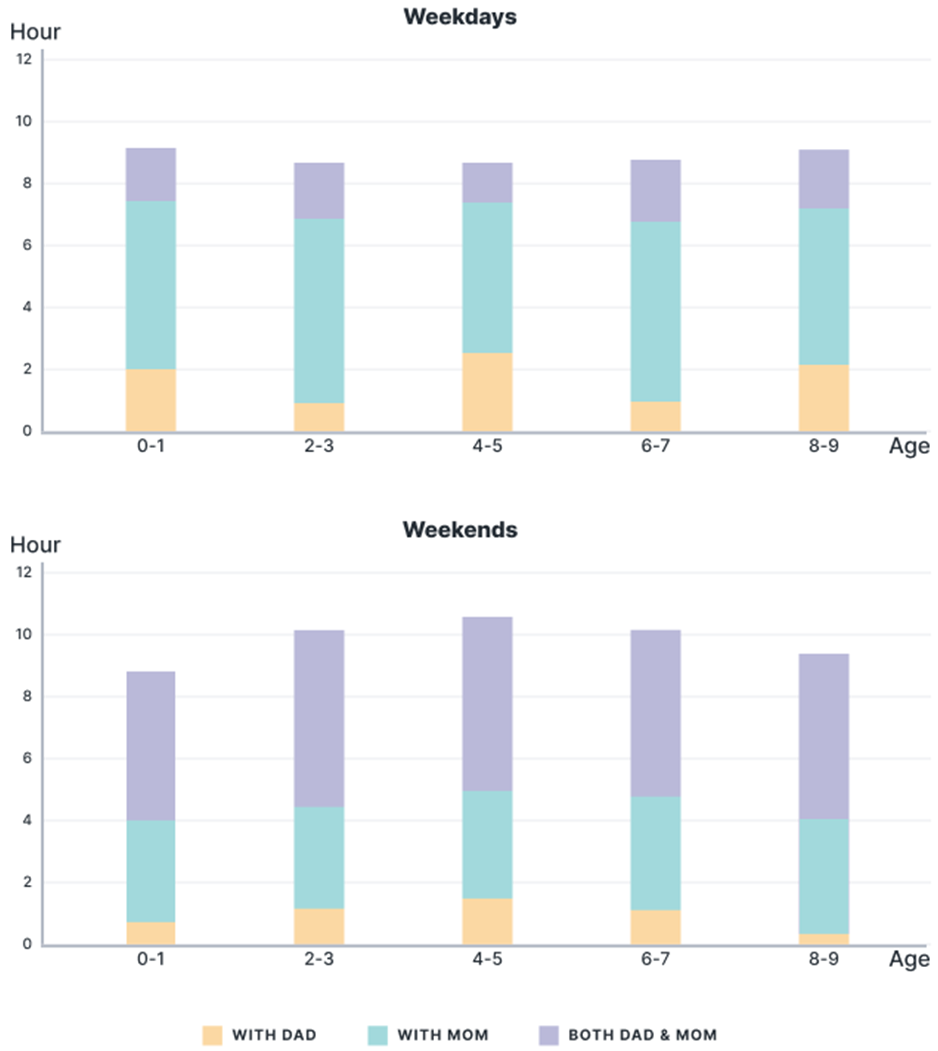
The chart below gives information about the amount of time children spend with their parents.
Summarise the information by selecting and reporting the main features, and make comparisons where relevant. Write at least 150 words.
Summarise the information by selecting and reporting the main features, and make comparisons where relevant. Write at least 150 words.
Câu hỏi trong đề: 2000 câu trắc nghiệm tổng hợp Tiếng Anh 2025 có đáp án !!
Quảng cáo
Trả lời:
Sample 1:
The stacked column charts highlight the data about how much time moms, dads and both spend on child-rearing during weekdays and weekends.
Overall, it is evident that moms are responsible for childcare in more hours than dads throughout childhood on weekdays as well as weekends. Another interesting point is that at weekends, more hours are well allotted to family time with both parents' presence, and children from 4 to 5 tend to be with their dads more than other age brackets.
On weekdays, children devote a significant part of their day with moms rather than dads or both. To be more specific, children allocate a total of around 9 hours with their parents, which includes 5 to 6 hours with moms and 2 or less than 2 hours with dads (except for children from 4 to 5 who have a bit more than 2 hours with dads).
Different patterns can be seen during weekends when children can spend up to slightly over 10 hours with their parents, an hour more compared to normal days of the week. Playtime with both moms and dads is extended remarkably to approximately 6 hours though alone time with dads is reduced to less than 1 hour (except for children from 4 to 5 who spend relatively more than 1 hour with their dads).
Sample 2:
The bar chart compares how much time children of multiple age groups spend with their parents, as displayed by the amounts of time that children spend with each parent alone and both parents together.
In general, children of all age groups spend more time with their mother than their father alone throughout the week. On the weekends, children’s time with parents increases and this time is predominantly spent with both parents, rather than with each parent separately.
For the weekdays, children typically spend around 7 hours with their mother alone. Infants, in particular, have almost 8 hours which strictly involve their mother, which is more or less the same amount of time for children in the 2-3 and 6-7 age group in this regard. The time spent exclusively with their father, on the other hand, is rather limited, which is at most above 2 hours for the 4-5 age group and at least 1 hour for the 2-3 age group.
Regarding the weekends, the amount of time that children spend with both parents, which is no more than 2 hours during the weekdays, becomes roughly 5.5 hours on average on weekends. This is at the expense of the amount of time that is spent exclusively with mothers and fathers, lowering to an average of 3.8 hours and sub-1 hour respectively. Finally, children from the age of 2 to 7 spend an increased total of around 10 hours with their parents on weekends.
Sample 3:
The given bar chart illustrates how much time children of five different age groups spend with their parents.
Overall, it is clear that children spend much more time with both parents on weekends while mothers tend to carve more time to take care of their offspring during weekdays. Additionally, fathers generally spend the least amount of time with their children.
During weekdays, the amount of time that babies aged from 0 to 1 year old spend with their dads is lowest, at 2 hours, while they spend most of their time with their moms (roughly 6 hours) and around 1 hour with both. Similar patterns are evident in the remaining age groups: around 1-2 hours are spent with the fathers, approximately 6 hours with the mothers and about 1.5-2 hours with both.
The child-rearing time at weekends follows a relatively different pattern. Across the age brackets, the dads still allocate the smallest amount of time for their kids (normally under 1 hour) whereas the mothers' time allocation ranges from 3 to 4 hours and both parents together set aside between 5 and 6 hours to care for their children.
Sample 4:
The stacked bar charts delineate how much time children of various age groups spend with their parents. The initial impression from the charts is that whilst children spend more time with both parents at weekends, mothers allocate more time for child-rearing during weekdays. It can also be seen across the two charts that fathers (excluding the ‘with both’ classification) generally spent the least time with their children.
During weekdays, babies aged from 0 to 1 year spent the least amount of time (2 hours) with the fathers, the most time with the mothers (roughly 5.8 hours), and around 1.2 hours with both. Similar pictures are evident in the remaining age groups; around 1.5-2 hours are spent with the fathers, approximately 6 hours with the mothers, and 1-2 hours with both.
A relatively different pattern could be observed regarding the child-rearing time at weekends. Across the age brackets, the fathers still set aside the least time with their kids (only a negligible 0.25-0.5 hours), mom’s time allocation is around 3-4 hours, and both parents together put from 5 to 6 hours into caring for child kids.
Hot: 1000+ Đề thi cuối kì 2 file word cấu trúc mới 2026 Toán, Văn, Anh... lớp 1-12 (chỉ từ 60k). Tải ngay
CÂU HỎI HOT CÙNG CHỦ ĐỀ
Lời giải

Sample 1:
The bar graph illustrates the overseas students' spending on accommodation, tuition, and living expenses, while the table depicts information about the average weekly expenses by international students in four countries: A, B, C, and D.
Overall, foreign students need to spend the highest in country A and the lowest in D. In nearly every nation, the international students’ weekly average living expenses are the greatest, while their housing cost registers the lowest.
The costliest country for studying is A, with a weekly average expense of 875 dollars. This is followed by B, C, and D, which have weekly expenses of 735, 540, and 435 dollars, respectively. However, foreign students always pay the least for accommodation, which incurs on average weekly 220, 280, 240, and 200 dollars in the nations A, B, C, and D, respectively.
On the other hand, living expenditures account for the highest portion of average weekly costs for international students in countries A, B, and C, with 430, 350, and 275 dollars, correspondingly. Tuition fees in the same countries (A, B and C) come in second with the weekly averages of 358, 320, and 250 dollars in order. However, D is the only nation where education accounts for the highest average spending area, coming in at USD 235, followed by the cost of living (USD 225) and housing (USD 200).
Sample 2:
The table illustrates information regarding the weekly spendings by overseas students in four countries, A, B, C and D, while the bar graph depicts the students’ expenditure on the sectors, housing, education fees and living expenses.
Overall, the cost of studying abroad is the highest in country A and the lowest in D. Apart from country D, living costs account for the most part of the weekly spendings in all countries, while accommodation registers the least.
Regarding the total cost of studying, A is the most expensive country with weekly average 875 dollars, followed by B, C and D with 735, 540 and 435 dollars, respectively. On the other hand, the overseas students always spend the least on accommodation, which are on average weekly 220, 280, 240 and 200 dollars in the corresponding countries A, B, C and D.
Considering the living cost, it takes the largest share of foreign students’ average weekly expenses in countries A, B, and C with 430, 350 and 275 dollars, respectively, while tuition fees in the same countries hold the second place with weekly average 358, 320 and 250 dollars, sequentially. However, D is the only country where tuition fee occupies the highest expenditure with average weekly 235 dollars, followed by living cost (USD 225) and accommodation (USD 200.)
Sample 3:
The table and bar graph depict information regarding the weekly spendings by overseas students in countries A, B C and D.
Overall, there are three elements, housing, school fees and living costs that contribute to the total weekly spendings. The total expenditure in country A is the highest while it is the lowest in country D. Living costs account for the most part of the weekly spendings in all countries except D.
The total mean weekly cost for pupils to study in country A is US$875, next by country B at US$735, and then by country C at US$540, and finally by country D at US$435. The living costs are always the biggest component of the expenditure except for country D, with about US$10 less than the major spending which is the school fees.
Accommodation accounts for the least among all spendings in all countries. The most expensive housing is found in country B, at US$280, and the cheapest in country D at US$200. The middle range can be seen in country A at US$220 and country C at US$240, respectively. Costs of the tuition fee range between US$ 358 and US$235 in country A and D, in order.
Lời giải

Sample 1:
The bar chart and pie chart give information about why US residents travelled and what travel problems they experienced in the year 2009.
It is clear that the principal reason why Americans travelled in 2009 was to commute to and from work. In the same year, the primary concern of Americans, with regard to the trips they made, was the cost of travelling.
Looking more closely at the bar chart, we can see that 49% of the trips made by Americans in 2009 were for the purpose of commuting. By contrast, only 6% of trips were visits to friends or relatives, and one in ten trips were for social or recreation reasons. Shopping was cited as the reason for 16% of all travel, while unspecific ‘personal reasons’ accounted for the remaining 19%.
According to the pie chart, price was the key consideration for 36% of American travellers. Almost one in five people cited safety as their foremost travel concern, while aggressive driving and highway congestion were the main issues for 17% and 14% of the travelling public. Finally, a total of 14% of those surveyed thought that access to public transport or space for pedestrians were the most important travel issues.
Sample 2:
The bar chart compares the figures for Americans going out for five reasons and the pie chart illustrates the percentage of six problems that concerned them when travelling in 2009. Overall, it is clear that the main reason why people in the US went out in 2009 is to commute to work, and the cost of travelling is the problem concerning them the most.
Looking first at the bar graph, the proportion of Americans going out for commuting to work stood at 49%, while the figure for those leaving their house for personal reasons accounted for 19%. In addition, the rate of people in the US going out for shopping and recreation made up 16% and 10%, respectively, while visiting friends or relatives accounted for the lowest percentage, at only 6%.
Turning to the pie chart, the cost of travelling was the most concerning problem of Americans when going out, with the figure making up 36%, while the proportion of safety concerns is half of that, at 19%. In addition, 17% of US citizens were concerned about aggressive drivers, while highway congestion made 14% of them worried when leaving their house. Access to public transportation and places for people to walk accounted for the lowest percentages, at only 8% and 6%, respectively.
Sample 3:
The provided charts offer insights into the reasons for travel and the primary concerns faced by the traveling public in the United States during the year 2009. The data is presented through a bar chart illustrating travel purposes and a pie chart highlighting key issues.
Notably, the primary motivation for travel among Americans in 2009 was commuting to and from work. Simultaneously, the major concern for the traveling public during their trips revolved around the cost associated with travel.
Examining the bar chart in detail reveals that almost half of the trips made by Americans in 2009, precisely 49%, were attributed to commuting. Conversely, visits to friends or relatives accounted for a mere 6%, while social or recreational trips constituted one in ten journeys. Shopping emerged as the purpose for 16% of all travel, leaving the remaining 19% for unspecific ‘personal reasons.’
Turning attention to the pie chart, it becomes evident that cost was the primary consideration for 36% of American travelers. Safety closely followed, with nearly one in five people, or 19%, expressing it as their foremost travel concern. Aggressive driving and highway congestion were significant issues for 17% and 14% of the traveling public, respectively. Additionally, 14% of respondents identified access to public transport or space for pedestrians as the most crucial travel issues.
Sample 4:
The bar chart shows why American people chose to travel, and the pie chart shows the main issues for the travelling public in the USA, both for 2009. The trend suggests that the reason and price were the main issues for travel in the United States. It is clear that commuting from work was reported as the biggest contribution to travel, at 49%. People who went travelling for personal reasons and shopping accounted for 35% when these two groups are combined. However, interaction with friends and relatives only accounted for 25% less than the above categories. And social and recreational activities took up only 6%, which was the lowest figure by more than 43%. The travelling public’s main issues were related to price and safety, with 55% of respondents reporting these two issues. While other issues accounted for a relatively small part. Only 17% of the respondents reported issues with aggressive drivers, while highway congestion accounted for even less at 14% of the issues reported. The percentage of access to public transport and space for pedestrians was much lower than the other categories at less than 10% for both. To conclude, price and commuting time were the dominant factors relating to travel in the US in 2009.
Lời giải
Bạn cần đăng ký gói VIP ( giá chỉ từ 250K ) để làm bài, xem đáp án và lời giải chi tiết không giới hạn.
Lời giải
Bạn cần đăng ký gói VIP ( giá chỉ từ 250K ) để làm bài, xem đáp án và lời giải chi tiết không giới hạn.
Lời giải
Bạn cần đăng ký gói VIP ( giá chỉ từ 250K ) để làm bài, xem đáp án và lời giải chi tiết không giới hạn.
Lời giải
Bạn cần đăng ký gói VIP ( giá chỉ từ 250K ) để làm bài, xem đáp án và lời giải chi tiết không giới hạn.
Lời giải
Bạn cần đăng ký gói VIP ( giá chỉ từ 250K ) để làm bài, xem đáp án và lời giải chi tiết không giới hạn.