


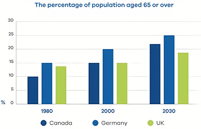
The bar chart below shows the proportion of the population aged 65 and over of three countries in 1980 and 2000 and prediction in 2030.
Summarise the information by selecting and reporting the main features, and make comparisons where relevant. Write at least 150 words.
The bar chart below shows the proportion of the population aged 65 and over of three countries in 1980 and 2000 and prediction in 2030.
Summarise the information by selecting and reporting the main features, and make comparisons where relevant. Write at least 150 words.
Câu hỏi trong đề: 2000 câu trắc nghiệm tổng hợp Tiếng Anh 2025 có đáp án !!
Quảng cáo
Trả lời:
Sample 1:
The chart shows the percentages of the population aged 65 and over in Canada, Germany, and the UK, in 1980, 2000, and projected figures for 2030.
Overall, Germany’s population had the largest percentage of people aged 65 and over. In addition, the predicted figures for 2030 show that Canada will see the biggest growth in the elderly population.
In 1980, 15% of the German population was aged 65 and over. This figure had risen to 20% by the year 2000. Meanwhile, the figures for the UK and Canada were approximately 14% and 10% respectively in 1980, with both countries rising to 15% by 2000.
Projected figures for 2030 show a further 5% increase in Germany’s elderly population, reaching 25%. Canada will see an even larger increase of 7% by 2030, which will make around 22% of their population aged 65 and over. Meanwhile, around 18% of the UK population is predicted to be aged 65 and over by the year 2030.
Sample 2:
The bar chart delineates the proportion of individuals aged 65 and older in three nations - Canada, Germany, and the UK - across three distinct years: 1980, 2000, and a projection for 2030. Each country’s data is represented in percentages.
An overview of the data reveals that Germany consistently exhibits the most substantial growth in its senior population, with projections indicating a continuation of this trend. Conversely, the UK demonstrates a slower and fluctuating growth pattern, although it is expected to see an appreciable increase by 2030.
In more detail, Germany's senior demographic experienced a significant upsurge from 1980 to 2000 and is anticipated to reach 25 percent by 2030. This rising trend underscores Germany's increasing older population, which notably surpasses that of the other two countries. Canada, while showing less dramatic increases than Germany, still follows a clear upward trajectory. From holding 10 percent of its population within the senior age bracket in 1980, it rose to 15 percent in 2000, with a forecast of approaching 23 percent by 2030.
The UK, however, presents a more nuanced scenario. In 1980, the percentage of the population aged 65 or over was slightly higher than in Canada but decreased by the year 2000. Nevertheless, projections suggest a recovery to around 18 percent by 2030. This illustrates a more gradual and less consistent growth in the elderly population compared to Canada and Germany, reflecting different demographic dynamics.
Sample 3:
The bar chart illustrates the percentage of the population aged 65 and above in three countries - Canada, Germany, and the UK - over three specific years: 1980, 2000, and a projection for 2030. The figures are presented as percentages, highlighting trends in aging demographics.
A general examination of the chart shows that Germany has the most pronounced increase in its elderly population, with continued growth anticipated through to 2030. In contrast, the UK's aging population growth is slower and exhibits some fluctuations, though a notable rise is forecasted for 2030.
Delving into specifics, Germany’s older population surged markedly between 1980 and 2000, with the projection indicating a rise to 25 percent by 2030. This trend emphasizes a significant aging population in Germany, far exceeding that observed in the other two nations. In Canada, the increase in the senior age group has been less dramatic but nonetheless steady. The data show an ascent from 10 percent in 1980 to 15 percent in 2000, with expectations of reaching approximately 23 percent by 2030.
Meanwhile, the UK's situation is somewhat more complex. Initially, in 1980, the share of the population aged 65 and over was marginally above Canada’s but saw a decrease by 2000. Projected figures suggest a rebound to around 18 percent by 2030, indicating a more moderate and uneven progression of the aging population in comparison to the steady and robust growth observed in Canada and Germany.
Sample 4:
The chart shows changes in the number of people in 65-year-old and over in three nations in the years 1980 and 2000 and predicts the share of this population group in 2030. The units are measured in percentage.
Overall, Germany and Canada show the most significant and consistent increase in the population rate of over-65 age group during 50-year period. However, the UK experiences a slow rise over the period of 50 years, despite a decline in 2000.
Germany saw the biggest rise in people aged over 65 in the first 20 years, and this percentage is likely to increase to 25 percent in 2030. Similarly, Canada also had an upward trend of population growth over-65 age bracket at 15 percent in the year 2000, and this percentage rate is predicted to remain rise to around 23 percent in 2030.
On the other hand, the 65 and above age group’s percentage share of population in the UK in 1980 was nearly 13 percent, which increased to 15 percent in 2000. However, the figure for the UK is expected to rise to 18 percent in 2030, which the growth of people aged above 65 still slower than that of Canada and US.
Sample 5:
The bar chart indicates the growth of population aged 65 and above in three countries between 1980 and 2000, with the projections towards 2030.
Overall, what stands out from the graph is that the percentage of senior demographics aged 65 and older has been on the rise since 1980 and is predicted to continue in 2030. It is also clear that Germany always heads the list over the surveyed period.
In 1980, 15% of the population was the elderly 65 or above in Germany, as opposed to 14% in the UK and only 10% in Canada. Twenty years later, these figures grew steadily by 5% in Germany and Canada, whilst the UK only saw a slight increase of 1%.
In 2030, both Germany and Canada expect a respectable rise in the rate of senior people 65 and over to reach a peak of 25% and 22% respectively. Meanwhile, it is anticipated that there will be around 19% of people aged 65 and older in the UK in 2030.
Sample 6:
The vertical bar graph illustrates the proportion of the population aged 65 and over in Canada, Germany, and the UK, in 1980, 2000, and projected figures for 2030.
In 1980, 15% of the German population was aged 65 or over. By 2000, this figure had risen to 20%. Meanwhile, rates for the United Kingdom and Canada were roughly 14% and 10% respectively in 1980, and by 2000 both countries had risen to 15%.
Projected figures for 2030 show a further 5% increase in the elderly population in Germany, reaching 25%. By 2030, Canada will experience an even bigger growth of 7%, which will account for about 22% of their population aged 65 and over. Meanwhile, around 18% of the United Kingdom population is predicted to be aged 65 and over by the year 2030.
Overall, the German population had the largest percentage of people aged 65 and over. In addition, projected figures for 2030 show that Canada will see the largest increase in the elderly population.
Sample 7:
The graph details the percentages of elderly people in the past with an outlook for the future in Canada, Germany, and the UK.
From an overall perspective, there is no doubt that the elderly population has risen and is predicted to continue to grow steadily.
If we look at the countries separately, Germany has and will continue to have the highest proportion, while Canada will likely overtake the UK. In 1980, Germany had the greatest percentage of elderly at 15%, slightly above the UK and 5% higher than Canada.
By 2000, percentages for Germany and Canada both surged by 5% (to 20% and 15%, respectively), compared to the UK, which rose marginally to equal with Canada. By 2030, Germany is expected to rise by another 5% to 25%, with Canada surpassing the United Kingdom and finishing at 22% and the latter’s figures lagging behind slightly at just under 20%.
Sample 8:
The graph given puts forward a series of data for the elderly people in Canada, Germany, and the UK in the past with projections for the future, looking from an overall perspective. It provides an apparatus to understand that the Elderly population have risen and are predicted to continue to grow steadily in the mentioned countries. While the trend of the rising elderly population is evident, Germany has indicated to have the highest proportion, and that Canada will likely overtake the UK.
At 15%, Germany had the greatest percentage of elderly in 1980, this is slightly above the UK and Canada. By 2000, percentages for Germany and Canada both surged by 5% (to 20% and 15%, respectively), compared to the UK which rose marginally to equal with Canada. By 2030, Germany is expected to rise by another 5% to 25%, with Canada surpassing the United Kingdom and finishing at 22% and the latter’s figures lagging behind slightly at just under 20%.
Sample 9:
The chart illustrates the proportions of the elderly population in Canada, Germany, and the UK in 1980, 2000, and projected figures for 2030.
Overall, Germany’s population had the largest percentage of people aged 65 and over. In addition, the predicted figures for 2030 show that Canada will see the biggest growth in the elderly population.
In 1980, 15% of the German population was aged 65 and over. This percentage had increased to 20% by the year 2000. Meanwhile, the percentages for the UK and Canada were approximately 14% and 10% respectively in 1980, both rising to 15% by 2000.
Projected figures for 2030 indicate a further 5% increase in Germany’s elderly population, reaching 25%. Canada is expected to experience an even larger increase of 7% by 2030, making up around 22% of their population aged 65 and over. Meanwhile, around 18% of the UK population is forecasted to be aged 65 and over by the year 2030.
Sample 10:
The graph details the percentages of elderly people in Canada, Germany, and the UK in the past with projections for the future. Looking from an overall perspective, it is readily apparent that Elderly populations have risen and are predicted to continue to grow steadily in all countries. Germany has and will continue to have the highest proportion, while Canada will likely overtake the UK.
In 1980, Germany had the greatest percentage of elderly at 15%, slightly above the UK and 5% higher than Canada. By 2000, percentages for Germany and Canada both surged by 5% (to 20% and 15%, respectively), compared to the UK which rose marginally to equal with Canada.
By 2030, Germany is expected to rise by another 5% to 25%, with Canada surpassing the United Kingdom and finishing at 22% and the latter’s figures lagging behind slightly at just under 20%.
Hot: 1000+ Đề thi cuối kì 2 file word cấu trúc mới 2026 Toán, Văn, Anh... lớp 1-12 (chỉ từ 60k). Tải ngay
CÂU HỎI HOT CÙNG CHỦ ĐỀ
Lời giải

Sample 1:
The bar graph illustrates the overseas students' spending on accommodation, tuition, and living expenses, while the table depicts information about the average weekly expenses by international students in four countries: A, B, C, and D.
Overall, foreign students need to spend the highest in country A and the lowest in D. In nearly every nation, the international students’ weekly average living expenses are the greatest, while their housing cost registers the lowest.
The costliest country for studying is A, with a weekly average expense of 875 dollars. This is followed by B, C, and D, which have weekly expenses of 735, 540, and 435 dollars, respectively. However, foreign students always pay the least for accommodation, which incurs on average weekly 220, 280, 240, and 200 dollars in the nations A, B, C, and D, respectively.
On the other hand, living expenditures account for the highest portion of average weekly costs for international students in countries A, B, and C, with 430, 350, and 275 dollars, correspondingly. Tuition fees in the same countries (A, B and C) come in second with the weekly averages of 358, 320, and 250 dollars in order. However, D is the only nation where education accounts for the highest average spending area, coming in at USD 235, followed by the cost of living (USD 225) and housing (USD 200).
Sample 2:
The table illustrates information regarding the weekly spendings by overseas students in four countries, A, B, C and D, while the bar graph depicts the students’ expenditure on the sectors, housing, education fees and living expenses.
Overall, the cost of studying abroad is the highest in country A and the lowest in D. Apart from country D, living costs account for the most part of the weekly spendings in all countries, while accommodation registers the least.
Regarding the total cost of studying, A is the most expensive country with weekly average 875 dollars, followed by B, C and D with 735, 540 and 435 dollars, respectively. On the other hand, the overseas students always spend the least on accommodation, which are on average weekly 220, 280, 240 and 200 dollars in the corresponding countries A, B, C and D.
Considering the living cost, it takes the largest share of foreign students’ average weekly expenses in countries A, B, and C with 430, 350 and 275 dollars, respectively, while tuition fees in the same countries hold the second place with weekly average 358, 320 and 250 dollars, sequentially. However, D is the only country where tuition fee occupies the highest expenditure with average weekly 235 dollars, followed by living cost (USD 225) and accommodation (USD 200.)
Sample 3:
The table and bar graph depict information regarding the weekly spendings by overseas students in countries A, B C and D.
Overall, there are three elements, housing, school fees and living costs that contribute to the total weekly spendings. The total expenditure in country A is the highest while it is the lowest in country D. Living costs account for the most part of the weekly spendings in all countries except D.
The total mean weekly cost for pupils to study in country A is US$875, next by country B at US$735, and then by country C at US$540, and finally by country D at US$435. The living costs are always the biggest component of the expenditure except for country D, with about US$10 less than the major spending which is the school fees.
Accommodation accounts for the least among all spendings in all countries. The most expensive housing is found in country B, at US$280, and the cheapest in country D at US$200. The middle range can be seen in country A at US$220 and country C at US$240, respectively. Costs of the tuition fee range between US$ 358 and US$235 in country A and D, in order.
Lời giải

Sample 1:
The bar chart and pie chart give information about why US residents travelled and what travel problems they experienced in the year 2009.
It is clear that the principal reason why Americans travelled in 2009 was to commute to and from work. In the same year, the primary concern of Americans, with regard to the trips they made, was the cost of travelling.
Looking more closely at the bar chart, we can see that 49% of the trips made by Americans in 2009 were for the purpose of commuting. By contrast, only 6% of trips were visits to friends or relatives, and one in ten trips were for social or recreation reasons. Shopping was cited as the reason for 16% of all travel, while unspecific ‘personal reasons’ accounted for the remaining 19%.
According to the pie chart, price was the key consideration for 36% of American travellers. Almost one in five people cited safety as their foremost travel concern, while aggressive driving and highway congestion were the main issues for 17% and 14% of the travelling public. Finally, a total of 14% of those surveyed thought that access to public transport or space for pedestrians were the most important travel issues.
Sample 2:
The bar chart compares the figures for Americans going out for five reasons and the pie chart illustrates the percentage of six problems that concerned them when travelling in 2009. Overall, it is clear that the main reason why people in the US went out in 2009 is to commute to work, and the cost of travelling is the problem concerning them the most.
Looking first at the bar graph, the proportion of Americans going out for commuting to work stood at 49%, while the figure for those leaving their house for personal reasons accounted for 19%. In addition, the rate of people in the US going out for shopping and recreation made up 16% and 10%, respectively, while visiting friends or relatives accounted for the lowest percentage, at only 6%.
Turning to the pie chart, the cost of travelling was the most concerning problem of Americans when going out, with the figure making up 36%, while the proportion of safety concerns is half of that, at 19%. In addition, 17% of US citizens were concerned about aggressive drivers, while highway congestion made 14% of them worried when leaving their house. Access to public transportation and places for people to walk accounted for the lowest percentages, at only 8% and 6%, respectively.
Sample 3:
The provided charts offer insights into the reasons for travel and the primary concerns faced by the traveling public in the United States during the year 2009. The data is presented through a bar chart illustrating travel purposes and a pie chart highlighting key issues.
Notably, the primary motivation for travel among Americans in 2009 was commuting to and from work. Simultaneously, the major concern for the traveling public during their trips revolved around the cost associated with travel.
Examining the bar chart in detail reveals that almost half of the trips made by Americans in 2009, precisely 49%, were attributed to commuting. Conversely, visits to friends or relatives accounted for a mere 6%, while social or recreational trips constituted one in ten journeys. Shopping emerged as the purpose for 16% of all travel, leaving the remaining 19% for unspecific ‘personal reasons.’
Turning attention to the pie chart, it becomes evident that cost was the primary consideration for 36% of American travelers. Safety closely followed, with nearly one in five people, or 19%, expressing it as their foremost travel concern. Aggressive driving and highway congestion were significant issues for 17% and 14% of the traveling public, respectively. Additionally, 14% of respondents identified access to public transport or space for pedestrians as the most crucial travel issues.
Sample 4:
The bar chart shows why American people chose to travel, and the pie chart shows the main issues for the travelling public in the USA, both for 2009. The trend suggests that the reason and price were the main issues for travel in the United States. It is clear that commuting from work was reported as the biggest contribution to travel, at 49%. People who went travelling for personal reasons and shopping accounted for 35% when these two groups are combined. However, interaction with friends and relatives only accounted for 25% less than the above categories. And social and recreational activities took up only 6%, which was the lowest figure by more than 43%. The travelling public’s main issues were related to price and safety, with 55% of respondents reporting these two issues. While other issues accounted for a relatively small part. Only 17% of the respondents reported issues with aggressive drivers, while highway congestion accounted for even less at 14% of the issues reported. The percentage of access to public transport and space for pedestrians was much lower than the other categories at less than 10% for both. To conclude, price and commuting time were the dominant factors relating to travel in the US in 2009.
Lời giải
Bạn cần đăng ký gói VIP ( giá chỉ từ 250K ) để làm bài, xem đáp án và lời giải chi tiết không giới hạn.
Lời giải
Bạn cần đăng ký gói VIP ( giá chỉ từ 250K ) để làm bài, xem đáp án và lời giải chi tiết không giới hạn.
Lời giải
Bạn cần đăng ký gói VIP ( giá chỉ từ 250K ) để làm bài, xem đáp án và lời giải chi tiết không giới hạn.
Lời giải
Bạn cần đăng ký gói VIP ( giá chỉ từ 250K ) để làm bài, xem đáp án và lời giải chi tiết không giới hạn.
Lời giải
Bạn cần đăng ký gói VIP ( giá chỉ từ 250K ) để làm bài, xem đáp án và lời giải chi tiết không giới hạn.