


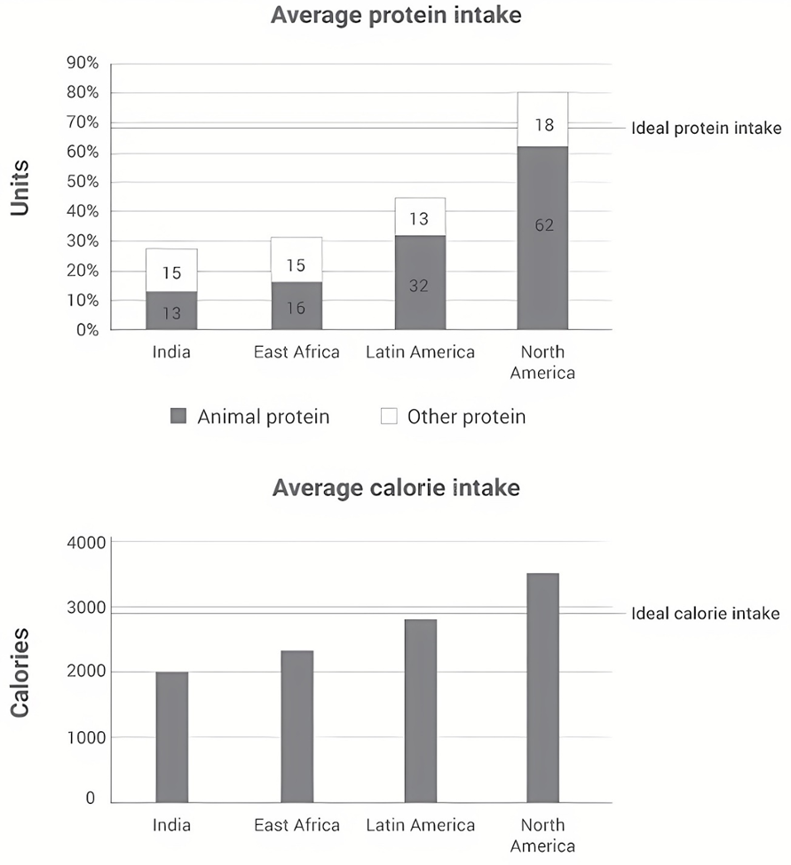
The charts below show the protein and calorie intakes of people in different parts of the world.
Summarise the information by selecting and reporting the main features, and make comparisons where relevant. Write at least 150 words.
Summarise the information by selecting and reporting the main features, and make comparisons where relevant. Write at least 150 words.
Câu hỏi trong đề: 2000 câu trắc nghiệm tổng hợp Tiếng Anh 2025 có đáp án !!
Quảng cáo
Trả lời:
Sample 1:
The given bar graphs illustrate the amount of protein and calories consumed by an average person in 4 regions. Overall, North America registers the highest figures, followed by Latin America, East Africa and lastly India in both charts. In addition, only the consumption statistics in North America exceed the recommended levels, and animals are the main source of protein in most regions.
Regarding average protein intake, the total in North America stands at 80 units, surpassing the advised figure of around 67 units. Out of the total, animal protein accounts for a major 62 units. In comparison, the overall figure in Latin America is significantly lower, at 45 units, of which 32 is from animals. In East Africa and India, other protein sources register 15 units in both areas, while the statistics for animal sources are16 and 13 units respectively.
Concerning the intake of calories, North Americans account for the greatest figure of around 3400 on average, which is about 500 higher than the recommendation. Latin American people, however, consume less than the ideal amount, at approximately 2800 calories. The figures in East Africa and India were even lower, standing at about 2200 and 2000 consecutively.
Sample 2:
The bar charts illustrate the protein and calorie consumption of people in India, East Africa, Latin America, and North America.
Overall, North Americans not only consume more protein and calories than any other region in the chart`but are also the only people whose consumption exceeds the ideal protein and calorie intake levels (nearly 70 units and 3000 calories). This is in stark contrast to India, where the consumption of both protein and calories is the lowest.
In terms of protein intake, North Americans consume an average of 80 units, distantly followed by Latin Americans, who consume approximately 45 units. Notably, the majority of the protein consumed in both regions comes from animals, at 62 and 32 units, respectively. Meanwhile, there is a negligible difference in the protein intake between East Africa and India, both at roughly 30 units, with approximately half of these derived from other unspecified sources.
Regarding caloric intake, North American people again top the list, at 3500 units. In contrast, the figures for Latin America, East Africa, and India are lower, standing at close to 3000, just over 2500, and 2000 calories, in that order.
Sample 3:
The bar charts compare the consumption of protein and calories by individuals from four particular regions around the world.
In both charts, North America has the largest overall numbers, followed distantly by Latin America, East Africa and India. It is also clear that people from North America consume more protein and calories than they are expected to with animal protein being preferred over other protein while the remaining regions do not exceed the recommended intake of these nutrients.
Regarding average protein intake, residents in North America get around 62 units of protein from animals and 18 units of other protein, surpassing the ideal levels of protein consumption. This figure is followed by Latin America with animal protein accounting for 32 units, almost 2 times as many units as other protein. Individuals from East Africa and India consume roughly similar amounts of protein, at around 30 units, with the exception of Indians who ingest more non-meat protein.
Concerning the calorie intake, North America is still the only continent that consumes more than required, at 3500. With 2800 calories ingested compared to 3000, Latin America nearly meets the necessary daily intake of calories. East Africa and India have far lower figures, with about 2400 and 2000 calories, respectively.
Sample 4:
The given bar charts offer a detailed comparison of protein and calorie consumption among individuals in four different regions around the world.
Overall, it is evident that North America and Latin America show higher levels of both protein and calorie intakes, whereas those figures are considerably lower in East Africa and India. Another noteworthy observation is that North America is the only territory exceeding the recommended amount for both categories.
Turning to the details, North America has the highest protein intake, with an average of approximately 80 grams. Latin America follows closely with 45 grams of protein, comprising one-third from animal sources and the remaining from alternative origins. Meanwhile, individuals in East Africa and India consume a similar amount of protein (roughly 30%), with half derived from animals and the other half from other sources.
Regarding the average calorie consumption, North America records the highest intake among four areas, averaging at 3500 calories. Latin America and East Africa have slightly lower figures, around 2700 and 2400 calories respectively. On the contrary, Indians take in an average of 2000 calories, which is the lowest among the four regions.
Sample 5:
The bar chart illustrates a comparison of the average protein and calorie consumption among populations in four distinct regions worldwide.
It is apparent that North American individuals not only consume the highest quantities of protein and calories but also exceed the recommended intake levels.
In terms of protein consumption, citizens in India and East Africa consume approximately 30g of protein each, with nearly equal divisions between two protein sources: animal products and others. In stark contrast, North America leads with an average protein intake of 80g, surpassing the ideal quantity by over 10g and nearly doubling the intake of Latin American individuals, who consume around 45g. Interestingly, the majority, approximately three-quarters, of protein intake in both North America and Latin America is derived from animal sources.
Regarding calorie absorption, the recommended level stands at 3000g, a threshold exceeded by North American consumers by 500g. Latin American people have their calorie intake very close to the ideal level, at roughly 2750g. Conversely, individuals in India and East Africa exhibit notably lower figures, at about 2000g and 2350g on average.
Sample 6:
The two bar charts provide a breakdown of consumption of protein and calories by people from four regions of the world. Generally, the inhabitants of North America have the highest intake of both, and this is also the only region where overconsumption of protein and calories occurs.
The average protein intake of North Americans is 80 units, exceeding the ideal value by 10. There are 62 units of protein derived from animals, while the remaining amount originates from other sources. Latin Americans report the second highest consumption, with 45 units, nearly three-quarters of which is from animals. The figures for East Africans and Indians are 31 and 28 units, respectively. Notably, India is the only region where the share of non-animal protein consumed is over 50%, with 15 units.
With regard to calorie intake, people from North America record a figure of 3500 calories, which is 600 above the recommended value. This is followed by the data of Latin America, where inhabitants' average intake hovers around 2800 calories, 100 short of the ideal threshold. About 2300 and 2000 calories are consumed by East Africans and Indians, correspondingly. Indians display the lowest figure out of all regions, at approximately two-thirds of the recommended consumption.
Sample 7:
The bar charts display the average intake of protein and calories in India, East Africa, Latin America and North America. It is clear that North America people had a much higher value of the average intake of protein or calories than the other countries.
In terms of the average intake of protein, North America had the highest rate of 80%, which includes the maximum percentage protein (62%) that derived from the fats and meats of animals, and other protein (18%). Latin America was the second (45%), which contains animal protein (32%) and other protein (13%). Then, East Africa was listed the third (31%), which involves animal protein (16%) and other protein (15%). finally, India had the minimum proportion of the account of the average intake of calories (28%), which embody animal protein (13%) and other protein (15%).
For the average intake of calories, much more calories intake by North America individuals than the people of Latin American, East Africa and India, the figure was 3500, which was followed by Latin America (2750), East Africa (2250), and India (2000).
Sample 8:
The graphs illustrate how much protein and energy are taken in by people in four different areas of the world, namely India, East Africa, Latin America, and North America.
Overall, animal sources fulfill the majority of the protein needs in all regions except India. In addition, North Americans, with the most protein-rich and high-calorie diets among the groups, are the only population to exceed ideal levels of protein and calories.
Regarding dietary protein, the ideal amount is 68. In North America, 62 out of a total of 80 protein units come from animals, which is almost double the corresponding figure for Latin America, with 32 units derived from animal sources, and other proteins coming to 13 units. Meanwhile, East Africa and India have similar animal protein intakes, at 16 and 13 units respectively, and both places have the exact same consumption of vegan protein, at 15 units each.
In terms of gross energy intake, people from India consume the lowest amount, at 2000 calories, nearly 1000 short of the ideal level, and 300 less than their East African counterparts. The caloric intake of the typical Latin American is the second highest, at approximately 2800 calories, compared to North America’s figure of 3500, which exceeds the recommended quota by over 500.
Sample 9:
The charts illustrate the amount of protein and calories consumed by the average person from four regions around the world.
It is immediately clear that among the people of four areas, North American residents consume the highest amount of protein and calories, while the opposite was true for people from India. Additionally, the former is also the only demographic whose intake is higher than the ideal for both protein and calories.
In terms of protein consumption, the ideal intake stands at about 68 grams. With an average consumption of 62 grams of animal protein and 18 grams of other protein combined, North American people are the only group to exceed the aforementioned threshold. This is followed distantly by the figure for Latin America, whose residents consume 32 grams of animal protein and 13 grams of other proteins on average. People from India and East Africa take in far below the ideal amount of protein, with both groups consuming, on average, 15 grams of other protein and 13 grams and 16 grams of protein, respectively.
Regarding calorie intake, the ideal average amount is 3000 calories. Similarly, North Americans are the only group to consume more than the recommended amount at 3500 calories on average, whereas the figure for Latin America stood at 2800, slightly short of the recommended amount. The average calorie consumption of India and East Africa once again fall far lower than the standard amount at 2000 calories and 2300 calories respectively.
Sample 10:
The bar charts give information about protein and calorie consumption in India, East Africa, Latin America and North America.
Overall, people in all of the countries examined generally did not consume the amounts of protein and calorie considered to be ideal, with North Americans consuming more than both amounts recommended, and an exception being recorded among Latin Americans, who consumed nearly the suggested calorie intake.
In terms of average protein intake, it was advisable that the average amount of protein eaten was a little under 70 units, and North America was the only country that exceeded that amount suggested, with 80 units of protein being consumed in this country. Although people in Latin America ate less protein in comparison to the ideal protein intake, averaging at 45 units, somewhat similar patterns can be observed between Latin America and North America, with the number of other kinds of protein being three times as high as that of animal protein, at 32 and 62 units for the former type, and 13 and 18 units for the latter one. Meanwhile, the consumption levels of protein in India and East Africa were relatively the same, hovering around 30 units and notably, their intake of animal protein and other types of protein were balanced, with each accounting for 15 units.
With regard to average calorie intake, the number of calories one was advised to consume was a little under 3000 calories, and again North Americans did not adhere to this as their dietary choices were high in calories (3500 calories) when compared to the ideal calorie intake. By comparison, the calorie-consuming number among Latin Americans was just minimally lower compared to the level of consumption suggested, whereas far fewer calories were eaten by people from East Africa and India (2200 as opposed to 2000 units).
Sample 11:
The charts illustrate the amount of protein and calories consumed by citizens from India, East Africa, Latin America, and North America. Overall, it can be seen that North America had the highest protein and calorie intakes while the lowest place belonged to India.
In terms of protein consumption, North America consumed 80 units, which was 11 units higher than the ideal intake level, with 62 units sourced from animal protein. In contrast, Latin America’s protein intake was nearly half of North America’s, totaling 45 units, of which 70% were from animal sources. Meanwhile, India recorded the lowest protein intake at 28 units, with animal protein accounting for only 13 units, and other proteins contributing 15 units. East Africa’s protein consumption totaled 31 units, evenly distributed between animal and other protein sources.
Regarding calorie intake, North America led with approximately 3500 calories, exceeding the ideal figure by 600 calories. Latin America followed with 2900 calories, 100 calories below the ideal intake. East Africa consumed 2200 calories, while India had the lowest average intake of 2000 calories, which was 900 calories below the ideal amount.
Sample 12:
Detailed in the shown bar charts is a comparison of average protein and calorie intake in four distinct regions of the world.
Overall, the average absorption rate of animal protein is relatively higher than that of other protein in almost all regions bar India. While the figure for average protein and calorie intake amongst citizens in North America surpasses the recommended levels, that in the remaining regions is recorded with a subpar performance.
North America leads in per capita protein consumption, with animal protein being a far more preferable source than other protein among consumers. More specifically, the consumption rate of animal-based protein (62 units) triples that of other proteins (18 units), and the sum of both is 10 units higher than the recommended protein serving size. Similarly, significantly more units (nearly 20 units) of animal protein are consumed by Latin Americans than those of other protein. In stark contrast, the lowest per capita consumption of animal-based protein and other types of protein can be found in India (15 units) and Latin America (13 units) respectively. The ratio of protein intake from animals to other sources among Indians and East Africans is relatively one to one (both at 15 units). Regarding daily caloric intake, Indians consume far fewer calories each day than is recommended – a mere 2,000, while North Americans consume most calories – in excess of 3,500 calories per diem. Seemingly, the figure for daily calorific consumption among Latin Americans and East Africans is closest to North Americans, standing in the vicinity of 3,000 and around 2,500 calories respectively.
Sample 13:
The given bar charts compare four different regions in terms of their protein and calories intake on average.
Overall, of all countries, citizens in North America consumed the largest amount of protein and calories on average, and it was also the only country that achieved an ideal meal intake for these two essential nutrients. What also stands out from the charts is that protein from animals accounts for a larger share than that from other sources in almost all countries surveyed with the exception of India.
As far as protein intake is considered, in North America, around 62 units of protein is from animals, almost triple that from other sources, the total of which exceeds the ideal amount, at nearly 70 units. This was followed by Latin America as the total amount of protein consumed stood at 45 units, with animal-based protein making up a third of the total. The average intake of Indian and East African citizens was relatively similar, ranging from 28 to 31 units. The ratio of protein from animals to others was almost one to one in these 2 countries.
Regarding calories intake, North America recorded the highest number of calories consumed, at nearly 3500 units, surpassing the ideal amount by nearly 500 units. The total intake of an average person in Latin America almost reaches the ideal level, standing at nearly 3000. The figures for East Africa and India were significantly lower, at 2300 and 2000 respectively.Hot: 1000+ Đề thi cuối kì 2 file word cấu trúc mới 2026 Toán, Văn, Anh... lớp 1-12 (chỉ từ 60k). Tải ngay
CÂU HỎI HOT CÙNG CHỦ ĐỀ
Lời giải

Sample 1:
The bar graph illustrates the overseas students' spending on accommodation, tuition, and living expenses, while the table depicts information about the average weekly expenses by international students in four countries: A, B, C, and D.
Overall, foreign students need to spend the highest in country A and the lowest in D. In nearly every nation, the international students’ weekly average living expenses are the greatest, while their housing cost registers the lowest.
The costliest country for studying is A, with a weekly average expense of 875 dollars. This is followed by B, C, and D, which have weekly expenses of 735, 540, and 435 dollars, respectively. However, foreign students always pay the least for accommodation, which incurs on average weekly 220, 280, 240, and 200 dollars in the nations A, B, C, and D, respectively.
On the other hand, living expenditures account for the highest portion of average weekly costs for international students in countries A, B, and C, with 430, 350, and 275 dollars, correspondingly. Tuition fees in the same countries (A, B and C) come in second with the weekly averages of 358, 320, and 250 dollars in order. However, D is the only nation where education accounts for the highest average spending area, coming in at USD 235, followed by the cost of living (USD 225) and housing (USD 200).
Sample 2:
The table illustrates information regarding the weekly spendings by overseas students in four countries, A, B, C and D, while the bar graph depicts the students’ expenditure on the sectors, housing, education fees and living expenses.
Overall, the cost of studying abroad is the highest in country A and the lowest in D. Apart from country D, living costs account for the most part of the weekly spendings in all countries, while accommodation registers the least.
Regarding the total cost of studying, A is the most expensive country with weekly average 875 dollars, followed by B, C and D with 735, 540 and 435 dollars, respectively. On the other hand, the overseas students always spend the least on accommodation, which are on average weekly 220, 280, 240 and 200 dollars in the corresponding countries A, B, C and D.
Considering the living cost, it takes the largest share of foreign students’ average weekly expenses in countries A, B, and C with 430, 350 and 275 dollars, respectively, while tuition fees in the same countries hold the second place with weekly average 358, 320 and 250 dollars, sequentially. However, D is the only country where tuition fee occupies the highest expenditure with average weekly 235 dollars, followed by living cost (USD 225) and accommodation (USD 200.)
Sample 3:
The table and bar graph depict information regarding the weekly spendings by overseas students in countries A, B C and D.
Overall, there are three elements, housing, school fees and living costs that contribute to the total weekly spendings. The total expenditure in country A is the highest while it is the lowest in country D. Living costs account for the most part of the weekly spendings in all countries except D.
The total mean weekly cost for pupils to study in country A is US$875, next by country B at US$735, and then by country C at US$540, and finally by country D at US$435. The living costs are always the biggest component of the expenditure except for country D, with about US$10 less than the major spending which is the school fees.
Accommodation accounts for the least among all spendings in all countries. The most expensive housing is found in country B, at US$280, and the cheapest in country D at US$200. The middle range can be seen in country A at US$220 and country C at US$240, respectively. Costs of the tuition fee range between US$ 358 and US$235 in country A and D, in order.
Lời giải

Sample 1:
The bar chart and pie chart give information about why US residents travelled and what travel problems they experienced in the year 2009.
It is clear that the principal reason why Americans travelled in 2009 was to commute to and from work. In the same year, the primary concern of Americans, with regard to the trips they made, was the cost of travelling.
Looking more closely at the bar chart, we can see that 49% of the trips made by Americans in 2009 were for the purpose of commuting. By contrast, only 6% of trips were visits to friends or relatives, and one in ten trips were for social or recreation reasons. Shopping was cited as the reason for 16% of all travel, while unspecific ‘personal reasons’ accounted for the remaining 19%.
According to the pie chart, price was the key consideration for 36% of American travellers. Almost one in five people cited safety as their foremost travel concern, while aggressive driving and highway congestion were the main issues for 17% and 14% of the travelling public. Finally, a total of 14% of those surveyed thought that access to public transport or space for pedestrians were the most important travel issues.
Sample 2:
The bar chart compares the figures for Americans going out for five reasons and the pie chart illustrates the percentage of six problems that concerned them when travelling in 2009. Overall, it is clear that the main reason why people in the US went out in 2009 is to commute to work, and the cost of travelling is the problem concerning them the most.
Looking first at the bar graph, the proportion of Americans going out for commuting to work stood at 49%, while the figure for those leaving their house for personal reasons accounted for 19%. In addition, the rate of people in the US going out for shopping and recreation made up 16% and 10%, respectively, while visiting friends or relatives accounted for the lowest percentage, at only 6%.
Turning to the pie chart, the cost of travelling was the most concerning problem of Americans when going out, with the figure making up 36%, while the proportion of safety concerns is half of that, at 19%. In addition, 17% of US citizens were concerned about aggressive drivers, while highway congestion made 14% of them worried when leaving their house. Access to public transportation and places for people to walk accounted for the lowest percentages, at only 8% and 6%, respectively.
Sample 3:
The provided charts offer insights into the reasons for travel and the primary concerns faced by the traveling public in the United States during the year 2009. The data is presented through a bar chart illustrating travel purposes and a pie chart highlighting key issues.
Notably, the primary motivation for travel among Americans in 2009 was commuting to and from work. Simultaneously, the major concern for the traveling public during their trips revolved around the cost associated with travel.
Examining the bar chart in detail reveals that almost half of the trips made by Americans in 2009, precisely 49%, were attributed to commuting. Conversely, visits to friends or relatives accounted for a mere 6%, while social or recreational trips constituted one in ten journeys. Shopping emerged as the purpose for 16% of all travel, leaving the remaining 19% for unspecific ‘personal reasons.’
Turning attention to the pie chart, it becomes evident that cost was the primary consideration for 36% of American travelers. Safety closely followed, with nearly one in five people, or 19%, expressing it as their foremost travel concern. Aggressive driving and highway congestion were significant issues for 17% and 14% of the traveling public, respectively. Additionally, 14% of respondents identified access to public transport or space for pedestrians as the most crucial travel issues.
Sample 4:
The bar chart shows why American people chose to travel, and the pie chart shows the main issues for the travelling public in the USA, both for 2009. The trend suggests that the reason and price were the main issues for travel in the United States. It is clear that commuting from work was reported as the biggest contribution to travel, at 49%. People who went travelling for personal reasons and shopping accounted for 35% when these two groups are combined. However, interaction with friends and relatives only accounted for 25% less than the above categories. And social and recreational activities took up only 6%, which was the lowest figure by more than 43%. The travelling public’s main issues were related to price and safety, with 55% of respondents reporting these two issues. While other issues accounted for a relatively small part. Only 17% of the respondents reported issues with aggressive drivers, while highway congestion accounted for even less at 14% of the issues reported. The percentage of access to public transport and space for pedestrians was much lower than the other categories at less than 10% for both. To conclude, price and commuting time were the dominant factors relating to travel in the US in 2009.
Lời giải
Bạn cần đăng ký gói VIP ( giá chỉ từ 250K ) để làm bài, xem đáp án và lời giải chi tiết không giới hạn.
Lời giải
Bạn cần đăng ký gói VIP ( giá chỉ từ 250K ) để làm bài, xem đáp án và lời giải chi tiết không giới hạn.
Lời giải
Bạn cần đăng ký gói VIP ( giá chỉ từ 250K ) để làm bài, xem đáp án và lời giải chi tiết không giới hạn.
Lời giải
Bạn cần đăng ký gói VIP ( giá chỉ từ 250K ) để làm bài, xem đáp án và lời giải chi tiết không giới hạn.
Lời giải
Bạn cần đăng ký gói VIP ( giá chỉ từ 250K ) để làm bài, xem đáp án và lời giải chi tiết không giới hạn.