


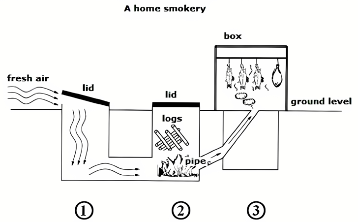
Smoked foods are popular worldwide because of their special flavor and their long life. The diagram below shows the structure of a home smokey and how it is used.
Summarise the information by selecting and reporting the main features, and make comparisons where relevant. Write at least 150 words.
Smoked foods are popular worldwide because of their special flavor and their long life. The diagram below shows the structure of a home smokey and how it is used.
Summarise the information by selecting and reporting the main features, and make comparisons where relevant. Write at least 150 words.
Câu hỏi trong đề: 2000 câu trắc nghiệm tổng hợp Tiếng Anh 2025 có đáp án !!
Quảng cáo
Trả lời:
Sample 1:
The diagram illustrates the design and operation of a home smokery in detailed steps.
Overall, this structure is a two-part construction that comprises two wells installed underground, and a box built on the ground level. These two parts are connected using a pipe system and tunnel that allow fresh air and smoke to pass through to smoke food.
The whole process respectively takes place at 3 parts of the construction, commencing with fresh air passing through the lid and entering the first well. After that, the flow of air is then driven to the second well where it meets the burning logs and sparks the fire. During this stage, new logs are provided to feed the fire through a lid installed above.
In the last stage, smoke emitted from the fire ascends across a bent pipe to a box built on the ground level. In this box, food is hung above and smoked.
Sample 2:
The diagram demonstrates how a home smokery works. It can be seen that there are mainly three steps involved in the process.
The home smokery machine has three parts. The first part is an empty underground section with a lid on top at ground level. Fresh air is allowed to flow into the machine by opening the lid. The fresh air then goes into the second part of the machine which is very similar to the first part. In this part, a fire is started by adding logs through the lid on top. Once the fire is burning, the heat from it is coursed through a narrow pipe that leads to a box. This box is the third part of the machine and is located at ground level. In the box, the food items that need to be cooked are placed. The heat coming from the second part of the machine cooks the food items.
Overall, the diagram depicts that there are three steps in the process of cooking food in a Home Smokery.
Sample 3:
According to the diagram, the smokery has three chambers linked with each other by air passages at their bottoms. Two chambers are underground while the smoking box at the end of the process in above the ground. ieltsxpress
As regards the working mechanism of the system, first, the lid of the first underground chamber is opened to feed the smokery with fresh air. Then the air travels to the second underground chamber to burn logs of firewood to create smoke. After that, the smoke finds no way to escape through the top of this chamber because of its closure by a lid, but it is forced by the air supply to continue to move to the third and final section of the system. In particular, smoke is channeled through a pipe up to the smoking box on the ground where fish and meat are hung for being smoked.
In general, the diagram details how smoke can be created and how food curing takes place in a homemade smokery.
Sample 4:
An outline of the structure of a home smokery and the way it works are portrayed clearly in the given diagram.
Overall, it is clear that of the three steps, two steps happen under the ground, while the remaining happens above the ground level.
As shown in the diagram, the first part of the structure is an empty underground section with its lid opening at an elevated space above the ground level. This lid, when opened, allows air inside the structure to assist the smoking process.
In the second part, a similar structure is there with a lid at the ground level. This lid can be opened, and wooden logs can be placed inside the chamber. Smoking food can be initiated when these logs are burned. ieltsxpress
In the third part, a bended long funnel is directed upwards in a fixed structure, which has a wide opening at the bottom that connects the fireplace and a narrow opening at the top. When logs burn, smoke passes through this opening to the chamber above the ground level, inside which fish and meat are hung from the top for cooking.
Sample 5:
The diagram illustrates the construction and function of a domestic smokery, employed in the preparation of smoked foods.
Overall, the smokehouse is composed of four main components: a chamber for airflow and one for burning logs, a connecting pipe, and a smoking box where the food is actually smoked. The process contains 3 key stages beginning with the entry of air and ending with smoke in a trap box.
At the initial stage, fresh air is introduced into the chamber by opening the first lid, the air travels to the next designated place. This area is covered with a lid and is situated below ground level, which allows for the controlled burning of wood, an essential element in the smoking process. Subsequently, the smoke generated from the burning logs is channeled through a pipe that directs it upwards into the smoking box. This box, positioned above ground, is equipped with a crossbar to hang the food. The enclosed design ensures that smoke circulates around the food, allowing for an even and thorough smoking process.
Sample 6:
The illustration highlights the various components of a home smokery in cross section and its mechanics.
Overall, it can be seen that while the first and second stages of the process take place underground, the third and last stage occurs above ground level.
As shown in the picture, the first section of a domestic smokery is an empty chamber under the ground with a lid at ground level that can be opened to allow fresh air in. After entering the chamber, air continues to pass along a pipe leading to a second underground chamber. This chamber has a lid at ground level that can be opened to load logs in. These logs, with the help of air from the first chamber, are burned to produce smoke.
The process of smoking food happens in the last stage, where heat and smoke from the second chamber go upward through a pipe into the third and final box, which is above ground level. At the top of this box is suspended meat or fish, which is ready to be cooked or preserved by the method of smoking.
Sample 7:
The diagram illustrates how a home smokery is operated and structured.
Overall, the smokery comprises three parts, connected by pipes, beginning with a chamber through which air enters and ending with a box in which the food is smoked.
First, air enters an underground chamber. The entry of air is controlled by opening and closing the lid of this chamber. At the base, there is a pipe which takes air from the chamber into a second underground chamber, with a lid situated at ground level. This contains logs, which are heated, producing smoke. The pipe at the base of this chamber, allows heat and smoke to pass to the final stage.
The process of smoking the food takes place in the third and final box or chamber, about two-thirds of which is above ground level. The box is an enclosed structure. Heat and smoke enter through the pipe at the base, passing through bricks which are placed on top of this inlet pipe. The heat and smoke then rise to the top of the box, where the meat or fish to be smoked is suspended and smoked.
Hot: 1000+ Đề thi cuối kì 2 file word cấu trúc mới 2026 Toán, Văn, Anh... lớp 1-12 (chỉ từ 60k). Tải ngay
CÂU HỎI HOT CÙNG CHỦ ĐỀ
Lời giải

Sample 1:
The bar graph illustrates the overseas students' spending on accommodation, tuition, and living expenses, while the table depicts information about the average weekly expenses by international students in four countries: A, B, C, and D.
Overall, foreign students need to spend the highest in country A and the lowest in D. In nearly every nation, the international students’ weekly average living expenses are the greatest, while their housing cost registers the lowest.
The costliest country for studying is A, with a weekly average expense of 875 dollars. This is followed by B, C, and D, which have weekly expenses of 735, 540, and 435 dollars, respectively. However, foreign students always pay the least for accommodation, which incurs on average weekly 220, 280, 240, and 200 dollars in the nations A, B, C, and D, respectively.
On the other hand, living expenditures account for the highest portion of average weekly costs for international students in countries A, B, and C, with 430, 350, and 275 dollars, correspondingly. Tuition fees in the same countries (A, B and C) come in second with the weekly averages of 358, 320, and 250 dollars in order. However, D is the only nation where education accounts for the highest average spending area, coming in at USD 235, followed by the cost of living (USD 225) and housing (USD 200).
Sample 2:
The table illustrates information regarding the weekly spendings by overseas students in four countries, A, B, C and D, while the bar graph depicts the students’ expenditure on the sectors, housing, education fees and living expenses.
Overall, the cost of studying abroad is the highest in country A and the lowest in D. Apart from country D, living costs account for the most part of the weekly spendings in all countries, while accommodation registers the least.
Regarding the total cost of studying, A is the most expensive country with weekly average 875 dollars, followed by B, C and D with 735, 540 and 435 dollars, respectively. On the other hand, the overseas students always spend the least on accommodation, which are on average weekly 220, 280, 240 and 200 dollars in the corresponding countries A, B, C and D.
Considering the living cost, it takes the largest share of foreign students’ average weekly expenses in countries A, B, and C with 430, 350 and 275 dollars, respectively, while tuition fees in the same countries hold the second place with weekly average 358, 320 and 250 dollars, sequentially. However, D is the only country where tuition fee occupies the highest expenditure with average weekly 235 dollars, followed by living cost (USD 225) and accommodation (USD 200.)
Sample 3:
The table and bar graph depict information regarding the weekly spendings by overseas students in countries A, B C and D.
Overall, there are three elements, housing, school fees and living costs that contribute to the total weekly spendings. The total expenditure in country A is the highest while it is the lowest in country D. Living costs account for the most part of the weekly spendings in all countries except D.
The total mean weekly cost for pupils to study in country A is US$875, next by country B at US$735, and then by country C at US$540, and finally by country D at US$435. The living costs are always the biggest component of the expenditure except for country D, with about US$10 less than the major spending which is the school fees.
Accommodation accounts for the least among all spendings in all countries. The most expensive housing is found in country B, at US$280, and the cheapest in country D at US$200. The middle range can be seen in country A at US$220 and country C at US$240, respectively. Costs of the tuition fee range between US$ 358 and US$235 in country A and D, in order.
Lời giải

Sample 1:
The bar chart and pie chart give information about why US residents travelled and what travel problems they experienced in the year 2009.
It is clear that the principal reason why Americans travelled in 2009 was to commute to and from work. In the same year, the primary concern of Americans, with regard to the trips they made, was the cost of travelling.
Looking more closely at the bar chart, we can see that 49% of the trips made by Americans in 2009 were for the purpose of commuting. By contrast, only 6% of trips were visits to friends or relatives, and one in ten trips were for social or recreation reasons. Shopping was cited as the reason for 16% of all travel, while unspecific ‘personal reasons’ accounted for the remaining 19%.
According to the pie chart, price was the key consideration for 36% of American travellers. Almost one in five people cited safety as their foremost travel concern, while aggressive driving and highway congestion were the main issues for 17% and 14% of the travelling public. Finally, a total of 14% of those surveyed thought that access to public transport or space for pedestrians were the most important travel issues.
Sample 2:
The bar chart compares the figures for Americans going out for five reasons and the pie chart illustrates the percentage of six problems that concerned them when travelling in 2009. Overall, it is clear that the main reason why people in the US went out in 2009 is to commute to work, and the cost of travelling is the problem concerning them the most.
Looking first at the bar graph, the proportion of Americans going out for commuting to work stood at 49%, while the figure for those leaving their house for personal reasons accounted for 19%. In addition, the rate of people in the US going out for shopping and recreation made up 16% and 10%, respectively, while visiting friends or relatives accounted for the lowest percentage, at only 6%.
Turning to the pie chart, the cost of travelling was the most concerning problem of Americans when going out, with the figure making up 36%, while the proportion of safety concerns is half of that, at 19%. In addition, 17% of US citizens were concerned about aggressive drivers, while highway congestion made 14% of them worried when leaving their house. Access to public transportation and places for people to walk accounted for the lowest percentages, at only 8% and 6%, respectively.
Sample 3:
The provided charts offer insights into the reasons for travel and the primary concerns faced by the traveling public in the United States during the year 2009. The data is presented through a bar chart illustrating travel purposes and a pie chart highlighting key issues.
Notably, the primary motivation for travel among Americans in 2009 was commuting to and from work. Simultaneously, the major concern for the traveling public during their trips revolved around the cost associated with travel.
Examining the bar chart in detail reveals that almost half of the trips made by Americans in 2009, precisely 49%, were attributed to commuting. Conversely, visits to friends or relatives accounted for a mere 6%, while social or recreational trips constituted one in ten journeys. Shopping emerged as the purpose for 16% of all travel, leaving the remaining 19% for unspecific ‘personal reasons.’
Turning attention to the pie chart, it becomes evident that cost was the primary consideration for 36% of American travelers. Safety closely followed, with nearly one in five people, or 19%, expressing it as their foremost travel concern. Aggressive driving and highway congestion were significant issues for 17% and 14% of the traveling public, respectively. Additionally, 14% of respondents identified access to public transport or space for pedestrians as the most crucial travel issues.
Sample 4:
The bar chart shows why American people chose to travel, and the pie chart shows the main issues for the travelling public in the USA, both for 2009. The trend suggests that the reason and price were the main issues for travel in the United States. It is clear that commuting from work was reported as the biggest contribution to travel, at 49%. People who went travelling for personal reasons and shopping accounted for 35% when these two groups are combined. However, interaction with friends and relatives only accounted for 25% less than the above categories. And social and recreational activities took up only 6%, which was the lowest figure by more than 43%. The travelling public’s main issues were related to price and safety, with 55% of respondents reporting these two issues. While other issues accounted for a relatively small part. Only 17% of the respondents reported issues with aggressive drivers, while highway congestion accounted for even less at 14% of the issues reported. The percentage of access to public transport and space for pedestrians was much lower than the other categories at less than 10% for both. To conclude, price and commuting time were the dominant factors relating to travel in the US in 2009.
Lời giải
Bạn cần đăng ký gói VIP ( giá chỉ từ 250K ) để làm bài, xem đáp án và lời giải chi tiết không giới hạn.
Lời giải
Bạn cần đăng ký gói VIP ( giá chỉ từ 250K ) để làm bài, xem đáp án và lời giải chi tiết không giới hạn.
Lời giải
Bạn cần đăng ký gói VIP ( giá chỉ từ 250K ) để làm bài, xem đáp án và lời giải chi tiết không giới hạn.
Lời giải
Bạn cần đăng ký gói VIP ( giá chỉ từ 250K ) để làm bài, xem đáp án và lời giải chi tiết không giới hạn.
Lời giải
Bạn cần đăng ký gói VIP ( giá chỉ từ 250K ) để làm bài, xem đáp án và lời giải chi tiết không giới hạn.