


The graph below shows the production of three forest industry products in a European country, namely timber, pulp, and paper from 1980 to 2000.
Summarise the information by selecting and reporting the main features, and make comparisons where relevant. Write at least 150 words.
The graph below shows the production of three forest industry products in a European country, namely timber, pulp, and paper from 1980 to 2000.
Summarise the information by selecting and reporting the main features, and make comparisons where relevant. Write at least 150 words.
Câu hỏi trong đề: 2000 câu trắc nghiệm tổng hợp Tiếng Anh 2025 có đáp án !!
Quảng cáo
Trả lời:
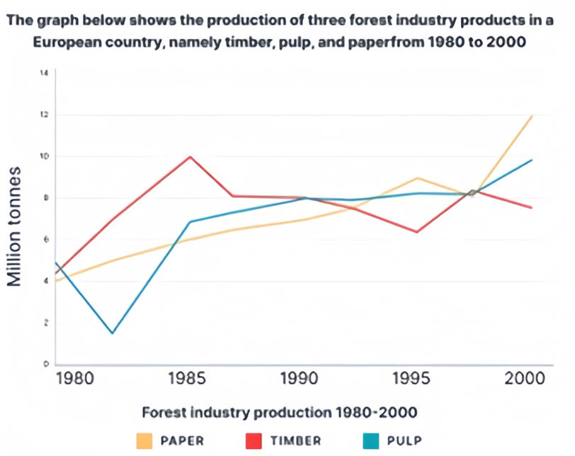
Sample 1:
The graph below shows the production of three forest industry products in a European country, namely timber, pulp, and paper, from 1980 to 2000.
Overall, while all three categories fluctuated wildly throughout the period, they ultimately increased substantially.
In 1980, even though pulp had the highest production initially (roughly 5.5 million tons), it plummeted to just over 2 million tons and was immediately overtaken by timber in the following years. From 1982 to 1985, both timber and pulp had similar increasing trends, rising sharply from 6.5 to 10 and 2.2 to 6.5 million tons, respectively. From 1985 to 1990, pulp’s figure kept growing at a slower rate while timber dipped to 8.0 million tons in 1987 and remained there till 1990. Paper consistently grew from 4.0 to 6.5 million tons during this time frame.
For the remaining period, timber declined to around 6.2 million tons before bouncing back to 8.0 in 1997 and slightly decreased to 7.8 in 2000, ultimately finishing last. In contrast, despite a slight dip in 1997, the paper almost doubled its 1990 figure and reached first place in 2000. In the same period, pulp gradually rose from 8.0 to approximately 10.0 million tons.
Sample 2:
The line chart demonstrates the production trends of three forest industry products - timber, pulp and paper - in a European country over a 20-year period, from 1980 to 2000.
Overall, it can be observed that all three categories had fluctuated throughout the period. Pulp and paper, in particular, experienced an upward trend, while timber saw a downward trend.
In terms of pulp and paper production, pulp was marginally higher than paper in 1980, with nearly 6 million tonnes and 4 million tonnes, respectively. Following a sharp decline, pulp production began to recover in 1985, climbing from 7 million tonnes to 10 million tonnes by the end of the period. Similarly, paper production rose steadily until a slight fallback in 1995, and then increased rapidly, peaking at 12 million tonnes in 2000.
Regarding timber, the production started at 5 million tonnes in 1980 and rose sharply to 10 million tonnes in 1985. However, over the following 15 years, the production figure saw a gradual decrease and eventually reached nearly 8 million tonnes at the end of the period.
Sample 3:
The given graph depicts the production of wood pulp, timber, and paper in a European country between 1980 and 2000. Overall, the growth in paper production was substantial and steady throughout the period, while the quantity of wood pulp increased moderately with some disruptions. Timber, on the other hand, was the only product to have such irregularities and experienced significant fluctuations.
In 1980, paper production began at 4 million tonnes, which climbed steadily to 9 million tonnes before experiencing a slight dip to 8 million tonnes in 1997-98. The quantity then recovered and reached its peak at 12 million tonnes in 2000.
Wood pulp started with the highest production of the three commodities, with 6 million tonnes, but dropped to about 3.6 million tonnes by 1983. It immediately rose again and tripled the previous level in 1985. However, there was not much growth in the following period, and the production remained between 7-10 million tonnes.
Between 1980 and 1985, the production of timber increased dramatically, from 5 million tonnes to 10 million tonnes, before declining to just over 6 million tonnes until 1995. Production grew once again to 8 million tonnes in the final five years of the era before rapidly falling off once more.
Sample 4:
The provided graph illustrates the production trends of timber, pulp, and paper in a European country from 1980 to 2000.
Throughout the entire period, all three categories experienced notable fluctuations, yet collectively demonstrated substantial overall growth.
The initial production of pulp slightly surpassed that of paper in 1980, with approximately 6 million tonnes for pulp and 4 million tonnes for paper. Subsequently, pulp experienced a significant decline to under 2 million tonnes in 1982 before a recovery to about 7 million tonnes in 1985 and then a substantial 10 million tonnes by the conclusion of the period. Conversely, paper production displayed a consistent increase from 4 to a high of approximately 9 million tonnes in 1995, momentarily slowing in 1995, before surging rapidly and reaching its pinnacle at 12 million tonnes by 2000.
In contrast, timber production commenced at 5 million tonnes in 1980, swiftly escalating to 10 million tonnes by 1985. However, over the ensuing 10 years, timber production exhibited a gradual decline to hit a low of about 6 million tonnes in 1995. Then, this figure rebounded before dropping again to under 8 million tonnes by 2000, concluding in the lowest position.
Hot: 1000+ Đề thi cuối kì 2 file word cấu trúc mới 2026 Toán, Văn, Anh... lớp 1-12 (chỉ từ 60k). Tải ngay
CÂU HỎI HOT CÙNG CHỦ ĐỀ
Lời giải

Sample 1:
The bar graph illustrates the overseas students' spending on accommodation, tuition, and living expenses, while the table depicts information about the average weekly expenses by international students in four countries: A, B, C, and D.
Overall, foreign students need to spend the highest in country A and the lowest in D. In nearly every nation, the international students’ weekly average living expenses are the greatest, while their housing cost registers the lowest.
The costliest country for studying is A, with a weekly average expense of 875 dollars. This is followed by B, C, and D, which have weekly expenses of 735, 540, and 435 dollars, respectively. However, foreign students always pay the least for accommodation, which incurs on average weekly 220, 280, 240, and 200 dollars in the nations A, B, C, and D, respectively.
On the other hand, living expenditures account for the highest portion of average weekly costs for international students in countries A, B, and C, with 430, 350, and 275 dollars, correspondingly. Tuition fees in the same countries (A, B and C) come in second with the weekly averages of 358, 320, and 250 dollars in order. However, D is the only nation where education accounts for the highest average spending area, coming in at USD 235, followed by the cost of living (USD 225) and housing (USD 200).
Sample 2:
The table illustrates information regarding the weekly spendings by overseas students in four countries, A, B, C and D, while the bar graph depicts the students’ expenditure on the sectors, housing, education fees and living expenses.
Overall, the cost of studying abroad is the highest in country A and the lowest in D. Apart from country D, living costs account for the most part of the weekly spendings in all countries, while accommodation registers the least.
Regarding the total cost of studying, A is the most expensive country with weekly average 875 dollars, followed by B, C and D with 735, 540 and 435 dollars, respectively. On the other hand, the overseas students always spend the least on accommodation, which are on average weekly 220, 280, 240 and 200 dollars in the corresponding countries A, B, C and D.
Considering the living cost, it takes the largest share of foreign students’ average weekly expenses in countries A, B, and C with 430, 350 and 275 dollars, respectively, while tuition fees in the same countries hold the second place with weekly average 358, 320 and 250 dollars, sequentially. However, D is the only country where tuition fee occupies the highest expenditure with average weekly 235 dollars, followed by living cost (USD 225) and accommodation (USD 200.)
Sample 3:
The table and bar graph depict information regarding the weekly spendings by overseas students in countries A, B C and D.
Overall, there are three elements, housing, school fees and living costs that contribute to the total weekly spendings. The total expenditure in country A is the highest while it is the lowest in country D. Living costs account for the most part of the weekly spendings in all countries except D.
The total mean weekly cost for pupils to study in country A is US$875, next by country B at US$735, and then by country C at US$540, and finally by country D at US$435. The living costs are always the biggest component of the expenditure except for country D, with about US$10 less than the major spending which is the school fees.
Accommodation accounts for the least among all spendings in all countries. The most expensive housing is found in country B, at US$280, and the cheapest in country D at US$200. The middle range can be seen in country A at US$220 and country C at US$240, respectively. Costs of the tuition fee range between US$ 358 and US$235 in country A and D, in order.
Lời giải

Sample 1:
The bar chart and pie chart give information about why US residents travelled and what travel problems they experienced in the year 2009.
It is clear that the principal reason why Americans travelled in 2009 was to commute to and from work. In the same year, the primary concern of Americans, with regard to the trips they made, was the cost of travelling.
Looking more closely at the bar chart, we can see that 49% of the trips made by Americans in 2009 were for the purpose of commuting. By contrast, only 6% of trips were visits to friends or relatives, and one in ten trips were for social or recreation reasons. Shopping was cited as the reason for 16% of all travel, while unspecific ‘personal reasons’ accounted for the remaining 19%.
According to the pie chart, price was the key consideration for 36% of American travellers. Almost one in five people cited safety as their foremost travel concern, while aggressive driving and highway congestion were the main issues for 17% and 14% of the travelling public. Finally, a total of 14% of those surveyed thought that access to public transport or space for pedestrians were the most important travel issues.
Sample 2:
The bar chart compares the figures for Americans going out for five reasons and the pie chart illustrates the percentage of six problems that concerned them when travelling in 2009. Overall, it is clear that the main reason why people in the US went out in 2009 is to commute to work, and the cost of travelling is the problem concerning them the most.
Looking first at the bar graph, the proportion of Americans going out for commuting to work stood at 49%, while the figure for those leaving their house for personal reasons accounted for 19%. In addition, the rate of people in the US going out for shopping and recreation made up 16% and 10%, respectively, while visiting friends or relatives accounted for the lowest percentage, at only 6%.
Turning to the pie chart, the cost of travelling was the most concerning problem of Americans when going out, with the figure making up 36%, while the proportion of safety concerns is half of that, at 19%. In addition, 17% of US citizens were concerned about aggressive drivers, while highway congestion made 14% of them worried when leaving their house. Access to public transportation and places for people to walk accounted for the lowest percentages, at only 8% and 6%, respectively.
Sample 3:
The provided charts offer insights into the reasons for travel and the primary concerns faced by the traveling public in the United States during the year 2009. The data is presented through a bar chart illustrating travel purposes and a pie chart highlighting key issues.
Notably, the primary motivation for travel among Americans in 2009 was commuting to and from work. Simultaneously, the major concern for the traveling public during their trips revolved around the cost associated with travel.
Examining the bar chart in detail reveals that almost half of the trips made by Americans in 2009, precisely 49%, were attributed to commuting. Conversely, visits to friends or relatives accounted for a mere 6%, while social or recreational trips constituted one in ten journeys. Shopping emerged as the purpose for 16% of all travel, leaving the remaining 19% for unspecific ‘personal reasons.’
Turning attention to the pie chart, it becomes evident that cost was the primary consideration for 36% of American travelers. Safety closely followed, with nearly one in five people, or 19%, expressing it as their foremost travel concern. Aggressive driving and highway congestion were significant issues for 17% and 14% of the traveling public, respectively. Additionally, 14% of respondents identified access to public transport or space for pedestrians as the most crucial travel issues.
Sample 4:
The bar chart shows why American people chose to travel, and the pie chart shows the main issues for the travelling public in the USA, both for 2009. The trend suggests that the reason and price were the main issues for travel in the United States. It is clear that commuting from work was reported as the biggest contribution to travel, at 49%. People who went travelling for personal reasons and shopping accounted for 35% when these two groups are combined. However, interaction with friends and relatives only accounted for 25% less than the above categories. And social and recreational activities took up only 6%, which was the lowest figure by more than 43%. The travelling public’s main issues were related to price and safety, with 55% of respondents reporting these two issues. While other issues accounted for a relatively small part. Only 17% of the respondents reported issues with aggressive drivers, while highway congestion accounted for even less at 14% of the issues reported. The percentage of access to public transport and space for pedestrians was much lower than the other categories at less than 10% for both. To conclude, price and commuting time were the dominant factors relating to travel in the US in 2009.
Lời giải
Bạn cần đăng ký gói VIP ( giá chỉ từ 250K ) để làm bài, xem đáp án và lời giải chi tiết không giới hạn.
Lời giải
Bạn cần đăng ký gói VIP ( giá chỉ từ 250K ) để làm bài, xem đáp án và lời giải chi tiết không giới hạn.
Lời giải
Bạn cần đăng ký gói VIP ( giá chỉ từ 250K ) để làm bài, xem đáp án và lời giải chi tiết không giới hạn.
Lời giải
Bạn cần đăng ký gói VIP ( giá chỉ từ 250K ) để làm bài, xem đáp án và lời giải chi tiết không giới hạn.
Lời giải
Bạn cần đăng ký gói VIP ( giá chỉ từ 250K ) để làm bài, xem đáp án và lời giải chi tiết không giới hạn.