


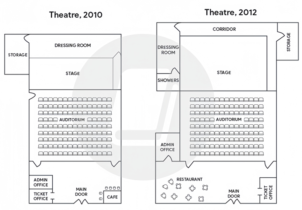
The plans below show a small theatre in 2010, and the same theatre in 2012.
Summarise the information by selecting and reporting the main features, and make comparisons where relevant. Write at least 150 words.
The plans below show a small theatre in 2010, and the same theatre in 2012.
Summarise the information by selecting and reporting the main features, and make comparisons where relevant. Write at least 150 words.
Câu hỏi trong đề: 2000 câu trắc nghiệm tổng hợp Tiếng Anh 2025 có đáp án !!
Quảng cáo
Trả lời:
Sample 1:
The two maps illustrate the degree to which a small theatre changed from 2010 to 2012.
Overall, after two years, the theater became noticeably larger with the expansion of its upper and lower sections, and all of its facilities were either repurposed or relocated, except for the auditorium and the stage.
Regarding the top of the plan, the stage was enlarged in a northerly direction, overtaking half of the space previously occupied by the dressing room in 2010, which was turned into a corridor two years later. Meanwhile, there used to be a storage space flanking the stage and the corridor on the left in 2010, but it was then repositioned to their right flank in order to make way for two new rooms where performers or actors could get changed and take a shower.
Turning to the remaining areas of the theater, although the auditorium in the middle remained intact, the foyer below it had been extended towards the left by 2012, allowing for the establishment of a restaurant at the expense of the administration and ticket offices on the left-hand side of the main entrance. This in turn led to the relocation of the former to the left side of the auditorium and the latter to the bottom right corner of the plan, replacing the cafe that was present in 2010.
Sample 2:
The maps illustrate the layout of a small theater between 2010 and 2012 show significant changes during that time period.
It can be seen that the theater received renovation efforts in the two-year time frame, with the building itself expanded sideways as existing features were moved and reconfigured. The only part that did not undergo significant changes was the central seating area.
Regarding the southern part of the theater, in 2010, there was a cafe situated in the corner to the right of the theater's main entrance, whereas the left corner was occupied by a ticket office and an administrative office. However, within the next two years, the ticket office was relocated to the bottom right corner where the cafe had been, while the administrative office was moved further back, to the left side of the seating area. This made way for a new restaurant area in the left rear corner.
In the upper section of the maps, one notable change was that the stage in front of the auditorium almost doubled in size with the addition of a side hall behind it, even as the auditorium itself remained unchanged. To the left of the stage was a storage room which, after 2010, was moved to the opposite end of the stage to make way for the construction of a showers area as well as the relocation of the dressing room. The old dressing room was located behind the stage in 2010, but this space, together with the right side of the stage, was redesigned to serve as a corridor which connected the dressing room and the storage room.
Sample 3:
The diagrams show the layouts of a theatre in 2010 and 2012. Overall, by 2012, it had been made significantly larger by adding new facilities and relocating some existing ones, while the main auditorium remained intact.
In 2010, the structure had two adjacent offices for admin and ticket sales and a cafe all located on either side of the main door at the centre of the lower wall. Inside the auditorium, there were two doors for entry, and one door for exit on the left next to the front-row seats. The main stage was about the same size as the dressing room behind it and a storage room was at the left rear of the theatre.
Over the next two years, the main door and auditorium with its entry doors remained untouched, while the exit one was lost. However, the lobby was widened, making room for a new restaurant. This means the admin office was moved a little up to the left in an addition, and the ticket counter replaced the old cafe on the right of the main door. Notably, although the stage was enlarged by almost double, the dressing room and storage were downsized and moved around slightly. The dressing room and new showers were located on the left in an extension, while the storage was on the right, all connected by a new long corridor at the back.
Sample 4:
The maps demonstrate how the layout of the small auditorium has changed over a span of 2 years.
Overall, with the core structure for the main operations remains largely the same, there are horizontal expansion of the theatre and significant alterations in amenities aiming to enhance the experiennce for customers and performers.
In 2010, the storage was occupied by a moderately sized on the left-hand side in the first half, while the rest area was utilized for the dressing room and the stage. Nevertheless, by 2012, the relocation of the storage to the opposite corner of the stage facilitated the establishment of a showers region as well as the refurbishment of a dressing room. Moreover, the old dressing room was combined with the right-hand side of the stage to construct a backstage corridor connecting the storage and dressing room, allowing for smoother movement. Additionally, the stage in front of the auditorium was nearly doubled in its origin, whereas the centered auditorium remained unchanged.
The period from 2010 to 2012 experienced a complete change in the lower section of the theatre. A restaurant was introduced in the left corner, where the admin office and the ticket office had been simultaneously removed. Furthermore, the cafe area was dismantled to accommodate a new ticket office, and the administrative office was shifted to the left-hand side of the seating room.
Hot: 1000+ Đề thi cuối kì 2 file word cấu trúc mới 2026 Toán, Văn, Anh... lớp 1-12 (chỉ từ 60k). Tải ngay
CÂU HỎI HOT CÙNG CHỦ ĐỀ
Lời giải

Sample 1:
The bar graph illustrates the overseas students' spending on accommodation, tuition, and living expenses, while the table depicts information about the average weekly expenses by international students in four countries: A, B, C, and D.
Overall, foreign students need to spend the highest in country A and the lowest in D. In nearly every nation, the international students’ weekly average living expenses are the greatest, while their housing cost registers the lowest.
The costliest country for studying is A, with a weekly average expense of 875 dollars. This is followed by B, C, and D, which have weekly expenses of 735, 540, and 435 dollars, respectively. However, foreign students always pay the least for accommodation, which incurs on average weekly 220, 280, 240, and 200 dollars in the nations A, B, C, and D, respectively.
On the other hand, living expenditures account for the highest portion of average weekly costs for international students in countries A, B, and C, with 430, 350, and 275 dollars, correspondingly. Tuition fees in the same countries (A, B and C) come in second with the weekly averages of 358, 320, and 250 dollars in order. However, D is the only nation where education accounts for the highest average spending area, coming in at USD 235, followed by the cost of living (USD 225) and housing (USD 200).
Sample 2:
The table illustrates information regarding the weekly spendings by overseas students in four countries, A, B, C and D, while the bar graph depicts the students’ expenditure on the sectors, housing, education fees and living expenses.
Overall, the cost of studying abroad is the highest in country A and the lowest in D. Apart from country D, living costs account for the most part of the weekly spendings in all countries, while accommodation registers the least.
Regarding the total cost of studying, A is the most expensive country with weekly average 875 dollars, followed by B, C and D with 735, 540 and 435 dollars, respectively. On the other hand, the overseas students always spend the least on accommodation, which are on average weekly 220, 280, 240 and 200 dollars in the corresponding countries A, B, C and D.
Considering the living cost, it takes the largest share of foreign students’ average weekly expenses in countries A, B, and C with 430, 350 and 275 dollars, respectively, while tuition fees in the same countries hold the second place with weekly average 358, 320 and 250 dollars, sequentially. However, D is the only country where tuition fee occupies the highest expenditure with average weekly 235 dollars, followed by living cost (USD 225) and accommodation (USD 200.)
Sample 3:
The table and bar graph depict information regarding the weekly spendings by overseas students in countries A, B C and D.
Overall, there are three elements, housing, school fees and living costs that contribute to the total weekly spendings. The total expenditure in country A is the highest while it is the lowest in country D. Living costs account for the most part of the weekly spendings in all countries except D.
The total mean weekly cost for pupils to study in country A is US$875, next by country B at US$735, and then by country C at US$540, and finally by country D at US$435. The living costs are always the biggest component of the expenditure except for country D, with about US$10 less than the major spending which is the school fees.
Accommodation accounts for the least among all spendings in all countries. The most expensive housing is found in country B, at US$280, and the cheapest in country D at US$200. The middle range can be seen in country A at US$220 and country C at US$240, respectively. Costs of the tuition fee range between US$ 358 and US$235 in country A and D, in order.
Lời giải

Sample 1:
The bar chart and pie chart give information about why US residents travelled and what travel problems they experienced in the year 2009.
It is clear that the principal reason why Americans travelled in 2009 was to commute to and from work. In the same year, the primary concern of Americans, with regard to the trips they made, was the cost of travelling.
Looking more closely at the bar chart, we can see that 49% of the trips made by Americans in 2009 were for the purpose of commuting. By contrast, only 6% of trips were visits to friends or relatives, and one in ten trips were for social or recreation reasons. Shopping was cited as the reason for 16% of all travel, while unspecific ‘personal reasons’ accounted for the remaining 19%.
According to the pie chart, price was the key consideration for 36% of American travellers. Almost one in five people cited safety as their foremost travel concern, while aggressive driving and highway congestion were the main issues for 17% and 14% of the travelling public. Finally, a total of 14% of those surveyed thought that access to public transport or space for pedestrians were the most important travel issues.
Sample 2:
The bar chart compares the figures for Americans going out for five reasons and the pie chart illustrates the percentage of six problems that concerned them when travelling in 2009. Overall, it is clear that the main reason why people in the US went out in 2009 is to commute to work, and the cost of travelling is the problem concerning them the most.
Looking first at the bar graph, the proportion of Americans going out for commuting to work stood at 49%, while the figure for those leaving their house for personal reasons accounted for 19%. In addition, the rate of people in the US going out for shopping and recreation made up 16% and 10%, respectively, while visiting friends or relatives accounted for the lowest percentage, at only 6%.
Turning to the pie chart, the cost of travelling was the most concerning problem of Americans when going out, with the figure making up 36%, while the proportion of safety concerns is half of that, at 19%. In addition, 17% of US citizens were concerned about aggressive drivers, while highway congestion made 14% of them worried when leaving their house. Access to public transportation and places for people to walk accounted for the lowest percentages, at only 8% and 6%, respectively.
Sample 3:
The provided charts offer insights into the reasons for travel and the primary concerns faced by the traveling public in the United States during the year 2009. The data is presented through a bar chart illustrating travel purposes and a pie chart highlighting key issues.
Notably, the primary motivation for travel among Americans in 2009 was commuting to and from work. Simultaneously, the major concern for the traveling public during their trips revolved around the cost associated with travel.
Examining the bar chart in detail reveals that almost half of the trips made by Americans in 2009, precisely 49%, were attributed to commuting. Conversely, visits to friends or relatives accounted for a mere 6%, while social or recreational trips constituted one in ten journeys. Shopping emerged as the purpose for 16% of all travel, leaving the remaining 19% for unspecific ‘personal reasons.’
Turning attention to the pie chart, it becomes evident that cost was the primary consideration for 36% of American travelers. Safety closely followed, with nearly one in five people, or 19%, expressing it as their foremost travel concern. Aggressive driving and highway congestion were significant issues for 17% and 14% of the traveling public, respectively. Additionally, 14% of respondents identified access to public transport or space for pedestrians as the most crucial travel issues.
Sample 4:
The bar chart shows why American people chose to travel, and the pie chart shows the main issues for the travelling public in the USA, both for 2009. The trend suggests that the reason and price were the main issues for travel in the United States. It is clear that commuting from work was reported as the biggest contribution to travel, at 49%. People who went travelling for personal reasons and shopping accounted for 35% when these two groups are combined. However, interaction with friends and relatives only accounted for 25% less than the above categories. And social and recreational activities took up only 6%, which was the lowest figure by more than 43%. The travelling public’s main issues were related to price and safety, with 55% of respondents reporting these two issues. While other issues accounted for a relatively small part. Only 17% of the respondents reported issues with aggressive drivers, while highway congestion accounted for even less at 14% of the issues reported. The percentage of access to public transport and space for pedestrians was much lower than the other categories at less than 10% for both. To conclude, price and commuting time were the dominant factors relating to travel in the US in 2009.
Lời giải
Bạn cần đăng ký gói VIP ( giá chỉ từ 250K ) để làm bài, xem đáp án và lời giải chi tiết không giới hạn.
Lời giải
Bạn cần đăng ký gói VIP ( giá chỉ từ 250K ) để làm bài, xem đáp án và lời giải chi tiết không giới hạn.
Lời giải
Bạn cần đăng ký gói VIP ( giá chỉ từ 250K ) để làm bài, xem đáp án và lời giải chi tiết không giới hạn.
Lời giải
Bạn cần đăng ký gói VIP ( giá chỉ từ 250K ) để làm bài, xem đáp án và lời giải chi tiết không giới hạn.
Lời giải
Bạn cần đăng ký gói VIP ( giá chỉ từ 250K ) để làm bài, xem đáp án và lời giải chi tiết không giới hạn.