


The graph and chart below give information on the average daily maximum and minimum temperature in degrees Celsius and the average number of days with rainfall each month for two Australian cities.
Summarise the information by selecting and reporting the main features, and make comparisons where relevant. Write at least 150 words.
Câu hỏi trong đề: 2000 câu trắc nghiệm tổng hợp Tiếng Anh 2025 có đáp án !!
Quảng cáo
Trả lời:
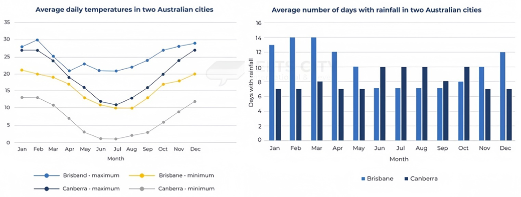
Sample 1:
The graphs show the average daily temperatures in two Australian cities and the average number of days per month with rainfall.
Overall, the minimum and maximum temperatures in Brisbane were higher than those in Canberra in general. Additionally, while the average daily temperature trends were similar between the two cities, with cooler weather occurring from April to September, the rainfall trends were opposite.
In Brisbane, the hottest average daily maximum temperature occurs in February, reaching around 30℃. Canberra’s hottest average maximum daily temperatures occur from December to February and reach approximately 27℃. The lowest average daily minimum temperature in both cities occurs in July, dropping to around 10℃ in Brisbane and 1℃ in Canberra.
Meanwhile, the highest average number of days with rainfall in Brisbane are in December to April, with the highest figures occurring in February and March at 14 days with rainfall per month. Canberra, on the other hand, experiences its rainiest months from June to August, at an average of 10 days with rainfall per month.
Sample 2:
The charts compare the lows and highs in average daily temperatures (°C) as well as the average number of rainy days during a year between two Australian cities, Brisbane and Canberra.
The statistics reflect that Brisbane is much warmer than Canberra. However, they both have in common that their temperatures tend to be higher in the first and last quarters of the year. As for rainfall, Brisbane generally experiences more rainy days than Canberra, except between June and October.
Maximum temperatures in Brisbane peak in February (30°C) and December (28°C), lowering towards June and July (21°C). Canberra’s warmest months also coincide with Brisbane’s, although the temperature is not as high (27°C). Nevertheless, in June and July, Canberra’s maximums (11–12°C) almost equal Brisbane’s minimums (10–11°C), while its minimums even get close to freezing point (1–2°C).
At its summit, Brisbane records up to 13–14 days of rainfall in the first quarter, while Canberra shows only half of that figure. In April, May, November, and December, the gap lessens, yet Brisbane’s figures (10–12) are still significantly higher than Canberra’s (7). Only from June to October does the reverse happen: Canberra experiences 8–10 days of rainfall compared to 7–8 days in Brisbane.
Sample 3:
The line graph juxtaposes the mean daily temperature in Brisbane and Canberra throughout a year, whilst the bar graph delineates the frequency of precipitation each month in these two cities.
It is readily apparent that Canberra experiences lower temperatures than Brisbane during both winter and summer. An intriguing observation is the higher incidence of rainfall in Brisbane's summer, whereas Canberra records a greater number of wet days in the winter.
Focusing on temperature, Brisbane witnesses similar patterns of daily maximum and minimum temperatures, approximately 27 and 25 degrees respectively, during the months of January and March. However, July records a notable disparity of 10 degrees. In stark contrast, Canberra maintains a steady monthly temperature variation of about 7 degrees, demonstrating a less pronounced fluctuation compared to Brisbane.
Turning to precipitation, Brisbane registers the highest frequency of rainy days in February and March with 14 days each, followed closely by January with 13 days and 12 days each in April and December. On the other hand, Canberra's weather pattern displays a distinct consistency from June to August, with each month experiencing 10 wet days. Interestingly, the rainfall days in Canberra in October align with Brisbane's November, equating to a third of the month.
Sample 4:
The line graph provides a comparative study of the average daily temperature fluctuations in Brisbane and Canberra over the span of a year, while the bar graph elucidates the frequency of rainy days on a monthly basis in the aforementioned cities.
Upon analysis, it is indisputable that Canberra is generally cooler than Brisbane during both winter and summer. Notably, Brisbane experiences a higher incidence of precipitation in the summer, whilst Canberra sees more rainy days in the winter season.
With regards to the temperature variations, the peak and the trough temperature during January and March in Brisbane are strikingly similar, at around 27 degrees and precisely 25 degrees respectively. Contrastingly, the greatest temperature variance is observed in July with a divergence of 10 degrees. Conversely, Canberra presents a uniform temperature difference of around 7 degrees each month, underscoring its lesser temperature fluctuation as compared to Brisbane.
In terms of precipitation, Brisbane endures the most rainfall with 14 rainy days in February and March, 13 days in January and 12 days in both April and December. However, Canberra sees a steady rate of rainfall from June to August, with each month recording 10 rainy days. Intriguingly, the occurrence of rainy days in Canberra in October mirrors that in Brisbane's November, tallying to approximately a third of the month.
Sample 5:
The graph and chart illustrate the average daily temperatures and the average number of rainy days between two cities in Australia: Brisbane and Canberra.
The data indicate that Brisbane is significantly warmer than Canberra. However, both cities share a similar temperature pattern, where the temperature tends to be higher in the first and last quarters of the year. In terms of rainfall, Brisbane generally has more rainy days than Canberra, except for the period between June and October.
Brisbane experiences its highest maximum temperatures in February (30°C) and December (28°C), which then decrease towards June and July (21°C). Similarly, Canberra's warmest months coincide with Brisbane's, although the temperature is not as high (27°C). However, in June and July, Canberra's maximum temperatures (11-12°C) almost match Brisbane's minimum temperatures (10-11°C), while its minimum temperatures can even reach a freezing point (1-2°C).
Brisbane has up to 13-14 days of rainfall in the first quarter, while Canberra only has half that figure. In April, May, November, and December, the difference between the two cities lessens, but Brisbane's figures (10-12) are still significantly higher than Canberra's (7). Only from June to October does the situation reverse, with Canberra experiencing from 8 to 10 days of rainfall compared to 7-8 days in Brisbane.
Sample 6:
The graph and chart provide information on the average daily temperatures in degrees Celsius and the number of rainy days per month for Brisbane and Canberra in Australia.
Overall, Brisbane has a higher temperature than Canberra all year round, with the highest temperature in Brisbane recorded in February. Brisbane experiences more rainy days each month from November to May, whereas Canberra has more rainy days from June to October.
Brisbane's maximum daily temperature reaches 30°C in February before dropping to 21°C in April. After rising to 23°C, it again falls to 21°C in June and July. In comparison, Canberra's temperature drops to approximately 11°C in July, only half of Brisbane's temperature. In the last five months of the year, both cities experienced an increase in temperature, with Brisbane reaching around 29°C and Canberra around 27°C in December. Regarding the minimum daily temperature, Brisbane starts at around 21°C in January and gradually decreases to 10°C in July and August before rising to 20°C at the end of the year. Canberra's minimum daily temperature follows a similar pattern, starting at 18°C in January, dropping to 1°C in June and July, and rising to approximately 12°C in December.
In addition, Brisbane experiences an increase in rainy days from 10 in November to 14 in February and March before decreasing to 10 in May. Canberra experiences around six rainy days per month for most of the year. From June to October, Brisbane has only 7 or 8 rainy days per month, while Canberra has 8 to 10 rainy days.
Sample 7:
The graph and charts compare the temperatures in degrees Celsius and the number of rainy days monthly in Brisbane and Canberra, Australia.
Despite similar periodic fluctuations, Brisbane’s maximum and minimum temperatures are consistently higher than Canberra’s. Moreover, the largest numbers of days with rainfall in Brisbane fall in the first half of the year, but an opposite pattern is recorded in Canberra.
Brisbane’s maximum and minimum temperatures start at 28 and 27 degrees, the gap of which widens from April to July and ultimately makes a striking difference of 10 degrees. The temperatures soar in the remaining months and similarly end at under 30 degrees. Meanwhile, Canberra’s statistics maintain a gap of 8-10 degrees throughout the period. Standing at 22 and 13 degrees in January, this city’s maximum and minimum temperatures experience a significant drop, reaching troughs of 10 degrees and 1 degree in July, before starting to rise again later in the year. Regarding the number of days with rainfall, Brisbane experiences 10-14 rainy days in the first five months, with the peaks recorded in February and March. After a plateau of 10 days between June and August, this figure reduces by three days in December. Meanwhile, Canberra experiences seven rainy days from January to September, with eight days in March being the exception. In the last quarter of the year, this figure sees a 50% surge to end at 12 days.
Sample 8:
The provided graph displays the average daily maximum and minimum temperatures in degrees Celsius (°C) for Brisbane and Canberra, while the accompanying chart illustrates the average number of days with rainfall in each city per month.
Overall, both cities experienced a decline in average daily temperatures from February to July. Brisbane consistently recorded higher temperatures than Canberra. Furthermore, Brisbane generally experienced a greater number of rainy days than Canberra, although Canberra showed a higher number of rainy days between June and October.
In January, both cities had similar average daily maximum temperatures, around 27°C. Brisbane reached its peak average daily maximum temperature of 30°C in February, while Canberra's remained relatively constant. From February to July, both cities experienced a decline in maximum temperatures; Brisbane's dropped to 21°C and Canberra's to 11°C. Subsequently, temperatures in both cities gradually rose, reaching 29°C in Brisbane and 27°C in Canberra by December.
Concerning rainfall, Brisbane saw a relatively constant number of rainy days, fluctuating between 12 and 14 days from December to March. This contrasted with a lower average of 7 days from June to September. Canberra, conversely, exhibited more stable rainfall patterns, with 7 or 8 rainy days from November to May, increasing to 10 days from June to August.
Hot: 1000+ Đề thi cuối kì 2 file word cấu trúc mới 2026 Toán, Văn, Anh... lớp 1-12 (chỉ từ 60k). Tải ngay
CÂU HỎI HOT CÙNG CHỦ ĐỀ
Lời giải

Sample 1:
The bar graph illustrates the overseas students' spending on accommodation, tuition, and living expenses, while the table depicts information about the average weekly expenses by international students in four countries: A, B, C, and D.
Overall, foreign students need to spend the highest in country A and the lowest in D. In nearly every nation, the international students’ weekly average living expenses are the greatest, while their housing cost registers the lowest.
The costliest country for studying is A, with a weekly average expense of 875 dollars. This is followed by B, C, and D, which have weekly expenses of 735, 540, and 435 dollars, respectively. However, foreign students always pay the least for accommodation, which incurs on average weekly 220, 280, 240, and 200 dollars in the nations A, B, C, and D, respectively.
On the other hand, living expenditures account for the highest portion of average weekly costs for international students in countries A, B, and C, with 430, 350, and 275 dollars, correspondingly. Tuition fees in the same countries (A, B and C) come in second with the weekly averages of 358, 320, and 250 dollars in order. However, D is the only nation where education accounts for the highest average spending area, coming in at USD 235, followed by the cost of living (USD 225) and housing (USD 200).
Sample 2:
The table illustrates information regarding the weekly spendings by overseas students in four countries, A, B, C and D, while the bar graph depicts the students’ expenditure on the sectors, housing, education fees and living expenses.
Overall, the cost of studying abroad is the highest in country A and the lowest in D. Apart from country D, living costs account for the most part of the weekly spendings in all countries, while accommodation registers the least.
Regarding the total cost of studying, A is the most expensive country with weekly average 875 dollars, followed by B, C and D with 735, 540 and 435 dollars, respectively. On the other hand, the overseas students always spend the least on accommodation, which are on average weekly 220, 280, 240 and 200 dollars in the corresponding countries A, B, C and D.
Considering the living cost, it takes the largest share of foreign students’ average weekly expenses in countries A, B, and C with 430, 350 and 275 dollars, respectively, while tuition fees in the same countries hold the second place with weekly average 358, 320 and 250 dollars, sequentially. However, D is the only country where tuition fee occupies the highest expenditure with average weekly 235 dollars, followed by living cost (USD 225) and accommodation (USD 200.)
Sample 3:
The table and bar graph depict information regarding the weekly spendings by overseas students in countries A, B C and D.
Overall, there are three elements, housing, school fees and living costs that contribute to the total weekly spendings. The total expenditure in country A is the highest while it is the lowest in country D. Living costs account for the most part of the weekly spendings in all countries except D.
The total mean weekly cost for pupils to study in country A is US$875, next by country B at US$735, and then by country C at US$540, and finally by country D at US$435. The living costs are always the biggest component of the expenditure except for country D, with about US$10 less than the major spending which is the school fees.
Accommodation accounts for the least among all spendings in all countries. The most expensive housing is found in country B, at US$280, and the cheapest in country D at US$200. The middle range can be seen in country A at US$220 and country C at US$240, respectively. Costs of the tuition fee range between US$ 358 and US$235 in country A and D, in order.
Lời giải

Sample 1:
The bar chart and pie chart give information about why US residents travelled and what travel problems they experienced in the year 2009.
It is clear that the principal reason why Americans travelled in 2009 was to commute to and from work. In the same year, the primary concern of Americans, with regard to the trips they made, was the cost of travelling.
Looking more closely at the bar chart, we can see that 49% of the trips made by Americans in 2009 were for the purpose of commuting. By contrast, only 6% of trips were visits to friends or relatives, and one in ten trips were for social or recreation reasons. Shopping was cited as the reason for 16% of all travel, while unspecific ‘personal reasons’ accounted for the remaining 19%.
According to the pie chart, price was the key consideration for 36% of American travellers. Almost one in five people cited safety as their foremost travel concern, while aggressive driving and highway congestion were the main issues for 17% and 14% of the travelling public. Finally, a total of 14% of those surveyed thought that access to public transport or space for pedestrians were the most important travel issues.
Sample 2:
The bar chart compares the figures for Americans going out for five reasons and the pie chart illustrates the percentage of six problems that concerned them when travelling in 2009. Overall, it is clear that the main reason why people in the US went out in 2009 is to commute to work, and the cost of travelling is the problem concerning them the most.
Looking first at the bar graph, the proportion of Americans going out for commuting to work stood at 49%, while the figure for those leaving their house for personal reasons accounted for 19%. In addition, the rate of people in the US going out for shopping and recreation made up 16% and 10%, respectively, while visiting friends or relatives accounted for the lowest percentage, at only 6%.
Turning to the pie chart, the cost of travelling was the most concerning problem of Americans when going out, with the figure making up 36%, while the proportion of safety concerns is half of that, at 19%. In addition, 17% of US citizens were concerned about aggressive drivers, while highway congestion made 14% of them worried when leaving their house. Access to public transportation and places for people to walk accounted for the lowest percentages, at only 8% and 6%, respectively.
Sample 3:
The provided charts offer insights into the reasons for travel and the primary concerns faced by the traveling public in the United States during the year 2009. The data is presented through a bar chart illustrating travel purposes and a pie chart highlighting key issues.
Notably, the primary motivation for travel among Americans in 2009 was commuting to and from work. Simultaneously, the major concern for the traveling public during their trips revolved around the cost associated with travel.
Examining the bar chart in detail reveals that almost half of the trips made by Americans in 2009, precisely 49%, were attributed to commuting. Conversely, visits to friends or relatives accounted for a mere 6%, while social or recreational trips constituted one in ten journeys. Shopping emerged as the purpose for 16% of all travel, leaving the remaining 19% for unspecific ‘personal reasons.’
Turning attention to the pie chart, it becomes evident that cost was the primary consideration for 36% of American travelers. Safety closely followed, with nearly one in five people, or 19%, expressing it as their foremost travel concern. Aggressive driving and highway congestion were significant issues for 17% and 14% of the traveling public, respectively. Additionally, 14% of respondents identified access to public transport or space for pedestrians as the most crucial travel issues.
Sample 4:
The bar chart shows why American people chose to travel, and the pie chart shows the main issues for the travelling public in the USA, both for 2009. The trend suggests that the reason and price were the main issues for travel in the United States. It is clear that commuting from work was reported as the biggest contribution to travel, at 49%. People who went travelling for personal reasons and shopping accounted for 35% when these two groups are combined. However, interaction with friends and relatives only accounted for 25% less than the above categories. And social and recreational activities took up only 6%, which was the lowest figure by more than 43%. The travelling public’s main issues were related to price and safety, with 55% of respondents reporting these two issues. While other issues accounted for a relatively small part. Only 17% of the respondents reported issues with aggressive drivers, while highway congestion accounted for even less at 14% of the issues reported. The percentage of access to public transport and space for pedestrians was much lower than the other categories at less than 10% for both. To conclude, price and commuting time were the dominant factors relating to travel in the US in 2009.
Lời giải
Bạn cần đăng ký gói VIP ( giá chỉ từ 250K ) để làm bài, xem đáp án và lời giải chi tiết không giới hạn.
Lời giải
Bạn cần đăng ký gói VIP ( giá chỉ từ 250K ) để làm bài, xem đáp án và lời giải chi tiết không giới hạn.
Lời giải
Bạn cần đăng ký gói VIP ( giá chỉ từ 250K ) để làm bài, xem đáp án và lời giải chi tiết không giới hạn.
Lời giải
Bạn cần đăng ký gói VIP ( giá chỉ từ 250K ) để làm bài, xem đáp án và lời giải chi tiết không giới hạn.
Lời giải
Bạn cần đăng ký gói VIP ( giá chỉ từ 250K ) để làm bài, xem đáp án và lời giải chi tiết không giới hạn.