


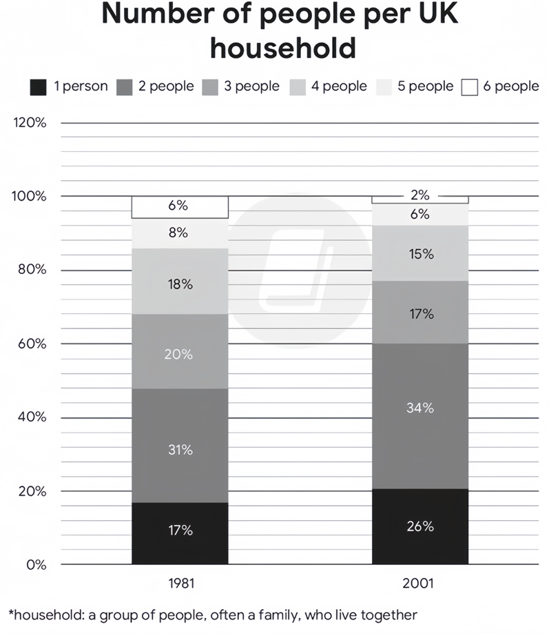
The chart below compares the number of people per household* by percentage in the UK in 1981 and 2001.
Summarise the information by selecting and reporting the main features, and make comparisons where relevant. Write at least 150 words.
The chart below compares the number of people per household* by percentage in the UK in 1981 and 2001.
Summarise the information by selecting and reporting the main features, and make comparisons where relevant. Write at least 150 words.
Câu hỏi trong đề: 2000 câu trắc nghiệm tổng hợp Tiếng Anh 2025 có đáp án !!
Quảng cáo
Trả lời:
Sample 1:
The stacked bar charts give a breakdown of the UK’s household composition in two separate years, namely 1981 and 2001.
Overall, there were decreases in the shares of households having from 3 to 6 people, whereas the converse was true in the case of those having 1 or 2 members, with 2-person and 6-person households being the most and least common in both given years, respectively.
Regarding households with an upward trend, the percentage of 2-member households was consistently the highest, starting at 31% before rising minimally by 3% in the final year. A similar change, but to a greater extent, was observed in the proportion of the smallest-sized households, growing from 17% initially to just over a quarter at the end of the period.
Turning to categories with a downward trend, households with 3 and 4 occupants witnessed the same level of decrease, with their figures dropping from 20% and 18% in 1981 to 17% and 15% two decades later, in that order. 5-person and 6-person households followed similar falling trends, albeit at lower rates. While the figure for the former had declined from 8% to 6% by 2001, that of the latter remained the lowest throughout, dipping from 6% to 2%.
Sample 2:
The two stacked bar charts detail the UK’s household demographics in 1981 and 2001. The initial impression from the chart is that 1-person and 2-person households were the second most and the most common family classifications in both given years, and they also experienced rises in percentages. The remaining groups made up smaller proportions and underwent corresponding drops, with the 6-person household being the least popular one.
In 1981, 2-person household made up 31%, ranking first among the given household type, after which the rate underwent a mild rise to 34% in 2001. A similar picture is evident in 1-person household, with its figure accounting for 17% and thereafter rising to 26% in 2001.
Opposite patterns could be observed with regard to the remaining groups. In 1981 the shares of 3-person, 4-person, 5-person and 6-person were 20%, 18%, 8% and 6% respectively. Over the next 20 years, they all decreased by similar margins (of around 2-3%) to 17%, 15%, 6% and 2%.
Sample 3:
The charts illustrate the percentage of different sized households in the UK, in 1981 and 2001.
Overall, the most common sized household in both measured years was that of 2-person households, while 6-person households were the least common. Additionally, while the percentage of 1-person and 2-person households increased, the percentage of all other sized households decreased.
In 1981, 31% of all households contained 2 people, while 20% of households contained 3 people. 1-person and 4-person households made up similar percentages, at 17% and 18% respectively, whereas 5-person and 6-person households only made up 8% and 6% of the total.
By 2001, the proportion of 1-person and 2-person households had risen to 26% and 34% respectively. Meanwhile, the proportion of all other sized households had decreased, with 3 and 4-person households dropping to similar levels, at 17% and 15% respectively, and 5 and 6-person households dropping to 6% and 2% respectively.
Sample 4:
The stacked bar charts delineate the household compositions with respect to the number of occupants in the UK in 1981 and 2001.
As is shown in the graph, most households in the UK had 2 occupants. Over the surveyed period, single and 2-person households enjoyed upswings whilst other demographics experienced a corresponding downturn.
Regarding the first stacked bar, 31% of households consisted of 2 occupants, heading the list of total demographics. Next came 3-person households with 20%, as opposed to single and 4-member households, accounting for 17% and 18% in turn. Large household sizes ranked in bottom place with 8% for 5-occupant and 6% for 6-occupant units.
20 years later, households with a single person living alone or two persons became dominant, with the figure for the former rising up by 9%, amounting to over one-quarter of total surveyed households. Meanwhile, households with 3 or 4 occupants recorded a fall of 3%, finishing at 17% and 15% respectively. Remaining in the last place were household units of 5 or 6 members, with their figures decreasing to 6% and 2%.
Sample 5:
The stacked bar charts delineate the composition of households in the UK during two distinct years: 1981 and 2001.
Overall, the UK preferred a smaller family size. Throughout both years, households comprising 2 individuals were the most prevalent, while those with 6 members were the least common.
Regarding the escalating trend, 2-person households consistently held the highest percentage, commencing at 31% and experiencing a marginal rise of 3% by the conclusion of the period. A comparable albeit more pronounced upward shift was noticeable in the proportion of the smallest-sized households (1 person), advancing from 17% initially to slightly over 25% by the terminal year.
Conversely, a declining trajectory was evident in households with 3 and 4 inhabitants, both experiencing a reduction from 20% and 18% in 1981 to 17% and 15% respectively by 2001. Similarly, households with 5 and 6 occupants also followed decreasing trends, albeit at slower rates. While the former decreased from 8% to 6% by 2001, the latter consistently demonstrated the lowest representation, plummeting from 6% to a mere 2% over the same period.
Sample 6:
The provided bar graphs compare the number of people per household in the UK in 1981 and 2001, elucidating the dynamic changes of household sizes. Notably, the trend indicates a pivot towards smaller household units over the two decades in question.
Overall, the data presents a clear downsizing trend in UK households, with a notable rise in one and two-person homes and a general decrease in larger family units.
In 1981, two-person households dominated, accounting for 31% of the total, and witnessed a slight increment to 34% by 2001, solidifying their prevalence. Conversely, the smallest household category, one-person units, experienced a significant upsurge from 17% to 26%, marking a move towards more individualised living spaces.
Meanwhile, the more populous household categories all contracted. Four-person homes, which constituted 18% in 1981, retracted to 15% by 2001. Three-person households mirrored this decrease, diminishing from 20% to 17%. Five-person households also saw a reduction, albeit less dramatically, from 8% to 6%. The most pronounced decline was observed in six-person households, which halved from 6% to a mere 2%, marking the most substantial demographic shift.
Sample 7:
The chart elucidates the changes in household composition in the UK, as measured by the number of occupants, between 1981 and 2001.
Overall, there was a noticeable shift towards smaller households in the UK over the 20-year period, with an increase in one and two-person households and a decrease in larger households.
In 1981, two-member households constituted the largest segment, accounting for 31% of the total, and this figure saw a modest rise to 34% in 2001. Single-person households also increased notably, jumping from 17% to 26% over the two decades. Households of three persons experienced a slight decline, from one fifth in 1981 to 17% in 2001.
Contrastingly, larger households displayed a downward trend. In 1981, four-member families accounted for 18% of households, but this fell marginally to 15% in 2001. A similar pattern was observed for five-member households, whose share dropped from 8% to 6% during the same period. Notably, households containing six members were the least common in both years, representing less than 6% of the total.
Sample 8:
The presented chart delineates the evolution of the number of people per household in the UK, by enumerating the number of inhabitants, from 1981 to 2001. It is compelling to note a significant transition towards smaller household units and a concurrent decline in more substantial familial arrangements.
In 1981, the dominant household structure comprised two occupants, accounting for 31% of the total. This segment saw a subtle uptick, reaching 34% by 2001. Singular dwellers also experienced a considerable surge, escalating from 17% to 26% over the two-decade span. The fraction of tri-member households diminished marginally, receding from one fifth in 1981 to 17% by 2001.
In stark contrast, households with larger numbers exhibited a waning trend. Four-member familial units, which represented 18% of total households in 1981, underwent a slight contraction to 15% in 2001. A congruent trajectory was observed amongst five-member households, dwindling from 8% to 6% over the same timeframe. Significantly, households embracing six inhabitants remained the least prevalent category, commanding less than 6% in both surveyed years.
Sample 9:
The given chart depicts the percentages for the number of people living in households over a period of twenty years from 1981 to 2001 in the UK.
Overall, the percentage of families with 1 to two members increased, while the proportion of families with 3 or more people decreased slightly. In addition, two person households account for the largest percentage of households, whereas six person households have the lowest percentage.
In 1981, the number of households with 2-person accounted for 31% and ranked first among the households, after which it witnessed a slight increase to 34% in 2001. Furthermore, the number of single-person households was responsible for 17%, which was followed by a significant increase of 26% in the next two decades.
Turning to households with a downward trend, the number of households with 3-person decreased slightly by 3% from 20% to 17% and households with 4-person witnessed the same level of decrease with their figures dropping from 18% to 15% over the following two decades. Remain in the last place are households of 5 and 6-person who also have a similar decrease with the rate falling to 6% and 2% respectively.
Sample 10:
The bar chart depicts the distribution of households in the UK based on their size in the years 1981 and 2001.
Overall, households consisting of two individuals were the most prevalent category in both years, whereas households with six members were the least common. Furthermore, while the percentage of one-person and two-person households witnessed an upward shift, the proportion of households of other sizes took the opposite trend.
In 1981, approximately 31% of all households comprised two people, while 20% were composed of three individuals. One-person and four-person households accounted for similar proportions, at 17% and 18% respectively, whereas five-person and six-person households constituted only 8% and 6% of the total in that order.
After 20 years, the percentage of one-person households rose considerably to 26%, representing a significant increase of 9%. The proportion of those with two people followed a similar pattern, although the increase was less pronounced, with a 3% rise. Meanwhile, the trend for the remaining categories was downward, as their figures decreased by around 2 to 4%.
Hot: 1000+ Đề thi cuối kì 2 file word cấu trúc mới 2026 Toán, Văn, Anh... lớp 1-12 (chỉ từ 60k). Tải ngay
CÂU HỎI HOT CÙNG CHỦ ĐỀ
Lời giải

Sample 1:
The bar graph illustrates the overseas students' spending on accommodation, tuition, and living expenses, while the table depicts information about the average weekly expenses by international students in four countries: A, B, C, and D.
Overall, foreign students need to spend the highest in country A and the lowest in D. In nearly every nation, the international students’ weekly average living expenses are the greatest, while their housing cost registers the lowest.
The costliest country for studying is A, with a weekly average expense of 875 dollars. This is followed by B, C, and D, which have weekly expenses of 735, 540, and 435 dollars, respectively. However, foreign students always pay the least for accommodation, which incurs on average weekly 220, 280, 240, and 200 dollars in the nations A, B, C, and D, respectively.
On the other hand, living expenditures account for the highest portion of average weekly costs for international students in countries A, B, and C, with 430, 350, and 275 dollars, correspondingly. Tuition fees in the same countries (A, B and C) come in second with the weekly averages of 358, 320, and 250 dollars in order. However, D is the only nation where education accounts for the highest average spending area, coming in at USD 235, followed by the cost of living (USD 225) and housing (USD 200).
Sample 2:
The table illustrates information regarding the weekly spendings by overseas students in four countries, A, B, C and D, while the bar graph depicts the students’ expenditure on the sectors, housing, education fees and living expenses.
Overall, the cost of studying abroad is the highest in country A and the lowest in D. Apart from country D, living costs account for the most part of the weekly spendings in all countries, while accommodation registers the least.
Regarding the total cost of studying, A is the most expensive country with weekly average 875 dollars, followed by B, C and D with 735, 540 and 435 dollars, respectively. On the other hand, the overseas students always spend the least on accommodation, which are on average weekly 220, 280, 240 and 200 dollars in the corresponding countries A, B, C and D.
Considering the living cost, it takes the largest share of foreign students’ average weekly expenses in countries A, B, and C with 430, 350 and 275 dollars, respectively, while tuition fees in the same countries hold the second place with weekly average 358, 320 and 250 dollars, sequentially. However, D is the only country where tuition fee occupies the highest expenditure with average weekly 235 dollars, followed by living cost (USD 225) and accommodation (USD 200.)
Sample 3:
The table and bar graph depict information regarding the weekly spendings by overseas students in countries A, B C and D.
Overall, there are three elements, housing, school fees and living costs that contribute to the total weekly spendings. The total expenditure in country A is the highest while it is the lowest in country D. Living costs account for the most part of the weekly spendings in all countries except D.
The total mean weekly cost for pupils to study in country A is US$875, next by country B at US$735, and then by country C at US$540, and finally by country D at US$435. The living costs are always the biggest component of the expenditure except for country D, with about US$10 less than the major spending which is the school fees.
Accommodation accounts for the least among all spendings in all countries. The most expensive housing is found in country B, at US$280, and the cheapest in country D at US$200. The middle range can be seen in country A at US$220 and country C at US$240, respectively. Costs of the tuition fee range between US$ 358 and US$235 in country A and D, in order.
Lời giải

Sample 1:
The bar chart and pie chart give information about why US residents travelled and what travel problems they experienced in the year 2009.
It is clear that the principal reason why Americans travelled in 2009 was to commute to and from work. In the same year, the primary concern of Americans, with regard to the trips they made, was the cost of travelling.
Looking more closely at the bar chart, we can see that 49% of the trips made by Americans in 2009 were for the purpose of commuting. By contrast, only 6% of trips were visits to friends or relatives, and one in ten trips were for social or recreation reasons. Shopping was cited as the reason for 16% of all travel, while unspecific ‘personal reasons’ accounted for the remaining 19%.
According to the pie chart, price was the key consideration for 36% of American travellers. Almost one in five people cited safety as their foremost travel concern, while aggressive driving and highway congestion were the main issues for 17% and 14% of the travelling public. Finally, a total of 14% of those surveyed thought that access to public transport or space for pedestrians were the most important travel issues.
Sample 2:
The bar chart compares the figures for Americans going out for five reasons and the pie chart illustrates the percentage of six problems that concerned them when travelling in 2009. Overall, it is clear that the main reason why people in the US went out in 2009 is to commute to work, and the cost of travelling is the problem concerning them the most.
Looking first at the bar graph, the proportion of Americans going out for commuting to work stood at 49%, while the figure for those leaving their house for personal reasons accounted for 19%. In addition, the rate of people in the US going out for shopping and recreation made up 16% and 10%, respectively, while visiting friends or relatives accounted for the lowest percentage, at only 6%.
Turning to the pie chart, the cost of travelling was the most concerning problem of Americans when going out, with the figure making up 36%, while the proportion of safety concerns is half of that, at 19%. In addition, 17% of US citizens were concerned about aggressive drivers, while highway congestion made 14% of them worried when leaving their house. Access to public transportation and places for people to walk accounted for the lowest percentages, at only 8% and 6%, respectively.
Sample 3:
The provided charts offer insights into the reasons for travel and the primary concerns faced by the traveling public in the United States during the year 2009. The data is presented through a bar chart illustrating travel purposes and a pie chart highlighting key issues.
Notably, the primary motivation for travel among Americans in 2009 was commuting to and from work. Simultaneously, the major concern for the traveling public during their trips revolved around the cost associated with travel.
Examining the bar chart in detail reveals that almost half of the trips made by Americans in 2009, precisely 49%, were attributed to commuting. Conversely, visits to friends or relatives accounted for a mere 6%, while social or recreational trips constituted one in ten journeys. Shopping emerged as the purpose for 16% of all travel, leaving the remaining 19% for unspecific ‘personal reasons.’
Turning attention to the pie chart, it becomes evident that cost was the primary consideration for 36% of American travelers. Safety closely followed, with nearly one in five people, or 19%, expressing it as their foremost travel concern. Aggressive driving and highway congestion were significant issues for 17% and 14% of the traveling public, respectively. Additionally, 14% of respondents identified access to public transport or space for pedestrians as the most crucial travel issues.
Sample 4:
The bar chart shows why American people chose to travel, and the pie chart shows the main issues for the travelling public in the USA, both for 2009. The trend suggests that the reason and price were the main issues for travel in the United States. It is clear that commuting from work was reported as the biggest contribution to travel, at 49%. People who went travelling for personal reasons and shopping accounted for 35% when these two groups are combined. However, interaction with friends and relatives only accounted for 25% less than the above categories. And social and recreational activities took up only 6%, which was the lowest figure by more than 43%. The travelling public’s main issues were related to price and safety, with 55% of respondents reporting these two issues. While other issues accounted for a relatively small part. Only 17% of the respondents reported issues with aggressive drivers, while highway congestion accounted for even less at 14% of the issues reported. The percentage of access to public transport and space for pedestrians was much lower than the other categories at less than 10% for both. To conclude, price and commuting time were the dominant factors relating to travel in the US in 2009.
Lời giải
Bạn cần đăng ký gói VIP ( giá chỉ từ 250K ) để làm bài, xem đáp án và lời giải chi tiết không giới hạn.
Lời giải
Bạn cần đăng ký gói VIP ( giá chỉ từ 250K ) để làm bài, xem đáp án và lời giải chi tiết không giới hạn.
Lời giải
Bạn cần đăng ký gói VIP ( giá chỉ từ 250K ) để làm bài, xem đáp án và lời giải chi tiết không giới hạn.
Lời giải
Bạn cần đăng ký gói VIP ( giá chỉ từ 250K ) để làm bài, xem đáp án và lời giải chi tiết không giới hạn.
Lời giải
Bạn cần đăng ký gói VIP ( giá chỉ từ 250K ) để làm bài, xem đáp án và lời giải chi tiết không giới hạn.