


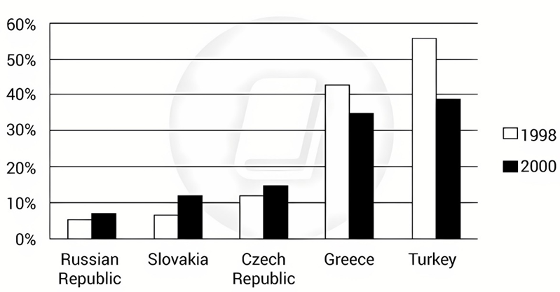
The graph below shows the percentage of self-employed workers of the total workforce in five countries in 1998 and 2008.
Summarise the information by selecting and reporting the main features, and make comparisons where relevant. Write at least 150 words.
The graph below shows the percentage of self-employed workers of the total workforce in five countries in 1998 and 2008.
Summarise the information by selecting and reporting the main features, and make comparisons where relevant. Write at least 150 words.
Câu hỏi trong đề: 2000 câu trắc nghiệm tổng hợp Tiếng Anh 2025 có đáp án !!
Quảng cáo
Trả lời:
Sample 1:
The given column graph illustrates the percentage of workers who were doing their own work, out of all employed people in five countries, in 1998 and 2008. It is manifest from the graph that the Turks and Greeks were more interested in entrepreneurship than the Russians, Slovakians and the Czechs.
The percentage of self-employed people from the Russian Republic, Slovakia and the Czech Republic was 5%, 7% and 11% respectively, in 1998. However, in just a decade the percentage rose in all three countries and reached 7%, 12% and 14% respectively, by 2008. The people of Greece and Turkey doing own business were 43% and 56% respectively but decreased to 35% and 39% respectively by 2008.
Overall, it is interesting to see that although the percentage of entrepreneurs in the Russian Republic, Slovakia and the Czech Republic were much lesser than those in Greece and Turkey, their interest in doing their own work grew with time. Whereas the people of Greece and Turkey were much more who were running their own business, but their interest in doing their own work dwindled with time.
Sample 2:
The bar chart gives information about the rate of self-employment in the working demographics of five distinct nations in two different years, 1998 and 2008.
Overall, Greece and Turkey boasted the largest self-employed population, far exceeding other countries. It is also noticeable that over the course of a decade, there was positive growth in the segment of people working for themselves in Russia, Slovakia, and the Czech Republic while Greece and Turkey witnessed considerable decreases in their numbers.
Russia, Slovakia, and the Czech Republic were the countries with the lowest levels of self-employment across the chart, with 3%, 5%, and 11% of the workforce working for themselves in 1998. 10 years later, both Russia and the Czech Republic experienced rather minimal increases in their numbers, growing to 5% and 14% respectively. Witnessing a similar trend, albeit at a more pronounced rate, Slovakia saw its self-employed workforce doubling to 12%.
At the beginning of the timescale, over half of the Turkey's working populace was self-employed, 10% higher than that of Greece. However, the level of self-employed workforce in Turkey plummeted by 16% within the next 10 years, marking the most significant change in the chart. A similar pattern was observed in Greece, whose percentage had dwindled to 35% by 2008. It is also worth noting that despite these variations, the pecking order remained the same, with Turkey leading, followed by Greece while the Czech Republic, Slovakia, and Russia lagged behind.
Sample 3:
The bar chart compares five nations in terms of the proportion of people working for themselves in 2 different years, 1998 and 2008.
Overall, both Greece and Turkey witnessed a downward trend over the examined period, while the opposite was true for the 3 remaining countries. Additionally, Turkey recorded the highest figures for self- employment in both years.
Starting with approximately 55 percent at the start of the period, the proportion of workers being self-employed in Turkey dropped considerably to about 38 percent in 2008. In second place on the chart was Greece, with the figures standing at 43 percent in 1998 and 35 percent 10 years later.
Regarding Czech Republic, around 12 percent of the labor workforce was self-employed, followed by a rise of 3 percent to 15 percent in 2008. In a similar way, that of Slovakia experienced a minor rise, from 6 to 12 percent over the 10-year period. 5 was the percentage of self-employment in Russian Republic, which later jumped to about 7% at the end of the period, making it rank last among the 5 nations.
Sample 4:
The bar chart illustrates the percentages of self-employed people in five different countries in 1998 and 2008.
Overall, while the percentage of self-employed people in Russia, Slovakia and the Czech Republic increased over the ten-year period, the figures for Greece and Turkey declined. Furthermore, the percentage of self-employed people in Turkey was highest in both years.
In 1998, the percentage of self-employed people in Russia accounted for 5% of the total labour force, increasing by around 2% by 2008. The Czech Republic saw a similar increase of around 3%, rising from 11% to 14%. Meanwhile, Slovakia’s self-employment figures doubled over the ten-year period from around 6% to 12%.
The percentage of self-employed people in Greece in 1998 was 42%, however it had dropped by around 5% by 2008. Additionally, Turkey had the largest percentage of self-employed people at around 56% of the workforce. However, this figure did decline significantly over the period to around 38% in 2008.
Hot: 1000+ Đề thi cuối kì 2 file word cấu trúc mới 2026 Toán, Văn, Anh... lớp 1-12 (chỉ từ 60k). Tải ngay
CÂU HỎI HOT CÙNG CHỦ ĐỀ
Lời giải

Sample 1:
The bar graph illustrates the overseas students' spending on accommodation, tuition, and living expenses, while the table depicts information about the average weekly expenses by international students in four countries: A, B, C, and D.
Overall, foreign students need to spend the highest in country A and the lowest in D. In nearly every nation, the international students’ weekly average living expenses are the greatest, while their housing cost registers the lowest.
The costliest country for studying is A, with a weekly average expense of 875 dollars. This is followed by B, C, and D, which have weekly expenses of 735, 540, and 435 dollars, respectively. However, foreign students always pay the least for accommodation, which incurs on average weekly 220, 280, 240, and 200 dollars in the nations A, B, C, and D, respectively.
On the other hand, living expenditures account for the highest portion of average weekly costs for international students in countries A, B, and C, with 430, 350, and 275 dollars, correspondingly. Tuition fees in the same countries (A, B and C) come in second with the weekly averages of 358, 320, and 250 dollars in order. However, D is the only nation where education accounts for the highest average spending area, coming in at USD 235, followed by the cost of living (USD 225) and housing (USD 200).
Sample 2:
The table illustrates information regarding the weekly spendings by overseas students in four countries, A, B, C and D, while the bar graph depicts the students’ expenditure on the sectors, housing, education fees and living expenses.
Overall, the cost of studying abroad is the highest in country A and the lowest in D. Apart from country D, living costs account for the most part of the weekly spendings in all countries, while accommodation registers the least.
Regarding the total cost of studying, A is the most expensive country with weekly average 875 dollars, followed by B, C and D with 735, 540 and 435 dollars, respectively. On the other hand, the overseas students always spend the least on accommodation, which are on average weekly 220, 280, 240 and 200 dollars in the corresponding countries A, B, C and D.
Considering the living cost, it takes the largest share of foreign students’ average weekly expenses in countries A, B, and C with 430, 350 and 275 dollars, respectively, while tuition fees in the same countries hold the second place with weekly average 358, 320 and 250 dollars, sequentially. However, D is the only country where tuition fee occupies the highest expenditure with average weekly 235 dollars, followed by living cost (USD 225) and accommodation (USD 200.)
Sample 3:
The table and bar graph depict information regarding the weekly spendings by overseas students in countries A, B C and D.
Overall, there are three elements, housing, school fees and living costs that contribute to the total weekly spendings. The total expenditure in country A is the highest while it is the lowest in country D. Living costs account for the most part of the weekly spendings in all countries except D.
The total mean weekly cost for pupils to study in country A is US$875, next by country B at US$735, and then by country C at US$540, and finally by country D at US$435. The living costs are always the biggest component of the expenditure except for country D, with about US$10 less than the major spending which is the school fees.
Accommodation accounts for the least among all spendings in all countries. The most expensive housing is found in country B, at US$280, and the cheapest in country D at US$200. The middle range can be seen in country A at US$220 and country C at US$240, respectively. Costs of the tuition fee range between US$ 358 and US$235 in country A and D, in order.
Lời giải

Sample 1:
The bar chart and pie chart give information about why US residents travelled and what travel problems they experienced in the year 2009.
It is clear that the principal reason why Americans travelled in 2009 was to commute to and from work. In the same year, the primary concern of Americans, with regard to the trips they made, was the cost of travelling.
Looking more closely at the bar chart, we can see that 49% of the trips made by Americans in 2009 were for the purpose of commuting. By contrast, only 6% of trips were visits to friends or relatives, and one in ten trips were for social or recreation reasons. Shopping was cited as the reason for 16% of all travel, while unspecific ‘personal reasons’ accounted for the remaining 19%.
According to the pie chart, price was the key consideration for 36% of American travellers. Almost one in five people cited safety as their foremost travel concern, while aggressive driving and highway congestion were the main issues for 17% and 14% of the travelling public. Finally, a total of 14% of those surveyed thought that access to public transport or space for pedestrians were the most important travel issues.
Sample 2:
The bar chart compares the figures for Americans going out for five reasons and the pie chart illustrates the percentage of six problems that concerned them when travelling in 2009. Overall, it is clear that the main reason why people in the US went out in 2009 is to commute to work, and the cost of travelling is the problem concerning them the most.
Looking first at the bar graph, the proportion of Americans going out for commuting to work stood at 49%, while the figure for those leaving their house for personal reasons accounted for 19%. In addition, the rate of people in the US going out for shopping and recreation made up 16% and 10%, respectively, while visiting friends or relatives accounted for the lowest percentage, at only 6%.
Turning to the pie chart, the cost of travelling was the most concerning problem of Americans when going out, with the figure making up 36%, while the proportion of safety concerns is half of that, at 19%. In addition, 17% of US citizens were concerned about aggressive drivers, while highway congestion made 14% of them worried when leaving their house. Access to public transportation and places for people to walk accounted for the lowest percentages, at only 8% and 6%, respectively.
Sample 3:
The provided charts offer insights into the reasons for travel and the primary concerns faced by the traveling public in the United States during the year 2009. The data is presented through a bar chart illustrating travel purposes and a pie chart highlighting key issues.
Notably, the primary motivation for travel among Americans in 2009 was commuting to and from work. Simultaneously, the major concern for the traveling public during their trips revolved around the cost associated with travel.
Examining the bar chart in detail reveals that almost half of the trips made by Americans in 2009, precisely 49%, were attributed to commuting. Conversely, visits to friends or relatives accounted for a mere 6%, while social or recreational trips constituted one in ten journeys. Shopping emerged as the purpose for 16% of all travel, leaving the remaining 19% for unspecific ‘personal reasons.’
Turning attention to the pie chart, it becomes evident that cost was the primary consideration for 36% of American travelers. Safety closely followed, with nearly one in five people, or 19%, expressing it as their foremost travel concern. Aggressive driving and highway congestion were significant issues for 17% and 14% of the traveling public, respectively. Additionally, 14% of respondents identified access to public transport or space for pedestrians as the most crucial travel issues.
Sample 4:
The bar chart shows why American people chose to travel, and the pie chart shows the main issues for the travelling public in the USA, both for 2009. The trend suggests that the reason and price were the main issues for travel in the United States. It is clear that commuting from work was reported as the biggest contribution to travel, at 49%. People who went travelling for personal reasons and shopping accounted for 35% when these two groups are combined. However, interaction with friends and relatives only accounted for 25% less than the above categories. And social and recreational activities took up only 6%, which was the lowest figure by more than 43%. The travelling public’s main issues were related to price and safety, with 55% of respondents reporting these two issues. While other issues accounted for a relatively small part. Only 17% of the respondents reported issues with aggressive drivers, while highway congestion accounted for even less at 14% of the issues reported. The percentage of access to public transport and space for pedestrians was much lower than the other categories at less than 10% for both. To conclude, price and commuting time were the dominant factors relating to travel in the US in 2009.
Lời giải
Bạn cần đăng ký gói VIP ( giá chỉ từ 250K ) để làm bài, xem đáp án và lời giải chi tiết không giới hạn.
Lời giải
Bạn cần đăng ký gói VIP ( giá chỉ từ 250K ) để làm bài, xem đáp án và lời giải chi tiết không giới hạn.
Lời giải
Bạn cần đăng ký gói VIP ( giá chỉ từ 250K ) để làm bài, xem đáp án và lời giải chi tiết không giới hạn.
Lời giải
Bạn cần đăng ký gói VIP ( giá chỉ từ 250K ) để làm bài, xem đáp án và lời giải chi tiết không giới hạn.
Lời giải
Bạn cần đăng ký gói VIP ( giá chỉ từ 250K ) để làm bài, xem đáp án và lời giải chi tiết không giới hạn.