


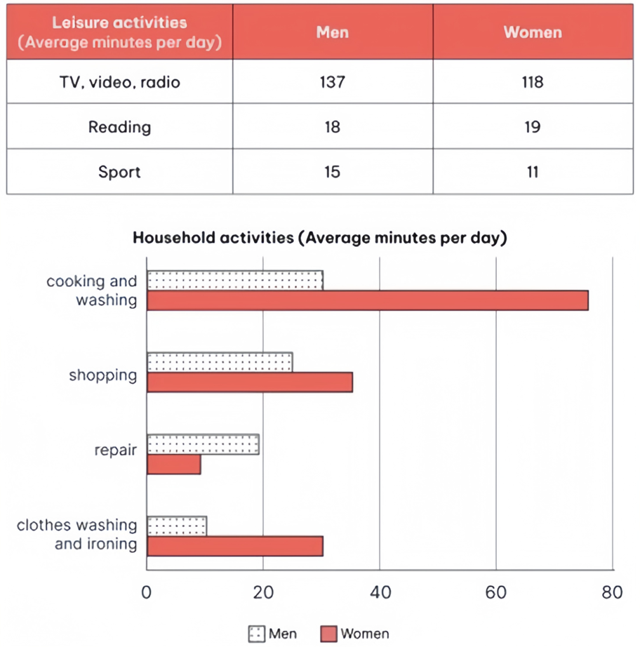
The charts below show the comparison of time spent, in minutes per day, by UK males and females on household and leisure activities in 2008.
Summarise the information by selecting and reporting the main features, and make comparisons where relevant. Write at least 150 words.
The charts below show the comparison of time spent, in minutes per day, by UK males and females on household and leisure activities in 2008.
Summarise the information by selecting and reporting the main features, and make comparisons where relevant. Write at least 150 words.
Câu hỏi trong đề: 2000 câu trắc nghiệm tổng hợp Tiếng Anh 2025 có đáp án !!
Quảng cáo
Trả lời:
Sample 1:
The given mixed charts compared the amount of time (measured in minutes per day) allocated by UK males and their counterparts on housework and entertainment in 2008.
Overall, it can be seen from the charts that the most popular activities for both genders were watching TV, videos and listening to the radio. It is also evident that while men tent to spend more time on recreational activities, women dedicated a more considerable amount of time to household chores.
In terms of leisure pursuits, 137 minutes was the amount of time spent each day by men to watch TV, videos and listen to the radio, which were also the most common types of activities among three categories examined. The amount used by women to do the same things was 19 minutes less, at 118 minutes per day. Similarly, men invested 15 minutes in sport exercises, 4 minutes more than women did. Men and women, interestingly, devoted quite a comparable amount of time in a day for reading, 18 and 19 minutes per day, respectively.
Concerning household chores, women allocated most of their time on cooking and washing (nearly 80 minutes/day), nearly double men (around 30 minutes/day). For shopping, women spent a bit under 40 minutes while this number for men was 25 minutes. Clothing washing and ironing were also more time-consuming activities for women compared to men, as this took women about 30 minutes each day to finish, three times the amount for men. As for repair, this was the only category where men spent more time the women did, as they spent nearly 20 minutes of each day to repair, twice as much as the time women spent on the same activity.
Sample 2:
The table compares men and women in terms of the average time spent on various pastimes, while the bar chart illustrates the time allocated to housework. The survey was carried out in the UK in 2008.
Overall, for both genders, while watching TV, videos, and listening to the radio were the most popular leisure activities, cooking and washing dishes were the chores that took up the most time. What is also notable from the chart is that men spent more time on most leisure activities compared to women whereas women dedicated significantly more time to household tasks.
In terms of pastimes, both genders preferred watching TV, videos, and listening to the radio, with men dedicating around 137 minutes daily, about 20 minutes more than women. Men also engaged more in sports, averaging 15 minutes compared to women’s 11 minutes. Conversely, reading was the only activity where women spent more time, albeit slightly, at 19 minutes as opposed to men’s 18 minutes.
Regarding household chores, women spent the majority of their time cooking and washing dishes, averaging 75 minutes daily, more than twice the time men spent. Shopping was the second most time-consuming task for both genders, with women also spending more time than men, with respective figures being approximately 35 minutes and around 25 minutes. A similar pattern was seen in clothes-related chores, where women spent 30 minutes, triple the time men dedicated. Lastly, men spent just under 20 minutes on repairs, double the time women allocated to this task.
Sample 3:
The bar chart and table illustrate how much time men and women in the UK allocated to housework and entertainment in 2008. Units are measured in minutes per day (mins/day).
Overall, the most popular leisure activities for both genders were watching TV, videos, and listening to the radio, while cooking and washing dishes were the most time-consuming household chores. Notably, men spent more time on most leisure activities compared to women, who dedicated significantly more time to household tasks.
In terms of recreational pursuits, watching TV, videos, and listening to the radio were by far the most common, with men spending more time than women (137 compared to 118 mins/day). Reading, however, was the only activity in which women invested more time than men, with respective figures of 19 and 18 mins/day.
As for household chores, women devoted the most time to cooking meals and washing dishes, at 75 mins/day on average, approximately double the figure for males, at about 30 minutes. The next most time-consuming activity for both genders was shopping, with women averaging around 35 and men roughly 25 mins/day. This pattern continued with clothes-related chores, where women spent 30 mins/day, three times the amount men did. In contrast, the amount of time men spent on repairs was twice as much as that of women, at nearly 20 mins/day.
Sample 4:
The charts provide a comparison of the average daily time, in minutes, spent by men and women in the UK on various household and leisure activities in 2008.
Overall, the data reveals that men in the UK spent more time on leisure activities, particularly watching TV and engaging in sports, whereas women dedicated more time to household chores such as cooking, washing, and ironing.
According to the table, men dedicated significantly more time to leisure activities such as watching TV, video, and listening to the radio, averaging 137 minutes per day compared to 118 minutes for women. Men spent 18 minutes reading, slightly less than the 19 minutes spent by women. Additionally, men allocated 15 minutes to sports activities, while women spent only 11 minutes on the same.
The bar chart highlights the gender disparities in household tasks. Men spent approximately 30 minutes on cooking and washing, whereas women spent around 75 minutes daily on these activities. In terms of shopping, men spent about 25 minutes, while women spent around 35 minutes. When it came to repair work, men invested nearly 20 minutes, significantly more than the 10 minutes spent by women. Lastly, men spent about 10 minutes on clothes washing and ironing, in contrast to the 30 minutes spent by women.
Sample 5:
The table and bar chart illustrate the average time allocation for different types of leisure pursuits as well as household duties by gender in the UK in 2008.
Overall, it can be seen that males engaged more in recreational activities, while females handled more household chores. In addition, both groups preferred entertainment through TV, radio, and video the most, whereas cooking and washing were the most time-consuming tasks.
In terms of leisure pursuits, men spent 137 minutes per day on TV, radio, and video entertainment, compared to 118 minutes by women. Notably, the amount of time allocated for media consumption was disproportionately higher than that for books and sports exercises, which took up less than 20 minutes each. In particular, men and women spent 18 and 19 minutes reading books every day, respectively. Physical activities were the least preferred, with men spending 15 minutes and women 11 minutes.
Regarding housework activities, women devoted nearly 80 minutes per day to preparing meals and cleaning dishes, which was double the time spent by men. The second time-consuming task was shopping, with women dedicating just under 40 minutes and men approximately 25 minutes. Laundry tasks consumed 30 minutes of women everday, three times higher than the time spent by men. Men, on the other hand, devoted more time to home maintenance than women, with 20 minutes compared to 10 minutes, respectively.
Sample 6:
The charts show data about the average time, in minutes, that males and females in the UK spent on different house chores and leisure activities each day in 2008.
In general, it is obvious that both men and women in the UK dedicated the most time to watching TV, video, and listening to the radio. Furthermore, women typically spent more time on household activities, including cooking, washing, and ironing.
In terms of entertainment, men allocated more time to watching TV, video, and listening to the radio, with an average of 137 minutes per day, compared to 118 minutes for women. Men engaged in sports activities 15 minutes daily, 4 minutes more than women did. Additionally, both genders dedicated nearly 20 minutes each day to reading.
The bar chart illustrates the disparity in house chores between men and women. Men allocated roughly 30 minutes per day to cooking and washing, whereas women dedicated more than double that amount of time to these tasks, at 75 minutes. When it came to shopping, men devoted about 25 minutes, while women spent approximately 35 minutes daily. Men in the UK excelled in time invested in repair work, allocating almost 20 minutes per day, which was twice as much as women.
Sample 7:
The charts depict the daily time, in minutes, that UK males and females devoted to household and leisure activities in 2008.
Overall, both genders primarily spent their leisure time engaged in watching TV, videos, and listening to music. In terms of household chores, women typically invested more time than men, except in the area of home repairs where men were more active.
According to the first chart, TV, videos, and radio emerged as the most popular leisure activities for both genders, with men averaging 137 minutes per day compared to 118 minutes for women. On the other hand, activities such as reading books and playing sports were considerably less popular, with both genders spending less than 20 minutes daily on each.
The second chart indicates a notable disparity in the time spent on household tasks, with women generally dedicating more time than men. Specifically, women spent 75 minutes per day on cooking and washing, whereas men allocated only 30 minutes. Women also spent 35 minutes on shopping and 30 minutes on clothes washing and ironing, compared to men who spent 25 minutes and just 10 minutes, respectively. In contrast, men devoted slightly under 20 minutes to repair work, while women spent less than 10 minutes.
Sample 8:
The table and bar chart compare men and women in the UK regarding their average time spent on pastimes and housework in 2008.
Overall, it is noticeable that for both genders, TV, video, and radio were the most favored leisure activities while cooking and washing were the most time-consuming household tasks. Moreover, men generally spent more time on entertainment, whereas women dedicated considerably more time to housework.
Looking first at freetime activities, both genders favored watching TV, videos, and listening to the radio, with men spending 137 minutes per day and women 118 minutes per day on these activities. Males also engaged in sports more, at 15 minutes daily compared to 11 minutes of their female counterparts. However, for reading, the time allocated among both males and females was nearly comparable at 18 and 19 minutes, respectively.
Regarding housework, women dedicated the greatest amount of time on cooking and washing dishes, at 75 minutes per day, which was double men's figure. Shopping was the second most time-intensive task, with the numbers being 25 minutes for males and 35 minutes for the other gender. The same pattern, but to a greater extent, can be witnessed in the figures of clothes washing and ironing, which tooks housewives 30 minutes on a typical day, triple that of their husbands. Conversely, repairing was the only household chore that men spent more time than women, averaging nearly 20 minutes compared to 9 minutes.
Sample 9:
The table and bar chart give information on how much time males and females spent on recreational activities and household chores per day in 2008.
Overall, both genders had the longest period of leisure activity on TV, video and radio. On average, there are significant differences between the amount of time spent by males and females on household work.
One striking feature regarding the table is that men had 137 minutes of leisure time on TV, video and radio per day, compared to 118 minutes for women. The same trend can be found in sport as males expended 15 minutes on this daily activity whereas females merely 11 minutes. Meanwhile, reading was equally popular among both genders, accounting for 18 minutes and 19 minutes respectively.
For the second bar chart, it is noticeable that females worked their highest amount of time cooking and washing dishes, which occupied approximately 75 minutes per day, threefold longer than that of males. Females also spent far more time on shopping, clothes washing and ironing. On the contrary, repair activities took up males almost 20 minutes, which doubles that of females.
Sample 10:
The chart and table provide information on the amount of time men and women spent on various leisure and household activities, measured in average minutes per day.
Overall, men tend to spend more time on leisure activities, particularly watching TV, while women dedicate significantly more time to household chores such as cooking and washing. The time spent on reading is nearly the same between men and women, while activities like sports and repairs are more male-dominated.
Regarding leisure activities, men spent the most time watching TV, video, and radio, with an average of 137 minutes per day, which is 19 minutes more than women. The time spent on reading was almost identical between genders, with men spending 18 minutes and women 19 minutes per day. Men also spent slightly more time on sports, at 15 minutes, compared to 11 minutes for women.
In terms of household activities, women spent the most time on cooking and washing, averaging 74 minutes per day, while men spent just under half that time at 30 minutes. Women also spent more time shopping and doing clothes washing and ironing, averaging 34 and 58 minutes per day, respectively. In contrast, men spent only 13 minutes shopping and 19 minutes on clothes washing and ironing. However, men spent slightly more time on repairs, averaging 19 minutes per day, compared to 9 minutes for women.
Sample 11:
The table and bar graph illustrates the average minutes that British males and females allocate each day to different recreational activities and house chores. Overall, both genders in the UK spend the longest time on TV, videos, and radio. Additionally, women allot more time every day on most houseworks, except for repairing.
Regarding entertainment, British men and women spend the longest time watching television, videos and listening to the radio at 137 and 118 minutes per day, respectively. Males play sport for an average of 15 minutes every day, which is 4 minutes higher than the figure for females. Moreover, nearly 20 minutes a day are dedicated to reading by each gender.
Concerning household activities, women in Britain allocate approximately 75 minutes to cooking and washing, while they only spend roughly more than half an hour on shopping or washing and ironing clothes. The figures for men for those three house chores are relatively smaller, with roughly 30 minutes for cooking and washing, about 25 for shopping, followed by nearly 10 minutes for washing and ironing clothes. Male citizens in the UK only dominate in the time for repairing work at nearly 20 minutes per day, which is double that of females.
Sample 12:
The table provides a breakdown on time spent on recreation, while the bar chart details the amount of time for household chores in a country by gender in 2008. Overall, there are two out of three leisure activities where men spent more time than women did. Females, meanwhile, were generally more active in daily household tasks than males were.
With regard to daily recreation, using the TV, radio, and watching videos were the most time-consuming activity for both genders, which took men around 137 minutes, and women 118 minutes on average. Women, in contrast, used slightly more time to read than men did, with 19 and 18 minutes, respectively. Finally, males from this country spent a quarter-hour on sports, which was nearly 1.5 times the figure for females.
It can be seen from the bar chart that kitchen-related tasks required more time than any other activity did. Women in this country used nearly 80 minutes per day to cook and wash dishes, whereas the level for men was below half of that, with around half an hour. Females allocated over 30 minutes daily to shopping, washing and ironing clothes, and they recorded the lowest figure in repairing, with under 10 minutes. None of these chores took more than 30 minutes of men’s time on average, and notably, men spent twice the amount of women’s time on repair work. Laundry-related activities took this country’s males the least time, with 10 minutes, which corresponded to one-third the figure for females.
Hot: 1000+ Đề thi cuối kì 2 file word cấu trúc mới 2026 Toán, Văn, Anh... lớp 1-12 (chỉ từ 60k). Tải ngay
CÂU HỎI HOT CÙNG CHỦ ĐỀ
Lời giải

Sample 1:
The bar graph illustrates the overseas students' spending on accommodation, tuition, and living expenses, while the table depicts information about the average weekly expenses by international students in four countries: A, B, C, and D.
Overall, foreign students need to spend the highest in country A and the lowest in D. In nearly every nation, the international students’ weekly average living expenses are the greatest, while their housing cost registers the lowest.
The costliest country for studying is A, with a weekly average expense of 875 dollars. This is followed by B, C, and D, which have weekly expenses of 735, 540, and 435 dollars, respectively. However, foreign students always pay the least for accommodation, which incurs on average weekly 220, 280, 240, and 200 dollars in the nations A, B, C, and D, respectively.
On the other hand, living expenditures account for the highest portion of average weekly costs for international students in countries A, B, and C, with 430, 350, and 275 dollars, correspondingly. Tuition fees in the same countries (A, B and C) come in second with the weekly averages of 358, 320, and 250 dollars in order. However, D is the only nation where education accounts for the highest average spending area, coming in at USD 235, followed by the cost of living (USD 225) and housing (USD 200).
Sample 2:
The table illustrates information regarding the weekly spendings by overseas students in four countries, A, B, C and D, while the bar graph depicts the students’ expenditure on the sectors, housing, education fees and living expenses.
Overall, the cost of studying abroad is the highest in country A and the lowest in D. Apart from country D, living costs account for the most part of the weekly spendings in all countries, while accommodation registers the least.
Regarding the total cost of studying, A is the most expensive country with weekly average 875 dollars, followed by B, C and D with 735, 540 and 435 dollars, respectively. On the other hand, the overseas students always spend the least on accommodation, which are on average weekly 220, 280, 240 and 200 dollars in the corresponding countries A, B, C and D.
Considering the living cost, it takes the largest share of foreign students’ average weekly expenses in countries A, B, and C with 430, 350 and 275 dollars, respectively, while tuition fees in the same countries hold the second place with weekly average 358, 320 and 250 dollars, sequentially. However, D is the only country where tuition fee occupies the highest expenditure with average weekly 235 dollars, followed by living cost (USD 225) and accommodation (USD 200.)
Sample 3:
The table and bar graph depict information regarding the weekly spendings by overseas students in countries A, B C and D.
Overall, there are three elements, housing, school fees and living costs that contribute to the total weekly spendings. The total expenditure in country A is the highest while it is the lowest in country D. Living costs account for the most part of the weekly spendings in all countries except D.
The total mean weekly cost for pupils to study in country A is US$875, next by country B at US$735, and then by country C at US$540, and finally by country D at US$435. The living costs are always the biggest component of the expenditure except for country D, with about US$10 less than the major spending which is the school fees.
Accommodation accounts for the least among all spendings in all countries. The most expensive housing is found in country B, at US$280, and the cheapest in country D at US$200. The middle range can be seen in country A at US$220 and country C at US$240, respectively. Costs of the tuition fee range between US$ 358 and US$235 in country A and D, in order.
Lời giải

Sample 1:
The bar chart and pie chart give information about why US residents travelled and what travel problems they experienced in the year 2009.
It is clear that the principal reason why Americans travelled in 2009 was to commute to and from work. In the same year, the primary concern of Americans, with regard to the trips they made, was the cost of travelling.
Looking more closely at the bar chart, we can see that 49% of the trips made by Americans in 2009 were for the purpose of commuting. By contrast, only 6% of trips were visits to friends or relatives, and one in ten trips were for social or recreation reasons. Shopping was cited as the reason for 16% of all travel, while unspecific ‘personal reasons’ accounted for the remaining 19%.
According to the pie chart, price was the key consideration for 36% of American travellers. Almost one in five people cited safety as their foremost travel concern, while aggressive driving and highway congestion were the main issues for 17% and 14% of the travelling public. Finally, a total of 14% of those surveyed thought that access to public transport or space for pedestrians were the most important travel issues.
Sample 2:
The bar chart compares the figures for Americans going out for five reasons and the pie chart illustrates the percentage of six problems that concerned them when travelling in 2009. Overall, it is clear that the main reason why people in the US went out in 2009 is to commute to work, and the cost of travelling is the problem concerning them the most.
Looking first at the bar graph, the proportion of Americans going out for commuting to work stood at 49%, while the figure for those leaving their house for personal reasons accounted for 19%. In addition, the rate of people in the US going out for shopping and recreation made up 16% and 10%, respectively, while visiting friends or relatives accounted for the lowest percentage, at only 6%.
Turning to the pie chart, the cost of travelling was the most concerning problem of Americans when going out, with the figure making up 36%, while the proportion of safety concerns is half of that, at 19%. In addition, 17% of US citizens were concerned about aggressive drivers, while highway congestion made 14% of them worried when leaving their house. Access to public transportation and places for people to walk accounted for the lowest percentages, at only 8% and 6%, respectively.
Sample 3:
The provided charts offer insights into the reasons for travel and the primary concerns faced by the traveling public in the United States during the year 2009. The data is presented through a bar chart illustrating travel purposes and a pie chart highlighting key issues.
Notably, the primary motivation for travel among Americans in 2009 was commuting to and from work. Simultaneously, the major concern for the traveling public during their trips revolved around the cost associated with travel.
Examining the bar chart in detail reveals that almost half of the trips made by Americans in 2009, precisely 49%, were attributed to commuting. Conversely, visits to friends or relatives accounted for a mere 6%, while social or recreational trips constituted one in ten journeys. Shopping emerged as the purpose for 16% of all travel, leaving the remaining 19% for unspecific ‘personal reasons.’
Turning attention to the pie chart, it becomes evident that cost was the primary consideration for 36% of American travelers. Safety closely followed, with nearly one in five people, or 19%, expressing it as their foremost travel concern. Aggressive driving and highway congestion were significant issues for 17% and 14% of the traveling public, respectively. Additionally, 14% of respondents identified access to public transport or space for pedestrians as the most crucial travel issues.
Sample 4:
The bar chart shows why American people chose to travel, and the pie chart shows the main issues for the travelling public in the USA, both for 2009. The trend suggests that the reason and price were the main issues for travel in the United States. It is clear that commuting from work was reported as the biggest contribution to travel, at 49%. People who went travelling for personal reasons and shopping accounted for 35% when these two groups are combined. However, interaction with friends and relatives only accounted for 25% less than the above categories. And social and recreational activities took up only 6%, which was the lowest figure by more than 43%. The travelling public’s main issues were related to price and safety, with 55% of respondents reporting these two issues. While other issues accounted for a relatively small part. Only 17% of the respondents reported issues with aggressive drivers, while highway congestion accounted for even less at 14% of the issues reported. The percentage of access to public transport and space for pedestrians was much lower than the other categories at less than 10% for both. To conclude, price and commuting time were the dominant factors relating to travel in the US in 2009.
Lời giải
Bạn cần đăng ký gói VIP ( giá chỉ từ 250K ) để làm bài, xem đáp án và lời giải chi tiết không giới hạn.
Lời giải
Bạn cần đăng ký gói VIP ( giá chỉ từ 250K ) để làm bài, xem đáp án và lời giải chi tiết không giới hạn.
Lời giải
Bạn cần đăng ký gói VIP ( giá chỉ từ 250K ) để làm bài, xem đáp án và lời giải chi tiết không giới hạn.
Lời giải
Bạn cần đăng ký gói VIP ( giá chỉ từ 250K ) để làm bài, xem đáp án và lời giải chi tiết không giới hạn.
Lời giải
Bạn cần đăng ký gói VIP ( giá chỉ từ 250K ) để làm bài, xem đáp án và lời giải chi tiết không giới hạn.