


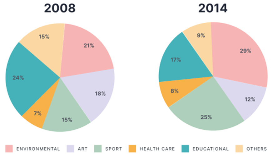
The charts show the percentage of volunteers by organizations in 2008-2014.
Summarise the information by selecting and reporting the main features, and make comparisons where relevant. Write at least 150 words.
The charts show the percentage of volunteers by organizations in 2008-2014.
Summarise the information by selecting and reporting the main features, and make comparisons where relevant. Write at least 150 words.
Câu hỏi trong đề: 2000 câu trắc nghiệm tổng hợp Tiếng Anh 2025 có đáp án !!
Quảng cáo
Trả lời:
Sample 1:
The pie charts illustrate the proportion of participants who work without getting paid in different sectors from 2008 to 2014.
Overall, it can be seen that while the percentage of volunteers in education, art and other fields decreased, that in environment, sport and healthcare saw an upward trend during the same period. Another highlight is that, although in 2008, the educational sector was the most attractive organization for volunteers, in the next 7 years, this dominance was challenged by environment.
In 2008, while education and environment were the two sectors that attracted the most volunteers (24% and 21%), the proportion of participants doing voluntary work in healthcare accounted for only 7%. The figure was only half of the percentage of volunteers in the remaining area, namely sport and others which shared the same pattern of 15%.
In the next 7 years, 17% of volunteers in education made its leading position beaten by environment with 29% of contributors. At the same time, there were 25% of volunteers in sport, which was roughly double the figure in art and triple that in healthcare.
Sample 2:
The pie charts depict the percentage of participants who worked unpaid in multiple sectors from 2008 to 2014.
Overall, there was a decline in the proportion of volunteers in education, art, and other sectors, while there was a surge in that in the environment, sports, and healthcare sectors throughout the same time frame. Furthermore, it is noteworthy that while the educational sector held the highest appeal for volunteers in 2008, its dominance was subsequently challenged by the environment over the following 7 years.
In 2008, the sectors of education and environment were the most popular among volunteers, with 24% and 21% of participants respectively. However, only 7% of volunteers were involved in healthcare. The statistics represented just 50% of the total number of volunteers in the remaining region, specifically in the fields of sports and other activities, which also had a similar distribution of 15%.
In the next seven years, the percentage of volunteers in the education sector who held the leadership position was surpassed by the environment sector, which had a higher percentage of contributors at 29%. Simultaneously, the percentage of volunteers in sport was 25%, approximately twice the proportion in art and three times that in healthcare.
Sample 3:
The bar charts depict the constitution of volunteers, categorized in various social sectors, in an unspecified country between 2008 and 2014.
As can be seen from the graphs, most volunteers opted for educational organizations in 2008, whilst 2014 witnessed a rise in the rate of environmental volunteers. Healthcare was the least favoured sector among volunteers in the two surveyed years.
In 2008, 24% of volunteers worked for educational organizations, compared to 21% and 18% of those who volunteered in the environmental and arts categories respectively. Next came the share of volunteers who chose to work for sports and other organizations with 15% in each sector. Bottom of the list was healthcare with only 7% of people volunteering.
In 2014, ranked in first place was no longer the educational sector as environment took the place with 29% of volunteers registered, a dramatic 8% increase. This was followed by sports with 25% of total volunteers, whereas the figure for educational volunteers saw a corresponding decline to 17%. Arts and other organizations also recorded a drop in the rate of volunteers, accounting for 12% and 9% of total people volunteering. The percentage of healthcare volunteers remained relatively the same with only 8%.
Sample 4:
The given pie charts compare the proportion of people who did voluntary work in different organizations in 2008 and 2014.
Overall, while the percentage of people volunteering for the environment, healthcare services and sports activities followed an upward trend, the reverse pattern was seen in the figure for the remaining groups. Besides, healthcare organizations were staffed with the least volunteers in both years.
In the year 2008, volunteers working in educational organizations accounted for the largest proportion, at 24%, in comparison with 21% and 18% of people volunteering in environmental and art projects respectively. Meanwhile, 15% of volunteers worked in sports organizations, which was the same as the figure for others. Voluntary work related to healthcare, however, was the least common choice among people, with a mere 7% participants.
After 6 years, the percentage of volunteers in educational organizations decreased to 17%. Likewise, the figure for people working in art and other volunteering activities witnessed a fall of 6%. In contrast, there were many more volunteers working in environmental and sports organizations compared to other groups, with 29% and 25% respectively. Activities in the healthcare sector, despite a slight rise of 1% in its figure, remained the least preferred option among volunteers.
Sample 5:
The pie charts compare the percentage of volunteers who worked for different types of organizations in 2008 and 2014. The categories include environmental, sport, education, healthcare, art, and others.
Overall, there was a notable increase in the percentage of volunteers working for environmental and healthcare organizations, while the proportion of volunteers in educational and art organizations saw a decline. The share of volunteers in other categories remained relatively stable over the six-year period.
In 2008, educational organizations had the highest share of volunteers, accounting for 24%, followed by healthcare and environmental organizations with 21% and 18%, respectively. Art and sport organizations made up a smaller portion, at 15% each, while the “other” category had the lowest percentage at 7%.
By 2014, environmental organizations had become the most popular choice for volunteers, with their share increasing significantly to 29%. Healthcare organizations also saw a rise to 25%, while the proportion of volunteers in educational organizations dropped to 17%. The percentage of volunteers in sport organizations remained stable at 15%, but art organizations experienced a noticeable decrease, falling to just 12%. The “other” category saw a slight increase, rising to 9%.
Sample 6:
The provided pie charts illustrate the percentage of people doing voluntary work in various organizations in 2008 and 2014.
It is noticeable that the figures for volunteers in Educational, sport and health care organizations decreased while those in Environmental, art, and other ones declined over the 6-year-period. Also, Heath care remained the least attractive area to volunteers.
In 2008, almost a quarter of total volunteers worked for Environmental organizations, followed by Education, at 21%. The percentage for Environmental dropped by 7% to 17% in 2014 whereas Education witnessed a dramatic jump to 29%. Sport sector, which attracted 15% of voluntary personnel, experienced a remarkable increase to 25%., making it the second most favorite sector after Education in 2014.
The voluntary participation in art organizations went down from 18% in 2008 to 12% in 2014. Similarly, the figure for volunteers working in other organizations stood at 15% in 2008 and then fell to 9% in the following 6 years. The percentage for health care remained lowest in both 2008 and 2014, at 7% and 8%, respectively.
Sample 7:
The pie charts show the proportions of people volunteering in various kinds of organisations in 2008 and 2014.
It is clear that while volunteers’ participation in environmental, sport, and health care organisations increased, the opposite was true for other types of organisations. Additionally, the percentages of health care volunteers were by far the lowest during the two years.
In 2008, volunteering in educational organisations was the most common choice, accounting for nearly a quarter of all volunteers, while 21% and 18% of volunteers took part in environmental and art projects respectively. 15% of volunteers worked in sport organisations, and another 15% in other organisations, while only 6% volunteered in health care.
In 2014, significantly more volunteers worked in environmental and sport organizations compared with the other fields, at 29% and 25% respectively. Meanwhile, the figures for art and other volunteers both fell by 6%. There was also a slight fall in volunteers in educational organizations, at 17%, while volunteering in health care was still the least preferred option, at only 8%.
Sample 8:
The table gives information about the participation in 6 categories of activities such as (environment, Arts, Sports, Health care, Educational, and others). The organization is estimated in percentage in the years 2008 and 2014.
Overall, at the beginning of the period, participants were the least, especially in sports and health. At the same time, education was the most significant in the band. In comparison, at the end of the year environment became the largest segment. However, the arts and others had slight changes in both years.
The number of volunteers in sports and health are lower in 2008. The groups are around 15% and 7%. They experience more than a fifth in 2014. In contrast, education is threefold higher at starting but dramatically fell to about 17% in the last year.
In 2008, the environment club was approximately 21%. That exceeded up to a one-half quarter in the last period. Whereas the Arts and others are slightly (18% and 15% respectively) and both are less than one-tenth and end up in 2014.
Hot: 1000+ Đề thi cuối kì 2 file word cấu trúc mới 2026 Toán, Văn, Anh... lớp 1-12 (chỉ từ 60k). Tải ngay
CÂU HỎI HOT CÙNG CHỦ ĐỀ
Lời giải

Sample 1:
The bar graph illustrates the overseas students' spending on accommodation, tuition, and living expenses, while the table depicts information about the average weekly expenses by international students in four countries: A, B, C, and D.
Overall, foreign students need to spend the highest in country A and the lowest in D. In nearly every nation, the international students’ weekly average living expenses are the greatest, while their housing cost registers the lowest.
The costliest country for studying is A, with a weekly average expense of 875 dollars. This is followed by B, C, and D, which have weekly expenses of 735, 540, and 435 dollars, respectively. However, foreign students always pay the least for accommodation, which incurs on average weekly 220, 280, 240, and 200 dollars in the nations A, B, C, and D, respectively.
On the other hand, living expenditures account for the highest portion of average weekly costs for international students in countries A, B, and C, with 430, 350, and 275 dollars, correspondingly. Tuition fees in the same countries (A, B and C) come in second with the weekly averages of 358, 320, and 250 dollars in order. However, D is the only nation where education accounts for the highest average spending area, coming in at USD 235, followed by the cost of living (USD 225) and housing (USD 200).
Sample 2:
The table illustrates information regarding the weekly spendings by overseas students in four countries, A, B, C and D, while the bar graph depicts the students’ expenditure on the sectors, housing, education fees and living expenses.
Overall, the cost of studying abroad is the highest in country A and the lowest in D. Apart from country D, living costs account for the most part of the weekly spendings in all countries, while accommodation registers the least.
Regarding the total cost of studying, A is the most expensive country with weekly average 875 dollars, followed by B, C and D with 735, 540 and 435 dollars, respectively. On the other hand, the overseas students always spend the least on accommodation, which are on average weekly 220, 280, 240 and 200 dollars in the corresponding countries A, B, C and D.
Considering the living cost, it takes the largest share of foreign students’ average weekly expenses in countries A, B, and C with 430, 350 and 275 dollars, respectively, while tuition fees in the same countries hold the second place with weekly average 358, 320 and 250 dollars, sequentially. However, D is the only country where tuition fee occupies the highest expenditure with average weekly 235 dollars, followed by living cost (USD 225) and accommodation (USD 200.)
Sample 3:
The table and bar graph depict information regarding the weekly spendings by overseas students in countries A, B C and D.
Overall, there are three elements, housing, school fees and living costs that contribute to the total weekly spendings. The total expenditure in country A is the highest while it is the lowest in country D. Living costs account for the most part of the weekly spendings in all countries except D.
The total mean weekly cost for pupils to study in country A is US$875, next by country B at US$735, and then by country C at US$540, and finally by country D at US$435. The living costs are always the biggest component of the expenditure except for country D, with about US$10 less than the major spending which is the school fees.
Accommodation accounts for the least among all spendings in all countries. The most expensive housing is found in country B, at US$280, and the cheapest in country D at US$200. The middle range can be seen in country A at US$220 and country C at US$240, respectively. Costs of the tuition fee range between US$ 358 and US$235 in country A and D, in order.
Lời giải

Sample 1:
The bar chart and pie chart give information about why US residents travelled and what travel problems they experienced in the year 2009.
It is clear that the principal reason why Americans travelled in 2009 was to commute to and from work. In the same year, the primary concern of Americans, with regard to the trips they made, was the cost of travelling.
Looking more closely at the bar chart, we can see that 49% of the trips made by Americans in 2009 were for the purpose of commuting. By contrast, only 6% of trips were visits to friends or relatives, and one in ten trips were for social or recreation reasons. Shopping was cited as the reason for 16% of all travel, while unspecific ‘personal reasons’ accounted for the remaining 19%.
According to the pie chart, price was the key consideration for 36% of American travellers. Almost one in five people cited safety as their foremost travel concern, while aggressive driving and highway congestion were the main issues for 17% and 14% of the travelling public. Finally, a total of 14% of those surveyed thought that access to public transport or space for pedestrians were the most important travel issues.
Sample 2:
The bar chart compares the figures for Americans going out for five reasons and the pie chart illustrates the percentage of six problems that concerned them when travelling in 2009. Overall, it is clear that the main reason why people in the US went out in 2009 is to commute to work, and the cost of travelling is the problem concerning them the most.
Looking first at the bar graph, the proportion of Americans going out for commuting to work stood at 49%, while the figure for those leaving their house for personal reasons accounted for 19%. In addition, the rate of people in the US going out for shopping and recreation made up 16% and 10%, respectively, while visiting friends or relatives accounted for the lowest percentage, at only 6%.
Turning to the pie chart, the cost of travelling was the most concerning problem of Americans when going out, with the figure making up 36%, while the proportion of safety concerns is half of that, at 19%. In addition, 17% of US citizens were concerned about aggressive drivers, while highway congestion made 14% of them worried when leaving their house. Access to public transportation and places for people to walk accounted for the lowest percentages, at only 8% and 6%, respectively.
Sample 3:
The provided charts offer insights into the reasons for travel and the primary concerns faced by the traveling public in the United States during the year 2009. The data is presented through a bar chart illustrating travel purposes and a pie chart highlighting key issues.
Notably, the primary motivation for travel among Americans in 2009 was commuting to and from work. Simultaneously, the major concern for the traveling public during their trips revolved around the cost associated with travel.
Examining the bar chart in detail reveals that almost half of the trips made by Americans in 2009, precisely 49%, were attributed to commuting. Conversely, visits to friends or relatives accounted for a mere 6%, while social or recreational trips constituted one in ten journeys. Shopping emerged as the purpose for 16% of all travel, leaving the remaining 19% for unspecific ‘personal reasons.’
Turning attention to the pie chart, it becomes evident that cost was the primary consideration for 36% of American travelers. Safety closely followed, with nearly one in five people, or 19%, expressing it as their foremost travel concern. Aggressive driving and highway congestion were significant issues for 17% and 14% of the traveling public, respectively. Additionally, 14% of respondents identified access to public transport or space for pedestrians as the most crucial travel issues.
Sample 4:
The bar chart shows why American people chose to travel, and the pie chart shows the main issues for the travelling public in the USA, both for 2009. The trend suggests that the reason and price were the main issues for travel in the United States. It is clear that commuting from work was reported as the biggest contribution to travel, at 49%. People who went travelling for personal reasons and shopping accounted for 35% when these two groups are combined. However, interaction with friends and relatives only accounted for 25% less than the above categories. And social and recreational activities took up only 6%, which was the lowest figure by more than 43%. The travelling public’s main issues were related to price and safety, with 55% of respondents reporting these two issues. While other issues accounted for a relatively small part. Only 17% of the respondents reported issues with aggressive drivers, while highway congestion accounted for even less at 14% of the issues reported. The percentage of access to public transport and space for pedestrians was much lower than the other categories at less than 10% for both. To conclude, price and commuting time were the dominant factors relating to travel in the US in 2009.
Lời giải
Bạn cần đăng ký gói VIP ( giá chỉ từ 250K ) để làm bài, xem đáp án và lời giải chi tiết không giới hạn.
Lời giải
Bạn cần đăng ký gói VIP ( giá chỉ từ 250K ) để làm bài, xem đáp án và lời giải chi tiết không giới hạn.
Lời giải
Bạn cần đăng ký gói VIP ( giá chỉ từ 250K ) để làm bài, xem đáp án và lời giải chi tiết không giới hạn.
Lời giải
Bạn cần đăng ký gói VIP ( giá chỉ từ 250K ) để làm bài, xem đáp án và lời giải chi tiết không giới hạn.
Lời giải
Bạn cần đăng ký gói VIP ( giá chỉ từ 250K ) để làm bài, xem đáp án và lời giải chi tiết không giới hạn.