


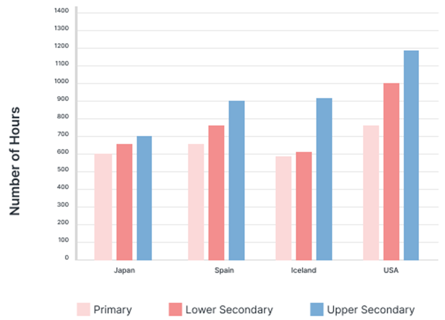
The graph below shows the hours of teaching per year done by each teacher in four different countries in 2001.
Summarise the information by selecting and reporting the main features, and make comparisons where relevant. Write at least 150 words.
The graph below shows the hours of teaching per year done by each teacher in four different countries in 2001.
Summarise the information by selecting and reporting the main features, and make comparisons where relevant. Write at least 150 words.
Câu hỏi trong đề: 2000 câu trắc nghiệm tổng hợp Tiếng Anh 2025 có đáp án !!
Quảng cáo
Trả lời:
Sample 1:
The bar charts illustrate the duration of time that teachers in four countries spent teaching across three different educational levels in 2001.
Overall, American teachers worked for the most extended hours while Japanese teachers worked for the least. In addition, there was a significant contrast in the hours worked between upper-secondary and lower-level teachers in Ireland.
In Japan, primary school teachers worked 600 hours, 50 hours less than those in Spain but 10 hours more than in Ireland. In the United States, primary school teachers worked over 750 hours, equivalent to the number of hours worked by middle school teachers in Spain.
In all four countries, the number of hours worked by lower secondary teachers was higher than that of primary school teachers, with American teachers working the most extended hours of over 1,000. In Spain and Ireland, upper secondary teachers worked 900 hours, 150 and 200 hours more than middle school teachers in Spain and high school teachers in Japan, respectively. Upper-level teachers in the United States spent the most time working nearly 1,200 hours at schools.
Sample 2:
The column graph represents data on average teaching hours by each educator in 2001 in Japan, Spain, Iceland and the USA in the primary, lower secondary and higher secondary school levels. Generally speaking, a US tutor on an average spent more hours on schooling than that of Japanese, Spanish and Icelandic teachers in 2001 and the time spent on teaching increases with the class levels in all countries.
According to the illustration, an instructor in Japan, Spain and Iceland typically spent around 600 hours in 2001 to teach elementary level students. This duration in the USA was the highest, roughly 750 hours. A US mentor taught lower secondary students for exactly 1000 hours in the same year, and it was roughly 600 hours in Iceland and Japan. However, lower secondary teachers in Spain disbursed roughly 750 hours each to their students. Finally, the time spent to teach higher secondary pupil in the USA was approximately 1200 hours which was 300 hours less in Iceland and Spain and precisely 700 hours in Japan.
Sample 3:
The bar graph outlines the average duration a teacher spent on three different levels in four different countries in 2001.
Overall, the teaching hours at the secondary level were higher than those of primary level and the US tutors spent more time teaching than the teachers in the other three countries did.
A US teacher spent more than 700 hours to teach primary students in 2001 while a Japanese educator disbursed exactly 600 hours for teaching the same graders. Time allocated to teaching elementary student by a Spanish teacher was 50 hours higher than that of Japanese teacher, but it was less than 600 hours in Iceland. An American teacher’s average schooling duration in 2001 for lower secondary students was 1000 hours which was 300 to 400 hours higher than the teaching duration by a teacher in the other three countries.
Finally, higher secondary students received almost 1200 hours’ lectures by a teacher in the US and this duration was noticeable higher than that of other countries. In Japan, an upper secondary level teacher taught for 700 hours in 2001, almost 500 hours less than that of a US teacher. In Iceland and Spain, teaching duration by a higher secondary level teacher was approximately 900 hours, about 300 hours less than that of an American teacher.
Sample 4:
The bar chart compares the number of teaching hours undertaken by primary and secondary school lecturers in Japan, Spain, Iceland, and the USA in 2001. Overall, teachers in Japan and Spain had a similar workload in primary and lower secondary levels. The duration of work appeared to be highest in upper secondary across all countries, with the exception of Iceland. Furthermore, American teachers worked the longest hours.
The minimum number of working hours for teachers was 600 hours, which was observed in Japanese schools; primary and lower secondary schools in Spain. In Iceland, this figure was only witnessed in primary schools and increased to 800 hours in lower secondary schools, which marked the longest working hours for teachers in that country. There was a slight reduction in the number of hours in upper secondary schools.
Shifting focus to the United States, primary school teachers spent approximately 850 hours in the classroom. The longest duration was reported in lower and upper secondary schools, with each amounting to around 1100 hours, more or less. The workload in Spain’s upper secondary schools came closest to this figure, reaching 1000 hours.
Sample 5:
The given bar chart demonstrates the number of hours taught primary, lower secondary, and upper secondary by teachers in the US, Japan, Spain, and Iceland in 2001.
Overall, lower secondary and upper secondary teachers in the US taught significantly more hours than their counterparts in the other three countries. In addition, teachers in the primary grades put in comparable hours in all four countries.
Primary and lower secondary teachers in Iceland had the fewest working hours (at approximately 600). Notably, upper-level secondary school teachers in Iceland undertook an enormous workload of about 900 hours. In Japan, teachers at all levels worked between 600 and 700 hours, with hardly any variation between grade levels.
Primary teachers in the US and Spain worked similar hours, at around 650. However, lower secondary and upper secondary teachers in Spain worked 750 and 900 hours, respectively, whereas lower secondary and upper secondary teachers in the US worked 1000 and 1200 hours, respectively. Finally, teachers' workload gradually grew in Spain as they progressed from lower classes to higher grades, but in the United States, this increase was more dramatic.
Sample 6:
The bar charts describe how much time a teacher spent at three school levels in four different countries in 2001.
Overall, teachers in the US had to work the longest hours, while Japanese teachers spent the least time at schools. Notably, there was a stark difference in working hours between upper secondary teachers and two lower-level ones in Iceland.
Teachers at primary school in Japan worked for 600 hours, 50 lower than in Spain and 10 higher than in Iceland. This figure in the USA was the highest, at over 750 hours, equivalent to the number of hours Spanish middle school teachers spent at work. On average, lower secondary level educators in all four countries worked more hours than primary ones by over 50 hours and higher, and the figure for the USA stood highest at 1000.
Both Spain and Iceland recorded a number of 900 working hours from upper secondary teachers. This number was 150 and 200 hours more than their Spanish colleagues at middle school and Japanese high school teachers, respectively. At nearly 1200 hours, upper-level American educators spent most time at schools.
Sample 7:
The bar chart delineates a comparison of the average working hours among elementary, middle, and high school teachers across four distinct countries in 2001.
Notably, it is evident that teachers in the USA dedicated longer hours to work than their counterparts. Additionally, the working hours of high school teachers exceeded those at primary and lower secondary levels.
At the primary school level, teachers in the USA logged approximately 750 hours, surpassing Spain’s working hours by a notable margin of 100. Meanwhile, Japan and Iceland registered slightly lower working durations, approximately 600 and 580 hours, respectively. Moving to the lower secondary school level, teachers in the USA experienced a considerable increase of around 250 hours compared to primary educators. Spain demonstrated a moderate rise of 100 hours, while Japan and Iceland showcased marginal differences, with an increase of approximately 50 hours or less.
Examining the upper secondary school teachers’ workload, the USA maintained the highest working hours, totaling just under 1200 hours, while Japan recorded the lowest at 700 hours. Teachers in Spain and Iceland reported similar working durations, at approximately 900 hours each.
Sample 8:
The bar chart illustrates the number of teaching hours per year undertaken by educators at three distinct educational levels in four countries during the year 2001.
Overall, it is evident that teachers in the United States were required to work the most extensive hours, while their counterparts in Japan logged the fewest. Strikingly, there was a pronounced discrepancy in working hours between the upper secondary educators and the other two levels in Iceland.
In Japan, primary school teachers worked for 600 hours, 50 hours fewer than in Spain and 10 hours more than in Iceland. The figure in the USA topped the chart at over 750 hours, mirroring the number of hours that Spanish middle school teachers devoted. On average, educators at the lower secondary level in all four countries exceeded the primary level by more than 50 hours, with the USA's figure being the highest at 1000 hours.
Moving onto upper-secondary teachers' data, both Spain and Iceland observed about 900 working hours, 150 hours more than Spanish middle school teachers and 200 hours more than Japanese high school educators. American upper-level teachers, with nearly 1200 hours, invested the most time in schools.
Sample 9:
The bar chart illustrates the number of hours each teacher spent teaching at primary, lower secondary, and upper secondary levels across four countries - Japan, Spain, Iceland, and the USA - in 2001.
Overall, teachers in the USA dedicated the highest number of hours to teaching across all educational levels compared to their counterparts in Japan, Spain, and Iceland. Notably, the time committed to teaching progressively increased from primary to upper secondary levels in each country.
In greater detail, Japanese, Spanish, and Icelandic teachers devoted approximately 600 hours to teaching primary students, while American teachers spent around 750 hours, marking the highest figure for primary education. For the lower secondary level, teachers in the USA spent a substantial 1000 hours, contrasting with about 600 hours in both Japan and Iceland. Meanwhile, Spanish lower secondary teachers dedicated approximately 750 hours to their teaching duties.
At the upper secondary level, the number of hours each teacher spent teaching was highest in the USA, reaching nearly 1200 hours. In comparison, Spanish and Icelandic teachers spent about 900 hours teaching upper secondary students, while Japanese teachers recorded the lowest time commitment at roughly 700 hours. This shows a clear disparity in teaching hours among countries, with American educators consistently leading across all educational levels.
Sample 10:
The bar chart illustrates the number of hours each teacher spent teaching across three educational levels - primary, lower secondary, and upper secondary - in Japan, Spain, Iceland, and the USA in 2001.
In general, the number of hours each teacher spent teaching increased with the level of education in all four countries. American teachers consistently dedicated the highest amount of time to teaching at each educational level, while Japanese teachers recorded the lowest hours, particularly at the upper secondary level.
Specifically, teachers in the USA invested more than 700 hours in primary education, compared to exactly 600 hours in Japan. Spanish teachers spent around 650 hours at the primary level, while Icelandic educators recorded slightly less than 600 hours. Moving to lower secondary education, American teachers led again, committing 1000 hours, a figure that was around 300-400 hours more than the time spent by teachers in Japan, Spain, and Iceland.
In upper secondary education, American teachers once again allocated the most hours, with nearly 1200 hours spent teaching. In comparison, teachers in Iceland and Spain each spent approximately 900 hours, while Japanese upper secondary teachers dedicated around 700 hours, marking the lowest figure. These differences highlight the variation in teaching hours among these countries, with the USA consistently requiring the highest teaching workload across all educational stages.
Sample 11:
The bar chart presents data on the number of hours each teacher spent teaching at three educational stages - primary, lower secondary, and upper secondary - across four countries (Japan, Spain, Iceland, and the USA) in 2001.
Overall, teachers in the USA dedicated the most hours to teaching at all levels, while Japan consistently reported the fewest hours, especially at the upper secondary level. Additionally, across all four nations, the hours spent teaching generally rose with each advancing educational stage.
Breaking down the data, Japanese, Spanish, and Icelandic teachers spent a similar amount of time in primary education, approximately 600 hours, with the USA leading by a wider margin, as American teachers invested around 750 hours at this level. For lower secondary students, the number of hours each teacher spent teaching in Japan and Iceland remained close to 600, while in Spain, it increased to around 750 hours and surged in the USA to approximately 1000 hours.
At the upper secondary level, American teachers committed nearly 1200 hours, which was notably higher than their counterparts in other countries. Iceland and Spain recorded around 900 hours for their upper secondary educators, while Japan trailed significantly with its teachers spending about 700 hours. This data highlights a considerable variation among countries in terms of teaching hours, with the USA demonstrating a significantly higher teaching workload across all school levels.
Sample 12:
The bar chart displays the number of hours each teacher spent teaching at primary, lower secondary, and upper secondary levels in four countries - Japan, Spain, Iceland, and the USA - during 2001.
Overall, it is evident that the number of hours each teacher spent teaching generally increased with the level of education across all countries. Additionally, American teachers recorded the highest teaching hours at each level, contrasting with Japan, where teachers committed the least time, particularly at the upper secondary level.
In more detail, primary school teachers in the USA dedicated over 700 hours to their teaching duties, exceeding the teaching hours of their Japanese, Spanish, and Icelandic counterparts, who each spent close to 600 hours. In lower secondary education, American teachers continued to lead, with around 1000 hours, which was significantly higher than the hours recorded in Japan and Iceland, where lower secondary teachers averaged close to 600 hours. Spanish lower secondary teachers, meanwhile, devoted approximately 750 hours.
When it comes to upper secondary education, American teachers again recorded the highest figure, with nearly 1200 hours spent teaching. In contrast, teachers in Spain and Iceland each spent roughly 900 hours at this level, while Japanese upper secondary teachers committed about 700 hours. This data underscores the considerable differences in teaching hours among these countries, with the USA consistently at the top across all education levels.
Sample 13:
The bar chart illustrates the average teaching time in different school categories in Japan, Spain, Iceland and USA in 2001.
Overall, it is apparent that USA teachers spent the most hours teaching in all 3 types of schools. In addition, while teaching time for upper secondary students was the least in Japan, that for primary and lower secondary was the lowest in Iceland.
Almost 1200 hours, the highest figure in the chart, was spent on teaching upper secondary classes in the USA. The second highest data in this category belonged to Iceland, standing at slightly more than 900 hours. In comparison, there was only 700 hours of teaching by Japan teachers, almost half the figure of USA.
Regarding primary schools, Iceland, Japan and Spain's teaching hours fluctuated around less than 600 to 650. The USA, on the other hand, recorded a significantly higher number of approximately 750 hours. Pupils in lower secondary schools in America had 1000 hours of studying, while those in Iceland spent less than that around 300 hours, which was also reported as the lowest statistics in this category.
Hot: 1000+ Đề thi cuối kì 2 file word cấu trúc mới 2026 Toán, Văn, Anh... lớp 1-12 (chỉ từ 60k). Tải ngay
CÂU HỎI HOT CÙNG CHỦ ĐỀ
Lời giải

Sample 1:
The bar graph illustrates the overseas students' spending on accommodation, tuition, and living expenses, while the table depicts information about the average weekly expenses by international students in four countries: A, B, C, and D.
Overall, foreign students need to spend the highest in country A and the lowest in D. In nearly every nation, the international students’ weekly average living expenses are the greatest, while their housing cost registers the lowest.
The costliest country for studying is A, with a weekly average expense of 875 dollars. This is followed by B, C, and D, which have weekly expenses of 735, 540, and 435 dollars, respectively. However, foreign students always pay the least for accommodation, which incurs on average weekly 220, 280, 240, and 200 dollars in the nations A, B, C, and D, respectively.
On the other hand, living expenditures account for the highest portion of average weekly costs for international students in countries A, B, and C, with 430, 350, and 275 dollars, correspondingly. Tuition fees in the same countries (A, B and C) come in second with the weekly averages of 358, 320, and 250 dollars in order. However, D is the only nation where education accounts for the highest average spending area, coming in at USD 235, followed by the cost of living (USD 225) and housing (USD 200).
Sample 2:
The table illustrates information regarding the weekly spendings by overseas students in four countries, A, B, C and D, while the bar graph depicts the students’ expenditure on the sectors, housing, education fees and living expenses.
Overall, the cost of studying abroad is the highest in country A and the lowest in D. Apart from country D, living costs account for the most part of the weekly spendings in all countries, while accommodation registers the least.
Regarding the total cost of studying, A is the most expensive country with weekly average 875 dollars, followed by B, C and D with 735, 540 and 435 dollars, respectively. On the other hand, the overseas students always spend the least on accommodation, which are on average weekly 220, 280, 240 and 200 dollars in the corresponding countries A, B, C and D.
Considering the living cost, it takes the largest share of foreign students’ average weekly expenses in countries A, B, and C with 430, 350 and 275 dollars, respectively, while tuition fees in the same countries hold the second place with weekly average 358, 320 and 250 dollars, sequentially. However, D is the only country where tuition fee occupies the highest expenditure with average weekly 235 dollars, followed by living cost (USD 225) and accommodation (USD 200.)
Sample 3:
The table and bar graph depict information regarding the weekly spendings by overseas students in countries A, B C and D.
Overall, there are three elements, housing, school fees and living costs that contribute to the total weekly spendings. The total expenditure in country A is the highest while it is the lowest in country D. Living costs account for the most part of the weekly spendings in all countries except D.
The total mean weekly cost for pupils to study in country A is US$875, next by country B at US$735, and then by country C at US$540, and finally by country D at US$435. The living costs are always the biggest component of the expenditure except for country D, with about US$10 less than the major spending which is the school fees.
Accommodation accounts for the least among all spendings in all countries. The most expensive housing is found in country B, at US$280, and the cheapest in country D at US$200. The middle range can be seen in country A at US$220 and country C at US$240, respectively. Costs of the tuition fee range between US$ 358 and US$235 in country A and D, in order.
Lời giải

Sample 1:
The bar chart and pie chart give information about why US residents travelled and what travel problems they experienced in the year 2009.
It is clear that the principal reason why Americans travelled in 2009 was to commute to and from work. In the same year, the primary concern of Americans, with regard to the trips they made, was the cost of travelling.
Looking more closely at the bar chart, we can see that 49% of the trips made by Americans in 2009 were for the purpose of commuting. By contrast, only 6% of trips were visits to friends or relatives, and one in ten trips were for social or recreation reasons. Shopping was cited as the reason for 16% of all travel, while unspecific ‘personal reasons’ accounted for the remaining 19%.
According to the pie chart, price was the key consideration for 36% of American travellers. Almost one in five people cited safety as their foremost travel concern, while aggressive driving and highway congestion were the main issues for 17% and 14% of the travelling public. Finally, a total of 14% of those surveyed thought that access to public transport or space for pedestrians were the most important travel issues.
Sample 2:
The bar chart compares the figures for Americans going out for five reasons and the pie chart illustrates the percentage of six problems that concerned them when travelling in 2009. Overall, it is clear that the main reason why people in the US went out in 2009 is to commute to work, and the cost of travelling is the problem concerning them the most.
Looking first at the bar graph, the proportion of Americans going out for commuting to work stood at 49%, while the figure for those leaving their house for personal reasons accounted for 19%. In addition, the rate of people in the US going out for shopping and recreation made up 16% and 10%, respectively, while visiting friends or relatives accounted for the lowest percentage, at only 6%.
Turning to the pie chart, the cost of travelling was the most concerning problem of Americans when going out, with the figure making up 36%, while the proportion of safety concerns is half of that, at 19%. In addition, 17% of US citizens were concerned about aggressive drivers, while highway congestion made 14% of them worried when leaving their house. Access to public transportation and places for people to walk accounted for the lowest percentages, at only 8% and 6%, respectively.
Sample 3:
The provided charts offer insights into the reasons for travel and the primary concerns faced by the traveling public in the United States during the year 2009. The data is presented through a bar chart illustrating travel purposes and a pie chart highlighting key issues.
Notably, the primary motivation for travel among Americans in 2009 was commuting to and from work. Simultaneously, the major concern for the traveling public during their trips revolved around the cost associated with travel.
Examining the bar chart in detail reveals that almost half of the trips made by Americans in 2009, precisely 49%, were attributed to commuting. Conversely, visits to friends or relatives accounted for a mere 6%, while social or recreational trips constituted one in ten journeys. Shopping emerged as the purpose for 16% of all travel, leaving the remaining 19% for unspecific ‘personal reasons.’
Turning attention to the pie chart, it becomes evident that cost was the primary consideration for 36% of American travelers. Safety closely followed, with nearly one in five people, or 19%, expressing it as their foremost travel concern. Aggressive driving and highway congestion were significant issues for 17% and 14% of the traveling public, respectively. Additionally, 14% of respondents identified access to public transport or space for pedestrians as the most crucial travel issues.
Sample 4:
The bar chart shows why American people chose to travel, and the pie chart shows the main issues for the travelling public in the USA, both for 2009. The trend suggests that the reason and price were the main issues for travel in the United States. It is clear that commuting from work was reported as the biggest contribution to travel, at 49%. People who went travelling for personal reasons and shopping accounted for 35% when these two groups are combined. However, interaction with friends and relatives only accounted for 25% less than the above categories. And social and recreational activities took up only 6%, which was the lowest figure by more than 43%. The travelling public’s main issues were related to price and safety, with 55% of respondents reporting these two issues. While other issues accounted for a relatively small part. Only 17% of the respondents reported issues with aggressive drivers, while highway congestion accounted for even less at 14% of the issues reported. The percentage of access to public transport and space for pedestrians was much lower than the other categories at less than 10% for both. To conclude, price and commuting time were the dominant factors relating to travel in the US in 2009.
Lời giải
Bạn cần đăng ký gói VIP ( giá chỉ từ 250K ) để làm bài, xem đáp án và lời giải chi tiết không giới hạn.
Lời giải
Bạn cần đăng ký gói VIP ( giá chỉ từ 250K ) để làm bài, xem đáp án và lời giải chi tiết không giới hạn.
Lời giải
Bạn cần đăng ký gói VIP ( giá chỉ từ 250K ) để làm bài, xem đáp án và lời giải chi tiết không giới hạn.
Lời giải
Bạn cần đăng ký gói VIP ( giá chỉ từ 250K ) để làm bài, xem đáp án và lời giải chi tiết không giới hạn.
Lời giải
Bạn cần đăng ký gói VIP ( giá chỉ từ 250K ) để làm bài, xem đáp án và lời giải chi tiết không giới hạn.