


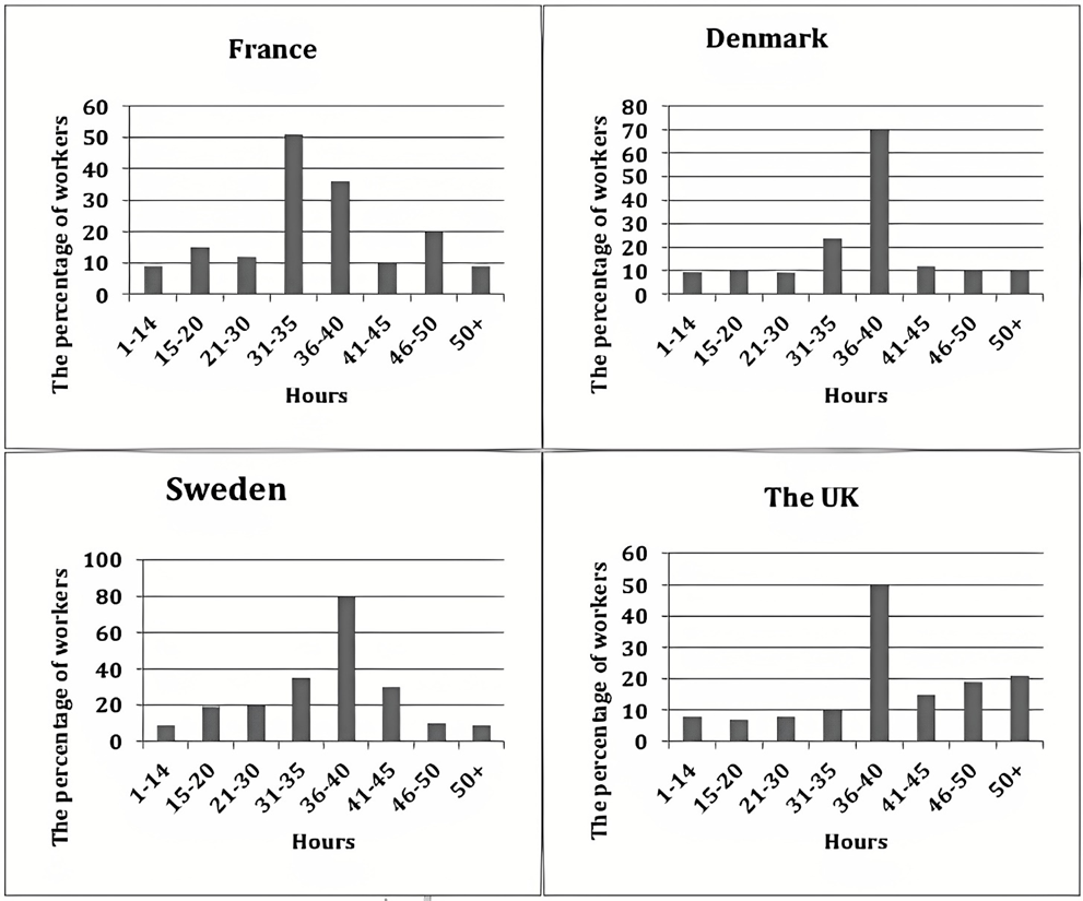
The charts below show the number of working hours per week, in the industrial sector, in four European countries in 2002.
Summarise the information by selecting and reporting the main features, and make comparisons where relevant. Write at least 150 words.
The charts below show the number of working hours per week, in the industrial sector, in four European countries in 2002.
Summarise the information by selecting and reporting the main features, and make comparisons where relevant. Write at least 150 words.
Câu hỏi trong đề: 2000 câu trắc nghiệm tổng hợp Tiếng Anh 2025 có đáp án !!
Quảng cáo
Trả lời:
Sample 1:
The given column graphs compare the number of hours spent on work per week by industrial workers in France, Denmark, Sweden and the UK in 2002. In three countries, it can be seen that the maximum workers worked 36-40 hours, but in France the maximum workers worked 31-35 hours per week.
In France, approximately half the workers worked for 31-35 hours per week. The percentage of people who worked for 36-40 hours and 46-50 hours was 35% and 20% respectively. The figures for the rest of the working hours accounted for around 10% workers each.
Denmark and Sweden witnessed the highest proportion of people working for 36-40 hours, which was quite different from that of France. The second and the third place came from 31- 35 hours and 41-45 hours workers (25% and 10% in Denmark; 35% and 30% in Sweden). The proportion of people working for the remaining hours was higher in Denmark than in Sweden.
It is interesting to note that in the UK, the percentage of people working 50+ hours was the maximum. Almost 50% worked 36-40 hours per week.
Overall, France was a country where the people worked for the least hours, whereas the Swedish people spent the most time on work among the people from four different countries.
Sample 2:
The bar graphs illustrate the number of hours spent on work per week, in industrial sectors in France, Denmark, Sweden, the UK in 2002. Overall, it is apparent that the maximum workers worked 36-4- hours and least spending time 1-14 hours, but in France, the maximum workers worked 31 to 35 hours per week.
An in-depth analysis of the bar graphs reveals that, in France, approximately, half the workers work for 31 -35 and 36-40 hours, 50% and 38% respectively. Only 20% of workers are worked in 4650 hours. Other working hours are accounted for around 12%, and fewer workers each Denmark, Sweden and the UK witnessed the highest proportion of people working fr 36-40 hours, which was quite different from France. The second and third highest proportion for (31-35 and 41-45) Denmark and Sweden. Comparatively, Sweden’s little increase showed in the number of the hours who spent the time of workers almost 10%.
Furthermore, the percentage of workers time comparatively less in the UK workers hours and 46-50 hours and 50+ hours almost 20% of workers worked. On the other hand, comparatively, other European countries place 46-50 and 50+hours, only less than 10% witnessed by Sweden.
Sample 3:
The bar charts compare the number of weekly working hours of European citizens in the industrial sector in 2002 across four different countries: France, Denmark, Sweden, and the UK. Overall, the majority of employees in all countries worked more than 30 hours per week, with the most common working hours falling between 36 and 40 hours per week, except for France. It is clear that British people were most likely to work overtime.
Regarding France and Denmark, in both countries, a relatively small percentage of the population worked less than 30 hours or more than 40 hours, at just under 20%. By contrast, the most common working hour durations in France were 31-35 hours per week and 36-40 hours per week, demonstrated by around 50%, and 35% of the French population respectively. Experiencing a reverse trend, the former in Denmark was about half that of France, at 25%, while the latter range was twice as high as that in France, at around 70%.
Sweden had the highest percentage, at around 80%, of workers spent 36-40 hours in their workplace per week, followed by approximately 40% who worked 31-35 hours, and 30% who worked 41-45 hours. Meanwhile, approximately 50% of British employees worked for around 36-40 hours per week, which was higher than the percentage of those who dedicated 41-50 hours, at around 20%.
Sample 4:
The given column graphs illustrate the number of hours worked per week by industrial workers in France, Denmark, Sweden, and the United Kingdom in 2002.
In Denmark, Sweden, and the United Kingdom witnessed the highest proportion of workers worked for 36-40 hours, with figures 70, 80, and 50 respectively, while in the case of France, the proportion was 35%. In contrast, the majority in France at 50% worked for 31-35 hours. The figures for those working 31-35 hours stood at 22%, 35%, and 10% in Denmark, Sweden, and the United Kingdom respectively.
The percentage of employees working less than 30 hours was a minority in almost all countries, with only 10-15% of employees working this number of hours in all countries. The percentage of people working more than 40 hours was also very low, and in all countries, the figure was 10-25%.
Overall, it can be seen that the maximum workers worked 36-40 hours, but in France, the maximum workers worked 31-35 hours per week. France was a nation where the people worked for the least hours, whereas the Swedish people spent the most time on work among the people from four different countries.
Sample 5:
The given bar charts illustrate the weekly working hours in an industrial area amongst four countries, namely France, Denmark, Sweden and the United Kingdom, within the year 2002. Overall, most of the workers spent 36 to 40 hours working per week, except for French people. Moreover, British employees tended to work overtime more than the other countries.
Regarding France, the working population in the industry sector of this country usually spent around 31-35 hours a week working, followed by those who worked from 36 to 40 hours. This working hour pattern was, however, contradictory in Denmark, as the proportion of laborers allocating around 40 hours at work was significantly higher than that of the French counterpart, at nearly 75%. Noteworthily, the percentage of employees working fewer than 30 hours and more than 40 hours in these two countries did not exceed 20%.
In terms of the other two countries, it could be observed that Sweden had a similar pattern as Denmark, since the percentage of workers working 36-40 hours weekly took the highest position, at 80%. This figure was twice as great as those spending 31-35 hours at work in this European country. Meanwhile, the UK possessed the lowest percentage of employees working fewer than 31 hours within a week; yet the country had the highest rate of overtime workers, as more than one-fifth of the working populace spent over 50 hours per workweek laboring.
Sample 6:
The charts below show the number of working hours per week, in the industrial sector, in four European countries in 2002.
The charts provide data on the working hours which laborers employed in industrial sectors had to fulfill in four particular European countries in 2002.
Overall, it is evident that the majority of workers in four countries worked for 36 to 40 hours, with the exception of those in France, with the majority of them working for only 31 to 35 hours. It is also more likely for a British worker to dedicate more than 40 hours to their job every week, while it is quite rare for employees to commit only 30 hours or less a week.
Sweden was the country which saw the largest percentage of people having to fulfill a 36-hour-and-above workweek, 80% of them having to work for 36 to 40 hours. The figure for Denmark was slightly behind, at 70%, while only half of the industrial laborers in the UK and France were required to fulfill the same work hour.
It is significantly less likely for laborers in this sector to work for more than 40 hours, with figures hardly ever exceeding 20%. Around 15% to 20% of people employed in this sector in the UK had. The same is true for France, but at a lower proportion. Sweden saw a noticeable proportion working for 41 to 45 hours (around 30%), but the other two figures were negligible, while Denmark's data was minimal, with none surpassing 10%.
Having to dedicate less than 35 hours to working a week was uncommon for UK and Danish industrial workers, with only 10% and 20% of them having such commitment respectively. This working practice was more prevalent in Sweden, with two in five people, and most common in France, with around half of the workers in total.
France was the country with the highest proportion of people having to fulfill 30 hours of work per week; and figures scarcely (hiếm khi) exceeded 10% for all the countries surveyed.
Sample 7:
The bar graphs given illustrate the information about the work hours per week in the industrial sector in France, Denmark, Sweden and the UK, over the time period of 2002.
Overall, it can be seen that the highest workers worked 36-4 hours and the least 1-14 hours, but in France, the maximum worked 31 to 35 hours per week.
The bar graphs show that the ratio of employees who work 14 hours in France and Denmark was 10%; however, the percentage of people slightly inclined and reached 15% in France. Whilst the figure was similar in Denmark to work for 21-30 hours. 50% of employees work in trade for 31 to 35 hours in France, whereas it was half of Denmark. In Denmark, labourers work 36 to 40 hours, 70% of which is half of France. The ratio of workers in France and Denmark was similar, 10 in 50 hours. It is interesting to note that it was 20% in 46 to 50 hours in France.
Analyzing the data further, it is manifested that the workers working 36-40 hours in Sweden were 80% which is 30% less than in the UK. The ratio was less than 10% of 1-14, 46-50 and 50+ hours in Sweden. However, 31-45 hours was approximately 35% of workers in the UK. The figure of employees below 10% who work 35 hours. However, 20% work 50 hours.
Sample 8:
The yielded bar charts illustrate the percentage of week wise hours in the commercial side in four European countries, namely France, Denmark, Sweden, the UK.
Overall, it can be clearly seen that 30 to 40 hours works had the highest percentage whereas, over 50 and 1 to 14 had the least in all given countries.
For France, nearly a quarter proportion of workers work 1 to 30 hours although, 31 to 35 hours job percentage was a half. Only 12% less jober did 36 to 40 hours. Above 41 hours proportion was same as 1 to 14 had except 46 to 50 which had one-fifth percentage. For Denmark, 21% of citizens worked 31 to 35 hours while 36 to 40 hours had 70%. The rest of hours workers proportion was the same, its 10%.
For Sweden, only 3% of people did 1 to 14 hours work which rose slightly as hours rose. With the zenith, four-fifth percentage of jober had 36 to 40 hours job. 41 to 45 and 46 to 50+ had 22% and 5% respectively.
For the UK, for 1 to 35 hours, workers proportion was roughly 10%. It had the same percentage of workers in 36 to 40 hours as France had in 31 to 35. Additionally, 15% was in 41 to 45 whereas, for 46 to 50+ proportion remained same.
Hot: 1000+ Đề thi cuối kì 2 file word cấu trúc mới 2026 Toán, Văn, Anh... lớp 1-12 (chỉ từ 60k). Tải ngay
CÂU HỎI HOT CÙNG CHỦ ĐỀ
Lời giải

Sample 1:
The bar graph illustrates the overseas students' spending on accommodation, tuition, and living expenses, while the table depicts information about the average weekly expenses by international students in four countries: A, B, C, and D.
Overall, foreign students need to spend the highest in country A and the lowest in D. In nearly every nation, the international students’ weekly average living expenses are the greatest, while their housing cost registers the lowest.
The costliest country for studying is A, with a weekly average expense of 875 dollars. This is followed by B, C, and D, which have weekly expenses of 735, 540, and 435 dollars, respectively. However, foreign students always pay the least for accommodation, which incurs on average weekly 220, 280, 240, and 200 dollars in the nations A, B, C, and D, respectively.
On the other hand, living expenditures account for the highest portion of average weekly costs for international students in countries A, B, and C, with 430, 350, and 275 dollars, correspondingly. Tuition fees in the same countries (A, B and C) come in second with the weekly averages of 358, 320, and 250 dollars in order. However, D is the only nation where education accounts for the highest average spending area, coming in at USD 235, followed by the cost of living (USD 225) and housing (USD 200).
Sample 2:
The table illustrates information regarding the weekly spendings by overseas students in four countries, A, B, C and D, while the bar graph depicts the students’ expenditure on the sectors, housing, education fees and living expenses.
Overall, the cost of studying abroad is the highest in country A and the lowest in D. Apart from country D, living costs account for the most part of the weekly spendings in all countries, while accommodation registers the least.
Regarding the total cost of studying, A is the most expensive country with weekly average 875 dollars, followed by B, C and D with 735, 540 and 435 dollars, respectively. On the other hand, the overseas students always spend the least on accommodation, which are on average weekly 220, 280, 240 and 200 dollars in the corresponding countries A, B, C and D.
Considering the living cost, it takes the largest share of foreign students’ average weekly expenses in countries A, B, and C with 430, 350 and 275 dollars, respectively, while tuition fees in the same countries hold the second place with weekly average 358, 320 and 250 dollars, sequentially. However, D is the only country where tuition fee occupies the highest expenditure with average weekly 235 dollars, followed by living cost (USD 225) and accommodation (USD 200.)
Sample 3:
The table and bar graph depict information regarding the weekly spendings by overseas students in countries A, B C and D.
Overall, there are three elements, housing, school fees and living costs that contribute to the total weekly spendings. The total expenditure in country A is the highest while it is the lowest in country D. Living costs account for the most part of the weekly spendings in all countries except D.
The total mean weekly cost for pupils to study in country A is US$875, next by country B at US$735, and then by country C at US$540, and finally by country D at US$435. The living costs are always the biggest component of the expenditure except for country D, with about US$10 less than the major spending which is the school fees.
Accommodation accounts for the least among all spendings in all countries. The most expensive housing is found in country B, at US$280, and the cheapest in country D at US$200. The middle range can be seen in country A at US$220 and country C at US$240, respectively. Costs of the tuition fee range between US$ 358 and US$235 in country A and D, in order.
Lời giải

Sample 1:
The bar chart and pie chart give information about why US residents travelled and what travel problems they experienced in the year 2009.
It is clear that the principal reason why Americans travelled in 2009 was to commute to and from work. In the same year, the primary concern of Americans, with regard to the trips they made, was the cost of travelling.
Looking more closely at the bar chart, we can see that 49% of the trips made by Americans in 2009 were for the purpose of commuting. By contrast, only 6% of trips were visits to friends or relatives, and one in ten trips were for social or recreation reasons. Shopping was cited as the reason for 16% of all travel, while unspecific ‘personal reasons’ accounted for the remaining 19%.
According to the pie chart, price was the key consideration for 36% of American travellers. Almost one in five people cited safety as their foremost travel concern, while aggressive driving and highway congestion were the main issues for 17% and 14% of the travelling public. Finally, a total of 14% of those surveyed thought that access to public transport or space for pedestrians were the most important travel issues.
Sample 2:
The bar chart compares the figures for Americans going out for five reasons and the pie chart illustrates the percentage of six problems that concerned them when travelling in 2009. Overall, it is clear that the main reason why people in the US went out in 2009 is to commute to work, and the cost of travelling is the problem concerning them the most.
Looking first at the bar graph, the proportion of Americans going out for commuting to work stood at 49%, while the figure for those leaving their house for personal reasons accounted for 19%. In addition, the rate of people in the US going out for shopping and recreation made up 16% and 10%, respectively, while visiting friends or relatives accounted for the lowest percentage, at only 6%.
Turning to the pie chart, the cost of travelling was the most concerning problem of Americans when going out, with the figure making up 36%, while the proportion of safety concerns is half of that, at 19%. In addition, 17% of US citizens were concerned about aggressive drivers, while highway congestion made 14% of them worried when leaving their house. Access to public transportation and places for people to walk accounted for the lowest percentages, at only 8% and 6%, respectively.
Sample 3:
The provided charts offer insights into the reasons for travel and the primary concerns faced by the traveling public in the United States during the year 2009. The data is presented through a bar chart illustrating travel purposes and a pie chart highlighting key issues.
Notably, the primary motivation for travel among Americans in 2009 was commuting to and from work. Simultaneously, the major concern for the traveling public during their trips revolved around the cost associated with travel.
Examining the bar chart in detail reveals that almost half of the trips made by Americans in 2009, precisely 49%, were attributed to commuting. Conversely, visits to friends or relatives accounted for a mere 6%, while social or recreational trips constituted one in ten journeys. Shopping emerged as the purpose for 16% of all travel, leaving the remaining 19% for unspecific ‘personal reasons.’
Turning attention to the pie chart, it becomes evident that cost was the primary consideration for 36% of American travelers. Safety closely followed, with nearly one in five people, or 19%, expressing it as their foremost travel concern. Aggressive driving and highway congestion were significant issues for 17% and 14% of the traveling public, respectively. Additionally, 14% of respondents identified access to public transport or space for pedestrians as the most crucial travel issues.
Sample 4:
The bar chart shows why American people chose to travel, and the pie chart shows the main issues for the travelling public in the USA, both for 2009. The trend suggests that the reason and price were the main issues for travel in the United States. It is clear that commuting from work was reported as the biggest contribution to travel, at 49%. People who went travelling for personal reasons and shopping accounted for 35% when these two groups are combined. However, interaction with friends and relatives only accounted for 25% less than the above categories. And social and recreational activities took up only 6%, which was the lowest figure by more than 43%. The travelling public’s main issues were related to price and safety, with 55% of respondents reporting these two issues. While other issues accounted for a relatively small part. Only 17% of the respondents reported issues with aggressive drivers, while highway congestion accounted for even less at 14% of the issues reported. The percentage of access to public transport and space for pedestrians was much lower than the other categories at less than 10% for both. To conclude, price and commuting time were the dominant factors relating to travel in the US in 2009.
Lời giải
Bạn cần đăng ký gói VIP ( giá chỉ từ 250K ) để làm bài, xem đáp án và lời giải chi tiết không giới hạn.
Lời giải
Bạn cần đăng ký gói VIP ( giá chỉ từ 250K ) để làm bài, xem đáp án và lời giải chi tiết không giới hạn.
Lời giải
Bạn cần đăng ký gói VIP ( giá chỉ từ 250K ) để làm bài, xem đáp án và lời giải chi tiết không giới hạn.
Lời giải
Bạn cần đăng ký gói VIP ( giá chỉ từ 250K ) để làm bài, xem đáp án và lời giải chi tiết không giới hạn.
Lời giải
Bạn cần đăng ký gói VIP ( giá chỉ từ 250K ) để làm bài, xem đáp án và lời giải chi tiết không giới hạn.