


The charts below show the percentage of food and goods bought in supermarkets in European countries in 1998 and 2008.
Summarise the information by selecting and reporting the main features, and make comparisons where relevant. Write at least 150 words.
The charts below show the percentage of food and goods bought in supermarkets in European countries in 1998 and 2008.
Summarise the information by selecting and reporting the main features, and make comparisons where relevant. Write at least 150 words.
Câu hỏi trong đề: 2000 câu trắc nghiệm tổng hợp Tiếng Anh 2025 có đáp án !!
Quảng cáo
Trả lời:
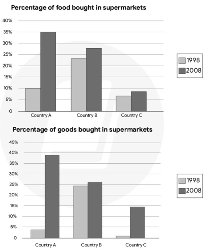
Sample 1:
The bar charts illustrate the proportion of food and other products purchased from supermarkets in three European countries in two separate years, namely 1998 and 2008.
Overall, there was a clear upward trend in supermarket sales across all countries, regardless of the type of products. Notably, although Country B had the highest percentage of food and goods bought from supermarkets in 1998, Country A had surpassed it by 2008.
In terms of food sales, Country B purchased around 23% of its food from supermarkets in the first year, followed by a modest rise of 5% over the next decade. In contrast, Country A experienced a sharper increase, with supermarket food purchases rising from 10% in 1998 to 35% in 2008, exceeding Country B. At the same time, Country C's food sales remained the lowest, making up less than 10% in both years, even though there was a small rise.
Other goods followed a similar trend. In 1998, Country B was at the forefront, with nearly 25% of supermarket sales, which was more than five times the amount for Country A. Yet by 2008, Country A had risen significantly, reaching almost 40%, surpassing the slower growth in Country B to about 27%. Meanwhile, Country C consistently had the lowest figures, growing from just over 2% in 1998 to almost 15% in 2008.
Sample 2:
The bar charts illustrate the percentage of food and other goods purchased from supermarkets in three European countries – A, B and C – in the years 1998 and 2008.
Overall, there was a significant increase in supermarket purchases in all three countries over the 10-year period. However, the extent of this increase varied between the countries, with Country A showing the most notable changes.
In terms of food purchases, Country A, which had the second-highest percentage at 10% in 1998, experienced a dramatic increase to 35% in 2008, making it the highest in that year. Country B, starting with the highest percentage of 23% in 1998, saw a smaller rise to 27% by 2008, ranking second. Meanwhile, Country C exhibited a modest increase from 6% to 8%, maintaining the lowest percentage of food purchases in both years.
Regarding the percentage of goods bought in supermarkets, a similar trend can be observed. In 1998, Country B had the highest proportion at just under 24%, compared to the minor figures in Country A (4%) and Country C (1%). By 2008, Country B increased only slightly by 2%, ranking second. Country A, however, saw the most dramatic rise, soaring to 38%, becoming the highest. Country C also climbed significantly to just under 15%, although it still remained the lowest among the three countries.
Sample 3:
The given bar graphs compare the proportions of groceries and other products purchased from supermarkets across three European nations between 1998 and 2008.
Overall, sales saw an upward trend in all the countries presented, with the most notable increase occurring in Country A. Another noteworthy feature is that in 1998, Country B led in supermarket sales; however, a decade later, Country A surpassed all other nations to take the top position.
Looking first at food purchases, in 1998, the percentage of groceries bought at supermarkets in Country B accounted for 23%, which was 13% higher than that in Country A and four times greater than Country C's figure.
Over the next decade, the figure for Country A experienced a significant surge, reaching 35% and becoming the leader in food sales. In contrast, minimal growth was observed in other nations during the same period, with increases of just under 5%.
Regarding sales of other goods, Country A, initially in second place, saw a sharp rise to 40% in the percentage of goods sold and overcame Country B to be the leader in this category. Likewise, Country C followed a comparable trajectory, increasing sevenfold to reach 14%, though it remained the nation with the lowest sales. Despite having the highest starting point of 24%, the growth in goods sales of Country B was slower, rising modestly to just over a quarter.
Sample 4:
The given bar charts compare three European countries in terms of the percentage of food and other products purchased from supermarkets between 1998 and 2008.
Overall, supermarket sales experienced a marked upward trend in all countries, irrespective of the type of products. It is also evident that while the proportion of both food and goods purchased in supermarkets in Country B was the highest in 1998, by 2008 it had been overtaken by Country A.
Regarding food sales, in 1998, individuals in Country B, on average, bought approximately 23% of their food from supermarkets, after which this figure increased modestly by 5% over the following decade. A similar trend, though more pronounced, was observed in Country A, where supermarket food sales surged from 10% to 35%, surpassing Country B. Meanwhile, food purchases in Country C remained relatively low, accounting for less than 10% in both years, despite a slight increase.
A comparable pattern emerged in the sale of goods. Country B initially led in 1998, with nearly 25% of goods purchased from supermarkets, quintuple the figure for Country A. However, by 2008, Country A saw an eightfold increase, reaching nearly 40%, thus surpassing the more modest rise to around 27% in Country B. Country C consistently registered the lowest proportion of goods bought in supermarkets, with figures increasing from just over 2% to nearly 15%.
Sample 5:
The given bar chart illustrates the rising dominance of supermarkets regarding food and goods purpchases across three European countries between 1998 and 2008.
Overall, it is clear that supermarkets had progressively gained a higher market share in selling food and goods across all 3 examined nations, despite to varying extents. Specifically, supermarkets were most prevalent among consumers in country 1, while country 3 displayed the lowest level of supermarket reliance.
With regards to food, 10% of food bought in country 1 was from supermarkets, which then increased remarkably to a staggering 40% 10 years later, registering as the highest figure across the chart. Country 2 followed a similar pattern, rising moderately from around 25% to over 30% in the same time period. By contrast, country 3 showcased the least interest in buying from supermarkets, witnessing only modest growth from about 5% to over 10% in the examined years.
As for goods, supermarkets once again displayed dominance in country 1, owning about 20% of the market in 1998, before rising to nearly 60% by 2008. Similarly, country 2 recorded a significant climb in its supermarket share, growing from approximately 40% to about 50% after 10 years. Finally, a neligible 3% was seen in the corresponding figure for country C in 1998, which grew to about 10% by 2008, reflecting a minimal shift in consumer preference toward supermarkets.
Hot: 1000+ Đề thi cuối kì 2 file word cấu trúc mới 2026 Toán, Văn, Anh... lớp 1-12 (chỉ từ 60k). Tải ngay
CÂU HỎI HOT CÙNG CHỦ ĐỀ
Lời giải

Sample 1:
The bar graph illustrates the overseas students' spending on accommodation, tuition, and living expenses, while the table depicts information about the average weekly expenses by international students in four countries: A, B, C, and D.
Overall, foreign students need to spend the highest in country A and the lowest in D. In nearly every nation, the international students’ weekly average living expenses are the greatest, while their housing cost registers the lowest.
The costliest country for studying is A, with a weekly average expense of 875 dollars. This is followed by B, C, and D, which have weekly expenses of 735, 540, and 435 dollars, respectively. However, foreign students always pay the least for accommodation, which incurs on average weekly 220, 280, 240, and 200 dollars in the nations A, B, C, and D, respectively.
On the other hand, living expenditures account for the highest portion of average weekly costs for international students in countries A, B, and C, with 430, 350, and 275 dollars, correspondingly. Tuition fees in the same countries (A, B and C) come in second with the weekly averages of 358, 320, and 250 dollars in order. However, D is the only nation where education accounts for the highest average spending area, coming in at USD 235, followed by the cost of living (USD 225) and housing (USD 200).
Sample 2:
The table illustrates information regarding the weekly spendings by overseas students in four countries, A, B, C and D, while the bar graph depicts the students’ expenditure on the sectors, housing, education fees and living expenses.
Overall, the cost of studying abroad is the highest in country A and the lowest in D. Apart from country D, living costs account for the most part of the weekly spendings in all countries, while accommodation registers the least.
Regarding the total cost of studying, A is the most expensive country with weekly average 875 dollars, followed by B, C and D with 735, 540 and 435 dollars, respectively. On the other hand, the overseas students always spend the least on accommodation, which are on average weekly 220, 280, 240 and 200 dollars in the corresponding countries A, B, C and D.
Considering the living cost, it takes the largest share of foreign students’ average weekly expenses in countries A, B, and C with 430, 350 and 275 dollars, respectively, while tuition fees in the same countries hold the second place with weekly average 358, 320 and 250 dollars, sequentially. However, D is the only country where tuition fee occupies the highest expenditure with average weekly 235 dollars, followed by living cost (USD 225) and accommodation (USD 200.)
Sample 3:
The table and bar graph depict information regarding the weekly spendings by overseas students in countries A, B C and D.
Overall, there are three elements, housing, school fees and living costs that contribute to the total weekly spendings. The total expenditure in country A is the highest while it is the lowest in country D. Living costs account for the most part of the weekly spendings in all countries except D.
The total mean weekly cost for pupils to study in country A is US$875, next by country B at US$735, and then by country C at US$540, and finally by country D at US$435. The living costs are always the biggest component of the expenditure except for country D, with about US$10 less than the major spending which is the school fees.
Accommodation accounts for the least among all spendings in all countries. The most expensive housing is found in country B, at US$280, and the cheapest in country D at US$200. The middle range can be seen in country A at US$220 and country C at US$240, respectively. Costs of the tuition fee range between US$ 358 and US$235 in country A and D, in order.
Lời giải

Sample 1:
The bar chart and pie chart give information about why US residents travelled and what travel problems they experienced in the year 2009.
It is clear that the principal reason why Americans travelled in 2009 was to commute to and from work. In the same year, the primary concern of Americans, with regard to the trips they made, was the cost of travelling.
Looking more closely at the bar chart, we can see that 49% of the trips made by Americans in 2009 were for the purpose of commuting. By contrast, only 6% of trips were visits to friends or relatives, and one in ten trips were for social or recreation reasons. Shopping was cited as the reason for 16% of all travel, while unspecific ‘personal reasons’ accounted for the remaining 19%.
According to the pie chart, price was the key consideration for 36% of American travellers. Almost one in five people cited safety as their foremost travel concern, while aggressive driving and highway congestion were the main issues for 17% and 14% of the travelling public. Finally, a total of 14% of those surveyed thought that access to public transport or space for pedestrians were the most important travel issues.
Sample 2:
The bar chart compares the figures for Americans going out for five reasons and the pie chart illustrates the percentage of six problems that concerned them when travelling in 2009. Overall, it is clear that the main reason why people in the US went out in 2009 is to commute to work, and the cost of travelling is the problem concerning them the most.
Looking first at the bar graph, the proportion of Americans going out for commuting to work stood at 49%, while the figure for those leaving their house for personal reasons accounted for 19%. In addition, the rate of people in the US going out for shopping and recreation made up 16% and 10%, respectively, while visiting friends or relatives accounted for the lowest percentage, at only 6%.
Turning to the pie chart, the cost of travelling was the most concerning problem of Americans when going out, with the figure making up 36%, while the proportion of safety concerns is half of that, at 19%. In addition, 17% of US citizens were concerned about aggressive drivers, while highway congestion made 14% of them worried when leaving their house. Access to public transportation and places for people to walk accounted for the lowest percentages, at only 8% and 6%, respectively.
Sample 3:
The provided charts offer insights into the reasons for travel and the primary concerns faced by the traveling public in the United States during the year 2009. The data is presented through a bar chart illustrating travel purposes and a pie chart highlighting key issues.
Notably, the primary motivation for travel among Americans in 2009 was commuting to and from work. Simultaneously, the major concern for the traveling public during their trips revolved around the cost associated with travel.
Examining the bar chart in detail reveals that almost half of the trips made by Americans in 2009, precisely 49%, were attributed to commuting. Conversely, visits to friends or relatives accounted for a mere 6%, while social or recreational trips constituted one in ten journeys. Shopping emerged as the purpose for 16% of all travel, leaving the remaining 19% for unspecific ‘personal reasons.’
Turning attention to the pie chart, it becomes evident that cost was the primary consideration for 36% of American travelers. Safety closely followed, with nearly one in five people, or 19%, expressing it as their foremost travel concern. Aggressive driving and highway congestion were significant issues for 17% and 14% of the traveling public, respectively. Additionally, 14% of respondents identified access to public transport or space for pedestrians as the most crucial travel issues.
Sample 4:
The bar chart shows why American people chose to travel, and the pie chart shows the main issues for the travelling public in the USA, both for 2009. The trend suggests that the reason and price were the main issues for travel in the United States. It is clear that commuting from work was reported as the biggest contribution to travel, at 49%. People who went travelling for personal reasons and shopping accounted for 35% when these two groups are combined. However, interaction with friends and relatives only accounted for 25% less than the above categories. And social and recreational activities took up only 6%, which was the lowest figure by more than 43%. The travelling public’s main issues were related to price and safety, with 55% of respondents reporting these two issues. While other issues accounted for a relatively small part. Only 17% of the respondents reported issues with aggressive drivers, while highway congestion accounted for even less at 14% of the issues reported. The percentage of access to public transport and space for pedestrians was much lower than the other categories at less than 10% for both. To conclude, price and commuting time were the dominant factors relating to travel in the US in 2009.
Lời giải
Bạn cần đăng ký gói VIP ( giá chỉ từ 250K ) để làm bài, xem đáp án và lời giải chi tiết không giới hạn.
Lời giải
Bạn cần đăng ký gói VIP ( giá chỉ từ 250K ) để làm bài, xem đáp án và lời giải chi tiết không giới hạn.
Lời giải
Bạn cần đăng ký gói VIP ( giá chỉ từ 250K ) để làm bài, xem đáp án và lời giải chi tiết không giới hạn.
Lời giải
Bạn cần đăng ký gói VIP ( giá chỉ từ 250K ) để làm bài, xem đáp án và lời giải chi tiết không giới hạn.
Lời giải
Bạn cần đăng ký gói VIP ( giá chỉ từ 250K ) để làm bài, xem đáp án và lời giải chi tiết không giới hạn.