


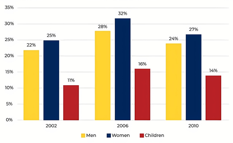
The chart below shows the percentage of the population in the UK who consumed the recommended daily amount of fruit and vegetables in 2002, 2006 and 2010.
Summarise the information by selecting and reporting the main features, and make comparisons where relevant. Write at least 150 words.
The chart below shows the percentage of the population in the UK who consumed the recommended daily amount of fruit and vegetables in 2002, 2006 and 2010.
Summarise the information by selecting and reporting the main features, and make comparisons where relevant. Write at least 150 words.
Câu hỏi trong đề: 2000 câu trắc nghiệm tổng hợp Tiếng Anh 2025 có đáp án !!
Quảng cáo
Trả lời:
Sample 1:
The given bar chart illustrates the proportion of British people who consumed the suggested amount of fruit and vegetables on a daily basis in three years: 2002, 2006 and 2010.
Overall, it can be seen that British women’s consumption of fruit and vegetables was far higher than the two remaining groups.
The initial impression from the graph is that the percentage of the recommended amount of fruit and vegetables every day that the British of both genders, namely male and female, consumed was nearly similar. Regarding men, their consumption shared the same pattern in 2002 and 2010 with roughly 23%. In 2010, both figures for men's and women’s consumption of fruit and vegetables reached the highest point at 27% and 32%, respectively. The recommended daily amount of fruit and vegetables consumed by women living in the UK was 25% in 2002 and rose slightly by 2% at the end of the period.
In 2002, children’s daily consumption of fruit and vegetables was much lower than the other groups with approximately one-tenth, which was half of the women’s and men’s consumption in the same year. In the next 4 years, the figure rose to 16% before dropping by 2% in 2010.
Sample 2:
The bar chart illustrates the proportion of men, women, and children in the UK who followed the recommended daily amount of fruit and vegetables in three different years.
From an overall perspective, upward trends were witnessed in all three groups of population. In addition, the percentage for women was consistently the highest, followed by that of men and children respectively. It is readily apparent that all of the figures reached their peaks in 2006.
25% of women in the UK followed the recommended amount in 2002, which was about 3% and 11% higher than men and children. Four years later, there was a significant increase in all three groups. While the percentage of women peaked at 32%, that of men and children grew to 28% and 16%.
However, all three groups experienced downward trends in 2010. In particular, a moderate decline of 5% was witnessed in the figure for women. Meanwhile, the proportion of men went down to 24%, which was 10% higher compared to that of children in the last year surveyed.
Sample 3:
The chart illustrates the percentage of men, women and children who consumed the recommended amount of fruit and vegetables on a daily basis in three different years.
Overall, women came out first in term of fruit and vegetable consumption while the opposite was true for children.
In all three years, there was a small difference in the percentage of males and females who consumed enough fruit and vegetables every day. The highest figure for women was 32% in 2006 compared to 28% of men. 2010 witnessed the second highest rank for both women and men’s figures. While 27% of women consumed fruit and vegetables, the percentage of men was 24%. And the smallest figure for both women and men, which was nearly the same as the 2010 figures, was recorded in 2002.
The smallest percentage of people consuming the daily recommended amount of fruit and vegetables was children with only 11% in 2002, half as much as that of men and women in the same year. Following that, the figure for children slightly increased to 16% in 2006 before falling marginally to 14% in the last.
Sample 4:
The bar chart illustrates the percentages of males, females and children in the UK consuming the recommended daily amount of fruit and vegetables, in three separate years (2002, 2006 and 2010).
Overall, the proportion of all groups eating fruit and vegetables increased over the period shown. Also, while women had a tendency to consume these foods the most, the opposite was true for children.
As can be seen from the chart, in 2002, approximately a quarter of females in the UK ate the recommended amount of fruit and vegetables. This was followed by nearly 22% of males consuming these foods daily, which was two times higher than that of children.
Over the following eight years, the figures for all groups increased to reach peaks in 2006 in which the figure for women was highest at just over 30%. By 2010, however, the percentage of females, males and children eating fruit and vegetables had decreased slightly to 27%, 24% and 14% respectively.
Sample 5:
The chart indicates the proportion of the British population who consumed the recommended daily amount of fruit and vegetables in 2002, 2006 and 2010.
As a general trend, the proportion of women is higher compared to the percentages for men and children across the three years, while the percentage for children is usually the lowest across this time period.
Between 2002 and 2006, it can be seen that the percentage of the UK population who consumed the recommended amount of fruit and vegetables increased uniformly across the three different groups before falling across the board between 2006 and 2010. This percentage for women experienced the greatest growth at 7 percent, rising from 25% in 2002 to 32% in 2006.
At the same time, the rate of growth for men and children were comparatively lower, at 6 percent for men and 5 for children between the same four years. Nonetheless, this percentage also dropped the furthest for women between 2006 and 2010, falling by 5 percent, compared to men and children, which fell by 4 and 2 percent respectively.
Sample 6:
The given chart compares the percentages of British people who consumed the recommended daily amount of fruit and vegetables in three years: 2002, 2006, 2010.
What is apparent from the chart is that British women’s consumption was the highest figure while the proportion of fruit and vegetables consumed by children was the lowest throughout the years. It can also be clearly seen that the percentage of all categories shared the same pattern over the period.
To go into specific detail, the percentages of fruit and vegetables that both male and female British consumed were 22% and 25% respectively in 2002. Over the next 8 years, the percentages of their consumption fluctuated and had an increase of 2% at the end of the period.
Regarding the children’s consumption, this number started at 11% before reaching a peak to 16% in 2006. This figure then witnessed a slight decrease, to 14% in 2010.
Sample 7:
The bar chart depicts the percentages of males, females, and children in the United Kingdom who consumed the recommended daily quantity of fruit and vegetables in three different years (2002, 2006 and 2010).
Overall, the proportion of people consuming fruits and vegetables followed an upward trend throughout the time period shown. Furthermore, whereas women consumed the most of these foods, the opposite was true for children.
According to the data, around one-quarter of females in the United Kingdom consumed the recommended quantity of fruits and vegetables in 2002. This was followed by over 22% of males consuming these items on a daily basis, which was twice as high as that of youngsters.
Over the next eight years, the statistics for all categories rose to a peak in 2006, with women accounting for little more than 30% of the total. However, by 2010, the percentage of ladies, males, and children consuming fruit and vegetables had fallen somewhat to 27 percent, 24 percent, and 14 percent, respectively.
Hot: 1000+ Đề thi cuối kì 2 file word cấu trúc mới 2026 Toán, Văn, Anh... lớp 1-12 (chỉ từ 60k). Tải ngay
CÂU HỎI HOT CÙNG CHỦ ĐỀ
Lời giải

Sample 1:
The bar graph illustrates the overseas students' spending on accommodation, tuition, and living expenses, while the table depicts information about the average weekly expenses by international students in four countries: A, B, C, and D.
Overall, foreign students need to spend the highest in country A and the lowest in D. In nearly every nation, the international students’ weekly average living expenses are the greatest, while their housing cost registers the lowest.
The costliest country for studying is A, with a weekly average expense of 875 dollars. This is followed by B, C, and D, which have weekly expenses of 735, 540, and 435 dollars, respectively. However, foreign students always pay the least for accommodation, which incurs on average weekly 220, 280, 240, and 200 dollars in the nations A, B, C, and D, respectively.
On the other hand, living expenditures account for the highest portion of average weekly costs for international students in countries A, B, and C, with 430, 350, and 275 dollars, correspondingly. Tuition fees in the same countries (A, B and C) come in second with the weekly averages of 358, 320, and 250 dollars in order. However, D is the only nation where education accounts for the highest average spending area, coming in at USD 235, followed by the cost of living (USD 225) and housing (USD 200).
Sample 2:
The table illustrates information regarding the weekly spendings by overseas students in four countries, A, B, C and D, while the bar graph depicts the students’ expenditure on the sectors, housing, education fees and living expenses.
Overall, the cost of studying abroad is the highest in country A and the lowest in D. Apart from country D, living costs account for the most part of the weekly spendings in all countries, while accommodation registers the least.
Regarding the total cost of studying, A is the most expensive country with weekly average 875 dollars, followed by B, C and D with 735, 540 and 435 dollars, respectively. On the other hand, the overseas students always spend the least on accommodation, which are on average weekly 220, 280, 240 and 200 dollars in the corresponding countries A, B, C and D.
Considering the living cost, it takes the largest share of foreign students’ average weekly expenses in countries A, B, and C with 430, 350 and 275 dollars, respectively, while tuition fees in the same countries hold the second place with weekly average 358, 320 and 250 dollars, sequentially. However, D is the only country where tuition fee occupies the highest expenditure with average weekly 235 dollars, followed by living cost (USD 225) and accommodation (USD 200.)
Sample 3:
The table and bar graph depict information regarding the weekly spendings by overseas students in countries A, B C and D.
Overall, there are three elements, housing, school fees and living costs that contribute to the total weekly spendings. The total expenditure in country A is the highest while it is the lowest in country D. Living costs account for the most part of the weekly spendings in all countries except D.
The total mean weekly cost for pupils to study in country A is US$875, next by country B at US$735, and then by country C at US$540, and finally by country D at US$435. The living costs are always the biggest component of the expenditure except for country D, with about US$10 less than the major spending which is the school fees.
Accommodation accounts for the least among all spendings in all countries. The most expensive housing is found in country B, at US$280, and the cheapest in country D at US$200. The middle range can be seen in country A at US$220 and country C at US$240, respectively. Costs of the tuition fee range between US$ 358 and US$235 in country A and D, in order.
Lời giải

Sample 1:
The bar chart and pie chart give information about why US residents travelled and what travel problems they experienced in the year 2009.
It is clear that the principal reason why Americans travelled in 2009 was to commute to and from work. In the same year, the primary concern of Americans, with regard to the trips they made, was the cost of travelling.
Looking more closely at the bar chart, we can see that 49% of the trips made by Americans in 2009 were for the purpose of commuting. By contrast, only 6% of trips were visits to friends or relatives, and one in ten trips were for social or recreation reasons. Shopping was cited as the reason for 16% of all travel, while unspecific ‘personal reasons’ accounted for the remaining 19%.
According to the pie chart, price was the key consideration for 36% of American travellers. Almost one in five people cited safety as their foremost travel concern, while aggressive driving and highway congestion were the main issues for 17% and 14% of the travelling public. Finally, a total of 14% of those surveyed thought that access to public transport or space for pedestrians were the most important travel issues.
Sample 2:
The bar chart compares the figures for Americans going out for five reasons and the pie chart illustrates the percentage of six problems that concerned them when travelling in 2009. Overall, it is clear that the main reason why people in the US went out in 2009 is to commute to work, and the cost of travelling is the problem concerning them the most.
Looking first at the bar graph, the proportion of Americans going out for commuting to work stood at 49%, while the figure for those leaving their house for personal reasons accounted for 19%. In addition, the rate of people in the US going out for shopping and recreation made up 16% and 10%, respectively, while visiting friends or relatives accounted for the lowest percentage, at only 6%.
Turning to the pie chart, the cost of travelling was the most concerning problem of Americans when going out, with the figure making up 36%, while the proportion of safety concerns is half of that, at 19%. In addition, 17% of US citizens were concerned about aggressive drivers, while highway congestion made 14% of them worried when leaving their house. Access to public transportation and places for people to walk accounted for the lowest percentages, at only 8% and 6%, respectively.
Sample 3:
The provided charts offer insights into the reasons for travel and the primary concerns faced by the traveling public in the United States during the year 2009. The data is presented through a bar chart illustrating travel purposes and a pie chart highlighting key issues.
Notably, the primary motivation for travel among Americans in 2009 was commuting to and from work. Simultaneously, the major concern for the traveling public during their trips revolved around the cost associated with travel.
Examining the bar chart in detail reveals that almost half of the trips made by Americans in 2009, precisely 49%, were attributed to commuting. Conversely, visits to friends or relatives accounted for a mere 6%, while social or recreational trips constituted one in ten journeys. Shopping emerged as the purpose for 16% of all travel, leaving the remaining 19% for unspecific ‘personal reasons.’
Turning attention to the pie chart, it becomes evident that cost was the primary consideration for 36% of American travelers. Safety closely followed, with nearly one in five people, or 19%, expressing it as their foremost travel concern. Aggressive driving and highway congestion were significant issues for 17% and 14% of the traveling public, respectively. Additionally, 14% of respondents identified access to public transport or space for pedestrians as the most crucial travel issues.
Sample 4:
The bar chart shows why American people chose to travel, and the pie chart shows the main issues for the travelling public in the USA, both for 2009. The trend suggests that the reason and price were the main issues for travel in the United States. It is clear that commuting from work was reported as the biggest contribution to travel, at 49%. People who went travelling for personal reasons and shopping accounted for 35% when these two groups are combined. However, interaction with friends and relatives only accounted for 25% less than the above categories. And social and recreational activities took up only 6%, which was the lowest figure by more than 43%. The travelling public’s main issues were related to price and safety, with 55% of respondents reporting these two issues. While other issues accounted for a relatively small part. Only 17% of the respondents reported issues with aggressive drivers, while highway congestion accounted for even less at 14% of the issues reported. The percentage of access to public transport and space for pedestrians was much lower than the other categories at less than 10% for both. To conclude, price and commuting time were the dominant factors relating to travel in the US in 2009.
Lời giải
Bạn cần đăng ký gói VIP ( giá chỉ từ 250K ) để làm bài, xem đáp án và lời giải chi tiết không giới hạn.
Lời giải
Bạn cần đăng ký gói VIP ( giá chỉ từ 250K ) để làm bài, xem đáp án và lời giải chi tiết không giới hạn.
Lời giải
Bạn cần đăng ký gói VIP ( giá chỉ từ 250K ) để làm bài, xem đáp án và lời giải chi tiết không giới hạn.
Lời giải
Bạn cần đăng ký gói VIP ( giá chỉ từ 250K ) để làm bài, xem đáp án và lời giải chi tiết không giới hạn.
Lời giải
Bạn cần đăng ký gói VIP ( giá chỉ từ 250K ) để làm bài, xem đáp án và lời giải chi tiết không giới hạn.