


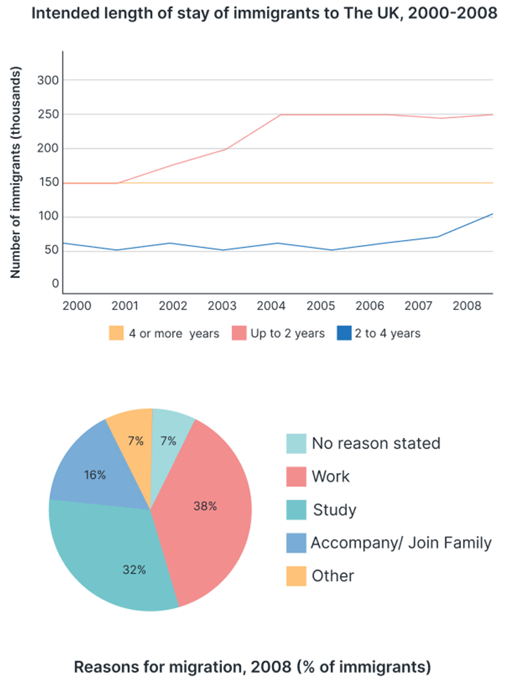
The graph and chart below give information about migration to the UK. The graph below shows how long immigrants in the year 2000-2008 intended to stay in the UK. And the pie chart shows reasons for migration in 2008.
Summarise the information by selecting and reporting the main features, and make comparisons where relevant. Write at least 150 words.
Câu hỏi trong đề: 2000 câu trắc nghiệm tổng hợp Tiếng Anh 2025 có đáp án !!
Quảng cáo
Trả lời:
Sample 1:
The line graph represents immigrants' intended duration of stay in the UK from 2000 to 2008. The pie chart demonstrates the reasons behind migration to the UK in 2008.
In general, most immigrants planned to reside in the UK for a maximum of two years. In addition, work was the primary reason for migration to the UK in 2008.
In 2000, most immigrants aimed to reside in the UK for "up to 2 years" and "4 or more years" (both categories were around 150,000). The following years saw a substantial increase in the former category, peaking in 2004 (at roughly 250,000). In contrast, those intending to reside for four or more years had a stable figure throughout the period, fluctuating around 150,000. Lastly, in the same time frame, the number of immigrants planning to stay for 2 to 4 years ranged between 50,000 to 60,000, with a significant jump to 100,000 in 2008.
In 2008, the pie chart delineates that work and study were the most prominent reasons for migration, accounting for 38% and 32% of all immigrants, respectively, while accompanying or joining the family constituted only 16%. Finally, unlisted reasons and non-respondents both comprised 7% each.
Sample 2:
The graphs present data on migration to the UK. The pie chart demonstrates the purposes for migration in 2008, while the line chart indicates the duration of expected stays from 2000 to 2008.
Overall, the line graph reveals that the majority of immigrants expected to stay in the UK for no more than two years. According to the pie chart, work was the key cause of migration in 2008.
In 2000, the number of immigrants in the “up to 2 years” and “4 or more years” categories were equal at 150 thousand. However, in 2001, the number of immigrants intending to migrate for up to 2 years considerably increased, peaking at 250 thousand in 2004. Meanwhile, the amount of people planning to resettle for 4 or more years remained relatively stable, hovering about 150 thousand. Also, between 50 and 100 thousand immigrants are expected to stay for 2 to 4 years throughout the period.
The pie chart reveals that 38% of all immigrants came for work, making it the most prominent factor. Study ranked second, accounting for 32% of all immigrants, followed by accompany/join family at 16%. Other reasons and those who did not respond both made up 7% of the total.
Sample 3:
The two illustrations provide insights into immigration trends in the UK between 2000 and 2008, focusing on duration of stay and motivation for relocation.
The data reveals that short-term stays, up to two years, were the most prevalent, with job opportunities being the predominant reason for moving.
Looking closely at the graph, it is evident that short-term immigrants constituted the largest segment. Initially, this group was around 150,000 strong in 2000, swelling steadily to peak at 250,000 by 2004, with this figure remaining static until 2008. In contrast, immigrants intending to stay for four years or longer maintained a consistent population of 150,000 throughout the period. Meanwhile, a smaller group, planning a two to four-year stay, showed the modest growth from 50,000 in 2000 to 100,000 in 2008.
Switching to the chart, it is clear that employment opportunities were the primary draw for migrants, accounting for 38% of the total. This was 6% higher than those immigrating for education. Family reunification prompted 16% of migrations, with the remaining 14% split evenly between unspecified reasons and other causes.
Sample 4:
The pair of depictions offer an in-depth look at immigration patterns in the United Kingdom from the start of the millennium until 2008, cantering on the length of stay and the impetus for making the move.
An analysis of the data divulges that transitory residences, not surpassing a two-year span, held the majority, with vocational prospects emerging as the chief rationale for relocation.
Upon examining the information about migration to the UK, it's apparent that transient immigrants comprised the largest demographic. Initially, this contingent held a strength of approximately 150,000 in the year 2000, experiencing a steady augmentation to reach its zenith at 250,000 by 2004. Intriguingly, this number remained constant until the end of the recorded period in 2008. In stark opposition, immigrants harbouring intentions to establish a home for a period of four years or beyond maintained a persistent count of 150,000 over the course of the observed timeline. Conversely, a minority group, envisioning a stay extending from two to four years, demonstrated a moderate escalation from 50,000 in 2000 to 100,000 by 2008.
Shifting attention to the pie-chart, it becomes unequivocally evident that the lure of employment opportunities served as the paramount magnet for migrants, accounting for a notable 38% of the entire pool. This was a full 6% greater than those electing to immigrate for academic advancement. The motive of family reunification spurred 16% of these translocations, leaving the remaining 14% to be equally distributed between undetermined reasons and various other triggers.
Hot: 1000+ Đề thi cuối kì 2 file word cấu trúc mới 2026 Toán, Văn, Anh... lớp 1-12 (chỉ từ 60k). Tải ngay
CÂU HỎI HOT CÙNG CHỦ ĐỀ
Lời giải

Sample 1:
The bar graph illustrates the overseas students' spending on accommodation, tuition, and living expenses, while the table depicts information about the average weekly expenses by international students in four countries: A, B, C, and D.
Overall, foreign students need to spend the highest in country A and the lowest in D. In nearly every nation, the international students’ weekly average living expenses are the greatest, while their housing cost registers the lowest.
The costliest country for studying is A, with a weekly average expense of 875 dollars. This is followed by B, C, and D, which have weekly expenses of 735, 540, and 435 dollars, respectively. However, foreign students always pay the least for accommodation, which incurs on average weekly 220, 280, 240, and 200 dollars in the nations A, B, C, and D, respectively.
On the other hand, living expenditures account for the highest portion of average weekly costs for international students in countries A, B, and C, with 430, 350, and 275 dollars, correspondingly. Tuition fees in the same countries (A, B and C) come in second with the weekly averages of 358, 320, and 250 dollars in order. However, D is the only nation where education accounts for the highest average spending area, coming in at USD 235, followed by the cost of living (USD 225) and housing (USD 200).
Sample 2:
The table illustrates information regarding the weekly spendings by overseas students in four countries, A, B, C and D, while the bar graph depicts the students’ expenditure on the sectors, housing, education fees and living expenses.
Overall, the cost of studying abroad is the highest in country A and the lowest in D. Apart from country D, living costs account for the most part of the weekly spendings in all countries, while accommodation registers the least.
Regarding the total cost of studying, A is the most expensive country with weekly average 875 dollars, followed by B, C and D with 735, 540 and 435 dollars, respectively. On the other hand, the overseas students always spend the least on accommodation, which are on average weekly 220, 280, 240 and 200 dollars in the corresponding countries A, B, C and D.
Considering the living cost, it takes the largest share of foreign students’ average weekly expenses in countries A, B, and C with 430, 350 and 275 dollars, respectively, while tuition fees in the same countries hold the second place with weekly average 358, 320 and 250 dollars, sequentially. However, D is the only country where tuition fee occupies the highest expenditure with average weekly 235 dollars, followed by living cost (USD 225) and accommodation (USD 200.)
Sample 3:
The table and bar graph depict information regarding the weekly spendings by overseas students in countries A, B C and D.
Overall, there are three elements, housing, school fees and living costs that contribute to the total weekly spendings. The total expenditure in country A is the highest while it is the lowest in country D. Living costs account for the most part of the weekly spendings in all countries except D.
The total mean weekly cost for pupils to study in country A is US$875, next by country B at US$735, and then by country C at US$540, and finally by country D at US$435. The living costs are always the biggest component of the expenditure except for country D, with about US$10 less than the major spending which is the school fees.
Accommodation accounts for the least among all spendings in all countries. The most expensive housing is found in country B, at US$280, and the cheapest in country D at US$200. The middle range can be seen in country A at US$220 and country C at US$240, respectively. Costs of the tuition fee range between US$ 358 and US$235 in country A and D, in order.
Lời giải

Sample 1:
The bar chart and pie chart give information about why US residents travelled and what travel problems they experienced in the year 2009.
It is clear that the principal reason why Americans travelled in 2009 was to commute to and from work. In the same year, the primary concern of Americans, with regard to the trips they made, was the cost of travelling.
Looking more closely at the bar chart, we can see that 49% of the trips made by Americans in 2009 were for the purpose of commuting. By contrast, only 6% of trips were visits to friends or relatives, and one in ten trips were for social or recreation reasons. Shopping was cited as the reason for 16% of all travel, while unspecific ‘personal reasons’ accounted for the remaining 19%.
According to the pie chart, price was the key consideration for 36% of American travellers. Almost one in five people cited safety as their foremost travel concern, while aggressive driving and highway congestion were the main issues for 17% and 14% of the travelling public. Finally, a total of 14% of those surveyed thought that access to public transport or space for pedestrians were the most important travel issues.
Sample 2:
The bar chart compares the figures for Americans going out for five reasons and the pie chart illustrates the percentage of six problems that concerned them when travelling in 2009. Overall, it is clear that the main reason why people in the US went out in 2009 is to commute to work, and the cost of travelling is the problem concerning them the most.
Looking first at the bar graph, the proportion of Americans going out for commuting to work stood at 49%, while the figure for those leaving their house for personal reasons accounted for 19%. In addition, the rate of people in the US going out for shopping and recreation made up 16% and 10%, respectively, while visiting friends or relatives accounted for the lowest percentage, at only 6%.
Turning to the pie chart, the cost of travelling was the most concerning problem of Americans when going out, with the figure making up 36%, while the proportion of safety concerns is half of that, at 19%. In addition, 17% of US citizens were concerned about aggressive drivers, while highway congestion made 14% of them worried when leaving their house. Access to public transportation and places for people to walk accounted for the lowest percentages, at only 8% and 6%, respectively.
Sample 3:
The provided charts offer insights into the reasons for travel and the primary concerns faced by the traveling public in the United States during the year 2009. The data is presented through a bar chart illustrating travel purposes and a pie chart highlighting key issues.
Notably, the primary motivation for travel among Americans in 2009 was commuting to and from work. Simultaneously, the major concern for the traveling public during their trips revolved around the cost associated with travel.
Examining the bar chart in detail reveals that almost half of the trips made by Americans in 2009, precisely 49%, were attributed to commuting. Conversely, visits to friends or relatives accounted for a mere 6%, while social or recreational trips constituted one in ten journeys. Shopping emerged as the purpose for 16% of all travel, leaving the remaining 19% for unspecific ‘personal reasons.’
Turning attention to the pie chart, it becomes evident that cost was the primary consideration for 36% of American travelers. Safety closely followed, with nearly one in five people, or 19%, expressing it as their foremost travel concern. Aggressive driving and highway congestion were significant issues for 17% and 14% of the traveling public, respectively. Additionally, 14% of respondents identified access to public transport or space for pedestrians as the most crucial travel issues.
Sample 4:
The bar chart shows why American people chose to travel, and the pie chart shows the main issues for the travelling public in the USA, both for 2009. The trend suggests that the reason and price were the main issues for travel in the United States. It is clear that commuting from work was reported as the biggest contribution to travel, at 49%. People who went travelling for personal reasons and shopping accounted for 35% when these two groups are combined. However, interaction with friends and relatives only accounted for 25% less than the above categories. And social and recreational activities took up only 6%, which was the lowest figure by more than 43%. The travelling public’s main issues were related to price and safety, with 55% of respondents reporting these two issues. While other issues accounted for a relatively small part. Only 17% of the respondents reported issues with aggressive drivers, while highway congestion accounted for even less at 14% of the issues reported. The percentage of access to public transport and space for pedestrians was much lower than the other categories at less than 10% for both. To conclude, price and commuting time were the dominant factors relating to travel in the US in 2009.
Lời giải
Bạn cần đăng ký gói VIP ( giá chỉ từ 250K ) để làm bài, xem đáp án và lời giải chi tiết không giới hạn.
Lời giải
Bạn cần đăng ký gói VIP ( giá chỉ từ 250K ) để làm bài, xem đáp án và lời giải chi tiết không giới hạn.
Lời giải
Bạn cần đăng ký gói VIP ( giá chỉ từ 250K ) để làm bài, xem đáp án và lời giải chi tiết không giới hạn.
Lời giải
Bạn cần đăng ký gói VIP ( giá chỉ từ 250K ) để làm bài, xem đáp án và lời giải chi tiết không giới hạn.
Lời giải
Bạn cần đăng ký gói VIP ( giá chỉ từ 250K ) để làm bài, xem đáp án và lời giải chi tiết không giới hạn.