


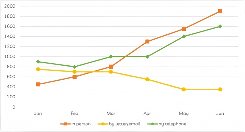
The graph below shows the number of enquiries received by the Tourist Information Office in one city over a six-month period in 2011.
Summarise the information by selecting and reporting the main features, and make comparisons where relevant. Write at least 150 words.
The graph below shows the number of enquiries received by the Tourist Information Office in one city over a six-month period in 2011.
Summarise the information by selecting and reporting the main features, and make comparisons where relevant. Write at least 150 words.
Câu hỏi trong đề: 2000 câu trắc nghiệm tổng hợp Tiếng Anh 2025 có đáp án !!
Quảng cáo
Trả lời:
Sample 1:
The line chart illustrates the number of inquiries sent to the Tourist Information Office in a particular city through three means of communication between January and June of the year 2011.
It is clear that visitors to the city made more inquiries in person and via telephone, while letters or emails became a less common choice. Also, the number of enquiries in person experienced the most dramatic change among the given methods.
In the first month of 2011, the Tourist Information Office received 900 enquiries from telephone, while just under 800 ones were sent by letter or email. Not many tourists chose to ask for information in person, with just over 400 queries. Over the next three months, telephone still remained the most popular method with 1000 enquires. Meanwhile, the number of enquiries made in person saw a considerable growth to 800 of emails, surpassing the figure for email and postal enquiries.
From March to June, the office received significantly more enquiries in person. Just after four months, the number of enquiries by this way soared by more than 1,000 to peak at 1,900 in June. The period also recorded a significant rise to 1,600 in the figure for telephones. By contrast, fewer people sent emails or letters to make enquires and the number ended at the lowest point of only under 400.
Sample 2:
The line chart illustrates the number of inquiries sent to the Tourist Information Office in a particular city via three means of communication, between January and June in 2011.
It is clear that visitors to the city made more inquiries in person and via telephone, while written letters and emails became the least common choices. Additionally, the number of enquiries in person experienced the most dramatic change among the different options.
In January, the Tourist Information Office received 900 telephone enquiries, while just under 800
letters and emails were received. Not many tourists chose to ask for information in person, with just over 400 queries. Over the next three months, the telephone still remained the most popular method of enquiry, at approximately 1000 queries.
Meanwhile, the number of enquiries made in person saw considerable growth to 800, surpassing the figures for emails and postal enquiries. From March to June, enquires in person were the most
common method of inquiry. By June, the number of in person enquires soared by more than 1,000 to peak at 1,900. During this period, there was also a significant rise in the figure for telephone enquiries, from 1000 to 1600. By contrast, fewer people sent emails or letters to make enquiries, with slightly less than 400 enquiries in May and June.
Sample 3:
During the first six months of 2011, the line graph compares the number of questions received by one particular Tourist Information Office via three different channels: telephone, letter/email, and direct communication. Overall, the office received significantly more inquiries via phone and directly from tourists, as opposed to a gradually declining preference for mailing platforms over the time period provided.
Tourists called the office with about 900 questions, which was the highest number in January. This figure then fell by 100 in February and March before rising to 1000 in March and April, followed by a sharp increase to around 1600 inquiries in June. Similarly, the number of in-person inquiries increased the most, from 450 to 1900, making face-to-face communication the most common method of obtaining travel information.
The trend in written inquiries was the polar opposite. After remaining relatively stable at around 700 questions for the first three months, the number dropped to just 350 questions in May and June.
Sample 4:
The graph demonstrates the quantity of questions received by the Tourist Information Office in one city over the first half of the year 2011. Overall, the number of enquiries received in person or by telephone each month increased over this period, whereas this figure decreased for enquiries received by letter or mail.
In January of 2011, it can be seen that enquiries in person were the fewest, at around 400 that month, compared to around 900 by telephone and 780 by letter or email. However, by June, while this number of enquiries for in person and by telephone has risen to 1900 and 1600 respectively, it has fallen to less than 400 by letter or mail.
It can also be seen that in person enquiries increased every month, surpassing enquiries by letter or email for the first time in March, and enquiries by telephone for the first time in April. Meanwhile, the number of enquiries by letter or email was uniformly lower than that by telephone across the period, with the gap between the two widening from around 100 in January to more than 1200 in June.
Sample 5:
The given line graph illustrates how many inquiries were received via different means by the Tourist Information Office in a particular city from January to June in 2011.
Overall, there was a gradual decrease in the number of enquiries received through telephone calls, while the opposite was true for face-to-face interactions and written correspondence. It is also evident that the figure for inquiries received in person experienced a dramatic rise to become the most popular from March onwards.
Just under 800 queries were dispatched to the Tourist Information Office via mail in January, with a subsequent slight decline to 700 queries two months later. The opposite changes were seen in the figures for enquiries sent in person and by calling, which grew from about 400 to 800 enquiries and from 900 to 1000 enquiries, respectively.
Between March and June, the number of inquiries received by the Tourist Information Office through direct interactions and telephone conversations continued to climb, by 1100 and 600 inquiries, in that order. Conversely, the figure for enquiries received via written correspondence kept dropping by 300 inquiries in May and remained unchanged in the concluding month.
Sample 6:
The presented line chart illustrates the volume of inquiries directed to a Tourist Information Office in a specific city across the initial half of 2011 through three distinct communication channels.
Overall, individuals visiting the city preferred making inquiries in person or via telephone, whereas opting for letters or emails became less prevalent.
In January 2011, the Tourist Information Office received roughly 900 inquiries via telephone, slightly less than 800 through letters or emails, and just over 400 in person. From February to April, telephone inquiries consistently maintained dominance, averaging around 1000 per month. However, a surge in in-person inquiries was witnessed, escalating to 800 queries in April, surpassing email and postal inquiries whose figure dropped modestly.
The months from May to June marked a notable escalation in in-person inquiries, reaching a peak of 1,900 in June after soaring by over 1,000. Concurrently, a substantial uptick was noted in telephone inquiries, amounting to 1,600 in June. In contrast, fewer individuals resorted to emails or letters for inquiries, plummeting to under 400 in June, marking the lowest point within the specified period.
Sample 7:
The line graph illustrates the number of enquiries made in person, by letter or email and by telephone at a Tourist Information Office in the first half of 2011. In general, we can see that tourists were most likely to enquire through phone calls in the first three months of 2011 while face-to-face enquiries exceed the number of such after April, reaching approximately 1900 enquiries by June. Based on the considerable growth of nearly 1500 enquiries received in person and the later surge of 600 enquiries made via telephone, it can be deduced that more tourists tended to ask for help after they arrived in the city from April to June. In contrast, the number of written enquiries remained more or less unchanged at roughly 700 in the first three months of the year, after which, it dropped a great deal in the later months to just below 400. Overall, it can be inferred that the peak season of the tourist centre is probably between April and June as the total number of enquiries increased a great deal.
Sample 8:
The line chart illustrates the number of inquiries sent to the Tourist Information Office in a particular city via three means of communication - telephone, letter/email, and in person - over a six-month period from January to June in 2011.
It is clear that in-person and telephone inquiries saw substantial increases, while written letters and emails became less common. Notably, inquiries made in person experienced the most dramatic growth.
In January, the Tourist Information Office received 900 telephone inquiries, while just under 800 letters and emails were received. Only around 400 tourists sought information in person. Over the next three months, the number of telephone inquiries remained steady, hovering at approximately 1000.
However, in-person inquiries rose sharply, reaching 800 by March, surpassing the figures for letters and emails. From March to June, in-person inquiries became the most common method, peaking at 1,900 in June, a significant increase of over 1,000 from January. Telephone inquiries also showed a notable rise, climbing from 1,000 to 1,600 by June. In contrast, the number of inquiries made via letter or email steadily declined, reaching just below 400 by May and June.
Overall, in-person and telephone inquiries grew significantly over the six months, while written methods of communication saw a marked decrease.
Sample 9:
The line chart illustrates the number of inquiries sent to the Tourist Information Office in a particular city via three means of communication, between January and June in 2011.
Overall, there is a contrasting trend in the queries made using different modes of communication, where doubts by mail have reduced over the period of time. While queries made through telephone and in person witness a rising trend. It is clearly seen that in person queries have risen dramatically compared to others.
In January, the Tourist Information Office received 900 phone calls and just under 800 letters and emails. With just over 400 queries, not many tourists chose to ask for information in person. The telephone remained the most popular method of inquiry for the next three months, with approximately 1000 queries.
Meanwhile, the number of in-person inquiries increased significantly to 800, surpassing the figures for email messages and postal inquiries. From March to June, the most popular method of inquiry was in person. By June, the number of in-person inquiries had increased by over 1,000, peaking at 1,900. During this time, the number of phone inquiries increased significantly, from 1000 to 1600. In May and June, however, fewer people sent emails or letters to inquire, with slightly less than 400 inquiries.
Sample 10:
The provided line graph depicts the distribution of questionnaires administered to a travel center in one specific area over the course of six months in 2011. In summary, the number of inquiries made in person and via telephone experienced a gradual increase, while there was a slight decrease in the volume of letters and emails seeking information.
Going into further detail, in January, telephone inquiries were the most common type, reaching a peak at 1000. Subsequently, from January to April, there was some fluctuation, with the number of telephone inquiries remaining between 800 and 1000. Following this period, there was a noticeable uptick, with the number of telephone inquiries rising from 1000 to 1600 over a two-month period. Additionally, in January, in-person inquiries were the least frequent, but they surged to approximately 2000 in June. Before March, in-person inquiries overtook letters in volume, and after March, they surpassed phone-based inquiries.
Conversely, letters were the second most prevalent type of inquiry in January, with a count of 800. Following this, there was a period of stability at 800, but over the next four months, the volume of letters gradually declined, ultimately reaching 400.
Sample 11:
The provided line graph illustrates the distribution of questionnaires distributed to a travel center in one specific area over a six-month period in 2011. In summary, there was a gradual increase in the number of in-person and telephone inquiries, while there was a slight decline in the volume of letters and emails requesting information.
Delving into the specifics, in January, telephone inquiries were the most common type, totaling 1000. Subsequently, from January to April, there was some fluctuation, with telephone inquiries remaining within the range of 800 to 1000. Following this period, there was a modest increase, with telephone inquiries rising from 1000 to 1600 over the course of two months. Additionally, in January, in-person inquiries were the least frequent, but they experienced a substantial surge, reaching approximately 2000 in June. Before March, in-person inquiries surpassed letters in volume, and after March, they even exceeded phone-based inquiries.
On the other hand, letters were the second most prevalent type of inquiry in January, with a count of 800. Following this, there was a period of stability at 800, but over the subsequent four months, the volume of letters gradually decreased, ultimately reaching 400.
Sample 12:
The line graph provides an overview of tourist inquiries made at the Tourist Information Office in a specific city from January to June 2011. There are three primary methods visitors can use to make these queries: in-person, via letter/email, or by telephone. Notably, these channels were relatively less utilized in the first month, with lower figures. However, a significant shift in the pattern occurred as in-person and telephone inquiries experienced substantial growth throughout the following months, while queries via letter/email exhibited the opposite trend.
In January, the highest number of inquiries, surpassing 800, were made by telephone. This number fluctuated over several months until April, after which it gradually increased, culminating in 1600 inquiries. In contrast, inquiries made via writing a letter or email remained just below 800. This figure held steady for the subsequent two months before dropping to its lowest point in May and June, with fewer than 400 inquiries.
Conversely, the number of in-person inquiries started at just over 400 in January, representing the lowest figure. However, there was a fivefold increase in the number of tourist queries, peaking in June and ending with slightly less than 2000 inquiries.
Sample 13:
The line graph provides an overview of tourist inquiries made at the Tourist Information office in a particular city from January to June 2011.
In general, when considering the available methods for making inquiries, tourists displayed a clear preference for asking questions in person, as opposed to using letters/emails or telephones. Notably, the number of written inquiries gradually declined throughout the survey period, in contrast to the trends observed for the other two channels.
To start, in January, there were 400 inquiries made in person, which steadily increased to over 1800 by the end of the survey in June. Similarly, telephone inquiries started at around 900 in the first month, dipped to 800, and then rebounded to remain at 1000 in March and April. However, despite this rise, the number of inquiries made via telephone could not match those made in person, accounting for 1600 inquiries in June.
Lastly, written inquiries began at approximately 800 in January but experienced a slight decrease to less than 600 in April. Afterward, they remained relatively stable at less than 400 from May until the end of the survey period.
Sample 14:
The line chart depicts the number of inquiries directed to the Tourist Information Office through three communication methods (in person, by letter or email, and by phone) in a specific city during the first half of 2011.
In general, inquiries were predominantly made by visitors in person and via phone, while written emails and letters were the less popular choices. Additionally, the most notable shift occurred in the number of in-person inquiries.
In January, there were 900 telephone inquiries made to the Tourist Information Office at the beginning of the period, gradually increasing to approximately 1600 in June. In contrast, only 400 letters and emails were sent to the tourist authority in January. The number of in-person inquiries increased significantly over the next three months, peaking at around 2000 inquiries, making it the most popular platform by the end of the period. In contrast, the number of written emails and letters steadily declined throughout the period, reaching a low point of 390 queries in May and June.
Sample 15:
The graph illustrates the number of inquiries received by the Tourist Information Office in a city over a six-month period in 2011.
In general, the three distinct lines on the graph represent three different methods through which tourists sought information. Notably, there was a significant increase in inquiries received in person, while the number of inquiries received by letter or email showed a decreasing trend.
In January, the Tourist Information Office received approximately 450 inquiries in person, while around 790 inquiries were sent via email or letter. Telephone inquiries were the most popular, with 900 calls recorded. In the following two months, the number of in-person inquiries steadily increased to 800 meetings, but it did not surpass the number of telephone inquiries.
From April to June, there was a noticeable decline in the number of inquiries received via letter or email. In contrast, the office continued to receive a substantial number of inquiries in person and via telephone. Moreover, the data highlighted a significant increase in the number of inquiries received in person, making it the leading method by June, with a total of 1900 inquiries.
Sample 16:
The provided line chart illustrates the number of inquiries received by the tourist information office in an urban area over a six-month period in 2011.
In general, there is a clear distinction in the trends of inquiries sent through different channels. The number of telephone inquiries decreased, while the opposite trend is observed for inquiries made in person and via letter or email. Additionally, after March, the number of in-person inquiries surpassed the other two methods.
In January, the highest number of inquiries, approximately 900, was made via telephone, while inquiries made in person and via letter or email were nearly 800 and over 400, respectively. From January to March, the number of in-person inquiries gradually increased, followed by a dramatic surge to approximately 1900 in June, making it the predominant method for inquiries in the office.
On the other hand, telephone inquiries experienced some fluctuations, hovering between 800 and 1000 during the first four months, followed by a clear increase to 1600 by the end of the period. Meanwhile, the number of inquiries made via letter or email gradually declined to approximately 400 and remained stable until the end of the six-month period.
Sample 17:
The chart provides an overview of the number of inquiries made to the Tourist Information Office in a specific city from January to June 2011. Inquiries were categorized into three types: in-person, telephone, and email/written correspondence.
In general, telephone and in-person inquiries witnessed an increase during this period, while email and written correspondence inquiries declined.
In January, the Tourist Information Office received around 800 inquiries via telephone, while in-person inquiries numbered half as many. The number of telephone inquiries experienced slight fluctuations until April when it began to rise significantly, reaching approximately 1100 inquiries by June. In contrast, in-person inquiries surpassed telephone inquiries in March and continued to climb, peaking at around 1200 inquiries in June.
Conversely, the number of email and letter inquiries saw a slight decline from January to March, followed by a more pronounced decrease in the subsequent months. By June, the figure for email and letter inquiries had dropped to approximately 200.
Sample 18:
The following chart illustrates an overview of tourist questions in a tourist center during the first half of 2011.
Overall, tourists ask their questions by three various ways, that is, in person, by telephone, and by letter. The first two methods experienced an increasing trend during these 6 months, while written and email enquiries were less prominent.
The number of people enquiries in person was approximately 450 in January (the minimum numbers compared to others). There was a significant growth in the number of in-person enquiries, reaching 1900 in June (maximum number compared to others). In January, the number of telephone questions was around 900, then it experienced a slight decrease to 800. Following this dip, there was a gradual increase to 1000 in May and maintaining this level until Apr. After that, there was a notable upward from Apr to Jun and achieved to 1600.
The inclination of people to ask their questions by letter/ email witnessed a slight downward to approximately 700 in Feb remaining constant until Mar. It then declined to around 390 in Mar and stayed this level until Jun.
Sample 19:
The line graph depicts the volume of queries made to a certain city’s tourist information office between January and June of 2011 using three different channels of communication.
It is obvious that phone calls and in-person inquiries from visitors to the city increased, but emails and letters declined in popularity. Also, among the mentioned ways, the number of inquiries made in person saw the most significant shift.
The Tourist Information Bureau received 900 phone inquiries in the first month of 2011, while slightly under 800 were addressed through letter or email. Just around 400 travelers choose to ask for information directly, which is not very many. With 1000 inquiries during the next three months, telephone inquiries continued to be the most common mode. Yet, compared to email and postal inquiries, the number of face-to-face inquiries increased significantly to 800 emails.
The office had a large increase in in-person inquiries from March to June. For four months, the number of inquiries received in this manner increased by more than 1,000, reaching a high of 1,900 in June. The number of telephones increased significantly during this time, reaching 1,600. In contrast, fewer individuals sent letters or emails to inquire, and the total fell to just under 400 at its lowest point.
Hot: 1000+ Đề thi cuối kì 2 file word cấu trúc mới 2026 Toán, Văn, Anh... lớp 1-12 (chỉ từ 60k). Tải ngay
CÂU HỎI HOT CÙNG CHỦ ĐỀ
Lời giải

Sample 1:
The bar graph illustrates the overseas students' spending on accommodation, tuition, and living expenses, while the table depicts information about the average weekly expenses by international students in four countries: A, B, C, and D.
Overall, foreign students need to spend the highest in country A and the lowest in D. In nearly every nation, the international students’ weekly average living expenses are the greatest, while their housing cost registers the lowest.
The costliest country for studying is A, with a weekly average expense of 875 dollars. This is followed by B, C, and D, which have weekly expenses of 735, 540, and 435 dollars, respectively. However, foreign students always pay the least for accommodation, which incurs on average weekly 220, 280, 240, and 200 dollars in the nations A, B, C, and D, respectively.
On the other hand, living expenditures account for the highest portion of average weekly costs for international students in countries A, B, and C, with 430, 350, and 275 dollars, correspondingly. Tuition fees in the same countries (A, B and C) come in second with the weekly averages of 358, 320, and 250 dollars in order. However, D is the only nation where education accounts for the highest average spending area, coming in at USD 235, followed by the cost of living (USD 225) and housing (USD 200).
Sample 2:
The table illustrates information regarding the weekly spendings by overseas students in four countries, A, B, C and D, while the bar graph depicts the students’ expenditure on the sectors, housing, education fees and living expenses.
Overall, the cost of studying abroad is the highest in country A and the lowest in D. Apart from country D, living costs account for the most part of the weekly spendings in all countries, while accommodation registers the least.
Regarding the total cost of studying, A is the most expensive country with weekly average 875 dollars, followed by B, C and D with 735, 540 and 435 dollars, respectively. On the other hand, the overseas students always spend the least on accommodation, which are on average weekly 220, 280, 240 and 200 dollars in the corresponding countries A, B, C and D.
Considering the living cost, it takes the largest share of foreign students’ average weekly expenses in countries A, B, and C with 430, 350 and 275 dollars, respectively, while tuition fees in the same countries hold the second place with weekly average 358, 320 and 250 dollars, sequentially. However, D is the only country where tuition fee occupies the highest expenditure with average weekly 235 dollars, followed by living cost (USD 225) and accommodation (USD 200.)
Sample 3:
The table and bar graph depict information regarding the weekly spendings by overseas students in countries A, B C and D.
Overall, there are three elements, housing, school fees and living costs that contribute to the total weekly spendings. The total expenditure in country A is the highest while it is the lowest in country D. Living costs account for the most part of the weekly spendings in all countries except D.
The total mean weekly cost for pupils to study in country A is US$875, next by country B at US$735, and then by country C at US$540, and finally by country D at US$435. The living costs are always the biggest component of the expenditure except for country D, with about US$10 less than the major spending which is the school fees.
Accommodation accounts for the least among all spendings in all countries. The most expensive housing is found in country B, at US$280, and the cheapest in country D at US$200. The middle range can be seen in country A at US$220 and country C at US$240, respectively. Costs of the tuition fee range between US$ 358 and US$235 in country A and D, in order.
Lời giải

Sample 1:
The bar chart and pie chart give information about why US residents travelled and what travel problems they experienced in the year 2009.
It is clear that the principal reason why Americans travelled in 2009 was to commute to and from work. In the same year, the primary concern of Americans, with regard to the trips they made, was the cost of travelling.
Looking more closely at the bar chart, we can see that 49% of the trips made by Americans in 2009 were for the purpose of commuting. By contrast, only 6% of trips were visits to friends or relatives, and one in ten trips were for social or recreation reasons. Shopping was cited as the reason for 16% of all travel, while unspecific ‘personal reasons’ accounted for the remaining 19%.
According to the pie chart, price was the key consideration for 36% of American travellers. Almost one in five people cited safety as their foremost travel concern, while aggressive driving and highway congestion were the main issues for 17% and 14% of the travelling public. Finally, a total of 14% of those surveyed thought that access to public transport or space for pedestrians were the most important travel issues.
Sample 2:
The bar chart compares the figures for Americans going out for five reasons and the pie chart illustrates the percentage of six problems that concerned them when travelling in 2009. Overall, it is clear that the main reason why people in the US went out in 2009 is to commute to work, and the cost of travelling is the problem concerning them the most.
Looking first at the bar graph, the proportion of Americans going out for commuting to work stood at 49%, while the figure for those leaving their house for personal reasons accounted for 19%. In addition, the rate of people in the US going out for shopping and recreation made up 16% and 10%, respectively, while visiting friends or relatives accounted for the lowest percentage, at only 6%.
Turning to the pie chart, the cost of travelling was the most concerning problem of Americans when going out, with the figure making up 36%, while the proportion of safety concerns is half of that, at 19%. In addition, 17% of US citizens were concerned about aggressive drivers, while highway congestion made 14% of them worried when leaving their house. Access to public transportation and places for people to walk accounted for the lowest percentages, at only 8% and 6%, respectively.
Sample 3:
The provided charts offer insights into the reasons for travel and the primary concerns faced by the traveling public in the United States during the year 2009. The data is presented through a bar chart illustrating travel purposes and a pie chart highlighting key issues.
Notably, the primary motivation for travel among Americans in 2009 was commuting to and from work. Simultaneously, the major concern for the traveling public during their trips revolved around the cost associated with travel.
Examining the bar chart in detail reveals that almost half of the trips made by Americans in 2009, precisely 49%, were attributed to commuting. Conversely, visits to friends or relatives accounted for a mere 6%, while social or recreational trips constituted one in ten journeys. Shopping emerged as the purpose for 16% of all travel, leaving the remaining 19% for unspecific ‘personal reasons.’
Turning attention to the pie chart, it becomes evident that cost was the primary consideration for 36% of American travelers. Safety closely followed, with nearly one in five people, or 19%, expressing it as their foremost travel concern. Aggressive driving and highway congestion were significant issues for 17% and 14% of the traveling public, respectively. Additionally, 14% of respondents identified access to public transport or space for pedestrians as the most crucial travel issues.
Sample 4:
The bar chart shows why American people chose to travel, and the pie chart shows the main issues for the travelling public in the USA, both for 2009. The trend suggests that the reason and price were the main issues for travel in the United States. It is clear that commuting from work was reported as the biggest contribution to travel, at 49%. People who went travelling for personal reasons and shopping accounted for 35% when these two groups are combined. However, interaction with friends and relatives only accounted for 25% less than the above categories. And social and recreational activities took up only 6%, which was the lowest figure by more than 43%. The travelling public’s main issues were related to price and safety, with 55% of respondents reporting these two issues. While other issues accounted for a relatively small part. Only 17% of the respondents reported issues with aggressive drivers, while highway congestion accounted for even less at 14% of the issues reported. The percentage of access to public transport and space for pedestrians was much lower than the other categories at less than 10% for both. To conclude, price and commuting time were the dominant factors relating to travel in the US in 2009.
Lời giải
Bạn cần đăng ký gói VIP ( giá chỉ từ 250K ) để làm bài, xem đáp án và lời giải chi tiết không giới hạn.
Lời giải
Bạn cần đăng ký gói VIP ( giá chỉ từ 250K ) để làm bài, xem đáp án và lời giải chi tiết không giới hạn.
Lời giải
Bạn cần đăng ký gói VIP ( giá chỉ từ 250K ) để làm bài, xem đáp án và lời giải chi tiết không giới hạn.
Lời giải
Bạn cần đăng ký gói VIP ( giá chỉ từ 250K ) để làm bài, xem đáp án và lời giải chi tiết không giới hạn.
Lời giải
Bạn cần đăng ký gói VIP ( giá chỉ từ 250K ) để làm bài, xem đáp án và lời giải chi tiết không giới hạn.