


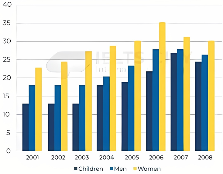
The bar chart shows the percentage of people who ate five portions of fruits and vegetables per day in the UK from 2001 to 2008.
Summarise the information by selecting and reporting the main features, and make comparisons where relevant. Write at least 150 words.
The bar chart shows the percentage of people who ate five portions of fruits and vegetables per day in the UK from 2001 to 2008.
Summarise the information by selecting and reporting the main features, and make comparisons where relevant. Write at least 150 words.
Câu hỏi trong đề: 2000 câu trắc nghiệm tổng hợp Tiếng Anh 2025 có đáp án !!
Quảng cáo
Trả lời:
Sample 1:
The provided bar chart depicts the percentage of individuals in the UK who included five portions of fruits and veggies in their daily diet from 2001 to 2008. The data is divided into three categories: children, men, and women.
Overall, all groups showed an upward trend in their consumption. Women consistently had the highest proportion, followed by men and children, throughout the surveyed period.
At the start of the course, less than a quarter of UK women ingested five servings of fresh produce in one day. However, this figure steadily grew over the years and hit a peak at 35% in 2006 before dropping to exactly 30% in 2008.
Regarding children, their percentage remained relatively stable in the first three years at approximately 12.5% and a similar pattern was observed in the men bracket during the same period, with their proportion remaining around 17.5%. Over the following three years, men witnessed a significant growth of nearly 10% and peaked at 27.5% in 2006, whereas, in the same years, the children group slightly increased and did not reach its highest point until 2007 at about 26.5%. Towards the end of the inspected duration, both men and children groups underwent a minor decline and ended at 26% and 24%, respectively.
Sample 2:
The bar chart depicts the changes in the proportion of people in the UK having five rations of fruits and vegetables daily between 2001 and 2008. In general, an upward trend was registered in the percentage of all three surveyed categories. Furthermore, women consistently boasted the highest rate of consumption throughout the period shown.
A closer look at the chart reveals that in 2001, nearly one quarter of females in the UK ate five portions of fruits and vegetables each day, distantly followed by males and children, with data recorded at around 17% and 13% respectively. Over the following three years, despite all undergoing increases in their consumption rates, women still topped the chart with about 28%, as opposed to merely 20% and below among the two remaining groups.
During subsequent years, the intake gap among these three categories was further narrowed. Specifically, after rising substantially and reaching its peak of 35% in 2006, the proportion of women consuming five portions of fruits and vegetables declined moderately to 30%, maintaining its first rank. Meanwhile, a considerable increase to over 25% was witnessed in the figure for male consumers, which was only roughly 2% higher compared to the youngest cohort.
Sample 3:
The graph illustrates the share of the UK population who ate fruit and vegetables five times per day between 2001 and 2008. Overall, there was an uptrend over the entire period for all categories; the figures for children and men increased sharply, while the share of women went up moderately.
The figure for children remained the lowest all over the time frame; it started at roughly 12% in 2001, remained constant until 2003 and then grew with a steady rate to about 25% in 2007. The share of men had a similar trend, but in 2001 it was around 17%, had no changes over next 2 years and then it started to increment rapidly to nearly 27% in 2007. Both segments of population suffered from a slight decline over last year in the graph.
In contrast, the percentage of women who ate five portions of fruit and vegetables in 2001 was the highest, among other categories. Over time, it incremented gradually between 2001 and 2006, from roughly 21% to about 34%, while in the last two years it declined by almost 3%, remaining the highest figure in 2008.
Sample 4:
The chart illustrates the percentage of people in the UK consuming five portions of fruit and vegetables daily from 2001 to 2008, categorized by children, men, and women.
Overall, there was a general upward trend in the consumption of fruits and vegetables across all groups from 2001 to 2008, with women consistently having the highest rates and children the lowest, despite a decline observed in 2007 and 2008.
In 2001, the percentage of women consuming five portions daily was the highest at approximately 22%. Men followed, with a rate close to 17%, and children had the lowest rate at around 12%. The figures for men and children remained relatively stable over the next two years, maintaining around 17.5% and 12.5%, respectively. In contrast, the percentage for women increased steadily, reaching over 27% by 2003.
From 2004 to 2006, there was a consistent rise in the percentages for men and children. Men’s consumption increased from 20% to nearly 27%, while children’s consumption grew from 17.5% to 23%. However, both groups saw a slight decline in 2007 and 2008. Men’s consumption peaked at 27% in 2006 and 2007 before dropping to about 26% in 2008. Similarly, children’s consumption peaked at 25% in 2007, then fell to approximately 24% in the final year.
Women’s consumption peaked at nearly 35% in 2006, followed by a decline to around 30% by 2008, a figure similar to that of 2005.
Sample 5:
The bar chart illustrates the proportion of women, men and children consuming five servingsof fruit and vegetables each day in 8 years from 2001 to 2008 in the UK.
Overall, it can be seen that the highest percentage of all people consuming fruit andvegetables was women, while children consistently accounted for the lowest proportion. Furthermore, a significant increase in the proportion of people eating these food items can be seen over the period given.
The percentage of women who ate fruit and vegetables started at just over 20% in 2001. This figure then rose steadily to reach a peak of almost 35% in 2006, before falling slightly to30% in the final year.
In terms of men and children eating fruit and vegetables, the rate remained relatively stable inthe first three years (about 17% and 12% respectively). From this point, the proportion ofmen climbed gradually to peak at about 27% in both 2006 and 2007, after which it dropped to about 26%. A similar growth in the figure for children was evident reaching 25% in 2007and around 24% in the final year.
Hot: 1000+ Đề thi cuối kì 2 file word cấu trúc mới 2026 Toán, Văn, Anh... lớp 1-12 (chỉ từ 60k). Tải ngay
CÂU HỎI HOT CÙNG CHỦ ĐỀ
Lời giải

Sample 1:
The bar graph illustrates the overseas students' spending on accommodation, tuition, and living expenses, while the table depicts information about the average weekly expenses by international students in four countries: A, B, C, and D.
Overall, foreign students need to spend the highest in country A and the lowest in D. In nearly every nation, the international students’ weekly average living expenses are the greatest, while their housing cost registers the lowest.
The costliest country for studying is A, with a weekly average expense of 875 dollars. This is followed by B, C, and D, which have weekly expenses of 735, 540, and 435 dollars, respectively. However, foreign students always pay the least for accommodation, which incurs on average weekly 220, 280, 240, and 200 dollars in the nations A, B, C, and D, respectively.
On the other hand, living expenditures account for the highest portion of average weekly costs for international students in countries A, B, and C, with 430, 350, and 275 dollars, correspondingly. Tuition fees in the same countries (A, B and C) come in second with the weekly averages of 358, 320, and 250 dollars in order. However, D is the only nation where education accounts for the highest average spending area, coming in at USD 235, followed by the cost of living (USD 225) and housing (USD 200).
Sample 2:
The table illustrates information regarding the weekly spendings by overseas students in four countries, A, B, C and D, while the bar graph depicts the students’ expenditure on the sectors, housing, education fees and living expenses.
Overall, the cost of studying abroad is the highest in country A and the lowest in D. Apart from country D, living costs account for the most part of the weekly spendings in all countries, while accommodation registers the least.
Regarding the total cost of studying, A is the most expensive country with weekly average 875 dollars, followed by B, C and D with 735, 540 and 435 dollars, respectively. On the other hand, the overseas students always spend the least on accommodation, which are on average weekly 220, 280, 240 and 200 dollars in the corresponding countries A, B, C and D.
Considering the living cost, it takes the largest share of foreign students’ average weekly expenses in countries A, B, and C with 430, 350 and 275 dollars, respectively, while tuition fees in the same countries hold the second place with weekly average 358, 320 and 250 dollars, sequentially. However, D is the only country where tuition fee occupies the highest expenditure with average weekly 235 dollars, followed by living cost (USD 225) and accommodation (USD 200.)
Sample 3:
The table and bar graph depict information regarding the weekly spendings by overseas students in countries A, B C and D.
Overall, there are three elements, housing, school fees and living costs that contribute to the total weekly spendings. The total expenditure in country A is the highest while it is the lowest in country D. Living costs account for the most part of the weekly spendings in all countries except D.
The total mean weekly cost for pupils to study in country A is US$875, next by country B at US$735, and then by country C at US$540, and finally by country D at US$435. The living costs are always the biggest component of the expenditure except for country D, with about US$10 less than the major spending which is the school fees.
Accommodation accounts for the least among all spendings in all countries. The most expensive housing is found in country B, at US$280, and the cheapest in country D at US$200. The middle range can be seen in country A at US$220 and country C at US$240, respectively. Costs of the tuition fee range between US$ 358 and US$235 in country A and D, in order.
Lời giải

Sample 1:
The bar chart and pie chart give information about why US residents travelled and what travel problems they experienced in the year 2009.
It is clear that the principal reason why Americans travelled in 2009 was to commute to and from work. In the same year, the primary concern of Americans, with regard to the trips they made, was the cost of travelling.
Looking more closely at the bar chart, we can see that 49% of the trips made by Americans in 2009 were for the purpose of commuting. By contrast, only 6% of trips were visits to friends or relatives, and one in ten trips were for social or recreation reasons. Shopping was cited as the reason for 16% of all travel, while unspecific ‘personal reasons’ accounted for the remaining 19%.
According to the pie chart, price was the key consideration for 36% of American travellers. Almost one in five people cited safety as their foremost travel concern, while aggressive driving and highway congestion were the main issues for 17% and 14% of the travelling public. Finally, a total of 14% of those surveyed thought that access to public transport or space for pedestrians were the most important travel issues.
Sample 2:
The bar chart compares the figures for Americans going out for five reasons and the pie chart illustrates the percentage of six problems that concerned them when travelling in 2009. Overall, it is clear that the main reason why people in the US went out in 2009 is to commute to work, and the cost of travelling is the problem concerning them the most.
Looking first at the bar graph, the proportion of Americans going out for commuting to work stood at 49%, while the figure for those leaving their house for personal reasons accounted for 19%. In addition, the rate of people in the US going out for shopping and recreation made up 16% and 10%, respectively, while visiting friends or relatives accounted for the lowest percentage, at only 6%.
Turning to the pie chart, the cost of travelling was the most concerning problem of Americans when going out, with the figure making up 36%, while the proportion of safety concerns is half of that, at 19%. In addition, 17% of US citizens were concerned about aggressive drivers, while highway congestion made 14% of them worried when leaving their house. Access to public transportation and places for people to walk accounted for the lowest percentages, at only 8% and 6%, respectively.
Sample 3:
The provided charts offer insights into the reasons for travel and the primary concerns faced by the traveling public in the United States during the year 2009. The data is presented through a bar chart illustrating travel purposes and a pie chart highlighting key issues.
Notably, the primary motivation for travel among Americans in 2009 was commuting to and from work. Simultaneously, the major concern for the traveling public during their trips revolved around the cost associated with travel.
Examining the bar chart in detail reveals that almost half of the trips made by Americans in 2009, precisely 49%, were attributed to commuting. Conversely, visits to friends or relatives accounted for a mere 6%, while social or recreational trips constituted one in ten journeys. Shopping emerged as the purpose for 16% of all travel, leaving the remaining 19% for unspecific ‘personal reasons.’
Turning attention to the pie chart, it becomes evident that cost was the primary consideration for 36% of American travelers. Safety closely followed, with nearly one in five people, or 19%, expressing it as their foremost travel concern. Aggressive driving and highway congestion were significant issues for 17% and 14% of the traveling public, respectively. Additionally, 14% of respondents identified access to public transport or space for pedestrians as the most crucial travel issues.
Sample 4:
The bar chart shows why American people chose to travel, and the pie chart shows the main issues for the travelling public in the USA, both for 2009. The trend suggests that the reason and price were the main issues for travel in the United States. It is clear that commuting from work was reported as the biggest contribution to travel, at 49%. People who went travelling for personal reasons and shopping accounted for 35% when these two groups are combined. However, interaction with friends and relatives only accounted for 25% less than the above categories. And social and recreational activities took up only 6%, which was the lowest figure by more than 43%. The travelling public’s main issues were related to price and safety, with 55% of respondents reporting these two issues. While other issues accounted for a relatively small part. Only 17% of the respondents reported issues with aggressive drivers, while highway congestion accounted for even less at 14% of the issues reported. The percentage of access to public transport and space for pedestrians was much lower than the other categories at less than 10% for both. To conclude, price and commuting time were the dominant factors relating to travel in the US in 2009.
Lời giải
Bạn cần đăng ký gói VIP ( giá chỉ từ 250K ) để làm bài, xem đáp án và lời giải chi tiết không giới hạn.
Lời giải
Bạn cần đăng ký gói VIP ( giá chỉ từ 250K ) để làm bài, xem đáp án và lời giải chi tiết không giới hạn.
Lời giải
Bạn cần đăng ký gói VIP ( giá chỉ từ 250K ) để làm bài, xem đáp án và lời giải chi tiết không giới hạn.
Lời giải
Bạn cần đăng ký gói VIP ( giá chỉ từ 250K ) để làm bài, xem đáp án và lời giải chi tiết không giới hạn.
Lời giải
Bạn cần đăng ký gói VIP ( giá chỉ từ 250K ) để làm bài, xem đáp án và lời giải chi tiết không giới hạn.