


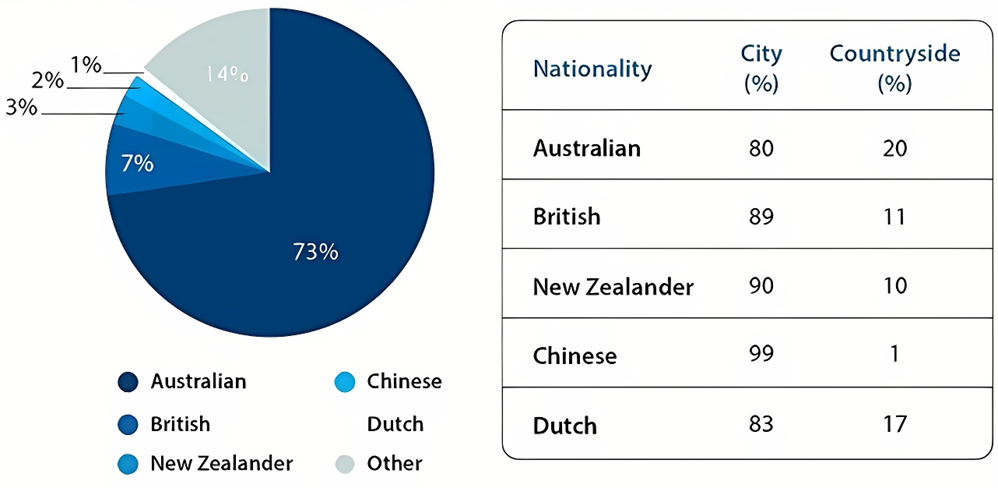
The table and pie chart give information about the population in Australia according to different nationalities and areas.
Summarise the information by selecting and reporting the main features, and make comparisons where relevant. Write at least 150 words.
The table and pie chart give information about the population in Australia according to different nationalities and areas.
Summarise the information by selecting and reporting the main features, and make comparisons where relevant. Write at least 150 words.
Câu hỏi trong đề: 2000 câu trắc nghiệm tổng hợp Tiếng Anh 2025 có đáp án !!
Quảng cáo
Trả lời:
Sample 1:
The pie chart gives information on the percentages of people from different countries who live in Australia while the table illustrates the proportions of inhabitants in rural and urban areas.
Looking from an overall perspective, the most striking feature of the pie chart is the predominance of native Australians living in this country. Regarding the table, it is apparent that the vast majority of people, regardless of their nationality, choose to live in cities.
In terms of the pie chart, Australians account for nearly three-quarters of the population in this country, which is almost ten times as large as the segment of people from Britain residing in Australia. New Zealand ranks third, at 3 percent, followed by China and the Netherlands, at 2 percent and 1 percent respectively while 14 percent of the Australian population is made up of residents from other countries.
Regarding their living areas, although the percentage of Australians living in rural areas is the highest among all demographics, at 20 percent, the majority of them still live in cities. A similar pattern can be observed in the figures for the Dutch, the British and New Zealanders with 83 per cent, 89 per cent and 90 percent of them opting for urban areas. Almost all Chinese residents live in these parts of the country (99 percent).
Sample 2:
The given pie chart illustrates the percentage of people of different nationalities residing in Australia, whereas the table shows demographical figures which are classified according to urban and rural areas. The initial impression from the pie chart is that the vast majority of Australian people claim their ancestry to be of Australian origin. It is also noticeable that most Australian people, regardless of their ethnicity, are city dwellers.
According to the pie chart, Australian ethnicity makes up nearly three fourths of the total population. This is followed by the figure for people coming from the UK (7%) and New Zealand (3%). People of Chinese and Dutch ethnicity, on the other hand, made up a negligible 1-2%.
As is seen from the table, roughly 80% of people from Australia and New Zealand live in cities, whereas only around 20% lived in the countryside. A similar picture is evident in the figures for people from China and New Zealand, with their urban population amounting to a high of 90-99%.
Sample 3:
The given pie chart illustrates the percentages of different nationalities that make up the Australian population, while the table gives information about whether they live in urban or rural areas.
In general, it is evident that the vast majority of Australia’s population is of Australian nationality. Furthermore, most people in this country, irrespective of their nationality, opt to live in cities.
The percentage of the Australian population that are of Australian nationality is 73%, whereas the figures for people of British or other nationalities are significantly lower, at 7% and 14% respectively. Meanwhile, 3% of the population come from New Zealand, while 2% are of Chinese nationality. 1% of Australia’s population comes from the Netherlands.
From the table it can be seen that 80% of Australians choose to reside in cities, along with 89% of the British and 90% of the New Zealanders. SImilarly, 99% of Chinese live in the city, as do 83% of the Dutch.
Sample 4:
The pie chart depicts the constitution of those residing in Australia with respect to their nationalities, whereas the table details where these people live in an unspecified year.
Overall, what stands out from the graph is that Australian demographics hold the lion’s share in the population of this nation. Another interesting point is that most residents opt for the city regardless of ethnicity.
With regards to the pie chart, local Australian people represent nearly three fourths (73%) of the total population. Next came other countries with 14%, whilst 7% come from the UK. Those whose home countries are in Dutch, China and New Zealand hold a negligible 1-3% of total people residing in Australia.
In terms of the table, the vast majority of surveyed Australian demographics favour living in the city with 8 out of 10. A similar pattern can be seen in the figures for Dutch, British and New Zealander residents, amounting to 83%, 89% and 90% respectively. This trend is particularly evident in Chinese people with 99% choosing to live in the city.
Sample 5:
The pie chart and table detail population figures in Australia and if residents tended to live in rural or urban areas. Looking from an overall perspective, it is readily apparent that the vast majority of the population is Australian, followed by sizeable numbers for other and British nationals, and more marginal figures for New Zealanders, Chinese, and the Dutch. All demographics live overwhelmingly in cities, especially individuals from China.
The pie chart indicates that 73% of the Australian population is made up of Australians themselves. This figure is followed distantly by other at 14%, residents from Great Britain at 7%, New Zealanders at 3%, Chinese at 2%, and people from the Netherlands at just 1%.
In terms of livings areas, Australians are most likely to live outside cities, though 80% still live in urban environments. Similarly, 83% of the Dutch live in cities and 17% in the countryside. British and New Zealand residents display nearly identical proportions with around 90% in cities. Finally, the Chinese live predominately in the cities (99%).
Sample 6:
The pie chart illustrates a demographic breakdown of the Australian population by nationality, and the table shows the proportions of these nationalities living in urban and rural areas.
Overall, Australian nationals are the predominant group in the entire country. In addition, the vast majority of the population gravitates towards city life regardless of their nationalities, with nearly the entire Chinese immigrant community doing so.
Looking first at the different nationalities, nearly three quarters (73%) of the population are Australian, which is more than ten times higher than the figure for British people, at 7%. Meanwhile, New Zealanders, Chinese, and Dutch nationals are also smaller minorities, with their respective figures being 3%,2% and 1%, and all other unnamed nationalities account for 14%.
Regarding the locations of these communities, almost all Chinese people reside in cities, specifically 99%. Similarly, the majority of people from the UK and New Zealand live in urban areas, at 89% and 90% respectively. Finally, 83% of people originating from the Netherlands have settled and remained in cities, which is only 3% more than that of Australians.
Sample 7:
The pie chart depicts the percentage of people of various nationalities living in Australia, whereas the table displays demographic data divided into urban and rural areas.
Overall, the pie chart gives the impression that the vast majority of Australians claim to have ancestors of Australian origin. It is also notable from the table that most Australians, regardless of ethnicity, are urban dwellers.
According to the pie chart, ethnicity accounts for nearly three-quarters of the total population in Australia. This is followed by figures for people from the United Kingdom (7%), and New Zealand (3%). People of Chinese and Dutch origin, on the other hand, made up a negligible 1-2% of the population.
Looking at the table, roughly 80% of Australians and New Zealanders live in cities, with only about 20% living in the countryside. A similar picture can be seen in the figures for people from China and New Zealand, where the urban population is 90-99%.
Sample 8:
The given pie chart shows the percentage of people of different nationalities residing in Australia, while the table shows demographic figures which are classified according to urban and rural areas.
Overall, Australians are the largest nationalities, residents, almost three-quarters of the major population, and they tend to live in the urban area. This figure is followed distantly by other citizens who are almost twice the residents from Great Britain (7%), New Zealanders at 3%, Chinese at 2%, and people from the Netherlands at just 1%.
It is readily apparent that Chinese live predominantly in the cities up to 99%, whereas only 1% live in the countryside. The other vast majority of city dwellers is New Zealanders and British, which display nearly identical proportions around 90%. In terms of living areas, Australians are few likely to live outside the cities, nearly 20%, while the rest still live in urban environments. Similarly, 83% of the Dutch live in cities and 17% in the countryside.
Sample 9:
The pie chart illustrates the proportion of people of different nationalities in Australia while the table shows their whereabouts.
Overall, the majority of the population has Australian nationality. It is also apparent that people mostly reside in urban areas.
According to the pie chart, a hefty 73% of people living in Australia are Australians. This is followed by the figure for those who hold other nationalities (14%), which is twice as much as that for people of British origin (7%). The remaining groups only account for a minority of the population, with New Zealanders comprising 3%, the Chinese occupying 2% and the Dutch making up 1%.
Regarding the table, it is evident that an overwhelming proportion of residents in Australia are city dwellers regardless of their nationality. Almost all Chinese people, New Zealanders and British people live in cities, at 99%, 90% and 89%, respectively. Likewise, the figures for people of Australian and Dutch descent also show a preference for urban areas, with a ratio of around 8 urbanites to 2 country dwellers.
Sample 10:
Given is the table illustrating how many people residing in Australia based on different nationalities, and the pie chartdelinates the demograph in this country in rural and urban areas.
Overall, the percentage of Australians who dwell in this country dominates the pie chart. By contrast, when it comes to thetable, city dwellers accounts for a vast majority of australia’s population.
According to the pie chart, the proportion of Australiansstand at the top position, at 73%, followed by that of the Britishwith 7%. Simultaneously, the next position belongs to the figure for New zealanders, at 3%. At the same time, around 2%was recorded for the figure of Chinese and Dutch, compared to 14% that of other nationalities.
As seen from the table, regarding the cosmopolitan area, the share of Chinese people ranks first at 99%, which wasapproximately 9% higher than that of NewZealander and British. In the meantime, a mere 82% of Dutch and Australianschoose to live in this area. In terms of the countryside, while the proportion of Australian residents is highest, at 20%, the figures for British, NewZealander and Dutch were comparable, at around 15%. However, Chinese people only have 1% oits population living there, which also occupies the lowest share in the table.
Sample 11:
The provided pie chart illustrates the percentage of people from various nationalities residing in Australia, while the table presents demographic data categorized by urban and rural areas. At first glance at the pie chart, it is evident that the majority of Australians identify their ancestry as Australian. Moreover, a notable observation is that the majority of Australians, regardless of their ethnic background, live in urban areas.
According to the pie chart, individuals of Australian descent constitute nearly three-quarters of the total population. This is followed by individuals from the UK (7%) and New Zealand (3%). Conversely, people of Chinese and Dutch descent account for a marginal 1-2%.
According to the table, approximately 80% of Australians and New Zealanders reside in urban areas, whereas only about 20% live in rural regions. A similar trend is observed among Chinese and New Zealand residents, where the urban population ranges from 90% to 99%.
Sample 12:
The pie chart illustrates the percentage of individuals from various nationalities residing in Australia, while the table presents demographic data categorized into urban and rural areas.
In summary, the pie chart suggests that the majority of Australians claim ancestry of Australian origin. The table also indicates that a significant proportion of Australians, irrespective of ethnicity, reside in urban areas.
According to the pie chart, ethnicity constitutes almost three-quarters of the total Australian population. This is followed by percentages for individuals from the United Kingdom (7%) and New Zealand (3%). Conversely, people of Chinese and Dutch descent account for a negligible 1-2% of the population.
Analyzing the table, approximately 80% of Australians and New Zealanders live in urban areas, with only around 20% residing in rural regions. A similar trend is observed for individuals from China and New Zealand, where the urban population ranges from 90% to 99%.
Hot: 1000+ Đề thi cuối kì 2 file word cấu trúc mới 2026 Toán, Văn, Anh... lớp 1-12 (chỉ từ 60k). Tải ngay
CÂU HỎI HOT CÙNG CHỦ ĐỀ
Lời giải

Sample 1:
The bar graph illustrates the overseas students' spending on accommodation, tuition, and living expenses, while the table depicts information about the average weekly expenses by international students in four countries: A, B, C, and D.
Overall, foreign students need to spend the highest in country A and the lowest in D. In nearly every nation, the international students’ weekly average living expenses are the greatest, while their housing cost registers the lowest.
The costliest country for studying is A, with a weekly average expense of 875 dollars. This is followed by B, C, and D, which have weekly expenses of 735, 540, and 435 dollars, respectively. However, foreign students always pay the least for accommodation, which incurs on average weekly 220, 280, 240, and 200 dollars in the nations A, B, C, and D, respectively.
On the other hand, living expenditures account for the highest portion of average weekly costs for international students in countries A, B, and C, with 430, 350, and 275 dollars, correspondingly. Tuition fees in the same countries (A, B and C) come in second with the weekly averages of 358, 320, and 250 dollars in order. However, D is the only nation where education accounts for the highest average spending area, coming in at USD 235, followed by the cost of living (USD 225) and housing (USD 200).
Sample 2:
The table illustrates information regarding the weekly spendings by overseas students in four countries, A, B, C and D, while the bar graph depicts the students’ expenditure on the sectors, housing, education fees and living expenses.
Overall, the cost of studying abroad is the highest in country A and the lowest in D. Apart from country D, living costs account for the most part of the weekly spendings in all countries, while accommodation registers the least.
Regarding the total cost of studying, A is the most expensive country with weekly average 875 dollars, followed by B, C and D with 735, 540 and 435 dollars, respectively. On the other hand, the overseas students always spend the least on accommodation, which are on average weekly 220, 280, 240 and 200 dollars in the corresponding countries A, B, C and D.
Considering the living cost, it takes the largest share of foreign students’ average weekly expenses in countries A, B, and C with 430, 350 and 275 dollars, respectively, while tuition fees in the same countries hold the second place with weekly average 358, 320 and 250 dollars, sequentially. However, D is the only country where tuition fee occupies the highest expenditure with average weekly 235 dollars, followed by living cost (USD 225) and accommodation (USD 200.)
Sample 3:
The table and bar graph depict information regarding the weekly spendings by overseas students in countries A, B C and D.
Overall, there are three elements, housing, school fees and living costs that contribute to the total weekly spendings. The total expenditure in country A is the highest while it is the lowest in country D. Living costs account for the most part of the weekly spendings in all countries except D.
The total mean weekly cost for pupils to study in country A is US$875, next by country B at US$735, and then by country C at US$540, and finally by country D at US$435. The living costs are always the biggest component of the expenditure except for country D, with about US$10 less than the major spending which is the school fees.
Accommodation accounts for the least among all spendings in all countries. The most expensive housing is found in country B, at US$280, and the cheapest in country D at US$200. The middle range can be seen in country A at US$220 and country C at US$240, respectively. Costs of the tuition fee range between US$ 358 and US$235 in country A and D, in order.
Lời giải

Sample 1:
The bar chart and pie chart give information about why US residents travelled and what travel problems they experienced in the year 2009.
It is clear that the principal reason why Americans travelled in 2009 was to commute to and from work. In the same year, the primary concern of Americans, with regard to the trips they made, was the cost of travelling.
Looking more closely at the bar chart, we can see that 49% of the trips made by Americans in 2009 were for the purpose of commuting. By contrast, only 6% of trips were visits to friends or relatives, and one in ten trips were for social or recreation reasons. Shopping was cited as the reason for 16% of all travel, while unspecific ‘personal reasons’ accounted for the remaining 19%.
According to the pie chart, price was the key consideration for 36% of American travellers. Almost one in five people cited safety as their foremost travel concern, while aggressive driving and highway congestion were the main issues for 17% and 14% of the travelling public. Finally, a total of 14% of those surveyed thought that access to public transport or space for pedestrians were the most important travel issues.
Sample 2:
The bar chart compares the figures for Americans going out for five reasons and the pie chart illustrates the percentage of six problems that concerned them when travelling in 2009. Overall, it is clear that the main reason why people in the US went out in 2009 is to commute to work, and the cost of travelling is the problem concerning them the most.
Looking first at the bar graph, the proportion of Americans going out for commuting to work stood at 49%, while the figure for those leaving their house for personal reasons accounted for 19%. In addition, the rate of people in the US going out for shopping and recreation made up 16% and 10%, respectively, while visiting friends or relatives accounted for the lowest percentage, at only 6%.
Turning to the pie chart, the cost of travelling was the most concerning problem of Americans when going out, with the figure making up 36%, while the proportion of safety concerns is half of that, at 19%. In addition, 17% of US citizens were concerned about aggressive drivers, while highway congestion made 14% of them worried when leaving their house. Access to public transportation and places for people to walk accounted for the lowest percentages, at only 8% and 6%, respectively.
Sample 3:
The provided charts offer insights into the reasons for travel and the primary concerns faced by the traveling public in the United States during the year 2009. The data is presented through a bar chart illustrating travel purposes and a pie chart highlighting key issues.
Notably, the primary motivation for travel among Americans in 2009 was commuting to and from work. Simultaneously, the major concern for the traveling public during their trips revolved around the cost associated with travel.
Examining the bar chart in detail reveals that almost half of the trips made by Americans in 2009, precisely 49%, were attributed to commuting. Conversely, visits to friends or relatives accounted for a mere 6%, while social or recreational trips constituted one in ten journeys. Shopping emerged as the purpose for 16% of all travel, leaving the remaining 19% for unspecific ‘personal reasons.’
Turning attention to the pie chart, it becomes evident that cost was the primary consideration for 36% of American travelers. Safety closely followed, with nearly one in five people, or 19%, expressing it as their foremost travel concern. Aggressive driving and highway congestion were significant issues for 17% and 14% of the traveling public, respectively. Additionally, 14% of respondents identified access to public transport or space for pedestrians as the most crucial travel issues.
Sample 4:
The bar chart shows why American people chose to travel, and the pie chart shows the main issues for the travelling public in the USA, both for 2009. The trend suggests that the reason and price were the main issues for travel in the United States. It is clear that commuting from work was reported as the biggest contribution to travel, at 49%. People who went travelling for personal reasons and shopping accounted for 35% when these two groups are combined. However, interaction with friends and relatives only accounted for 25% less than the above categories. And social and recreational activities took up only 6%, which was the lowest figure by more than 43%. The travelling public’s main issues were related to price and safety, with 55% of respondents reporting these two issues. While other issues accounted for a relatively small part. Only 17% of the respondents reported issues with aggressive drivers, while highway congestion accounted for even less at 14% of the issues reported. The percentage of access to public transport and space for pedestrians was much lower than the other categories at less than 10% for both. To conclude, price and commuting time were the dominant factors relating to travel in the US in 2009.
Lời giải
Bạn cần đăng ký gói VIP ( giá chỉ từ 250K ) để làm bài, xem đáp án và lời giải chi tiết không giới hạn.
Lời giải
Bạn cần đăng ký gói VIP ( giá chỉ từ 250K ) để làm bài, xem đáp án và lời giải chi tiết không giới hạn.
Lời giải
Bạn cần đăng ký gói VIP ( giá chỉ từ 250K ) để làm bài, xem đáp án và lời giải chi tiết không giới hạn.
Lời giải
Bạn cần đăng ký gói VIP ( giá chỉ từ 250K ) để làm bài, xem đáp án và lời giải chi tiết không giới hạn.
Lời giải
Bạn cần đăng ký gói VIP ( giá chỉ từ 250K ) để làm bài, xem đáp án và lời giải chi tiết không giới hạn.