


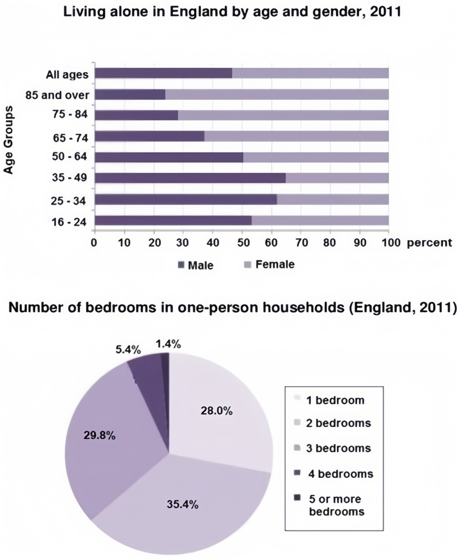
The bar chart below shows the proportions of English men and women of different ages who were living alone in 2011. The pie chart compares the numbers of bedrooms in these one-person households.
Summarise the information by selecting and reporting the main features, and make comparisons where relevant. Write at least 150 words.
Câu hỏi trong đề: 2000 câu trắc nghiệm tổng hợp Tiếng Anh 2025 có đáp án !!
Quảng cáo
Trả lời:
Sample 1:
The first chart compares the percentage of English people living alone in terms of age distribution by gender in the year 2011. The second chart gives information about how many bedrooms these one-person households had in the same year. The trend suggests that women aged 65 and over were more likely to live by themselves than men in England. At the same time, it is also noticeable that the majority of one household lived in a two-bedroom residence.
According to the bar chart, there were more men who lived alone than women in age groups under 65. Close to 65% of men aged 35 to 49 lived by themselves in that year, but this proportion shrank with age. From 65 onward, it is shown that the figure for women who lived alone was increasing, at around 63% in the 65 to 74-year-old bracket and that there was 76% in the 85 and over age group.
In the pie chart, it can clearly be seen that for all age groups, 35.4% of one-person households in England lived in a two-bedroom residence. There were similar percentages of people living alone in one bedroom and a three-bedroom house, at 28% and 29.8%, respectively. Only 1.4% of one-person households lived in houses that had more than five bedrooms.
Overall, a higher number of older women lived alone compared to men, and most English residents lived in a two-bedroom house.
Sample 2:
The bar chart displays the proportions of English men and women of different ages living alone in 2011, while the pie chart illustrates the distribution of the number of bedrooms in these one-person households.
Overall, females constituted a higher proportion of those living alone compared to males, particularly in older age categories. The most common number of bedrooms in single-occupant homes was two.
According to the bar chart, the "All Ages" and 16-24-year-olds categories had balanced proportions between males and females. For the 25-34 and 35-49 age groups, males outnumbered females, with nearly 65% of individuals living alone in the 35-49 category being men. In contrast, females dominated the older age groups, with women constituting around 72% of single occupants aged 75 to 84 and 76% of those aged 85 and over, leaving men at 24% in the latter category.
Regarding the number of bedrooms, 35.4% of one-person households had two bedrooms, making it the most popular choice. Additionally, one-bedroom and three-bedroom homes accounted for 28% and 29.8% of the total, respectively, and less than 7% of single-occupant homes had four or more bedrooms.
Sample 3:
The provided charts offer insights into single-occupant households in England during 2011. The bar chart delineates the distribution of individuals living alone across various age groups and genders, while the accompanying pie chart provides data on the number of bedrooms in these solitary residences.
Notably, a higher percentage of females chose to live alone compared to their male counterparts. This discrepancy was particularly pronounced in the elderly demographic. Additionally, the charts highlight that two-bedroom homes were the most prevalent in single-occupant households.
A significant gender disparity is evident among individuals aged 65 and above living alone in England in 2011, with females constituting the majority. Around 72% of single occupants in the 75-84 age group and 76% in the 85 and above category were women. Conversely, in the 35-49 age bracket, men represented nearly 65% of those residing alone.
In terms of the number of bedrooms, the majority of one-person households in England, 35.4%, featured two bedrooms. One-bedroom and three-bedroom homes accounted for 28% and 29.8%, respectively, of the total. Notably, less than 7% of these solitary residences had four or more bedrooms.
Sample 4:
The two charts give information about single-occupant households in England in the year 2011. The bar chart compares figures for occupants' age and gender, and the pie chart shows data about the number of bedrooms in these homes.
Overall, females made up a higher proportion of people living alone than males, and this difference is particularly noticeable in the older age categories. We can also see that the most common number of bedrooms in a single-occupant home was two.
A significant majority of the people aged 65 or over who were living alone in England in 2011 were female. Women made up around 72% of single occupants aged 75 to 84, and 76% of those aged 85 or over. By contrast, among younger adults the figures for males were higher. For example, in the 35-49 age category, men accounted for nearly 65% of people living alone.
In the same year, 35.4% of one-person households in England had two bedrooms, while one- and three-bedroom homes accounted for 28% and 29.8% of the total. Under 7% of single-occupant homes had four or more bedrooms.
Sample 5:
The bar chart provides a breakdown of English men and women of different ages who were living alone in 2011, while the accompanying pie chart illustrates the distribution of the number of bedrooms within their one-person households.
Overall, older women were more likely to live alone than their male counterparts, while younger men were more prone to solitary living compared to younger women. Additionally, most individuals living alone resided in homes with one to three bedrooms, with two-bedroom properties being the most prevalent.
Focusing on the bar chart, the proportion of women living alone increases with age, especially after the age of 65, where nearly 70% of such individuals are female, far exceeding the percentage of males. In contrast, younger age groups show a reversed trend, with more men opting for single-person households, particularly among those aged 35 to 49, where men represent a significant majority. A similar pattern can be seen in the 16-24 and 25-34 age groups, with men consistently outnumbering women. In the 50-64 age group, however, the percentage of men and women living alone is equal.
The pie chart reveals that the majority of single-person households consist of two or three bedrooms, with two-bedroom homes accounting for 35.4% and three-bedroom residences making up 29.8%. One-bedroom properties are also common, representing 28% of the total. Larger homes, including those with four or more bedrooms, are rare among single occupants, with just 5.4% having four bedrooms and only 1.4% featuring five or more.
Sample 6:
The bar chart illustrates the proportions of English men and women of different ages who were living alone in 2011, while the pie chart provides information about the number of bedrooms available in these one-person households.
In general, older women were more inclined to live independently compared to their male counterparts, whereas younger men showed a greater tendency to live on their own than younger women. Additionally, most one-person households were comprised of homes with one to three bedrooms, with two-bedroom accommodations being the most common.
Delving into the bar chart, it is clear that the trend of living alone shifts notably with age. For individuals over 65 years, women dominate the figures, making up a much larger share compared to men. This gap becomes particularly significant for the 75-84 and 85-and-over categories, where women outnumber men considerably. Conversely, men are more represented among younger age brackets, especially those aged between 35-49, where their share peaks. In the 16-24 and 25-34 groups, men also outstrip women, showing a preference for solitary living during their youth. The only age range with an equal proportion of both genders living alone is 50-64.
The pie chart reveals that two-bedroom residences make up the highest portion of single-occupant homes, followed closely by three-bedroom ones. One-bedroom homes are also frequent among these households, while properties with four or more bedrooms are uncommon. Notably, only a very small fraction of these single-occupant residences features five or more bedrooms.
Sample 7:
The bar chart demonstrates the proportions of English men and women of different ages who were living alone in 2011, while the pie chart displays the distribution of the number of bedrooms in their one-person households.
A significant pattern emerges in both visuals: older women were more likely to live by themselves than their male counterparts, and younger men were more inclined toward independent living compared to younger women. Additionally, the majority of these single-occupant residences consisted of one to three bedrooms, with two-bedroom homes forming the largest segment.
In greater detail, the bar chart reveals that among individuals aged 65 and above, women clearly outnumber men in solitary living, especially in the oldest age categories, where female occupancy rises dramatically. In contrast, the trend is reversed for younger age groups, with a higher proportion of men living alone, most notably between the ages of 35 and 49. A similar male dominance is observed in the 16-24 and 25-34 brackets, indicating that men are more inclined to live independently during their younger years. The age group 50-64 is the only category where the ratio of men and women living alone is perfectly balanced.
The pie chart illustrates that two-bedroom homes are the most frequent choice among these households, followed by those with three bedrooms. One-bedroom accommodations also constitute a substantial share, while larger properties with four or more bedrooms are relatively rare. Only a small minority of single-occupant homes contain five or more bedrooms, emphasizing the preference for compact living spaces.
Sample 8:
The bar graph compares the ratio of English males and females of different ages. In 2011, clusters who resided independently are presented in the pie chart with information on the count of bedrooms they possessed. Generally, a high number of British females chose to live solitary as their age advanced, and the majority of houses belonging to these individually residing people contained one to three sleeping rooms. As per the bar chart, approximately 55% of British females were living alone, a higher rate compared to males. In the year 2011, this statement was especially valid for older ladies because approximately 70% of them. had lived apart as compared to less than 30% of males who were over 65 years old. The proportion between the two. In 2011, the individuals of all genders who were living by themselves and were between the ages of 50 to 64 years old had exact similarities. However, younger English males preferred to live individually more than their female individuals. On average, six out of ten were males who resided alone during their younger age, from 16 to 49 years old. The majority percentage of unmarried men were between the ages of 35 and 49 years old. However, for women, it was different as most single females were above the age of 80 years.
The pie chart shows that a majority of houses occupied by single individuals have one to three bedrooms. Among them, two-bedroom houses are the most common with roughly 35%, which is about 6% more than three-bedroom apartments. Very few singles reside in large homes with many rooms, and around a quarter of these dwellings contain just a single room.
Sample 9:
The bar chart compares the proportion of English guys and females from diverse age bunches who lived independently in 2011, whereas the pie chart shows the number of rooms they had. Generally, more British ladies lived alone when they got more seasoned, and most of these independently living persons' houses comprised one to three rooms.
According to the bar chart, more British females, generally 55%, lived alone than that of guys in 2011. Typically, especially genuine for mature ladies since generally 70% of them lived independently, compared to less than 30% of guys over 65 a long time ancient. The proportion of both sexual orientations living alone who were 50 to 64 a long time ancient in 2011 was precisely the same. In any case, more youthful English guys favoured to live exclusively more than their female partners. Six out of ten, on a normal, were men who lived solo when they were more youthful, 16-49 a long time ancient. The most noteworthy rates of single guys in this category were between 35 and 49 a long time ancient, whereas this proportion was most noteworthy for the ladies over 80 a long time ancient.
The pie chart delineates that most of the single persons' houses had one to three rooms and two-bedroom houses for such individuals were the most elevated, around 35%, surpassing the three-bedroom flats by generally 6 percent. Barely they had bigger houses with numerous rooms and around one-fourth of these homes had as it were one room.
Sample 10:
The bar chart uncovers data about the English guys and females, in 8 diverse age bunches, who lived alone in 2011. The pie chart provides information about the number of rooms within the houses with one inhabitant. By and large, 34-49 a long time people had the most noteworthy rate of living alone, whereas 85 a long time and over had the least. Most of the houses with one inhabitant had two rooms, and less than 2% of one-person families had 5 or more rooms. In 2011, less than 50% of all age bunches of English people lived alone. The foremost proportion of people who had a private house was more than 50% among 16 to 64 ages, bunches of men and ladies. On the other hand, more than 64 a long time ancient people were less sharp at living alone with approximately 30% for 75-84 a long time ancient, far less than 30% for 75-84 and fair over 20% for 85 and over, individually.
Within the case of the number of rooms, 35.4% of private houses with one inhabitant had 2 rooms, which was followed by 3 rooms with 29.8% and rooms with 28%, separately. In any case, as it were less than 7% of one-person family units had 4 or more rooms.
Sample 11:
The two charts present data on single-occupant households in England in 2011. The bar chart compares the age and gender distribution of occupants, while the pie chart illustrates the distribution of the number of bedrooms in these homes.
In general, a higher percentage of females lived alone compared to males, and this difference was particularly noticeable among older age groups. Additionally, the most common configuration for single-occupant homes was having two bedrooms.
A significant majority of individuals aged 65 or over who lived alone in England in 2011 were female. Women accounted for approximately 72% of single occupants in the age range of 75 to 84, and 76% among those aged 85 or older. Conversely, among younger adults, there was a higher proportion of males living alone. For instance, in the 35-49 age category, men constituted nearly 65% of single occupants.
Regarding the number of bedrooms in single-occupant homes, approximately 35.4% of such households had two bedrooms. One-bedroom and three-bedroom homes accounted for 28% and 29.8% of the total, respectively. Less than 7% of single-occupant homes had four or more bedrooms.
In summary, the charts provide insights into single-occupant households in England in 2011. Females comprised a larger proportion of individuals living alone, especially among older age groups. Furthermore, homes with two bedrooms were the most common configuration for single occupants.
Sample 12:
The bar graph compares the ratio of English males and females from different age groups who lived individually in 2011, while the pie chart shows the number of bedrooms they had. Overall, more British women lived alone when they got older and most of these separately living persons' houses comprised one to three bedrooms.
According to the bar chart, more British females, roughly 55%, lived alone than that of males in 2011. This is particularly true for the aged women since roughly 70% of them lived separately compared to less than 30% males over 65 years old. The ratio of both genders living alone who were 50 to 64 years old in 2011 was exactly the same. However, younger English males preferred to live individually more than their female counterparts. Six out of ten, on an average, were men who lived solo when they were younger, 16-49 years old. The highest percentages of single males of this category were between 35 to 49 years old while this ratio was highest for the women over 80 years old.
The pie chart depicts that most of the single persons’ houses had one to three bedrooms and two-bedroom houses for such people was the highest, around 35%, exceeding the three-bedroom apartments by roughly 6 percent. Scarcely they had larger houses with many rooms and around one-fourth of these homes had only one room.
Sample 13:
The bar chart compares the figures of a person living alone with different genders and ages in England in the year 2011. The pie chart indicates data showing the number of bedrooms in these homes at the same period.
Overall, the women had the bigger percentages of people living alone than men. We can also see that the most common number of bedrooms in one person was two.
Females had around 77% of one person aged 85 or over, and 72% of those aged 75 to 84. By contrast, females had smaller proportion than males from 25 to 49 aged. For example, in the 35- 49 age category, men had the biggest figure of people living alone, at nearly 65%.
In 2011, 35.4% of one person households had two bedrooms. Whilst third bedroom and one bedroom were the second and third of the most of these houses in England, 29,8% and 28.0% respectively. There were nearly under 7.0% of the other bedrooms.
Hot: 1000+ Đề thi cuối kì 2 file word cấu trúc mới 2026 Toán, Văn, Anh... lớp 1-12 (chỉ từ 60k). Tải ngay
CÂU HỎI HOT CÙNG CHỦ ĐỀ
Lời giải

Sample 1:
The bar graph illustrates the overseas students' spending on accommodation, tuition, and living expenses, while the table depicts information about the average weekly expenses by international students in four countries: A, B, C, and D.
Overall, foreign students need to spend the highest in country A and the lowest in D. In nearly every nation, the international students’ weekly average living expenses are the greatest, while their housing cost registers the lowest.
The costliest country for studying is A, with a weekly average expense of 875 dollars. This is followed by B, C, and D, which have weekly expenses of 735, 540, and 435 dollars, respectively. However, foreign students always pay the least for accommodation, which incurs on average weekly 220, 280, 240, and 200 dollars in the nations A, B, C, and D, respectively.
On the other hand, living expenditures account for the highest portion of average weekly costs for international students in countries A, B, and C, with 430, 350, and 275 dollars, correspondingly. Tuition fees in the same countries (A, B and C) come in second with the weekly averages of 358, 320, and 250 dollars in order. However, D is the only nation where education accounts for the highest average spending area, coming in at USD 235, followed by the cost of living (USD 225) and housing (USD 200).
Sample 2:
The table illustrates information regarding the weekly spendings by overseas students in four countries, A, B, C and D, while the bar graph depicts the students’ expenditure on the sectors, housing, education fees and living expenses.
Overall, the cost of studying abroad is the highest in country A and the lowest in D. Apart from country D, living costs account for the most part of the weekly spendings in all countries, while accommodation registers the least.
Regarding the total cost of studying, A is the most expensive country with weekly average 875 dollars, followed by B, C and D with 735, 540 and 435 dollars, respectively. On the other hand, the overseas students always spend the least on accommodation, which are on average weekly 220, 280, 240 and 200 dollars in the corresponding countries A, B, C and D.
Considering the living cost, it takes the largest share of foreign students’ average weekly expenses in countries A, B, and C with 430, 350 and 275 dollars, respectively, while tuition fees in the same countries hold the second place with weekly average 358, 320 and 250 dollars, sequentially. However, D is the only country where tuition fee occupies the highest expenditure with average weekly 235 dollars, followed by living cost (USD 225) and accommodation (USD 200.)
Sample 3:
The table and bar graph depict information regarding the weekly spendings by overseas students in countries A, B C and D.
Overall, there are three elements, housing, school fees and living costs that contribute to the total weekly spendings. The total expenditure in country A is the highest while it is the lowest in country D. Living costs account for the most part of the weekly spendings in all countries except D.
The total mean weekly cost for pupils to study in country A is US$875, next by country B at US$735, and then by country C at US$540, and finally by country D at US$435. The living costs are always the biggest component of the expenditure except for country D, with about US$10 less than the major spending which is the school fees.
Accommodation accounts for the least among all spendings in all countries. The most expensive housing is found in country B, at US$280, and the cheapest in country D at US$200. The middle range can be seen in country A at US$220 and country C at US$240, respectively. Costs of the tuition fee range between US$ 358 and US$235 in country A and D, in order.
Lời giải

Sample 1:
The bar chart and pie chart give information about why US residents travelled and what travel problems they experienced in the year 2009.
It is clear that the principal reason why Americans travelled in 2009 was to commute to and from work. In the same year, the primary concern of Americans, with regard to the trips they made, was the cost of travelling.
Looking more closely at the bar chart, we can see that 49% of the trips made by Americans in 2009 were for the purpose of commuting. By contrast, only 6% of trips were visits to friends or relatives, and one in ten trips were for social or recreation reasons. Shopping was cited as the reason for 16% of all travel, while unspecific ‘personal reasons’ accounted for the remaining 19%.
According to the pie chart, price was the key consideration for 36% of American travellers. Almost one in five people cited safety as their foremost travel concern, while aggressive driving and highway congestion were the main issues for 17% and 14% of the travelling public. Finally, a total of 14% of those surveyed thought that access to public transport or space for pedestrians were the most important travel issues.
Sample 2:
The bar chart compares the figures for Americans going out for five reasons and the pie chart illustrates the percentage of six problems that concerned them when travelling in 2009. Overall, it is clear that the main reason why people in the US went out in 2009 is to commute to work, and the cost of travelling is the problem concerning them the most.
Looking first at the bar graph, the proportion of Americans going out for commuting to work stood at 49%, while the figure for those leaving their house for personal reasons accounted for 19%. In addition, the rate of people in the US going out for shopping and recreation made up 16% and 10%, respectively, while visiting friends or relatives accounted for the lowest percentage, at only 6%.
Turning to the pie chart, the cost of travelling was the most concerning problem of Americans when going out, with the figure making up 36%, while the proportion of safety concerns is half of that, at 19%. In addition, 17% of US citizens were concerned about aggressive drivers, while highway congestion made 14% of them worried when leaving their house. Access to public transportation and places for people to walk accounted for the lowest percentages, at only 8% and 6%, respectively.
Sample 3:
The provided charts offer insights into the reasons for travel and the primary concerns faced by the traveling public in the United States during the year 2009. The data is presented through a bar chart illustrating travel purposes and a pie chart highlighting key issues.
Notably, the primary motivation for travel among Americans in 2009 was commuting to and from work. Simultaneously, the major concern for the traveling public during their trips revolved around the cost associated with travel.
Examining the bar chart in detail reveals that almost half of the trips made by Americans in 2009, precisely 49%, were attributed to commuting. Conversely, visits to friends or relatives accounted for a mere 6%, while social or recreational trips constituted one in ten journeys. Shopping emerged as the purpose for 16% of all travel, leaving the remaining 19% for unspecific ‘personal reasons.’
Turning attention to the pie chart, it becomes evident that cost was the primary consideration for 36% of American travelers. Safety closely followed, with nearly one in five people, or 19%, expressing it as their foremost travel concern. Aggressive driving and highway congestion were significant issues for 17% and 14% of the traveling public, respectively. Additionally, 14% of respondents identified access to public transport or space for pedestrians as the most crucial travel issues.
Sample 4:
The bar chart shows why American people chose to travel, and the pie chart shows the main issues for the travelling public in the USA, both for 2009. The trend suggests that the reason and price were the main issues for travel in the United States. It is clear that commuting from work was reported as the biggest contribution to travel, at 49%. People who went travelling for personal reasons and shopping accounted for 35% when these two groups are combined. However, interaction with friends and relatives only accounted for 25% less than the above categories. And social and recreational activities took up only 6%, which was the lowest figure by more than 43%. The travelling public’s main issues were related to price and safety, with 55% of respondents reporting these two issues. While other issues accounted for a relatively small part. Only 17% of the respondents reported issues with aggressive drivers, while highway congestion accounted for even less at 14% of the issues reported. The percentage of access to public transport and space for pedestrians was much lower than the other categories at less than 10% for both. To conclude, price and commuting time were the dominant factors relating to travel in the US in 2009.
Lời giải
Bạn cần đăng ký gói VIP ( giá chỉ từ 250K ) để làm bài, xem đáp án và lời giải chi tiết không giới hạn.
Lời giải
Bạn cần đăng ký gói VIP ( giá chỉ từ 250K ) để làm bài, xem đáp án và lời giải chi tiết không giới hạn.
Lời giải
Bạn cần đăng ký gói VIP ( giá chỉ từ 250K ) để làm bài, xem đáp án và lời giải chi tiết không giới hạn.
Lời giải
Bạn cần đăng ký gói VIP ( giá chỉ từ 250K ) để làm bài, xem đáp án và lời giải chi tiết không giới hạn.
Lời giải
Bạn cần đăng ký gói VIP ( giá chỉ từ 250K ) để làm bài, xem đáp án và lời giải chi tiết không giới hạn.