


The chart and graph below give the information about three categories of workers in Australia and unemployment levels within those categories.
Summarise the information by selecting and reporting the main features, and make comparisons where relevant. Write at least 150 words.
The chart and graph below give the information about three categories of workers in Australia and unemployment levels within those categories.
Summarise the information by selecting and reporting the main features, and make comparisons where relevant. Write at least 150 words.
Câu hỏi trong đề: 2000 câu trắc nghiệm tổng hợp Tiếng Anh 2025 có đáp án !!
Quảng cáo
Trả lời:
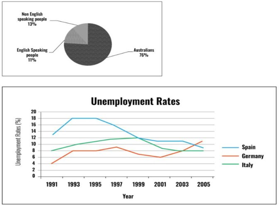
Sample 1:
The pie chart illustrates the proportion of three different groups of workers in Australia in the year of 1991 while the line chart shows the changes in the unemployment rates of 3 countries, namely Spain, Germany and Italy, from 1991 to 2005.
Overall, Australia-born workers represented the largest proportion in the total workforce of Australia. In addition, while Spain and Italy witnessed a downward trend in unemployment level, that of Germany grew and remained the highest at the end of the period.
Regarding workforce composition, in 1991, the vast majority were people who were born in Australia, accounting for 76%. Far fewer were those originating from countries that do not speak English, at 13%, which was slightly higher than the figure for workers from English-speaking nations, at 11%.
Concerning the patterns of unemployment, that of Spain fluctuated with a downward trend, dropping from around 13% in 1991 to 9% in 2005 after reaching a peak of 18% in the years between 1993 and 1995. Meanwhile, the unemployment level of Italy grew steadily from 8% in 1991 to hit the highest point of 12% in 1999 before declining back to 8% in 2003 and ending at this figure in 2005. The unemployment rate in Germany, on the other hand, doubled from 4% in 1991 to 9% in 1997. This number, despite a noticeable decrease to 6% in 2001, saw a steep climb from 6% to 11% in 2005, ending the period as the highest among the other countries.
Sample 2:
The given charts illustrate the distribution of the Australian workforce as well as unemployment rates of various worker types in three countries from 1991 to 2005. Overall, the vast majority of the workforce in Australia was Australian, followed distantly by non-English speaking and English-speaking people. Additionally, the unemployment figure for Spain declined, while the statistics of Germany increased and those of Italy fluctuated despite an increase in the middle of the period.
Concerning the worker categories, Australians made up the by far greatest percentage of workers, at 76%. The figures for non-English speaking and English-speaking workers were mostly comparable, standing at 13% and 11% respectively.
Regarding unemployment, the rate of Spanish people started highest at about 13%, then grew rapidly to 18% in 1993. It stayed constant in the next two years before plummeting to a low of approximately 9% in 2005. By contrast, the unemployment level in Germany increased significantly by almost threefolds from 4% in 1991 to rank first at slightly under 12% at the end of the period. Finally, the proportion for Italy underwent a constant growth of about 4% to 12% in the first 8 years prior to a noticeable dive back to 8% in the final year, moving from second to third position.
Sample 3:
The pie chart and line graph provided illustrate the composition of Australia’s workforce and the unemployment rates in Spain, Germany, and Italy over a 14-year period from 1991 to 2005.
Overall, the majority of the Australian workforce is comprised of English speakers, and over the years, Spain saw a dramatic decline in unemployment, while Italy witnessed a fall followed by a slight increase.
The pie chart demonstrates a workforce predominantly composed of Australians, who constitute 76% of the total. Non-English-speaking people account for 13%, while the remaining 11% of the workforce are English speaking people, presumably representing those who do not fall into the former two categories.
Examining the unemployment trends, Spain had a significant reduction in its unemployment rate, from the highest point of approximately 18% in 1993 to just under 8% in 2005. In contrast, Italy’s unemployment rate remained relatively stable with minor fluctuations around 10%, while Germany experienced an increase from the lowest rate of about 4% in 1991 to peak at around 11% in 1999.
Sample 4:
The pie chart depicts three distinct categories of workers residing in Australia. The line graph, on the other hand, illustrates unemployment trends in three different countries throughout the period from 1991 to 2005.
It is clear that Australian workers accounted for a vast majority of the graph given. Regarding the second graph, the interesting point is that there were 3 distinctive trends in accordance with 3 countries.
As the first chart shows, Australians made up the largest portion of the workforce, occupying a substantial 76% share. Conversely, non-English and English-speaking individuals only constituted 13% and 11%, respectively.
The line graph reveals three unique trends for each country’s unemployment rate. Germany’s rate experienced significant fluctuations, starting at 4% in 1991 before reaching 10% by 2005. In contrast, Spain’s rate went up to its peak of 18% in 1995, but then gradually decreased, eventually stabilizing at around 8%. Finally, Italy’s rate saw a rise to 12% in 1999 but then steadily declined to its starting point.
Sample 5:
The pie chart depicts the composition of the Australian workforce, while the line graph illustrates changes in unemployment across three European nations from 1991 to 2005. It is evident that Australians constitute the majority of the workforce in their own country, whereas unemployment trends vary among the countries featured in the line graph.
In Australia, the overwhelming majority of employees are native Australians, comprising 76%. The remaining quarter of the workforce consists of English-speaking and non-English-speaking individuals. Specifically, those who do not speak English constitute 13% of Australia’s workforce, while 11% are foreign English speakers, representing the smallest group.
Regarding the line graph, Spain had the highest unemployment rate among the three countries, at 13%, followed by Italy and Germany, with rates of 8% and 4%, respectively. Spain's unemployment rate peaked between 1993 and 1995 at 18%, before declining for most of the remaining years, reaching 9% in 2005. Italy's data, on the other hand, initially increased steadily to a peak of 12% in 1999, before decreasing until 2005, when the unemployment rate reverted to its 1991 level. Germany was the only country to experience a rise in unemployment; following a period of uncertainty until 2001, its rate surpassed those of Spain and Italy, reaching a record high of 11% in 2005.
Hot: 1000+ Đề thi cuối kì 2 file word cấu trúc mới 2026 Toán, Văn, Anh... lớp 1-12 (chỉ từ 60k). Tải ngay
CÂU HỎI HOT CÙNG CHỦ ĐỀ
Lời giải

Sample 1:
The bar graph illustrates the overseas students' spending on accommodation, tuition, and living expenses, while the table depicts information about the average weekly expenses by international students in four countries: A, B, C, and D.
Overall, foreign students need to spend the highest in country A and the lowest in D. In nearly every nation, the international students’ weekly average living expenses are the greatest, while their housing cost registers the lowest.
The costliest country for studying is A, with a weekly average expense of 875 dollars. This is followed by B, C, and D, which have weekly expenses of 735, 540, and 435 dollars, respectively. However, foreign students always pay the least for accommodation, which incurs on average weekly 220, 280, 240, and 200 dollars in the nations A, B, C, and D, respectively.
On the other hand, living expenditures account for the highest portion of average weekly costs for international students in countries A, B, and C, with 430, 350, and 275 dollars, correspondingly. Tuition fees in the same countries (A, B and C) come in second with the weekly averages of 358, 320, and 250 dollars in order. However, D is the only nation where education accounts for the highest average spending area, coming in at USD 235, followed by the cost of living (USD 225) and housing (USD 200).
Sample 2:
The table illustrates information regarding the weekly spendings by overseas students in four countries, A, B, C and D, while the bar graph depicts the students’ expenditure on the sectors, housing, education fees and living expenses.
Overall, the cost of studying abroad is the highest in country A and the lowest in D. Apart from country D, living costs account for the most part of the weekly spendings in all countries, while accommodation registers the least.
Regarding the total cost of studying, A is the most expensive country with weekly average 875 dollars, followed by B, C and D with 735, 540 and 435 dollars, respectively. On the other hand, the overseas students always spend the least on accommodation, which are on average weekly 220, 280, 240 and 200 dollars in the corresponding countries A, B, C and D.
Considering the living cost, it takes the largest share of foreign students’ average weekly expenses in countries A, B, and C with 430, 350 and 275 dollars, respectively, while tuition fees in the same countries hold the second place with weekly average 358, 320 and 250 dollars, sequentially. However, D is the only country where tuition fee occupies the highest expenditure with average weekly 235 dollars, followed by living cost (USD 225) and accommodation (USD 200.)
Sample 3:
The table and bar graph depict information regarding the weekly spendings by overseas students in countries A, B C and D.
Overall, there are three elements, housing, school fees and living costs that contribute to the total weekly spendings. The total expenditure in country A is the highest while it is the lowest in country D. Living costs account for the most part of the weekly spendings in all countries except D.
The total mean weekly cost for pupils to study in country A is US$875, next by country B at US$735, and then by country C at US$540, and finally by country D at US$435. The living costs are always the biggest component of the expenditure except for country D, with about US$10 less than the major spending which is the school fees.
Accommodation accounts for the least among all spendings in all countries. The most expensive housing is found in country B, at US$280, and the cheapest in country D at US$200. The middle range can be seen in country A at US$220 and country C at US$240, respectively. Costs of the tuition fee range between US$ 358 and US$235 in country A and D, in order.
Lời giải

Sample 1:
The bar chart and pie chart give information about why US residents travelled and what travel problems they experienced in the year 2009.
It is clear that the principal reason why Americans travelled in 2009 was to commute to and from work. In the same year, the primary concern of Americans, with regard to the trips they made, was the cost of travelling.
Looking more closely at the bar chart, we can see that 49% of the trips made by Americans in 2009 were for the purpose of commuting. By contrast, only 6% of trips were visits to friends or relatives, and one in ten trips were for social or recreation reasons. Shopping was cited as the reason for 16% of all travel, while unspecific ‘personal reasons’ accounted for the remaining 19%.
According to the pie chart, price was the key consideration for 36% of American travellers. Almost one in five people cited safety as their foremost travel concern, while aggressive driving and highway congestion were the main issues for 17% and 14% of the travelling public. Finally, a total of 14% of those surveyed thought that access to public transport or space for pedestrians were the most important travel issues.
Sample 2:
The bar chart compares the figures for Americans going out for five reasons and the pie chart illustrates the percentage of six problems that concerned them when travelling in 2009. Overall, it is clear that the main reason why people in the US went out in 2009 is to commute to work, and the cost of travelling is the problem concerning them the most.
Looking first at the bar graph, the proportion of Americans going out for commuting to work stood at 49%, while the figure for those leaving their house for personal reasons accounted for 19%. In addition, the rate of people in the US going out for shopping and recreation made up 16% and 10%, respectively, while visiting friends or relatives accounted for the lowest percentage, at only 6%.
Turning to the pie chart, the cost of travelling was the most concerning problem of Americans when going out, with the figure making up 36%, while the proportion of safety concerns is half of that, at 19%. In addition, 17% of US citizens were concerned about aggressive drivers, while highway congestion made 14% of them worried when leaving their house. Access to public transportation and places for people to walk accounted for the lowest percentages, at only 8% and 6%, respectively.
Sample 3:
The provided charts offer insights into the reasons for travel and the primary concerns faced by the traveling public in the United States during the year 2009. The data is presented through a bar chart illustrating travel purposes and a pie chart highlighting key issues.
Notably, the primary motivation for travel among Americans in 2009 was commuting to and from work. Simultaneously, the major concern for the traveling public during their trips revolved around the cost associated with travel.
Examining the bar chart in detail reveals that almost half of the trips made by Americans in 2009, precisely 49%, were attributed to commuting. Conversely, visits to friends or relatives accounted for a mere 6%, while social or recreational trips constituted one in ten journeys. Shopping emerged as the purpose for 16% of all travel, leaving the remaining 19% for unspecific ‘personal reasons.’
Turning attention to the pie chart, it becomes evident that cost was the primary consideration for 36% of American travelers. Safety closely followed, with nearly one in five people, or 19%, expressing it as their foremost travel concern. Aggressive driving and highway congestion were significant issues for 17% and 14% of the traveling public, respectively. Additionally, 14% of respondents identified access to public transport or space for pedestrians as the most crucial travel issues.
Sample 4:
The bar chart shows why American people chose to travel, and the pie chart shows the main issues for the travelling public in the USA, both for 2009. The trend suggests that the reason and price were the main issues for travel in the United States. It is clear that commuting from work was reported as the biggest contribution to travel, at 49%. People who went travelling for personal reasons and shopping accounted for 35% when these two groups are combined. However, interaction with friends and relatives only accounted for 25% less than the above categories. And social and recreational activities took up only 6%, which was the lowest figure by more than 43%. The travelling public’s main issues were related to price and safety, with 55% of respondents reporting these two issues. While other issues accounted for a relatively small part. Only 17% of the respondents reported issues with aggressive drivers, while highway congestion accounted for even less at 14% of the issues reported. The percentage of access to public transport and space for pedestrians was much lower than the other categories at less than 10% for both. To conclude, price and commuting time were the dominant factors relating to travel in the US in 2009.
Lời giải
Bạn cần đăng ký gói VIP ( giá chỉ từ 250K ) để làm bài, xem đáp án và lời giải chi tiết không giới hạn.
Lời giải
Bạn cần đăng ký gói VIP ( giá chỉ từ 250K ) để làm bài, xem đáp án và lời giải chi tiết không giới hạn.
Lời giải
Bạn cần đăng ký gói VIP ( giá chỉ từ 250K ) để làm bài, xem đáp án và lời giải chi tiết không giới hạn.
Lời giải
Bạn cần đăng ký gói VIP ( giá chỉ từ 250K ) để làm bài, xem đáp án và lời giải chi tiết không giới hạn.
Lời giải
Bạn cần đăng ký gói VIP ( giá chỉ từ 250K ) để làm bài, xem đáp án và lời giải chi tiết không giới hạn.