


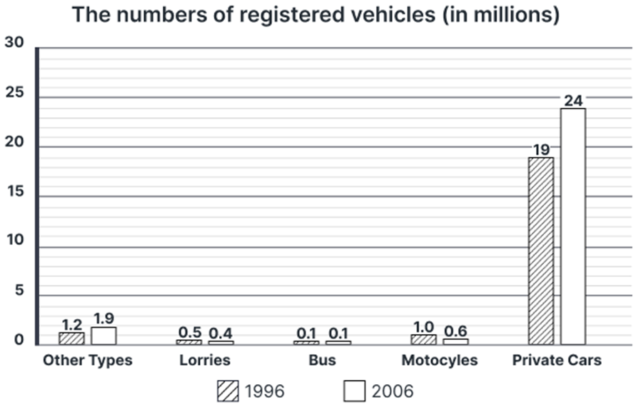
The number of vehicles registered for use between 1996 and 2006 in a European country.
Summarise the information by selecting and reporting the main features, and make comparisons where relevant. Write at least 150 words.
The number of vehicles registered for use between 1996 and 2006 in a European country.
Summarise the information by selecting and reporting the main features, and make comparisons where relevant. Write at least 150 words.
Câu hỏi trong đề: 2000 câu trắc nghiệm tổng hợp Tiếng Anh 2025 có đáp án !!
Quảng cáo
Trả lời:
Sample 1:
The bar chart shows how many road vehicles were registered for usage in a particular country in Europe in two years, 1996 and 2006.
Overall, there was an upward trend in the registration of private cars and other vehicle types while lorries and motorcycles took the opposite direction, except buses whose figures remained unchanged. Among these categories, private cars had the highest registration in both years.
At the start of the period, by far the leading mode of transportation was private cars, with 19 million vehicles registered. The figures for the remaining options were negligible, ranging from 0.1 to 1.2 million vehicles.
Thereafter, the number of automobiles registered for private use witnessed a substantial increase, hitting a record high of 24 million in 2006. The trend for other types of vehicles was relatively similar, although the magnitude of change was less pronounced, with 1.9 million vehicles recorded in 2006. Conversely, the figures for motorcycles and lorries experienced a downward shift, declining to 0.6 and 0.4 million vehicles respectively at the end of the period. Finally, the number of registered buses in use remained stable at 0.1 million.
Sample 2:
The bar chart shows the number of registered road vehicles being used in a European country in 1996 and 2006. Overall, registered private cars and other types of vehicles showed an upward trend in numbers, with private cars experiencing the greatest increase, whereas negligible declines were seen in the numbers of registered lorries and motorcycles. In addition, private automobiles dominated other vehicles in both years, while the opposite was true in the case of bus registrations.
Private car registration stood at 19 million in 1996, after which it experienced a remarkable rise to 24 million in 2006. The only other category to witness an increase, albeit to a lesser extent, was other types of vehicles, which climbed from 1.2 million in 1996 to 1.9 million 20 years later.
Conversely, only half a million lorries were registered in 1996, compared to 1 million motorcycles registered in the same year. By 2006, the figures for both these vehicle types had dropped to 0.4 and 0.6, respectively.
Bus registrations, on the other hand, remained unchanged in both given years, with 0.1 million buses being registered in 1996 as well as in 2016, representing a minority among all the listed modes of transport.
Sample 3:
The bar chart depicts the changes in the quantity of registered road vehicles in a European nation between 1996 and 2006. Overall, except for lorries and motorcycles, the use of the remaining means of transport either increased or stayed unchanged. Furthermore, private cars were by far the most commonly used vehicle over the surveyed period.
It can be clearly observed that the disparity between car usage and other modes of transport was highly significant. In 1996, there were a total of 19 million private cars in use on the road, far exceeding the figures for all the remaining vehicles, which hovered merely between a marginal number of 0.1 million to 1.2 million.
The gap was further widened after a decade, in which the number of registered cars continued to top the chart after rising substantially to 24 million, roughly 12 times higher than that of other types of vehicles (1.9 million). Meanwhile, negligible declines to 0.4 and 0.6 million were recorded in the figures for lorries and motorcycles respectively, whereas bus usage remained unaltered at only 0.1 million in 2006.
Sample 4:
The bar chart illustrates the registration figures for various categories of vehicles in Europe over a decade, specifically from 1996 to 2006.
Overall, private cars had the highest number of registrations in both years, showing a significant increase over the decade. In contrast, the registrations for lorries and motorcycles declined, while the number of buses remained unchanged. The category of other types of vehicles also experienced notable growth.
In 1996, private cars dominated the vehicle registration landscape with 19 million units, which significantly rose to 24 million by 2006, indicating a growth of 5 million or a 26.3% increase. Similarly, the category of other types of vehicles also experienced an increase, climbing from 1.2 million in 1996 to 1.9 million in 2006, which corresponds to a rise of 0.7 million or approximately 58.3%.
Conversely, the registration figures for lorries and motorcycles demonstrated a different trajectory. Lorries, which had 0.5 million registrations in 1996, saw a minor decline to 0.4 million in 2006. This drop of 0.1 million constitutes a reduction of 20%. Motorcycles also fell significantly, recording a decrease from 1 million in 1996 to 0.6 million in 2006, representing a decline of 0.4 million or 40%. Interestingly, the number of buses remained static at 0.1 million throughout the decade.
Sample 5:
The bar chart provides information on the number of vehicles registered for use in a European country between 1996 and 2006, measured in millions, across categories including Other Types, Lorries, Buses, Motorcycles, and Private Cars.
Overall, Private Cars dominated vehicle registrations in both years, with a notable rise over the decade. Motorcycles and Other Types also increased, whereas Lorries saw a minor decrease, and Buses remained constant.
In 1996, Private Cars were the most registered vehicles at 19 million, rising significantly to 24 million by 2006, marking the highest increase among all categories. Other Types also saw growth from 1.2 million to 1.9 million.
Lorries experienced a slight decline from 0.5 million to 0.4 million, while Buses remained stable at 0.1 million over the decade. Motorcycles had an increase from 1 million to 1.6 million.
Hot: 1000+ Đề thi cuối kì 2 file word cấu trúc mới 2026 Toán, Văn, Anh... lớp 1-12 (chỉ từ 60k). Tải ngay
CÂU HỎI HOT CÙNG CHỦ ĐỀ
Lời giải

Sample 1:
The bar graph illustrates the overseas students' spending on accommodation, tuition, and living expenses, while the table depicts information about the average weekly expenses by international students in four countries: A, B, C, and D.
Overall, foreign students need to spend the highest in country A and the lowest in D. In nearly every nation, the international students’ weekly average living expenses are the greatest, while their housing cost registers the lowest.
The costliest country for studying is A, with a weekly average expense of 875 dollars. This is followed by B, C, and D, which have weekly expenses of 735, 540, and 435 dollars, respectively. However, foreign students always pay the least for accommodation, which incurs on average weekly 220, 280, 240, and 200 dollars in the nations A, B, C, and D, respectively.
On the other hand, living expenditures account for the highest portion of average weekly costs for international students in countries A, B, and C, with 430, 350, and 275 dollars, correspondingly. Tuition fees in the same countries (A, B and C) come in second with the weekly averages of 358, 320, and 250 dollars in order. However, D is the only nation where education accounts for the highest average spending area, coming in at USD 235, followed by the cost of living (USD 225) and housing (USD 200).
Sample 2:
The table illustrates information regarding the weekly spendings by overseas students in four countries, A, B, C and D, while the bar graph depicts the students’ expenditure on the sectors, housing, education fees and living expenses.
Overall, the cost of studying abroad is the highest in country A and the lowest in D. Apart from country D, living costs account for the most part of the weekly spendings in all countries, while accommodation registers the least.
Regarding the total cost of studying, A is the most expensive country with weekly average 875 dollars, followed by B, C and D with 735, 540 and 435 dollars, respectively. On the other hand, the overseas students always spend the least on accommodation, which are on average weekly 220, 280, 240 and 200 dollars in the corresponding countries A, B, C and D.
Considering the living cost, it takes the largest share of foreign students’ average weekly expenses in countries A, B, and C with 430, 350 and 275 dollars, respectively, while tuition fees in the same countries hold the second place with weekly average 358, 320 and 250 dollars, sequentially. However, D is the only country where tuition fee occupies the highest expenditure with average weekly 235 dollars, followed by living cost (USD 225) and accommodation (USD 200.)
Sample 3:
The table and bar graph depict information regarding the weekly spendings by overseas students in countries A, B C and D.
Overall, there are three elements, housing, school fees and living costs that contribute to the total weekly spendings. The total expenditure in country A is the highest while it is the lowest in country D. Living costs account for the most part of the weekly spendings in all countries except D.
The total mean weekly cost for pupils to study in country A is US$875, next by country B at US$735, and then by country C at US$540, and finally by country D at US$435. The living costs are always the biggest component of the expenditure except for country D, with about US$10 less than the major spending which is the school fees.
Accommodation accounts for the least among all spendings in all countries. The most expensive housing is found in country B, at US$280, and the cheapest in country D at US$200. The middle range can be seen in country A at US$220 and country C at US$240, respectively. Costs of the tuition fee range between US$ 358 and US$235 in country A and D, in order.
Lời giải

Sample 1:
The bar chart and pie chart give information about why US residents travelled and what travel problems they experienced in the year 2009.
It is clear that the principal reason why Americans travelled in 2009 was to commute to and from work. In the same year, the primary concern of Americans, with regard to the trips they made, was the cost of travelling.
Looking more closely at the bar chart, we can see that 49% of the trips made by Americans in 2009 were for the purpose of commuting. By contrast, only 6% of trips were visits to friends or relatives, and one in ten trips were for social or recreation reasons. Shopping was cited as the reason for 16% of all travel, while unspecific ‘personal reasons’ accounted for the remaining 19%.
According to the pie chart, price was the key consideration for 36% of American travellers. Almost one in five people cited safety as their foremost travel concern, while aggressive driving and highway congestion were the main issues for 17% and 14% of the travelling public. Finally, a total of 14% of those surveyed thought that access to public transport or space for pedestrians were the most important travel issues.
Sample 2:
The bar chart compares the figures for Americans going out for five reasons and the pie chart illustrates the percentage of six problems that concerned them when travelling in 2009. Overall, it is clear that the main reason why people in the US went out in 2009 is to commute to work, and the cost of travelling is the problem concerning them the most.
Looking first at the bar graph, the proportion of Americans going out for commuting to work stood at 49%, while the figure for those leaving their house for personal reasons accounted for 19%. In addition, the rate of people in the US going out for shopping and recreation made up 16% and 10%, respectively, while visiting friends or relatives accounted for the lowest percentage, at only 6%.
Turning to the pie chart, the cost of travelling was the most concerning problem of Americans when going out, with the figure making up 36%, while the proportion of safety concerns is half of that, at 19%. In addition, 17% of US citizens were concerned about aggressive drivers, while highway congestion made 14% of them worried when leaving their house. Access to public transportation and places for people to walk accounted for the lowest percentages, at only 8% and 6%, respectively.
Sample 3:
The provided charts offer insights into the reasons for travel and the primary concerns faced by the traveling public in the United States during the year 2009. The data is presented through a bar chart illustrating travel purposes and a pie chart highlighting key issues.
Notably, the primary motivation for travel among Americans in 2009 was commuting to and from work. Simultaneously, the major concern for the traveling public during their trips revolved around the cost associated with travel.
Examining the bar chart in detail reveals that almost half of the trips made by Americans in 2009, precisely 49%, were attributed to commuting. Conversely, visits to friends or relatives accounted for a mere 6%, while social or recreational trips constituted one in ten journeys. Shopping emerged as the purpose for 16% of all travel, leaving the remaining 19% for unspecific ‘personal reasons.’
Turning attention to the pie chart, it becomes evident that cost was the primary consideration for 36% of American travelers. Safety closely followed, with nearly one in five people, or 19%, expressing it as their foremost travel concern. Aggressive driving and highway congestion were significant issues for 17% and 14% of the traveling public, respectively. Additionally, 14% of respondents identified access to public transport or space for pedestrians as the most crucial travel issues.
Sample 4:
The bar chart shows why American people chose to travel, and the pie chart shows the main issues for the travelling public in the USA, both for 2009. The trend suggests that the reason and price were the main issues for travel in the United States. It is clear that commuting from work was reported as the biggest contribution to travel, at 49%. People who went travelling for personal reasons and shopping accounted for 35% when these two groups are combined. However, interaction with friends and relatives only accounted for 25% less than the above categories. And social and recreational activities took up only 6%, which was the lowest figure by more than 43%. The travelling public’s main issues were related to price and safety, with 55% of respondents reporting these two issues. While other issues accounted for a relatively small part. Only 17% of the respondents reported issues with aggressive drivers, while highway congestion accounted for even less at 14% of the issues reported. The percentage of access to public transport and space for pedestrians was much lower than the other categories at less than 10% for both. To conclude, price and commuting time were the dominant factors relating to travel in the US in 2009.
Lời giải
Bạn cần đăng ký gói VIP ( giá chỉ từ 250K ) để làm bài, xem đáp án và lời giải chi tiết không giới hạn.
Lời giải
Bạn cần đăng ký gói VIP ( giá chỉ từ 250K ) để làm bài, xem đáp án và lời giải chi tiết không giới hạn.
Lời giải
Bạn cần đăng ký gói VIP ( giá chỉ từ 250K ) để làm bài, xem đáp án và lời giải chi tiết không giới hạn.
Lời giải
Bạn cần đăng ký gói VIP ( giá chỉ từ 250K ) để làm bài, xem đáp án và lời giải chi tiết không giới hạn.
Lời giải
Bạn cần đăng ký gói VIP ( giá chỉ từ 250K ) để làm bài, xem đáp án và lời giải chi tiết không giới hạn.